Live: try it with the mouse and the keyboard (Tab, arrows, Escape).
Screenshot
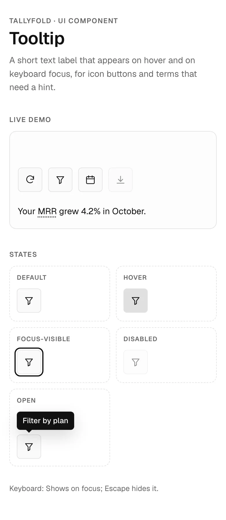
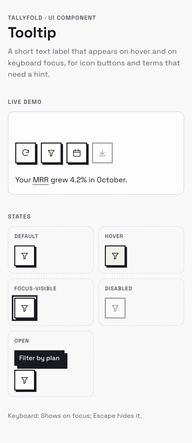
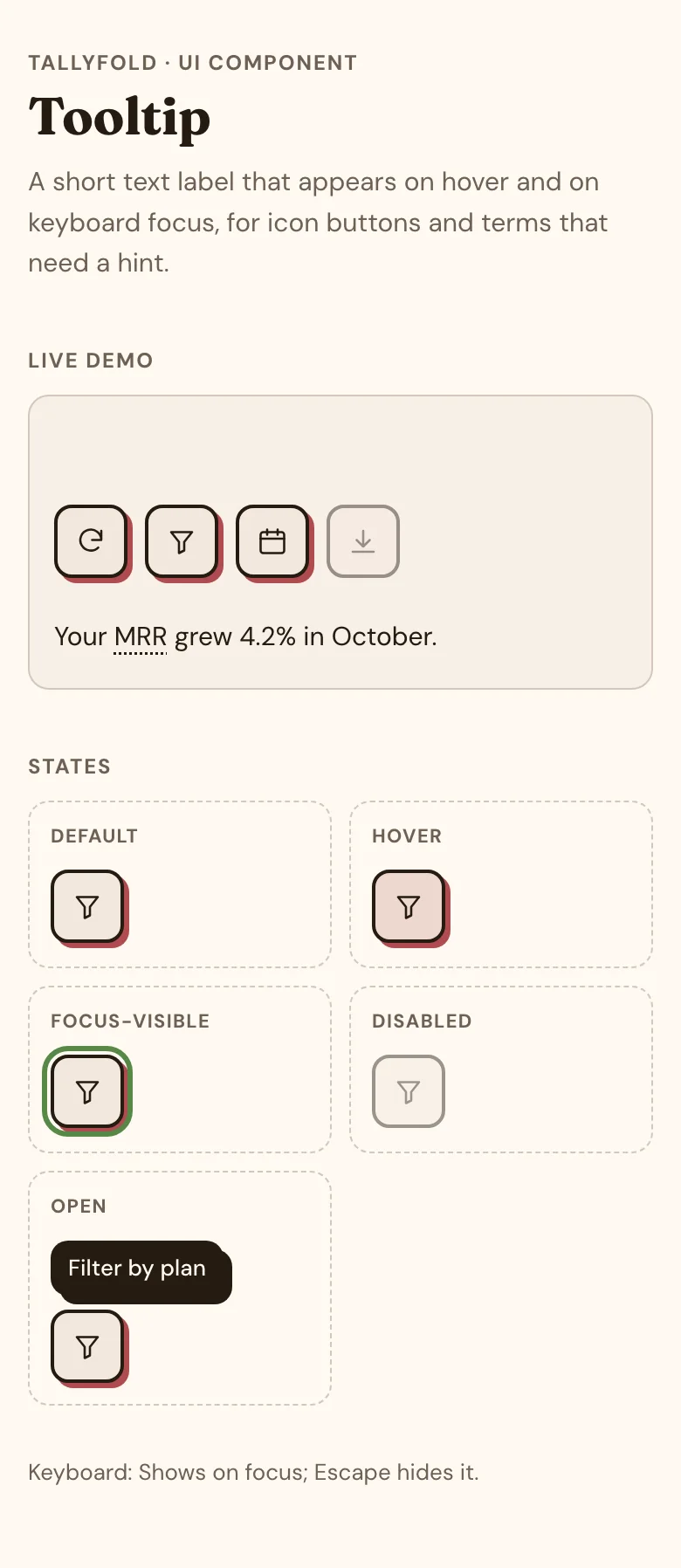
Tooltip component — mobile, monochrome style
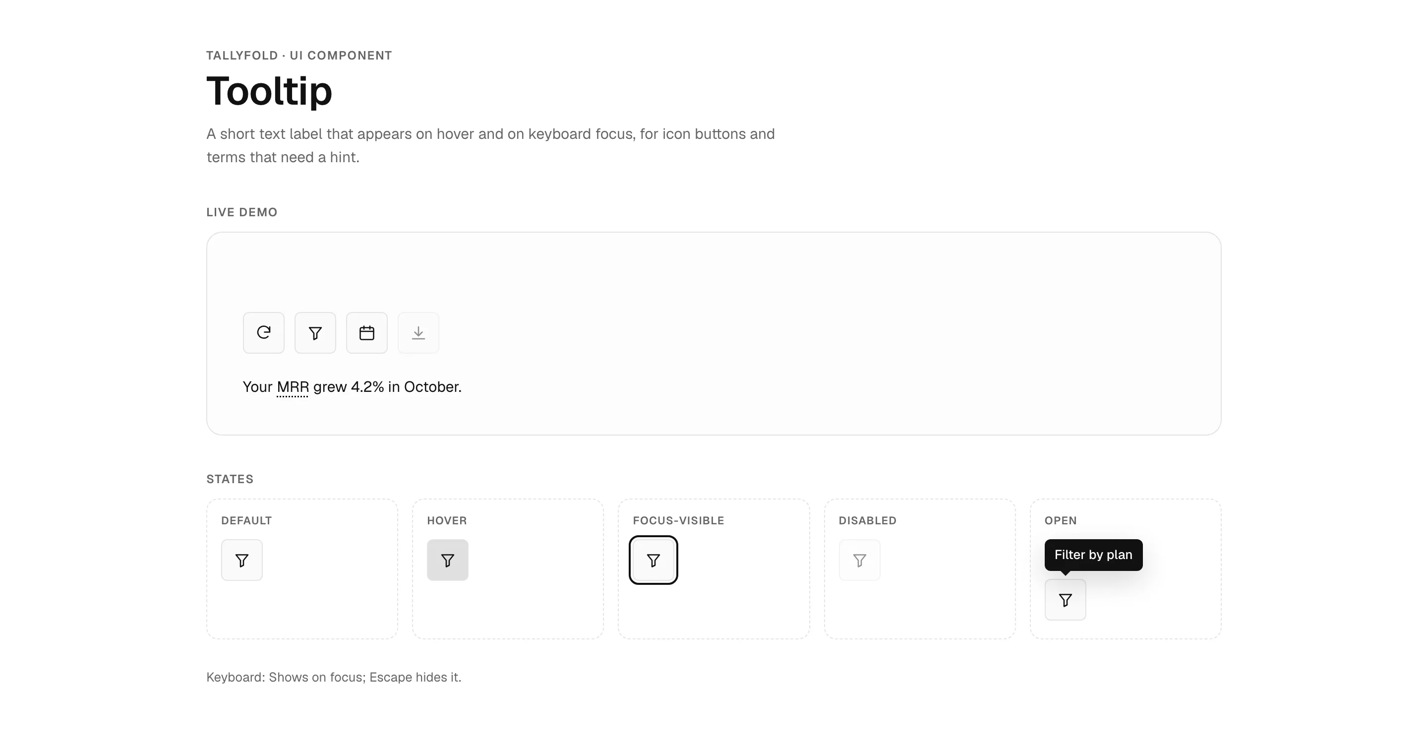
Tooltip UI component for websites and web apps, shown in Tallyfold, a fictional finance product. Shows icon buttons and a glossary term with tooltips on hover and keyboard focus, a disabled button that still explains itself, and every state (default, hover, focus-visible, open, disabled). Monochrome style: pure greyscale, Geist, black primary actions and flat surfaces. Comes with copyable HTML, CSS and a few lines of plain JavaScript (keyboard support and ARIA per the WAI-ARIA Authoring Practices), a live demo, and a DESIGN.md with light and dark colour tokens.
- Pattern
- Tooltip
- Device
- Mobile
- Style
- Monochrome
- Product (fictional)
- Tallyfold
- Category
- Finance
Spec
- Colours (light)
- background
#ffffff· surface#fafafa· text#111111· muted#666666· primary#111111· accent#444444 - Colours (dark)
- background
#0a0a0a· surface#161616· text#f2f2f2· muted#a0a0a0· primary#f2f2f2· accent#c8c8c8 - Fonts
- Geist (headings and body), JetBrains Mono (code) · Google Fonts, under their own licences
- Light and dark
- Both included; follows the system setting
- ARIA pattern
- Tooltip (WAI-ARIA Authoring Practices)
- Keyboard
- Shows on focus; Escape hides it
- States
- default, hover, focus-visible, open, disabled
Code
Paste the HTML where the component goes, the CSS into your stylesheet and the script before </body>. The tokens block holds the light and dark colours; swap in your own.
<div class="mgd-tipbar" role="group" aria-label="Revenue chart tools">
  <span class="mgd-tip mgd-tip--start"><button class="mgd-tip__btn" type="button" aria-labelledby="tip-0"><svg class="i" width="18" height="18" viewBox="0 0 24 24" fill="none" stroke="currentColor" stroke-width="1.7" stroke-linecap="round" stroke-linejoin="round" aria-hidden="true"><path d="M20 11a8 8 0 1 0-2.3 5.7M20 4v7h-7"/></svg></button><span class="mgd-tip__bubble" role="tooltip" id="tip-0">Refresh data</span></span>
  <span class="mgd-tip"><button class="mgd-tip__btn" type="button" aria-labelledby="tip-1"><svg class="i" width="18" height="18" viewBox="0 0 24 24" fill="none" stroke="currentColor" stroke-width="1.7" stroke-linecap="round" stroke-linejoin="round" aria-hidden="true"><path d="M4 5h16l-6 7.5V19l-4 2v-8.5z"/></svg></button><span class="mgd-tip__bubble" role="tooltip" id="tip-1">Filter by plan</span></span>
  <span class="mgd-tip"><button class="mgd-tip__btn" type="button" aria-labelledby="tip-2"><svg class="i" width="18" height="18" viewBox="0 0 24 24" fill="none" stroke="currentColor" stroke-width="1.7" stroke-linecap="round" stroke-linejoin="round" aria-hidden="true"><rect x="3" y="5" width="18" height="16" rx="2"/><path d="M3 10h18M8 3v4M16 3v4"/></svg></button><span class="mgd-tip__bubble" role="tooltip" id="tip-2">Change date range</span></span>
  <span class="mgd-tip"><button class="mgd-tip__btn" type="button" aria-labelledby="tip-3" aria-disabled="true"><svg class="i" width="18" height="18" viewBox="0 0 24 24" fill="none" stroke="currentColor" stroke-width="1.7" stroke-linecap="round" stroke-linejoin="round" aria-hidden="true"><path d="M12 4v12M7 11l5 5 5-5M4 20h16"/></svg></button><span class="mgd-tip__bubble" role="tooltip" id="tip-3">Export CSV (needs the Growth plan)</span></span>
</div>
<p class="mgd-tip-copy">Your <span class="mgd-tip"><button class="mgd-tip__term" type="button" aria-describedby="tip-mrr">MRR</button><span class="mgd-tip__bubble" role="tooltip" id="tip-mrr">Monthly recurring revenue: active subscriptions, normalised to one month.</span></span> grew 4.2% in October.</p>/* Tokens (light + dark) */
:root{--bg:#ffffff;--surface:#fafafa;--border:#e4e4e4;--text:#111111;--muted:#666666;--primary:#111111;--on-primary:#ffffff;--accent:#444444;--font-h:"Geist",Georgia,serif;--font-b:"Geist",system-ui,sans-serif;--hw:600;
--c-bw:1px;--c-line:var(--border);--c-r:6px;--c-pill:6px;--c-sh:none;--c-pop:0 10px 28px rgb(0 0 0 / .16);--c-tt:none;--c-ls:0;--c-fw:500;--c-fs:14px;--c-ring:2px solid var(--text);--c-ind:2px;color-scheme:light}
@media (prefers-color-scheme:dark){:root:not([data-theme="light"]){--bg:#0a0a0a;--surface:#161616;--border:#2c2c2c;--text:#f2f2f2;--muted:#a0a0a0;--primary:#f2f2f2;--on-primary:#0a0a0a;--accent:#c8c8c8;color-scheme:dark}
}
:root[data-theme="dark"]{--bg:#0a0a0a;--surface:#161616;--border:#2c2c2c;--text:#f2f2f2;--muted:#a0a0a0;--primary:#f2f2f2;--on-primary:#0a0a0a;--accent:#c8c8c8;color-scheme:dark}
/* Component */
.mgd-sr{position:absolute!important;width:1px;height:1px;padding:0;margin:-1px;overflow:hidden;clip:rect(0 0 0 0);white-space:nowrap;border:0}
.mgd-tipbar{display:flex;flex-wrap:wrap;align-items:center;gap:10px;padding-top:44px}
.mgd-tip{position:relative;display:inline-flex}
.mgd-tip__btn{width:42px;height:42px;display:inline-grid;place-items:center;border:var(--c-bw) solid var(--c-line);border-radius:var(--c-pill);background:var(--surface);color:var(--text);box-shadow:var(--c-sh);cursor:pointer;transition:background-color .12s}
.mgd-tip__btn:hover,.mgd-tip__btn.is-hover{background:color-mix(in oklab,var(--primary) 10%,var(--surface))}
.mgd-tip__btn:focus-visible,.mgd-tip__btn.is-focus{outline:var(--c-ring);outline-offset:2px}
.mgd-tip__btn[aria-disabled="true"],.mgd-tip__btn.is-off{opacity:.45;cursor:not-allowed;box-shadow:none}
.mgd-tip__term{border:0;padding:0;background:none;color:inherit;font:inherit;cursor:help;text-decoration:underline dotted;text-underline-offset:4px}
.mgd-tip__term:focus-visible{outline:var(--c-ring);outline-offset:2px;border-radius:2px}
.mgd-tip__bubble{position:absolute;z-index:10;bottom:calc(100% + 8px);left:50%;transform:translateX(-50%);width:max-content;max-width:240px;padding:7px 10px;border-radius:var(--c-r);background:var(--text);color:var(--bg);font:500 13px/1.35 var(--font-b);letter-spacing:0;text-transform:none;box-shadow:var(--c-pop);opacity:0;visibility:hidden;transition:opacity .12s .15s,visibility 0s .27s;pointer-events:none}
.mgd-tip__bubble::after{content:"";position:absolute;top:100%;left:50%;margin-left:-5px;border:5px solid transparent;border-top-color:var(--text)}
.mgd-tip--start .mgd-tip__bubble{left:0;transform:none}
.mgd-tip--start .mgd-tip__bubble::after{left:21px}
.mgd-tip:hover .mgd-tip__bubble,.mgd-tip:focus-within .mgd-tip__bubble,.mgd-tip.is-open .mgd-tip__bubble{opacity:1;visibility:visible;transition-delay:.15s,0s;pointer-events:auto}
.mgd-tip.is-dismissed .mgd-tip__bubble{opacity:0;visibility:hidden}
.mgd-tip-copy{margin:22px 0 0;max-width:58ch;font-size:15px}
.mgd-tip-copy .mgd-tip__bubble{white-space:normal}
@media (prefers-reduced-motion:reduce){.mgd-tip,.mgd-tip *{transition:none!important;animation-duration:2.4s!important}}document.querySelectorAll(".mgd-tip").forEach(function (tip) {
tip.addEventListener("keydown", function (e) { if (e.key === "Escape") tip.classList.add("is-dismissed"); });
tip.addEventListener("mouseleave", function () { tip.classList.remove("is-dismissed"); });
tip.addEventListener("focusout", function () { tip.classList.remove("is-dismissed"); });
});
document.addEventListener("keydown", function (e) { if (e.key === "Escape") document.querySelectorAll(".mgd-tip:hover").forEach(function (t) { t.classList.add("is-dismissed"); }); });
document.querySelectorAll('.mgd-tip__btn[aria-disabled="true"]').forEach(function (b) { b.addEventListener("click", function (e) { e.preventDefault(); }); });DESIGN.md
Component section (states, ARIA, keyboard)
## Component: Tooltip

A short text label that appears on hover and on keyboard focus, for icon buttons and terms that need a hint.

- **Pattern:** WAI-ARIA Authoring Practices, Tooltip (https://www.w3.org/WAI/ARIA/apg/patterns/tooltip/)
- **Roles and attributes:** The tooltip has role="tooltip" and the trigger points to it with aria-describedby (or aria-labelledby for an icon-only button). It shows on hover and focus, stays while hovered, and Escape hides it without moving focus.
- **States drawn:** default, hover, focus-visible, open, disabled
- **Focus:** a visible `:focus-visible` outline (2px solid text), never removed
- **Style knobs (monochrome):** border 1px, corners 6px, shadow none, labels sentence case
- **Motion:** transitions are short (≤160ms) and switched off under `prefers-reduced-motion: reduce`
- **Code:** HTML + CSS + a few lines of plain JavaScript (no libraries); colours come only from the tokens above, so light and dark both work

### Keyboard
- **Tab:** focus a trigger to show its tooltip
- **Escape:** hide the tooltip, keep focus

### Licence
Original Made Good Designs code: free to use and adapt in any project, including commercial ones, with no credit needed. Fonts are Google Fonts under their own licences.Build this with your AI
Add the Made Good Designs library to your assistant once. Then ask for UI references, brand palettes, font pairings and design tokens in any chat.
https://madegooddesigns.com/inspiration/mcp?ref=ui-tooltip-uiSettings → Connectors → Add custom connector → paste the URL.
Settings → Apps & Connectors → Advanced → Developer mode → Create → paste the URL.
One click, then confirm in Cursor.
One click, then confirm in VS Code (Copilot agent mode).
claude mcp add --transport http made-good-designs https://madegooddesigns.com/inspiration/mcp?ref=ui-tooltip-ui
gemini mcp add --transport http made-good-designs https://madegooddesigns.com/inspiration/mcp?ref=ui-tooltip-ui
Add this to the app's MCP config (Windsurf: mcp_config.json).
Fonts: Geist (Google Fonts)
Prompt copied: paste it into the chat that just opened.
Writing about this component?
More tooltip components
search_ui_screens (e.g. “billing settings, editorial style”), get_ui_flow for a whole journey, and get_ui_screen_code to pull the HTML and DESIGN.md straight into your project.