Invitation Design Principles That Work
An invitation does two jobs at once: it communicates the practical details of an event and sets the emotional expectation for it. Before a guest reads a single word, the paper, type, and color have already told them whether to anticipate a black-tie gala or a backyard barbecue. Thoughtful invitation design principles ensure the essential facts are effortless to find while the mood is unmistakable. Invitations fail when details are buried, the tone clashes with the occasion, or the layout feels cramped. They succeed when hierarchy, type, and theme work in harmony.
The key principles of invitation design
These principles move from function to feeling: first make the information clear, then make the impression memorable. Here is the quick reference before we examine each in detail.
| Principle | Why it matters |
|---|---|
| Clear information hierarchy | Guests must find who, what, when, where, and RSVP at a glance. |
| Tone matched to the event | Design sets expectations before a word is read. |
| Elegant type pairing | A display and body face create contrast and readability. |
| Generous margins | Breathing room signals quality and keeps the card uncluttered. |
| A single focal motif | One anchor image or ornament unifies the composition. |
| Paper and finish | Stock and texture communicate formality through touch. |
| Consistent theme | Matching suite pieces feel coordinated and intentional. |
1. Clear information hierarchy — who, what, when, where, RSVP
Every invitation must answer five questions instantly: who is hosting or being celebrated, what the occasion is, when it happens, where to go, and how to respond. Arrange these so the eye lands on the event name first, then the date and time, then the venue, then the RSVP details. Use size and weight to rank them. A guest should never have to hunt for the date or squint to find the address; a deliberate visual hierarchy makes the practical information feel obvious.
2. Tone matched to the event — design as expectation
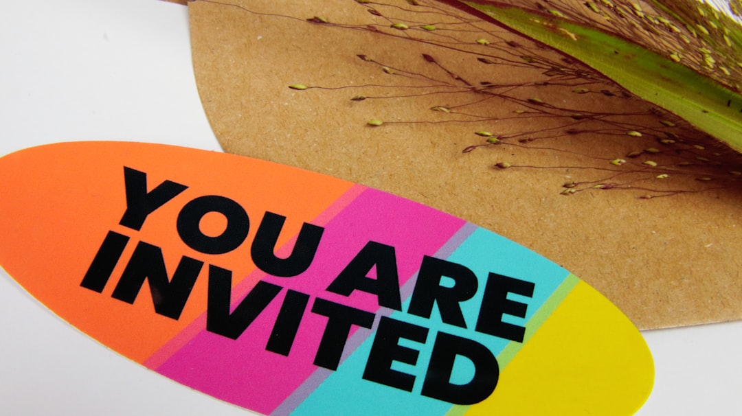
The visual style should mirror the formality and spirit of the occasion. A flowing script and gold foil promise an elegant wedding; bold sans-serif and bright color suit a child’s birthday. When the tone of the design clashes with the event — playful type for a memorial, or stiff formality for a casual party — guests feel a subtle dissonance. Decide the emotional register first, then let every choice of color, type, and imagery reinforce it.
3. Elegant type pairing — contrast with restraint
Most invitations use two typefaces: a distinctive display face for names and the headline moment, and a clean, legible face for dates, addresses, and fine print. The pairing should contrast enough to create hierarchy without clashing. A script paired with a simple serif is a timeless combination. Avoid setting full lines of an ornate script, which becomes hard to read; reserve decorative faces for short, high-impact phrases. Our typography glossary can help you talk through pairings with a printer or designer.
4. Generous margins — let the card breathe
Crowding text to the edges makes an invitation feel cheap and anxious. Generous margins frame the content, create a sense of occasion, and give the design poise. The empty space around your words is doing quiet work, signaling care and quality. Resist the urge to fill the card; deliberate white space is one of the clearest markers of refined invitation design.
5. A single focal motif — one anchor for the eye
Whether it is a monogram, a botanical illustration, a crest, or a simple ornamental rule, one focal motif gives the composition a center of gravity. Repeated across the suite, that motif becomes a visual signature. Avoid competing decorations that fight for attention; choose a single anchor and let it lead. The motif also bridges the practical and the emotional, carrying the event’s theme without saying a word.
6. Paper and finish — design you can feel
An invitation is a physical object, and its weight, texture, and finish communicate before the words do. Heavier cotton stock, a soft cotton texture, letterpress impression, or foil accents all signal formality and care. A flimsy sheet undercuts even the most elegant layout. Match the finish to the tone — matte and tactile for organic warmth, smooth and foiled for glamour — so the experience of holding the card reinforces the occasion.
7. Consistent theme across the suite — coordinated from save-the-date to RSVP
Formal events often involve a suite: a save-the-date, the main invitation, an RSVP card, and detail inserts. Carry the same palette, type pairing, motif, and finish through every piece so the set reads as one coordinated family. Consistency builds anticipation and signals professionalism. If you also produce a greeting card or thank-you note for the event, echo the same theme to extend the cohesive impression.
Common invitation design mistakes to avoid
- Burying the date, time, or RSVP details in small or low-contrast type.
- Choosing a tone that clashes with the event’s formality or spirit.
- Setting long passages in an ornate script that becomes hard to read.
- Crowding the card edge to edge with no margins or breathing room.
Frequently Asked Questions
What are the most important invitation design principles?
The most important principles are a clear information hierarchy, a tone matched to the event, an elegant type pairing, and generous margins. Together they ensure guests find the essential details instantly while the design sets the right emotional expectation for the occasion ahead.
What size should an invitation be?
Common invitation sizes include 5 x 7 inches for weddings and formal events and 4 x 6 inches for casual gatherings, both of which fit standard envelopes and mailing rates. Choose a size that suits your content and budget, and always confirm envelope and postage compatibility before printing.
How many fonts should an invitation use?
Two typefaces is the reliable standard: one display or script face for names and the headline moment, and one clean, legible face for dates, addresses, and fine print. A third can be added sparingly, but more than that usually clutters the design and weakens the hierarchy.
What information must an invitation include?
Every invitation needs the host or honoree, the event or occasion, the date and time, the venue and address, and clear RSVP instructions with a deadline. Optional details like dress code, registry, or directions belong on a separate insert card to keep the main invitation uncluttered.
How do I make an invitation feel formal?
Use a refined serif or script, generous margins, heavier paper stock, and finishing touches like foil or letterpress. Follow classic design principles of balance and restraint, keep the palette muted, and anchor the layout with a single elegant motif rather than busy decoration.


