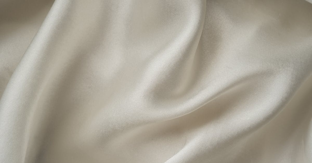
Ivory vs Cream vs Off-White: What’s the Difference?
At first glance, ivory, cream, and off-white can look nearly identical. All three are warm, muted variations of white, and the differences between them come down to subtle undertones that have a real impact on design outcomes. Ivory is a warm white with a slight yellow tint (hex ~#FFFFF0), cream carries a stronger yellow warmth (hex ~#FFFDD0), and off-white is a broad category covering any white that has been tinted with another color. Understanding the ivory vs cream vs off-white distinction helps designers make precise choices in branding, web design, weddings, and print materials.
This guide walks through each shade, explains how they compare, and offers practical advice for using them in your graphic design projects.
Ivory: The Warm White
Ivory takes its name from the natural material — the tusks and teeth of animals — which has a characteristic warm, slightly yellowish-white appearance. In design, ivory is defined by a very faint yellow undertone that softens the starkness of pure white without making the color feel overtly warm or tinted. The standard hex code for ivory is #FFFFF0, which is nearly white with just a whisper of yellow in the green and blue channels.
Ivory in Design and Culture
Ivory has strong associations with elegance, tradition, and understated luxury. It is one of the most popular color choices for wedding stationery, formal invitations, and high-end packaging. In web design, ivory backgrounds create a gentler reading experience than pure white (#FFFFFF), reducing eye strain while maintaining a clean, minimal aesthetic.
When building a neutral color palette, ivory serves as an excellent base that pairs with virtually any accent color. It works especially well with warm metallics like gold, rich earth tones, and muted pastels.
Cream: The Yellow-White
Cream is warmer and more obviously tinted than ivory. Named after the color of dairy cream, it carries a clear yellow undertone that gives it a cozy, inviting quality. The standard hex code for cream is #FFFDD0, which shows noticeably more yellow than ivory’s #FFFFF0. Where ivory whispers warmth, cream states it plainly.
Cream in Design and Culture
Cream evokes comfort, nostalgia, and approachability. It is a staple in rustic design, farmhouse aesthetics, and vintage-inspired branding. In earth tone palettes, cream acts as a light anchor that grounds darker browns, greens, and terracottas.
For web and app design, cream backgrounds add warmth that pure white or ivory cannot match. Brands in the food, lifestyle, and home goods sectors frequently use cream as a primary background color to create an inviting, organic feel. However, cream can read as slightly aged or yellowed in contexts where crispness is expected, so it is best suited to designs that intentionally embrace warmth.
Off-White: The Broad Category
Off-white is not a single color but a category that includes any white with a visible tint. Ivory and cream are both technically off-whites, but the term also covers whites tinted with pink, gray, blue, or green. Common off-white shades include linen (#FAF0E6), snow (#FFFAFA), floral white (#FFFAF0), and ghost white (#F8F8FF).
Off-White in Design and Culture
Because off-white is such a broad category, its associations depend entirely on the specific tint. Cool off-whites with blue or gray undertones feel modern, clinical, and sleek. Warm off-whites with yellow or pink undertones feel organic, classic, and soft. The key advantage of off-white over pure white in design is that it introduces subtle personality without sacrificing the clean, spacious feel that white provides.
In interior design, fashion, and graphic design alike, choosing the right off-white is a foundational decision. A cool off-white background paired with warm accents creates a different mood than a warm off-white paired with the same accents. Designers working with color harmony principles should pay close attention to these undertones.
Key Differences
Here is a clear comparison of all three shades across the most important attributes:
- Undertone: Ivory has a faint yellow tint; cream has a strong yellow tint; off-white varies widely.
- Warmth: Ivory is subtly warm; cream is noticeably warm; off-white can be warm or cool depending on tint.
- Hex codes: Ivory is #FFFFF0; cream is #FFFDD0; off-white has no single hex (it is a category).
- Brightness: Ivory is closest to pure white; cream is slightly darker and more saturated; off-white ranges broadly.
- Mood: Ivory feels elegant and refined; cream feels cozy and organic; off-white depends on its specific tint.
Hex Codes and Design Use
In digital design, the differences between ivory and cream are measurable. Ivory (#FFFFF0) has an RGB value of (255, 255, 240), where only the blue channel drops by 15 points from pure white. Cream (#FFFDD0) has an RGB value of (255, 253, 208), with a significantly more pronounced yellow cast. In the CMYK model for print, cream requires noticeable amounts of yellow ink, while ivory is nearly indistinguishable from white stock paper.
For web backgrounds, ivory is the safer choice when you want just a touch of warmth without altering the perceived color of other page elements. Cream works better for sections, cards, or containers where you want to create visual separation and signal warmth deliberately.
Off-white selections for digital use should be tested against the full palette. A cool off-white like ghost white (#F8F8FF) pairs well with blue and gray accent colors, while a warm off-white like floral white (#FFFAF0) complements browns, oranges, and reds.
When to Use Each
Choosing between ivory, cream, and off-white comes down to the mood and context of your project:
- Wedding and formal design: Ivory is the traditional choice for invitations, programs, and formal branding. It reads as refined without being cold.
- Rustic and lifestyle branding: Cream adds the warmth and earthiness that these aesthetics demand. Pair it with rich textures and earth tones for a cohesive result.
- Modern and minimal web design: A cool off-white provides the breathing room of white with a softer, more sophisticated edge. Test several off-white options to find the right match for your accent palette.
- Luxury branding: Ivory paired with gold or dark neutrals communicates prestige without relying on stark contrast. It is a staple in the neutral palettes of high-end fashion and beauty brands.
Frequently Asked Questions
Is ivory warmer than cream?
No. Cream is warmer than ivory. Ivory has a very faint yellow undertone, while cream has a much more pronounced yellow cast. If you want minimal warmth, choose ivory; for obvious warmth, choose cream.
What is the best off-white for web backgrounds?
It depends on your palette. For warm designs, try floral white (#FFFAF0) or ivory (#FFFFF0). For cool, modern designs, ghost white (#F8F8FF) or white smoke (#F5F5F5) work well. Always test your choice against text and accent colors for readability.
Can I mix ivory and cream in the same design?
Yes, but use caution. Because both are warm whites, the difference can look like an inconsistency rather than an intentional choice unless you create clear visual separation between the two. Using one as a background and the other within a card or container is one effective approach.
Are ivory and cream the same in fashion and graphic design?
The color names refer to the same general hues across industries, but exact shades vary. In fashion, fabric texture and lighting heavily influence how ivory and cream are perceived. In graphic design, hex codes provide a precise, repeatable standard that eliminates ambiguity.


