What Font Does Johnny Cash Use?
If you have ever stared at a vintage concert poster and wondered exactly what the johnny cash font is, the honest answer is that there is no single one. Across five decades of records, the Man in Black’s name appeared in a rotating cast of heavy, masculine letterforms – most of them custom-drawn by label art departments. What unifies them is a feeling: thick strokes, square corners, and the authority of a man who walked the line. For more icons handled this way, see our famous brand fonts hub.
What font does Johnny Cash use for branding/albums?
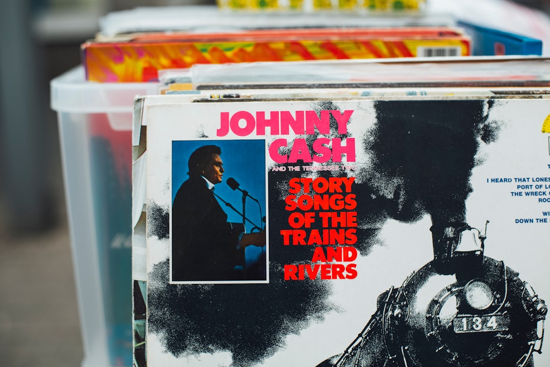
The most recognized Cash branding – the bold block “JOHNNY CASH” used on reissues, box sets, and merch – is a heavy slab serif rendered in solid capitals. Slab serifs (also called Egyptian or Clarendon-style faces) carry thick, rectangular feet that read as rugged and industrial, perfect for a working-man persona. Earlier Sun and Columbia covers leaned on hand-painted Western and condensed gothic styles, while the iconic At Folsom Prison era favored stark, utilitarian type. The constant is weight: Cash’s name is always set bold enough to punch through a dim stage light.
It helps to think in terms of two families. The first is the Clarendon-style slab serif – rounded bracketed feet, even stroke weight, and a sturdy, almost civic confidence that suited official-looking reissue packaging. The second is the wood-type Western tradition, where letters were carved for nineteenth-century broadsides and railroad bills; those forms are taller, narrower, and rougher around the edges. Cash’s catalog borrows from both depending on the decade, which is exactly why no single download will ever match every cover. Recognizing which family a particular sleeve belongs to is the fastest way to pick the right free substitute for your own recreation.
Is there a free Johnny Cash font?
There is no official “Johnny Cash” typeface for download, but the look is easy to recreate. Fan-made novelty fonts occasionally surface on free sites, though they are tracings of the logo and unreliable for licensing. A far better route is a genuine open-source slab serif. Zilla Slab (free, Google Fonts) in its heaviest weight nails the blocky, dependable character of the Cash wordmark. For poster-grade drama, a free Western display delivers the rodeo-and-railroad mood without copying anyone’s trademark.
Free fonts that look like the Johnny Cash font
Match the job to the face. A clean slab handles wordmarks and merch; a textured Western display sells the vintage poster. Here is a quick mapping.
| Use case | Johnny Cash uses | Free alternative |
|---|---|---|
| Logo / wordmark | Heavy all-caps slab serif | Zilla Slab Bold |
| Album covers | Hand-painted Western / condensed display | Rye or Carnevalee Freakshow |
| Merch / body | Solid block capitals | Oswald Bold or Roboto Slab |
Why does Johnny Cash use this kind of type?
Heavy slab and Western type is visual shorthand for grit, labor, and the American frontier – exactly the territory Cash sang about. The thick strokes survive cheap printing, distressed textures, and low light, which mattered for prison concerts and roadhouse posters alike. There is also restraint: no swashes, no flourish, no apology. The lettering mirrors the music, plain and unbreakable. If you love that aesthetic, our roundup of the best vintage fonts covers more of the same era.
Can I use the Johnny Cash font for my own project?
You can absolutely use a slab-serif or Western font to evoke the same vibe – those styles are not protected. What you cannot do is reproduce the exact “Johnny Cash” wordmark, his signature, or any estate-owned logo on merchandise without permission, because those are trademarks and likeness rights. For personal mockups you have wide latitude; for anything commercial, read our font licensing guide first and keep your lettering original.
Frequently Asked Questions
Is the Johnny Cash logo a real font?
No. The familiar block “JOHNNY CASH” wordmark is custom lettering created by record-label artists, not a font you can buy off the shelf. Different releases used different hand-drawn or set styles. To get close, designers reach for a heavy slab serif like Zilla Slab Bold rather than hunting for an official file that does not exist.
What free font looks most like Johnny Cash’s name?
For the bold block wordmark, Zilla Slab in its heaviest weight is the best free match – it shares the square serifs and dense color of the original. If you want the dusty concert-poster feel instead, a free Western display such as Rye captures the frontier texture far better than a clean slab does.
What style is the Man in Black aesthetic?
It blends heavy slab serifs, condensed gothics, and hand-painted Western lettering, almost always in solid capitals. The mood is rugged, industrial, and unadorned – type that looks like it was stamped onto a railroad car. High weight and minimal decoration are the two traits to keep if you are recreating the look.
Can I sell shirts using a Johnny Cash-style font?
You can sell shirts that use a generic slab or Western font, since type styles are not trademarked. You cannot legally sell merch that copies the official Johnny Cash wordmark, signature, or image without a license from his estate. Keep the typeface as a stylistic nod and write your own text to stay safe.
Which font pairs well with a Cash-style slab?
Pair a heavy slab headline with a quiet workhorse for body text – a humanist sans like Open Sans or a slim slab like Roboto Slab keeps things legible without competing. The headline carries the personality; the body stays out of the way. That contrast mirrors how vintage country sleeves balanced big names against small print.