What Font Does Justice League Use?
If you searched for the Justice League font, you are probably after that imposing, monument-like title, the one built to carry an entire roster of heroes on a single line. The honest answer is that the wordmark is bespoke artwork rather than a font you can install. This guide explains what the logo really is, what the films use, and which free fonts get you closest to that monumental weight.
What font is the Justice League logo?
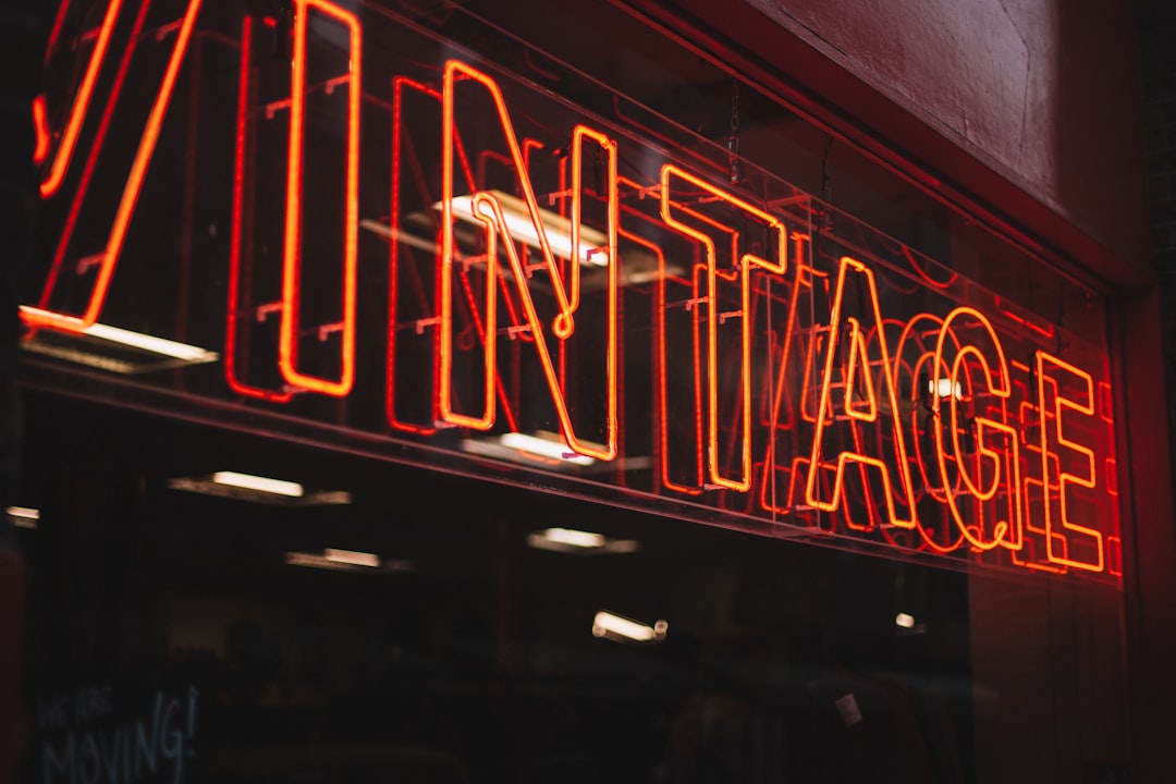
The Justice League logo is custom lettering, not a font from a library. The wordmark is bold and monumental, often condensed so a long, two-word title still reads with maximum impact, and finished with a metallic or stone-like surface. The look has to feel epic and unifying, because it represents a team rather than a single character. Designers tune each letter so the title feels like an institution, a league, carved in steel.
Because it is artwork, you cannot type the logo from a keyboard. Fan sites sometimes name a single typeface as the Justice League font, but those claims should be treated as an informed observation, not a confirmed spec from the studio. A more accurate description is a custom heavy condensed grotesque display logotype with a monumental metallic finish, which is a style you can approximate but not directly copy.
What typeface is used in the films?
Across the Justice League films, the on-screen title is a custom display logotype rather than a licensed retail font. The treatment favors strong, condensed capitals with heavy weight, tight spacing, and a forged metallic or stone surface. The compression is practical: two long words need to fit one commanding line, and condensing the letters keeps the title both large and legible. The result reads as monumental and authoritative.
As with most tentpole films, the headline is the artwork while the supporting copy, taglines and credit blocks, typically uses ordinary commercial fonts. The studio commissions the title lettering so it is unique, legally protectable, and readable from a billboard to a phone screen. So when you recreate the Justice League look, you are matching a heavy, condensed, monumental style, not downloading the actual logo.
Free fonts that look like the Justice League font
You cannot legally download the real logo, but several free faces capture its bold, condensed, monumental character. You want heavy weight, narrow proportions, and a clean grotesque structure that takes a steel or stone gradient well. Strong free options include:
- Oswald — a tall, versatile condensed sans you can pack tightly for a commanding headline.
- Bebas Neue — an all-caps condensed display with strong, monumental presence.
- Anton — extremely heavy and slightly condensed; great for maximum impact.
- Archivo Narrow — a clean narrow grotesque that holds up under a metallic treatment.
| Use case | Justice League uses | Free alternative |
|---|---|---|
| Main monumental title | Custom condensed logotype | Bebas Neue or Oswald |
| Maximum-impact headline | Custom drawn lettering | Anton |
| Clean condensed subhead | Hand-tuned forged art | Archivo Narrow |
| Steel surface treatment | Custom metallic finish | Add a gradient to any of the above |
Set Bebas Neue or a tightly tracked Oswald in all caps, add a steel gradient and a subtle bevel, and you land close to the title’s monumental mood without touching the trademarked artwork. For more film and brand wordmarks built this way, see our roundup of famous brand fonts.
Why does Justice League use this kind of type?
The bold, condensed, monumental style does direct work for an ensemble brand. Heavy weight and a forged finish signal collective power, this is not one hero but many, and the typography needs to feel as immovable as the team itself. Condensing the letters lets a long, two-word title stay large and commanding on one line, which matters for posters and merchandise where space is tight.
There is a business reason too. A custom wordmark is legally protectable and uniquely ownable, which a stock font is not. By commissioning bespoke lettering, the studio gains a defensible brand asset that ties the whole DC ensemble together across films and products. That is why Justice League, like its individual-hero siblings, invests in hand-drawn type rather than typing a title in an off-the-shelf condensed face. Drawing the title by hand also lets designers solve the spacing puzzle a long two-word name creates, balancing the optical weight of “Justice” against “League” so neither half dominates and the whole mark feels like one unified block. A stock condensed font set straight rarely achieves that balance without manual kerning and reshaping. The reward is a logo that looks engineered to last, the typographic equivalent of a team built to stand together.
Can I use the Justice League font for my own project?
For private, non-commercial fun, a fan poster or a movie-night invite you never sell, recreating the look with a free condensed face like Bebas Neue is low risk. Once your project becomes commercial, branded, or widely distributed, the situation changes. The Justice League name and stylized wordmark are trademarks, and trademark protects brand identity regardless of which font you used. A look-alike that implies an official tie-in can draw legal attention.
The safe path is to treat the Justice League style as inspiration. Choose a freely licensed font, confirm its license covers your use, and avoid reproducing the exact wordmark or suggesting endorsement. Read our font licensing guide before any commercial release. If you like these heroic DC titles, our Aquaman font and Wonder Woman font guides cover related logos.
Frequently Asked Questions
Is there an official Justice League font to download?
No. The studio has never released the title lettering as a retail font; it is custom artwork. Anything labeled “official Justice League font” online is a fan recreation or look-alike. Confirm its license before using it, and avoid implying an official connection to the films or brand.
What free font looks most like Justice League?
For the bold, condensed, monumental feel, Bebas Neue and Oswald are the strongest free matches, especially set in all caps with a steel gradient. Anton gives maximum heavy impact, while Archivo Narrow offers a cleaner condensed alternative for subheads.
Can I use a Justice League look-alike font commercially?
You can use a freely licensed look-alike commercially if its license allows it, but you cannot reproduce the Justice League name or wordmark in a way that implies official endorsement. Those are trademarks. Keep your design distinctly your own and avoid any suggested studio connection.
Why is the Justice League logo so condensed?
Condensing the letters lets a long, two-word title stay large and legible on a single commanding line, which matters for posters and merchandise. The narrow, heavy proportions also read as monumental and authoritative, fitting an ensemble of heroes, which is why condensed faces like Bebas Neue approximate it well.


