What Font Does Kimera Use?
If you are searching for the kimera font, you want the clean wordmark from Kimera Kolors, the miniature paint range known for its pure, single-pigment colours that painters mix to build a custom palette. The honest answer is that the logo is custom, modern lettering, not a single released typeface you can install. The letters are smooth, even, and contemporary, signalling a range built for painters who want true, mixable pigments rather than pre-blended hues. Below we break down what the lettering actually is, why a clean style fits the brand, and which free fonts get you closest legally, without copying the trademark.
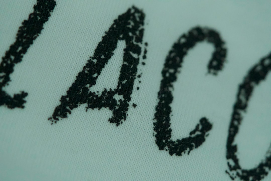
What font is the Kimera logo?
The Kimera logo is best understood as a custom, clean lettering treatment rather than a font you can grab off a shelf. The letters are smooth, even, and confident, drawn with the steady precision of a brand that wants to look modern and dependable on a paint bottle. That clean, contemporary character is the whole point: the wordmark reads as professional and approachable rather than fussy, the kind of mark a painter recognises instantly across a shelf of pure-pigment colours.
Because Kimera Kolors has shaped its identity deliberately, treat the precise construction as an informed observation, not a confirmed spec. What we can say confidently is that it is not a famous commercial font dropped in unedited — the weight, spacing, and proportions were tuned for clarity at small sizes. The look is reminiscent of clean, modern geometric and grotesque sans faces rather than any one downloadable file. If it were a stock typeface, painters and designers would have named it years ago, so the safest description is custom clean lettering built specifically for the brand.
What typeface does Kimera use in its branding?
Across paint bottles, pigment sets, mixing guides, and the website, Kimera pairs its clean wordmark with legible, modern sans faces for colour names, pigment codes, and instructions. The logo gets the smooth, contemporary treatment; functional text such as pigment names, set contents, and mixing notes stays in a quieter sans so everything reads on a small label or a screen. This split between a characterful wordmark and neutral supporting type is standard across modern miniature-paint branding.
So if you want to mirror the whole identity, make two decisions: one clean display face for the logo-style headline, and one calm, well-spaced sans for the paragraphs and labels. Setting your colour-name labels in a heavy display weight is the most common mistake when chasing this clean, modern aesthetic, because it works against the smooth, precise feel the brand is known for.
Free fonts that look like the Kimera font
No free font will be an exact match, but several capture the clean, modern spirit well enough for a poster, a mockup, or a fan project. Bold names below are free alternatives you can search for and license accordingly.
| Use case | Kimera uses | Free alternative |
|---|---|---|
| Main wordmark / headline | Custom clean modern display | Poppins or Montserrat |
| Subheads / labels | Smooth modern sans | Archivo or Work Sans |
| Body / instructions | Clean legible sans | Roboto or Inter |
Poppins is a strong starting point for the wordmark because its geometric, even character shares the logo’s smooth, modern feel; scale it and tune the spacing to match. Montserrat gives a slightly more structured tone if you want a sturdier read, and Archivo works well for subheads and labels with clean, contemporary letterforms. For readable supporting copy, Roboto stays neutral and clear. The weight and spacing matter as much as the font itself, and no free font will recreate the exact brand mark for you. For a related paint-brand breakdown, see our Pro Acryl font guide.
Why does Kimera use this kind of type?
The clean lettering is doing real branding work. Kimera Kolors is positioned around pure, mixable pigments trusted by serious painters, so its mark needs to feel clean, modern, and precise rather than ornate or heavy. Smooth, even letterforms read as approachable and reliable, exactly the tone you want on a paint a colour-mixing painter reaches for again and again. A fussy or overly decorative face would feel wrong here, undercutting the pure, technical promise the range is known for.
The choice also helps the brand stand out on a crowded paint shelf. A clean, confident wordmark reads as a modern specialist rather than a passing novelty, reassuring painters investing in a pure-pigment system. That calm clarity is hard to achieve with a careless stock font, because a generic sans can read as ordinary rather than purposeful. A bespoke treatment lets the designers pitch the mood precisely. For more logo breakdowns, browse our famous brand fonts hub.
Can I use the Kimera font for my own project?
You can recreate the style, but you cannot use the actual logo. The Kimera and Kimera Kolors names, wordmark, and brand design are trademarked branding owned by the company, so copying them for merchandise, a business, or anything implying affiliation is off-limits. Using a free clean look-alike for a personal, fan, or unrelated creative project is fine as long as you respect each font’s individual license. Our font licensing guide explains personal-versus-commercial use, and for another miniature-paint mark, see our Scale75 font guide.
Frequently Asked Questions
Is the Kimera font free to download?
No. The Kimera logo is custom clean lettering, not a released font, so there is no official file to download. Any “Kimera font” you find is a fan recreation or look-alike. For the style, use free fonts like Poppins or Montserrat, keep them smooth and even, and check each license before commercial use.
What font is most similar to the Kimera logo?
Poppins and Montserrat are among the closest free matches for the clean, modern letterforms, with Archivo a smooth choice for labels. None is identical, since the logo is custom-styled and relies on its weight and spacing, but with the right tracking they get convincingly close for mockups and fan projects.
What is Kimera Kolors known for?
Kimera Kolors is a miniature paint range built around pure, single-pigment colours that painters mix to create their own custom shades. This article covers the brand’s custom clean wordmark, not any unrelated company or mythological creature that may share the spelling of the word “chimera.”
Can I use a Kimera-style font commercially?
You can use a free look-alike font commercially if its license permits, but you cannot reproduce the trademarked Kimera wordmark or logo on products you sell. Set your own text in a free clean sans instead of copying the official mark, and verify both the font license and trademark rules first.