What Font Does Lamborghini Use?
If you have ever tried to match the badge on a Huracán or Revuelto, you already know the answer is frustrating: the lamborghini font is bespoke trademarked lettering rather than a typeface anyone sells. That is true of most supercar marques, and Lamborghini’s identity is one of the most aggressively styled in the category. Below we break down the wordmark, the reported brand typeface, and the free fonts that get you closest. For more teardowns like this, see our famous brand fonts hub.
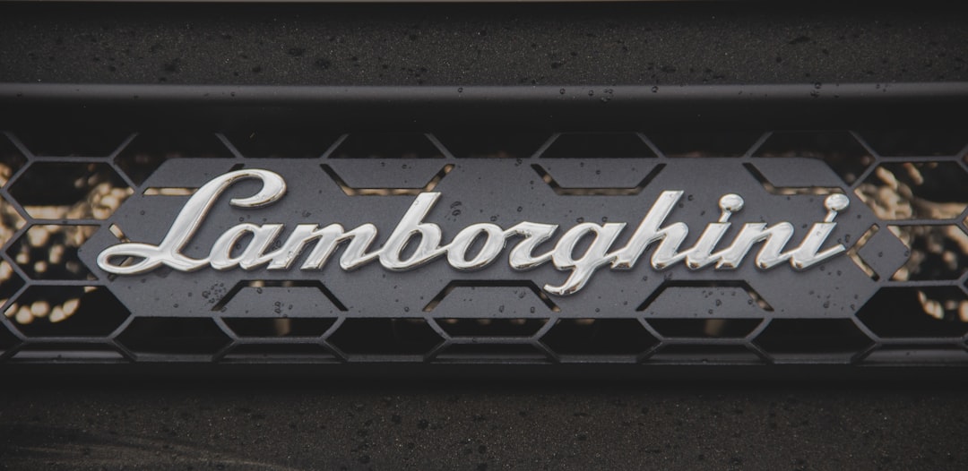
What font is the Lamborghini logo?
The Lamborghini logo pairs a gold raging-bull shield with the marque name set in tall, narrow, all-capital letters. The lettering appears to be custom-drawn: stems are dead straight, terminals are cut on sharp angles, and the overall proportions are slightly condensed so the long name fits cleanly under the crest. There are no rounded humanist curves here. Even the “G” and “O” carry a faceted, almost knife-edged quality that signals precision engineering and aggression. Because it is a registered trademark drawn for the brand, you will not find an exact match in any font library, and any “Lamborghini font” download you see online is a fan recreation, not the official artwork.
What is Lamborghini’s brand typeface?
Beyond the badge, Lamborghini’s marketing materials are reported to lean on clean, modern sans-serif typography that keeps the focus on the cars rather than the type. The brand typeface across configurators, brochures and signage appears to be a contemporary grotesque or geometric sans chosen for its neutral, high-tech feel. Lamborghini has not published its corporate font specification publicly, so treat any specific name as unconfirmed. What is consistent is the styling intent: tight letterspacing in headlines, plenty of uppercase, and a restrained, almost technical body face. The closest match in spirit is a crisp geometric sans rather than anything ornate.
Free fonts that look like the Lamborghini font
You cannot license the actual wordmark, but you can recreate the angular, fast-looking feel with free type. Here is how the pieces map, paired by use case so you can build a complete system rather than just a logo.
| Use case | Lamborghini uses | Free alternative |
|---|---|---|
| Logo / wordmark | Custom angular all-caps lettering | Oswald or Saira (bold, condensed, tight tracking) |
| Headlines | Reported modern geometric/grotesque sans | Rajdhani or Saira Condensed |
| Body / UI | Neutral technical sans | Work Sans or Inter |
Why does Lamborghini use this kind of type?
Everything about Lamborghini’s design language is built to telegraph speed, power and Italian aggression before you read a single word. Sharp angular letterforms echo the brand’s famously sharp-creased bodywork and scissor doors; the geometry feels machined rather than handwritten. All-caps lettering reads as confident and loud, which suits a brand that sells theatre as much as performance. A condensed proportion also lets a long name sit assertively under the crest without crowding. The result is typography that behaves like the cars: precise, hard-edged and impossible to ignore.
Can I use the Lamborghini font for my own project?
No. The wordmark and bull shield are protected trademarks, and copying them, or using a clone font to imply a Lamborghini association, can create legal exposure even if the font file is “free.” Fan recreations of the lettering are also usually unlicensed for commercial use. The safe path is to capture the style, an angular, condensed, all-caps sans, using properly licensed fonts like Oswald, Saira or Rajdhani, then make the design your own. For a plain-language walk-through of what is and is not allowed, read our font licensing guide, and browse our best sans-serif fonts roundup for options.
Frequently Asked Questions
Is the Lamborghini font available to download?
No. The logo lettering is custom, trademarked artwork created for the brand, not a commercial typeface. Any file labelled “Lamborghini font” online is a fan-made recreation. To get the look legally, use a bold condensed sans such as Oswald or Saira and set it in all caps with tight letterspacing.
What font is closest to the Lamborghini logo?
For free options, Oswald and Saira come closest because they share the tall, narrow, all-caps proportions and clean geometry of the wordmark. Rajdhani is another strong match for the angular, technical feel. None are exact, since the original is hand-tuned, but they reproduce the aggressive, fast character convincingly.
Is the Lamborghini wordmark all caps?
Yes. The marque name is always rendered in capital letters beneath the bull shield. The uppercase treatment, combined with the condensed width, is a big part of why the logo reads as bold and confident. If you are recreating the style, keep everything uppercase and avoid mixing in lowercase letters.
Does Lamborghini use the same font as other supercar brands?
Not exactly, though most supercar makers share a strategy: custom all-caps wordmarks paired with clean modern sans typography. Lamborghini’s lettering is distinctively angular and faceted, which sets it apart from rounder marks. The shared trait across the category is bespoke, trademarked logos rather than off-the-shelf fonts.
What free font should I pair with an Oswald headline for a Lamborghini look?
Pair a bold Oswald or Saira headline with a neutral body face like Inter or Work Sans. This mirrors Lamborghini’s reported system, an assertive condensed display type up top and a quiet, technical sans for running text, so your layout feels engineered rather than decorative.


