Lilac vs Lavender: What’s the Difference?
At first glance, lilac and lavender look like the same color — both are soft, light purples that evoke springtime, elegance, and calm. But look more carefully, and you will see a clear difference. Lilac is a warmer purple with noticeable pink undertones, while lavender is a cooler purple that leans toward blue. Understanding the lilac vs lavender distinction helps designers make precise color choices that set the right mood and create polished, intentional palettes.
Both colors take their names from flowers, and both sit in the lighter range of the purple color palette. But their different undertones give them distinct personalities in design, fashion, interior decorating, and branding. Knowing when to reach for lilac versus lavender — and how each interacts with surrounding colors — is a valuable skill for any designer.
Lilac: The Warmer Purple
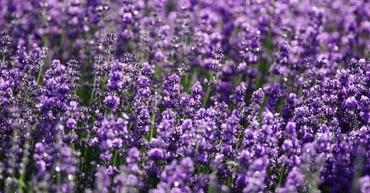
Lilac gets its name from the lilac shrub (Syringa vulgaris), which produces clusters of fragrant flowers in shades ranging from pale pink-purple to deep violet. The color lilac sits on the warmer side of the purple spectrum, with a strong pink component that gives it a rosy, romantic quality.
The most commonly referenced hex code for lilac is #C8A2C8. In RGB terms, that breaks down to R:200, G:162, B:200 — notice how the red and blue values are equal, with green lower, producing a balanced purple with warm pink presence. In some references, lilac runs slightly darker and more saturated than lavender.
In color psychology, lilac carries associations with romance, nostalgia, and youthful femininity. It feels more personal and intimate than lavender. This makes it a popular choice for wedding designs, beauty branding, spring-themed campaigns, and products targeting a feminine aesthetic.
Lilac in Design
Lilac works beautifully in designs that need warmth without intensity. It pairs naturally with other warm tones — soft pinks, warm creams, muted golds, and dusty roses. It also creates lovely contrast when placed against deep plums or charcoal grays. In fashion, lilac has experienced periodic surges in popularity, most recently as a trending color in streetwear and haute couture alike.
For interior design, lilac brings coziness and personality to spaces. It reads as more characterful than lavender — less neutral, more statement-making, while still remaining gentle and approachable.
Lavender: The Cooler Purple
Lavender takes its name from the lavender plant (Lavandula), famous for its soothing fragrance and slender purple-blue flower spikes. The color lavender is lighter and cooler than lilac, with a distinct blue undertone that gives it an airy, serene quality.
The standard web color for lavender is #E6E6FA, which translates to R:230, G:230, B:250. The higher blue value is what pushes lavender toward the cool side of the spectrum, and the overall high values across all channels make it a very pale, almost pastel shade. Lavender is lighter than lilac — closer to white with a purple tint.
Lavender’s psychological associations lean toward tranquility, cleanliness, and sophistication. It feels calm and open, which is why it appears so frequently in spa branding, wellness products, luxury packaging, and spaces designed for relaxation. As part of the broader pastel color palette, lavender carries a delicate, refined sensibility.
Lavender in Design
Lavender’s cool, neutral-leaning character makes it incredibly versatile. It pairs well with other cool tones — soft blues, silvery grays, cool whites, and sage greens. It also creates elegant contrast with navy, deep indigo, and black. Because it is so light and unsaturated, lavender often functions almost as a neutral, providing a gentle purple tint without overwhelming a composition.
In web and UI design, lavender is a popular background and accent color because it offers visual interest without competing with content. It reads as calm and trustworthy, making it effective for health, wellness, technology, and financial brands.
Key Differences
The difference between lilac and lavender comes down to undertone, saturation, and lightness:
- Undertone: Lilac has pink/warm undertones. Lavender has blue/cool undertones.
- Lightness: Lavender is generally lighter and closer to white. Lilac is slightly deeper and more saturated.
- Mood: Lilac feels romantic and warm. Lavender feels serene and cool.
- Warmth: Lilac sits on the warm side of the purple spectrum. Lavender sits on the cool side.
- Versatility: Lavender acts more like a neutral and blends into a wider range of palettes. Lilac makes a stronger color statement.
Both colors exist in the broader purple family, but thinking of them as interchangeable will lead to palettes that feel slightly off. Swapping lavender for lilac in a cool, minimalist design would introduce unexpected warmth, while replacing lilac with lavender in a romantic, feminine design would make it feel too detached.
Hex Codes and Design Use
Here are some commonly used hex values for lilac and lavender, along with related shades:
- Lilac: #C8A2C8
- Light Lilac: #DCD0FF
- Rich Lilac: #B666D2
- Lavender (web): #E6E6FA
- Lavender Blue: #CCCCFF
- Lavender Gray: #C4C3D0
When building design systems, specifying the exact hex code eliminates any ambiguity between lilac and lavender. Since these names are interpreted differently across cultures, industries, and even individuals, a hex value provides an objective reference point that ensures consistency across brand identity materials.
Pairing with Other Colors
Because lilac and lavender have different undertones, they pair best with different companion colors.
Best Pairings for Lilac
- Dusty rose and blush pink — Creates a cohesive warm-toned feminine palette
- Gold and warm cream — Adds elegance and luxury
- Sage green — Balances the pink warmth with an earthy complement
- Charcoal gray — Grounds the softness of lilac with depth
- Deep plum or eggplant — Builds a rich monochromatic purple range
Best Pairings for Lavender
- Soft blue and periwinkle — Extends the cool, airy quality into an analogous color scheme
- Silver and cool gray — Creates a sleek, modern, sophisticated palette
- Mint green — A fresh, springlike combination that stays cool-toned
- Navy or deep indigo — Dramatic contrast while staying in the cool family
- White and off-white — Maximizes the clean, calming quality of lavender
For more guidance on building palettes from purple shades, explore our purple color palette guide. Understanding color harmony principles helps you place these soft purples in balanced, professional compositions.
Frequently Asked Questions
Is lilac darker than lavender?
Generally, yes. Standard lilac (#C8A2C8) is slightly deeper and more saturated than standard lavender (#E6E6FA). Lavender is a very pale purple that sits close to white, while lilac has more color presence. However, both names cover a range of shades, so some lighter lilacs and darker lavenders may overlap.
Can lilac and lavender be used together in a design?
Yes, but with care. Because they have different undertones — lilac is warm, lavender is cool — placing them side by side can create a subtle visual tension. This can work well if intentional, creating depth and dimension in a purple palette. To make them harmonize, include transitional shades that bridge the warm-cool gap, or use one as a dominant color and the other as a small accent.
Which is better for branding — lilac or lavender?
It depends on the brand personality. Lilac works better for brands that want to convey warmth, romance, and approachability — think beauty, fashion, and lifestyle brands. Lavender suits brands aiming for calm, trust, and sophistication — wellness, technology, and premium services. Neither is universally “better”; the right choice aligns with the brand’s values and target audience.
Are lilac and lavender considered pastel colors?
Both are commonly grouped with pastels, since they are light, low-saturation shades. Lavender is more clearly a pastel due to its very high lightness and low saturation. Lilac can range from pastel to mid-tone depending on the specific shade. In pastel color palettes, both appear frequently alongside soft pinks, baby blues, and mint greens.


