Lime vs Green: What’s the Difference?
The lime vs green question comes down to how much yellow is in the mix and how bright the color is. Green is the balanced, true green of grass and leaves. Lime shifts that green toward yellow and cranks the brightness, producing a vivid, zesty, almost electric color named after the citrus fruit. That yellow lean and high energy is the whole difference.
What color is green?
Green is one of the most fundamental colors in the spectrum, sitting between blue and yellow. In paint theory it is a secondary color made from blue and yellow; on screens it is a primary in the RGB model. A representative “true green” hex is #008000, where green is at half intensity and red and blue are zero, producing a deep, balanced color. Green carries strong associations of nature, growth, calm, and renewal, and it spans an enormous range from forest to emerald to grass.
Because green sits at the center of its family, it can lean cool toward blue-green or warm toward yellow-green. Pure, balanced green like #008000 reads as natural and grounded rather than electric. For the full spectrum, browse our guide to shades of green.
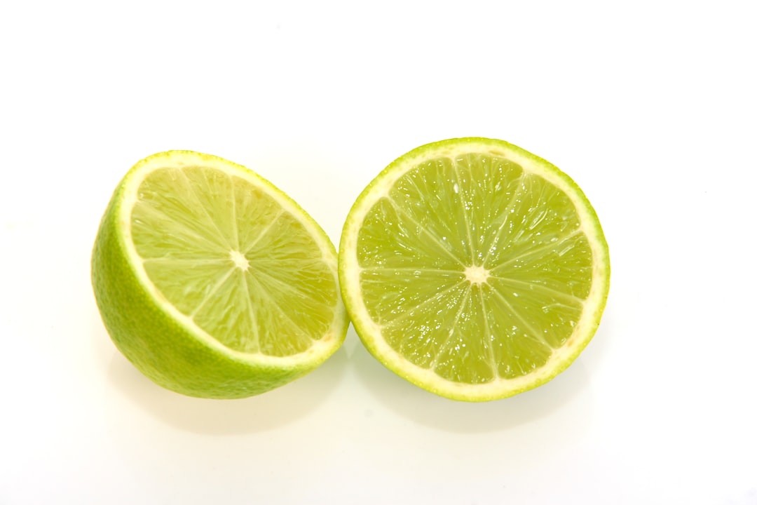
What color is lime?
Lime is a bright, yellow-leaning green named after the citrus fruit. It comes in two common forms: an electric, almost neon version near #BFFF00, where green and red are both very high and the color glows yellow-green, and a more saturated “lime green” near #32CD32, which is greener but still vivid and zesty. In both cases, the defining trait is a strong push toward yellow plus high brightness, which is what makes lime feel energetic and loud.
Because lime borrows so much yellow, it reads as fresh, acidic, and high-energy rather than calm. It is essentially green with the brightness and yellow turned up, sitting close to chartreuse on the warm side of the green family.
Lime vs green: side-by-side comparison
Exact values vary across brands and screens, but these representative specs show the yellow-lean, high-brightness split clearly.
| Attribute | Lime | Green |
|---|---|---|
| Hex code | #32CD32 (or #BFFF00) | #008000 |
| RGB | 50, 205, 50 | 0, 128, 0 |
| CMYK (approx) | 76, 0, 76, 20 | 100, 0, 100, 50 |
| Undertone | Warm, yellow lean | Balanced to slightly cool |
| Hue family | Yellow-green (bright) | True green (core) |
| Best used for | Energy, sport, tech, alerts | Nature, finance, calm, growth |
| Mood / feel | Zesty, electric, loud, fresh | Natural, grounded, balanced, calm |
How can you tell lime and green apart?
The reliable test is to look for yellow and brightness. Hold the swatches together: lime glows with a yellow-green zest and feels electric, while true green sits deeper and more balanced, reading as natural rather than loud. If the color makes you think of citrus, highlighter ink, or neon sportswear, it is lime. If it makes you think of grass, leaves, or a forest, it is green. A second cue is saturation at high brightness: lime is both bright and intense, which is an attention-grabbing combination.
The numbers confirm it. True green at 0, 128, 0 has zero red and blue and only moderate green, producing a deep, grounded color. Lime at 50, 205, 50 lifts green far higher and adds red, which introduces yellow and brightness; the neon form #BFFF00 pushes red even higher than blue, making the yellow lean unmistakable. Whenever a green’s red value climbs and its overall brightness spikes, you are moving from green toward lime.
Where do lime and green sit on the color wheel?
On the color wheel, green sits squarely between blue and yellow as a core hue. Lime sits on the warm side of green, in the yellow-green region between green and yellow, and then lifts sharply in brightness. So lime is not a separate hue family; it is green rotated toward yellow and raised in value. That position explains why lime feels like an energized, citrusy relative of green rather than a different color.
The second axis is brightness and saturation. True green at #008000 is moderate in brightness and reads as calm. Lime is very high in brightness and saturation, which is what produces its electric, high-visibility quality. This combination, a yellow rotation plus a big brightness lift, is why lime reads as zesty and attention-seeking where balanced green reads as natural and restful.
How do lime and green perform in branding and interiors?
In branding, lime is an extrovert: bright, energetic, and impossible to ignore, which is why it appears in sport, energy drinks, tech, gaming, and youth brands that want to feel fast and modern. Its high visibility also makes it common for alerts and “go” signals. Green is more versatile and grounded, dominating finance, health, sustainability, and nature-focused brands because it signals trust, growth, and calm. Green feels stable and reassuring where lime feels energetic and current.
In interiors, lime behaves like a bold statement accent: a lime cushion, wall, or piece of art injects energy, but its brightness means it is used sparingly. True and deeper greens behave like livable, natural tones; sage, forest, and olive greens work across large surfaces because they are restful. A room with lime accents feels playful and contemporary, while a room built on softer greens feels calm and connected to nature.
When should you use lime vs green?
Choose lime when you want energy, freshness, and high visibility. Its zesty brightness suits sport, tech, youth brands, and high-impact accents where you want to grab attention and signal vitality. Lime is a confident, loud color. Choose green when you want balance, trust, and a natural feel: finance, wellness, sustainability, and calming interiors lean on green because it reads as stable, grounded, and reassuring.
Lime also works as a high-energy accent within a green palette, adding a citrus pop against deeper, calmer greens. For a related comparison, see how a bright green compares with a blue-green in green vs teal, and to understand why lime energizes and green soothes, read our guide to color psychology.
Frequently Asked Questions
Is lime a shade of green or yellow?
Lime is a shade of green that leans heavily toward yellow. It stays in the green family but rotates toward yellow and lifts in brightness, which is why it reads as yellow-green or chartreuse rather than a pure grass green. The most accurate label is bright yellow-green, which captures both its hue lean and its high energy.
What are the hex codes for lime and green?
True green is commonly #008000 (RGB 0, 128, 0), a deep, balanced hue. Lime appears as either #32CD32 (RGB 50, 205, 50), a vivid green, or the neon #BFFF00 (RGB 191, 255, 0), which leans strongly yellow. Exact values vary, but lime is always brighter and more yellow than true green.
Why does lime look so bright compared to green?
Lime sits at very high brightness and saturation while leaning toward yellow, and the human eye is most sensitive to yellow-green wavelengths. That combination makes lime appear to glow, which is why it is used for highlighters and safety gear. True green is darker and more balanced, so it reads as calm rather than electric.
What colors go well with lime and green?
Lime pops against navy, charcoal, magenta, and crisp white, where its brightness has contrast to play off. True and deeper greens pair beautifully with cream, wood tones, terracotta, and warm neutrals for a natural look. Both greens also work in tonal palettes with other greens, as long as one leads and the others support.
Is green a primary color?
It depends on the model. In the RGB system used by screens, green is a primary color alongside red and blue. In traditional paint mixing (RYB), green is a secondary color made from blue and yellow. Lime is never primary in either model; it is always a bright, yellow-leaning variation of green.


