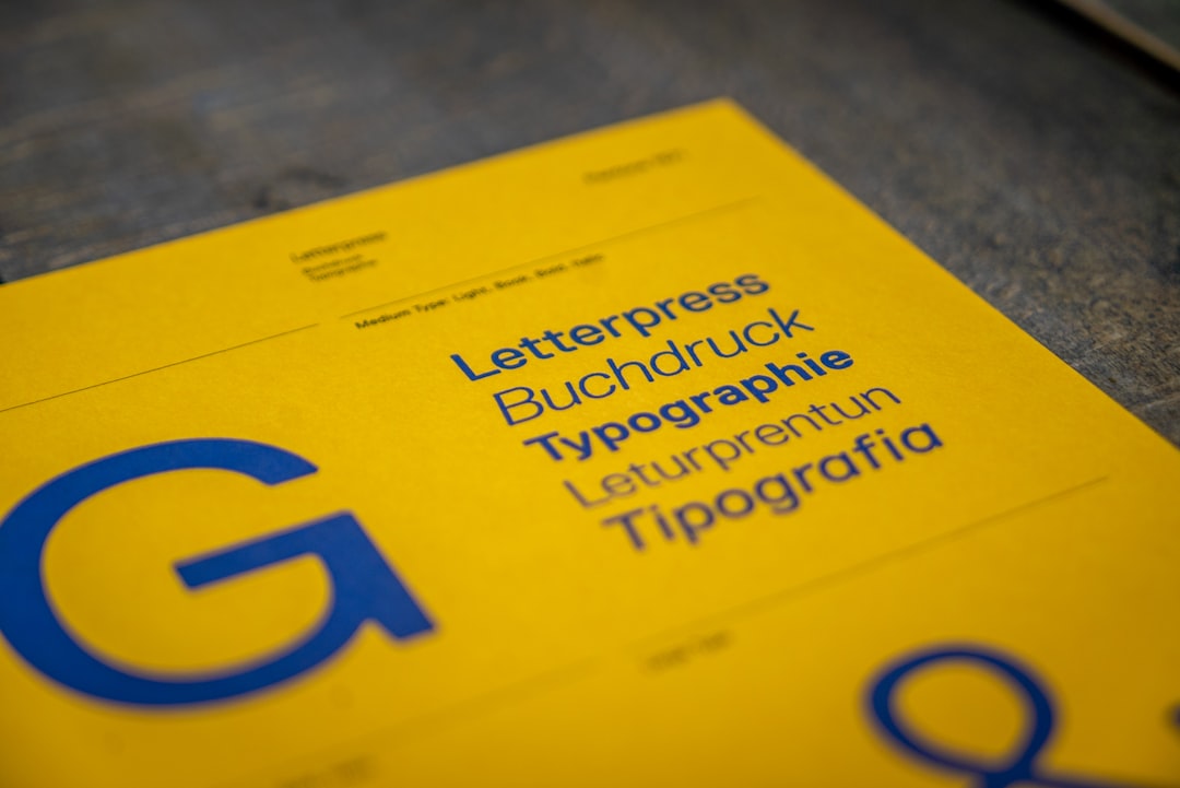
Lora Alternatives: Free and Paid
Lora is a beloved contemporary serif with calligraphic roots, moderate contrast and brushed details that read warmly at body sizes — which is exactly why it became a default on so many blogs and book-style layouts. If you need a fresh look, a font Lora is already overused near, or wider weights and language coverage, this guide rounds up the best Lora alternatives, all real typefaces with accurate licensing. Most are free on Google Fonts, so swapping is usually a one-line change.
For the original, see our Lora font guide, and if you are weighing the two most popular options head-to-head, our Lora vs Merriweather and Merriweather vs Lora comparisons go deeper on each.
Why use a Lora alternative?
Lora is excellent, but it is not the right answer for every project. You might want an alternative because Lora’s calligraphic warmth feels too soft for a technical or corporate brand, because you need a heavier display weight Lora does not offer, or simply because Lora is so widely used that it no longer feels distinctive. Some teams also want a serif with broader Cyrillic, Greek or Vietnamese support, or one tuned for smaller UI sizes. The good news: the free serif landscape is deep, so you can match Lora’s readable, moderate-contrast character without compromise.
Best free Lora alternatives
These are all free under the SIL Open Font License and available on Google Fonts, so they are safe for commercial and web use.
Merriweather (free)
Merriweather is the most natural substitute for Lora. Designed by Sorkin Type and free on Google Fonts, it has a slightly larger x-height, sturdier serifs and a touch more weight on screen, making it the more robust choice for dense body text. Where Lora feels literary, Merriweather feels dependable — ideal for blogs, documentation and reading-heavy sites that need rock-solid legibility.
PT Serif (free)
PT Serif from ParaType is a transitional serif with excellent screen rendering and broad Cyrillic support — a strong pick if Lora’s language coverage falls short. It is calmer and more neutral than Lora, pairs cleanly with its sister PT Sans, and is free on Google Fonts. Reach for it when you want a workmanlike, unfussy serif for articles and reports.
Source Serif 4 (free)
Source Serif 4 is Adobe’s open-source serif, free on Google Fonts and GitHub. It is a full variable family with many weights and true italics, giving you far more typographic range than Lora’s four styles. Its slightly more contemporary, low-contrast structure suits editorial sites and product marketing where you want refinement plus flexibility.
Bitter (free)
Bitter is a slab-influenced serif designed specifically for comfortable on-screen reading. Free on Google Fonts and now a variable font, Bitter has slightly heavier, more rectangular serifs than Lora, lending text a steady, grounded feel. Choose it when you want a touch more structure and a slab-leaning personality without losing readability.
Crimson Text (free)
Crimson Text (and its updated sibling Crimson Pro) is a book-oriented old-style serif inspired by classic typesetting. Free on Google Fonts, it has higher contrast and a more traditional, literary voice than Lora — perfect for long-form essays, digital magazines and anything that should feel like a printed book.
Spectral (free)
Spectral, designed by Production Type for Google, is a refined serif built for both screen and print, with a generous range of weights and italics. Free on Google Fonts, it is more elegant and editorial than Lora, with crisp details that hold up at larger sizes. Use it for premium publications and brand typography that needs a literary but modern tone.
Tinos (free)
Tinos is a free, metrically compatible alternative to Times New Roman, available on Google Fonts under the Apache license. It is more conventional and economical than Lora, fitting more text per line. Pick it when you need a familiar, space-efficient serif — for documents, legal text or print-style layouts — rather than Lora’s warmer character.
Noto Serif (free)
Noto Serif is Google’s universal serif, engineered for enormous language coverage across the Noto superfamily. Free on Google Fonts, it is the safest choice when your content spans many scripts and you need consistent design. It is more neutral than Lora, but unbeatable for multilingual reliability.
Best paid Lora alternatives
Lora’s strength is that you almost never need to pay — the free field is deep. If you do want a commercial serif with bespoke detailing, look to typefaces like FF Tisa, Freight Text or Lyon Text from foundries such as Monotype, Phil’s Fonts and Commercial Type. These offer wider optical-size ranges and more nuanced italics than free options, but for most blogs and product sites a free Google Font fully matches Lora’s role. Always confirm a webfont license before deploying — our font licensing guide explains desktop vs web vs app rights.
How to choose the right Lora alternative
Start with intent. For maximum readable body text, choose Merriweather or PT Serif. For a more contemporary, flexible system with many weights, choose Source Serif 4 or Spectral. For a slab-leaning, grounded feel, choose Bitter. For a classic book voice, choose Crimson Text. For multilingual or Times-compatible needs, choose Noto Serif or Tinos. Test your real content — headings, body and italics — at actual sizes before committing, and pair your serif with a clean sans for UI elements.
| Alternative | Free/Paid | Best for | How it compares to Lora |
|---|---|---|---|
| Merriweather | Free (Google Fonts) | Body text, blogs, docs | Sturdier, larger x-height, less calligraphic |
| PT Serif | Free (Google Fonts) | Articles, reports, Cyrillic | Calmer, more neutral, broader language support |
| Source Serif 4 | Free (Google Fonts) | Editorial, product marketing | More weights, contemporary, variable |
| Bitter | Free (Google Fonts) | Screen reading, UI text | Slab-leaning, more rectangular serifs |
| Crimson Text | Free (Google Fonts) | Long-form essays, books | Higher contrast, more traditional |
| Spectral | Free (Google Fonts) | Premium publishing, brand | More elegant and refined |
| Tinos | Free (Google Fonts) | Documents, print-style text | Times-compatible, space-efficient |
| Noto Serif | Free (Google Fonts) | Multilingual content | More neutral, vast script coverage |
For more curated picks, browse our roundups of the best serif fonts and the best Google Fonts. If you are pairing a serif with a rounded sans on the same project, our Merriweather alternatives guide is a useful sibling read.
Frequently Asked Questions
What font is closest to Lora?
Merriweather is the closest free alternative to Lora. Both are contemporary serifs tuned for on-screen body text with moderate contrast, but Merriweather is a touch sturdier with a larger x-height. PT Serif is the next-closest, offering a calmer, more neutral feel and broader Cyrillic support.
Is Lora free for commercial use?
Yes. Lora is licensed under the SIL Open Font License and is free for personal and commercial use, including websites, print and embedding in apps. Every alternative recommended here is also free on Google Fonts under open licenses, so you can swap without new licensing costs.
What is a good free alternative to Lora on Google Fonts?
Merriweather, PT Serif, Source Serif 4 and Bitter are all free on Google Fonts and serve the same long-form-reading role as Lora. Merriweather is the most direct substitute, while Source Serif 4 gives you more weights and a more modern structure for flexible design systems.
Which Lora alternative is best for body text?
For pure readability in long body copy, Merriweather and PT Serif are the strongest choices. Both were engineered for screen reading at small sizes with sturdy serifs and generous x-heights. Bitter is also excellent if you prefer a slightly more structured, slab-leaning texture.
Does Lora have a serif or sans-serif alternative?
Lora is a serif, so its best alternatives are also serifs like Merriweather and Source Serif 4. If you need a sans-serif counterpart to pair with it, consider clean grotesques such as Inter or Source Sans 3 — see our best sans-serif fonts roundup for matched pairings.