What Font Does Lyft Use?
If you’ve ever wondered what gives the Lyft app its warm, playful personality, the answer starts with type. The lyft font is one of the most distinctive identities in the rideshare space, leaning into softness where competitors lean into sharp efficiency. Below we break down the logo lettering, the wider brand typeface, and the free fonts that get you closest. For more breakdowns like this, browse our famous brand fonts hub.
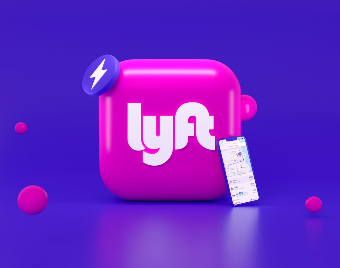
What font is the Lyft logo?
The Lyft logo is a lowercase wordmark rendered in a vivid magenta-pink, and it is best described as custom lettering rather than a font you can download. The letterforms are unmistakably rounded: the terminals are soft, the bowls of the “y” and the “f” feel friendly rather than mechanical, and the overall weight is medium-bold so it reads clearly at app-icon size. Lyft has refined this mark over several brand updates, and like most major tech companies the precise outlines are drawn by hand or heavily customized. That means the wordmark is trademarked artwork, not a typeface anyone can license.
What is Lyft’s brand typeface?
Beyond the logo, Lyft uses a rounded, humanist sans-serif system across its marketing, app interface, and signage. Reports and brand observers describe the family as a friendly geometric sans designed for warmth and high legibility on small screens. Lyft has used custom and licensed type over the years, so the exact named typeface in any given campaign can vary and should be treated as approximate. What stays consistent is the intent: open counters, generous spacing, and gently rounded shapes that make the brand feel approachable rather than corporate. If you want that same tone, a rounded humanist or geometric sans is the family to reach for.
Free fonts that look like the Lyft font
You don’t need a custom typeface to echo Lyft’s soft, optimistic vibe. The table below pairs each part of the brand system with a free, widely available alternative you can use in real projects.
| Use case | Lyft uses | Free alternative |
|---|---|---|
| Logo / wordmark | Custom rounded lowercase lettering | Poppins (Medium/SemiBold), Quicksand |
| Headlines | Friendly geometric/humanist sans | Nunito, Poppins |
| Body / UI | Rounded, legible sans-serif | Inter, Nunito Sans |
Poppins is the fastest way to suggest the lowercase, rounded-geometric look of the wordmark, while Nunito’s soft terminals lean even closer to Lyft’s friendliness. For interface and body copy where neutrality matters, Inter keeps things clean. Explore more options in our guide to the best sans-serif fonts.
Why does Lyft use this kind of type?
Type is strategy. Rideshare is a category built on trust between strangers, so Lyft deliberately uses warm, rounded letterforms to feel human and welcoming rather than transactional. Soft terminals read as friendly and safe, which matters when you’re asking someone to get into a stranger’s car. The lowercase wordmark reinforces an informal, peer-to-peer tone, positioning Lyft as the approachable, community-minded option. The high-legibility sans also performs well in motion and at small sizes, exactly where a rideshare brand lives: on phones, in cars, and on glowing dashboard emblems at night. There’s a competitive dimension too. In a category long dominated by sleeker, more corporate-feeling rivals, Lyft’s softness is a deliberate point of difference, the type equivalent of a friendly wave. Every rounded terminal and gentle curve is doing brand work, telling riders this is the warmer, more human choice. That consistency across the wordmark, the app, and even the iconic pink “glowstache” once mounted on dashboards is what makes the system feel cohesive and instantly recognizable.
Can I use the Lyft font for my own project?
No, you should not use Lyft’s actual logo lettering for your own project. The wordmark is a registered trademark and protected brand asset, and recreating it for commercial use can create legal exposure even if you find a similar font. Instead, build your own identity with a free rounded sans like Poppins or Nunito, both of which carry open licenses that allow commercial use. Always confirm the specific license before publishing, and read our font licensing guide to understand the difference between using a typeface and copying a brand’s mark.
Frequently Asked Questions
Is the Lyft logo a real font I can download?
No. The Lyft logo is custom lettering, not a downloadable typeface. It was drawn or heavily customized specifically for the brand and is protected as a trademark. To get a similar look, designers reach for rounded geometric sans-serifs like Poppins or Quicksand rather than trying to find the exact font.
What free font looks most like the Lyft wordmark?
Poppins in a Medium or SemiBold weight is the closest free match for the lowercase, rounded-geometric character of the Lyft wordmark. If you want something even softer and friendlier, Nunito’s rounded terminals are an excellent alternative, and both are free for commercial use under open-source licenses.
Why is the Lyft logo lowercase?
Lowercase lettering signals informality and friendliness, which fits Lyft’s community-first, peer-to-peer positioning. It makes the brand feel approachable and modern rather than corporate. Many consumer tech brands use lowercase wordmarks for the same reason: the shapes feel more relaxed and human, reinforcing a warm, welcoming personality.
What color is the Lyft font?
The Lyft wordmark is rendered in a bright magenta-pink, sometimes described as “Lyft pink.” This vivid hue is central to the brand’s identity and helps it stand apart from competitors that lean on darker or more neutral palettes. The color paired with rounded type creates an energetic, optimistic feel.
Does Lyft use the same font as other rideshare apps?
No. While many tech brands use geometric sans-serifs, Lyft’s rounded, friendly approach is distinct from the sharper, more utilitarian type often used by competitors. Lyft’s softer letterforms and lowercase wordmark deliberately differentiate it, signaling warmth and community rather than pure efficiency.


