Magazine Design Principles That Work
A magazine is dozens of pages that must feel like one coherent publication while still surprising the reader as they turn each spread. Disciplined magazine design principles create that balance of consistency and variety through grids, type systems, and deliberate pacing. Layouts fail when columns wander, type styles multiply without reason, or every page looks identical and flat. They succeed when structure runs invisibly beneath the surface and the reader simply enjoys a smooth, well-paced read.
The key principles of magazine design
The seven principles below move from the underlying grid to the cover that has to sell the issue.
| Principle | Why it matters |
|---|---|
| Build on a grid | Columns and modules give every page a shared structure. |
| Use a baseline grid | Aligning text across columns creates a calm, professional read. |
| Define type styles | Reusable styles keep headlines, body, and captions consistent. |
| Balance image and text | The right ratio keeps spreads engaging, not cramped or empty. |
| Use white space and pull quotes | They give the eye rest and create entry points into articles. |
| Pace the page flow | Varying rhythm keeps a long issue from feeling monotonous. |
| Keep cover and masthead consistent | Recognition issue to issue builds the brand and sells copies. |
1. Build on a grid — give every page structure
A column grid is the skeleton of a magazine. Choosing a system, often a flexible multi-column grid like a 12-column layout, lets you place text and images in consistent positions while still allowing variety. Elements snap to columns and modules, so even adventurous spreads feel intentional. Without a grid, margins drift and the publication loses the underlying order that signals quality and makes long reads comfortable.
2. Use a baseline grid — align text across columns
A baseline grid sets an invisible horizontal rhythm so that lines of text align across adjacent columns and from page to page. When body text sits on a shared baseline, spreads feel calm and precise; when it doesn’t, the eye senses a subtle wobble even if it can’t name it. Lock body leading to the baseline and let headings span whole numbers of baseline units to keep everything in register.
3. Define type styles — build a reusable system
Magazines repeat the same kinds of text constantly: headlines, standfirsts, body copy, captions, pull quotes, and folios. Define a paragraph and character style for each, then apply them everywhere so the publication stays coherent and edits stay fast. Limit yourself to one or two typeface families with a few weights. Grounding choices in solid typography fundamentals keeps the hierarchy clear from headline down to footnote.
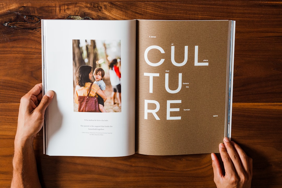
4. Balance image and text — compose the spread
Each spread is a single composition, not two separate pages. Decide how images and text share the space: a dominant lead image with a column of copy, a grid of smaller photos, or a text-led page with one accent visual. Give one element on the spread clear dominance so the eye has a starting point, and let supporting images and captions reinforce rather than compete with it.
5. Use white space and pull quotes — create entry points
Dense gray text walls discourage reading. Deliberate white space around headlines and images gives the eye places to rest and makes premium spreads feel airy. Pull quotes do double duty: they break up long columns and offer skimmers a reason to dive in. Set them in a contrasting size or weight, and pull a genuinely interesting line rather than a filler sentence.
6. Pace the page flow — vary the rhythm
A great magazine reads like music, with quiet passages and loud ones. Alternate dense text features with airy, image-driven spreads, and vary layouts so no two consecutive features look the same. This pacing keeps a thick issue engaging from front to back. Map the flow of the whole issue early, planning where the big visual moments land relative to the calmer reading stretches.
7. Keep cover and masthead consistent — sell and signal
The cover does the hardest job: it sells the issue and signals the brand. Build a clear hierarchy with the masthead, a strong cover image, and a few well-ranked coverlines, with the main feature dominating. Keep the masthead’s position, typeface, and treatment consistent across issues so readers recognize it instantly on a shelf or in a feed, even as the imagery changes every month.
Common magazine design mistakes to avoid
- Abandoning the grid so columns and margins drift from page to page.
- Introducing too many typefaces and unmanaged type styles.
- Making every spread identical, leaving the issue flat and monotonous.
- Cluttering the cover with too many coverlines and no clear focal point.
Frequently Asked Questions
What are the most important magazine design principles?
The essentials are working on a consistent grid and baseline, defining a reusable system of type styles, balancing images and text within each spread, using white space and pull quotes as entry points, and pacing the issue so the rhythm varies. A consistent cover and masthead tie everything together and build recognition.
What size and format should a magazine be?
Common print sizes include A4 (210 x 297 mm) and US Letter (8.5 x 11 in), with smaller digest formats around 5.5 x 8.5 in for portability. Choose based on your content, distribution, and budget, then design every spread to that trim with consistent margins and bleed for any full-page imagery.
What is a baseline grid and why does it matter?
A baseline grid is an invisible set of horizontal lines that body text sits on, so lines align across columns and pages. It creates a calm, precise rhythm that readers feel even if they don’t consciously notice it. Locking leading to the baseline keeps multi-column text in register throughout the publication.
How many fonts should a magazine use?
Usually one or two typeface families are enough: often a display or serif face for headlines paired with a readable face for body text. Variety comes from weights, sizes, and styles within those families rather than from adding more fonts, which quickly makes a publication feel inconsistent and chaotic.
How do I create good page flow in a magazine?
Vary the rhythm by alternating dense text features with airy, image-led spreads and changing layouts between consecutive articles. Plan the whole issue’s pacing early so big visual moments are spaced out. For more on hierarchy and balance, see our overview of core design principles.


