Mauve vs Dusty Rose: What’s the Difference?
When working with soft, muted pinks, two colors come up constantly: mauve and dusty rose. Both are sophisticated, toned-down alternatives to bright pink, but they are not the same color. The key difference in mauve vs dusty rose is where they sit on the color spectrum. Mauve leans toward purple with gray undertones, while dusty rose leans toward pink with warm, brownish undertones. That seemingly small shift creates noticeably different moods in design, fashion, and interiors.
Let’s break down each color in detail, compare their properties, and look at how to choose between them for your next project.
Mauve: The Muted Purple-Pink
Mauve gets its name from the French word for the mallow flower, and the color captures that same soft purple-pink quality. The standard mauve hex code is approximately #E0B0FF, though in practical design, slightly more muted versions like #C9A0DC or #B784A7 are more common.
What defines mauve is its distinct purple lean. It sits clearly between pink and purple on the color wheel, with enough gray in its composition to feel sophisticated rather than playful. Mauve has an elegant, slightly vintage quality that has made it a perennial favorite in fashion and wedding design.
Characteristics of Mauve
- Undertone: Cool purple-gray. Mauve always has a visible violet or lavender quality.
- Temperature: Cool to neutral. The purple undertone keeps mauve on the cooler side.
- Saturation: Low to moderate. Mauve is muted but not as desaturated as dusty rose.
- Mood: Romantic, vintage, elegant, dreamy, artistic.
- Associations: Wisteria, twilight, vintage florals, Victorian aesthetics.
Mauve pairs beautifully with other purple tones, deep greens, navy, and metallics like gold and copper. It’s a staple in romantic branding, wedding stationery, and editorial design that needs a feminine touch without being overtly girly.
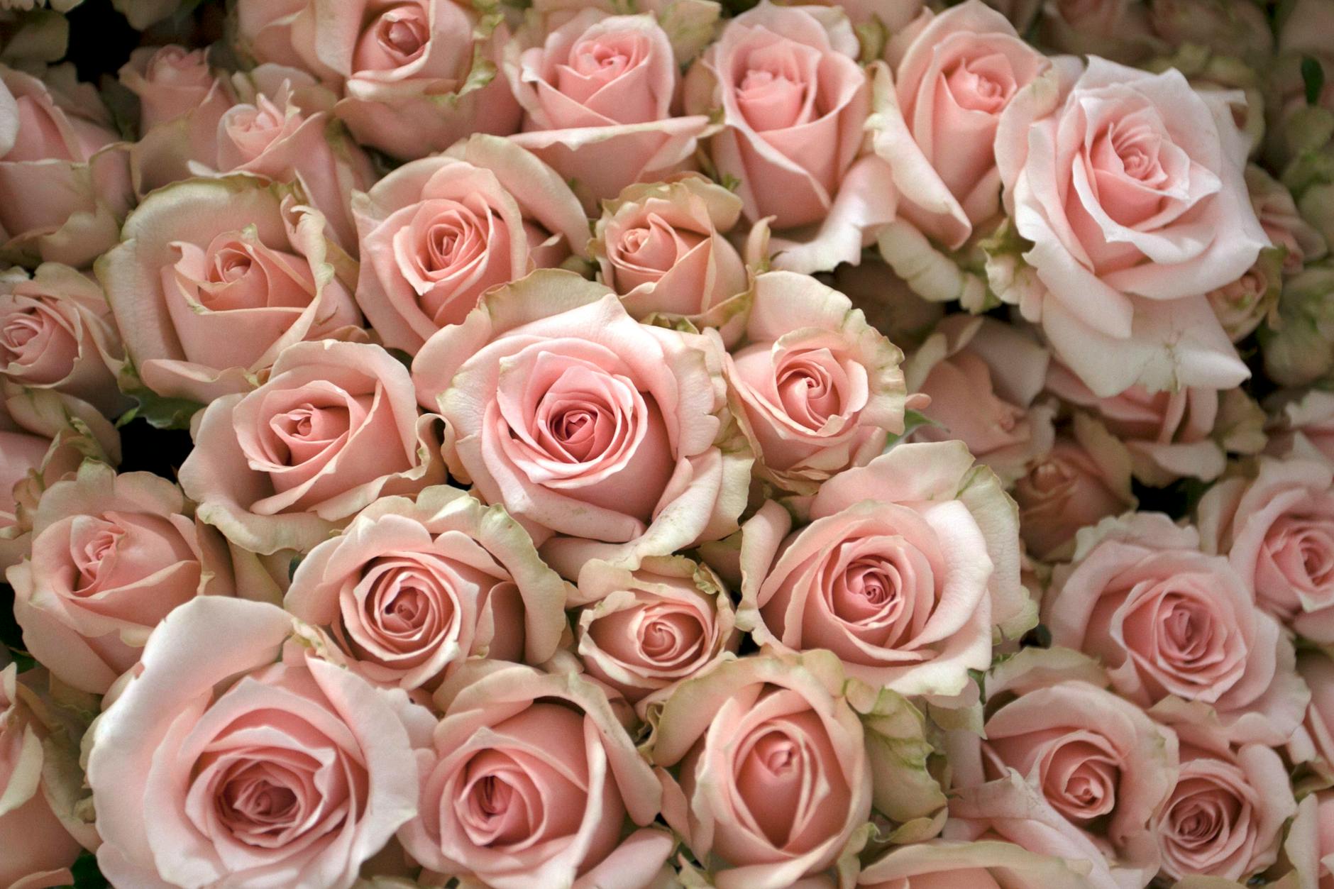
Dusty Rose: The Soft Warm Pink
Dusty rose describes a pink that has been “dusted” with gray and brown, creating a warm, muted, almost vintage quality. The standard dusty rose hex code is approximately #DCAE96, though variations like #C4767A and #D4A5A5 are also widely used.
The defining characteristic of dusty rose is its warm, brownish undertone. Where mauve pushes toward purple, dusty rose pushes toward the earthy side of the pink palette. It feels like a pink that has been softened by sunlight and time, which gives it an inherently warm, nostalgic quality.
Characteristics of Dusty Rose
- Undertone: Warm brown-gray. There’s always a hint of warmth beneath the pink.
- Temperature: Warm. Dusty rose sits on the warmer side of the pink family.
- Saturation: Low. Dusty rose is one of the most muted pinks available.
- Mood: Warm, nostalgic, romantic, soft, approachable.
- Associations: Dried flowers, antique textiles, skin tones, cottage interiors.
Dusty rose pairs wonderfully with cream, sage green, taupe, warm gray, and other muted earth tones. It’s a favorite for feminine branding that needs warmth, boho wedding palettes, and interior design that calls for soft color without coolness.
Key Differences Between Mauve and Dusty Rose
Here is a clear comparison of how mauve vs dusty rose differ across the most important design factors:
- Hue direction: Mauve leans purple. Dusty rose leans pink-brown.
- Temperature: Mauve is cooler. Dusty rose is warmer.
- Undertone: Mauve has gray-purple undertones. Dusty rose has gray-brown undertones.
- Vibrancy: Mauve retains slightly more chromatic presence. Dusty rose is more heavily muted.
- Mood: Mauve feels more ethereal and elegant. Dusty rose feels more grounded and cozy.
- Era association: Mauve evokes Victorian or Art Nouveau. Dusty rose evokes cottage-core and bohemian.
The simplest test: if the color looks like it could be called a light purple, it’s mauve. If it looks like a faded, sun-warmed pink, it’s dusty rose.
Hex Codes and Design Use
For precise digital design work, here are common hex codes for each color:
Mauve variations:
- Classic mauve: #E0B0FF
- Deep mauve: #B784A7
- Soft mauve: #C9A0DC
- Mauve taupe: #915F6D
Dusty rose variations:
- Classic dusty rose: #DCAE96
- Medium dusty rose: #C4767A
- Light dusty rose: #D4A5A5
- Deep dusty rose: #B5656A
When working with either color in a pastel palette, keep surrounding colors at a similar saturation level. Both mauve and dusty rose lose their impact when placed next to highly saturated colors, which can make them look washed out rather than deliberately soft.
When to Use Each
Choose Mauve When You Want
- A cool-toned feminine palette with a hint of purple.
- An elegant, slightly mysterious or artistic mood.
- Pairing with other cool tones like lavender, silver, navy, or forest green.
- A vintage or Victorian-inspired aesthetic.
- Branding that needs to feel refined and creative.
Choose Dusty Rose When You Want
- A warm, inviting feminine palette with earthy undertones.
- A cozy, approachable, or nostalgic mood.
- Pairing with warm tones like cream, sage, terracotta, or gold.
- Bohemian, cottage-core, or organic design aesthetics.
- Branding that needs to feel soft, warm, and human.
Both colors serve the same broad purpose — adding muted femininity to a design — but they attract different audiences and pair with different supporting colors. Your choice should be guided by the temperature of your overall palette.
FAQ
Is mauve more purple or pink?
Mauve sits between purple and pink but leans noticeably toward purple. That violet undertone is what distinguishes mauve from other muted pinks. If you removed the gray from mauve, you’d be left with something close to orchid or light violet rather than a true pink. The lilac and lavender family is mauve’s closest relative.
Is dusty rose the same as blush?
No, though they’re close. Blush is generally lighter and warmer, resembling the natural flush of skin. Dusty rose is slightly darker and more muted, with a visible gray-brown component that blush typically lacks. Think of blush as a fresh petal and dusty rose as a dried one. Both are beautiful, but dusty rose has more visual weight and complexity.
Can mauve and dusty rose be used together?
Yes, and the combination can be very effective. The key is using a neutral bridge color — like cream, warm white, or taupe — to smooth the temperature transition between mauve’s coolness and dusty rose’s warmth. This pairing works especially well in wedding palettes, feminine branding, and interior design where you want layered, nuanced pinks and purples.
Which is better for wedding colors?
Both are excellent wedding colors, but they set different tones. Mauve weddings tend to feel elegant, garden-party, and slightly whimsical. Dusty rose weddings feel warm, intimate, and romantic in a cozy way. Consider your venue and season: mauve suits spring gardens and cool-toned venues, while dusty rose works beautifully in rustic barns, autumn celebrations, and warm-lit spaces.


