What Font Does Megalo Box Use?
If you searched for the megalo box font, you probably want to recreate the raw, gritty title from Megalo Box — the futuristic boxing anime, made as a 50th-anniversary homage to Ashita no Joe, where an underground fighter known as “Junk Dog” claws his way toward the Megalonia tournament. The honest answer is that the logo is bespoke artwork, not a single released typeface. Below we break down what the lettering actually is, why it matches the show’s rough, retro-future grit, and which free fonts get you closest without copying the trademark.
What font is the Megalo Box logo?
The Megalo Box title is a custom-designed wordmark, not a downloadable font. The letters are bold and blocky with a deliberately rough, weathered edge — fitting for a series built on grime, underground rings, and worn machinery. Like most anime logos, each letter was drawn and treated by hand to work as a single graphic, often with distress, texture, or stencil-like cuts that no standard typeface includes. So while you will find “Megalo Box font” files online, they are fan recreations, not the real logo type. Treat any specific font claim as an informed observation, not a confirmed spec — the heavy, slab-edged forms are reminiscent of a condensed industrial grotesque, but that is our reading, not a confirmed source.
What typeface does Megalo Box use in its branding?
Megalo Box leans hard into a retro, lo-fi visual identity, and it helps to separate the layers. The custom Latin wordmark — sometimes styled “MEGALOBOX” — carries the gritty signature, while the series also uses bold supporting type for fight cards, on-screen labels, and the deliberately VHS-flavored title sequences. The Japanese on-screen text and credits are set in standard broadcast and print typefaces, usually a mix of gothic (sans) and mincho (serif) faces chosen by the production and localization teams; these vary by the Japanese master, streaming captions, and any home-video release. The recognizable, weathered signature lives in the hand-built logo, not the supporting type.
So if your goal is to match “the anime font,” be precise about which element you mean. The gritty, distressed signature is the logo, not the subtitle text on a streaming platform. For fan art, fight posters, or tribute pieces, focus on echoing the heavy, weathered display lettering of the title. If you enjoy this kind of breakdown, our look at the DAYS anime font covers a cleaner, more energetic sports-anime wordmark for an interesting contrast in tone.
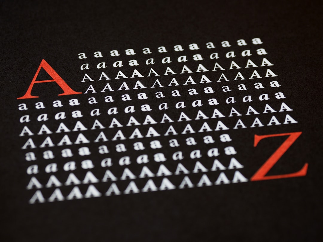
Free fonts that look like the Megalo Box font
You cannot legally reuse the trademarked Megalo Box logo, but you can capture its gritty, industrial feel with free, openly licensed fonts. This table maps each layer of the look to a free alternative.
| Use case | Megalo Box uses | Free alternative |
|---|---|---|
| Logo / title | Custom bold distressed wordmark | Anton or Archivo Black |
| Fight cards / taglines | Heavy industrial lettering | Oswald or Saira Condensed |
| Body / captions | Clean sans | Archivo or Roboto |
Anton is the best starting point for the title: its single heavy weight and tall, condensed proportions echo the logo’s blunt, aggressive presence. Set it in all caps, tighten the spacing, then add your own texture, and you are most of the way to that gritty, underground-ring feel. Archivo Black is a chunkier alternative when you want the title to read as a heavy, blocky punch rather than a tall column.
To push the resemblance further, lean on a few finishing touches — this is where the Megalo Box look really comes from. Overlay a grunge or scratched texture so the letters look beaten-up, add subtle VHS scanlines or chromatic-aberration shift behind the words, and choose a desaturated, high-contrast palette of dirty whites, deep blacks, and a single bruised accent color. These are presentation tricks layered on top of a free font, but they do most of the work in selling the raw, retro-future personality. Pair the heavy display title with a plain sans for any supporting copy so the grit reads as intentional rather than noisy everywhere.
Why does Megalo Box use this kind of type?
Megalo Box is a gritty, grounded underdog story set in a worn-down near-future, so its logo needs to feel rough, heavy, and a little dangerous. Bold, blocky, distressed letters read as raw and industrial — matching the underground fights, scrap-built gear, and Junk Dog’s stubborn defiance. A clean polished logo would undercut the grime; a soft rounded one would clash entirely with the tone. The custom wordmark threads that needle, and its bespoke texturing makes the brand instantly recognizable on a crowded shelf.
Can I use the Megalo Box font for my own project?
The Megalo Box logo is a trademark tied to its publisher and studio, so you should not reproduce it on anything you sell or distribute. For personal fan art it is fine to imitate the style, but for commercial work, use a free look-alike like Anton or Archivo Black and confirm its license first. Our font licensing guide explains the difference between personal and commercial use, and our vintage fonts hub collects more display-type breakdowns. If you are styling a whole sports-anime project, our Big Windup font guide covers a warmer, more traditional athletic title for an interesting contrast.
Frequently Asked Questions
Is the Megalo Box font free to download?
No. The Megalo Box logo is custom brand lettering, not a released font, so there is no official file to download. Any “Megalo Box font” you find is a fan recreation or look-alike. For the style, use free fonts like Anton or Archivo Black and check their licenses before commercial use.
What font is most similar to the Megalo Box logo?
Anton is the closest free match for the bold, blocky, condensed feel, with Archivo Black a chunkier alternative. Neither is identical, since the wordmark is hand-drawn and textured, but in all caps with added grunge either gets convincingly close for fan projects.
Can I use a Megalo Box-style font commercially?
You can use a free look-alike font commercially if its license permits, but you cannot reproduce the trademarked Megalo Box logo on products you sell. Set your own text in a free bold condensed font instead of copying the official wordmark, and verify both the font license and trademark rules first.
What kind of font is the Megalo Box logo?
It is a custom display wordmark — bold, blocky, and distressed with a gritty industrial edge. It sits in the edgy sports-anime title category but was drawn specifically for Megalo Box rather than typed in any existing typeface.


