What Font Does Memento Use?
If you searched “memento font” hoping to download the exact title typeface, the honest answer is that it does not exist as a retail font. First, a quick disambiguation: “memento” is also an everyday word meaning a keepsake or reminder, which is fittingly on-theme. This article is about Christopher Nolan’s 2000 thriller Memento, the film told largely in reverse about a man with short-term memory loss, and the typography of its title. The logo is custom lettering, but you can recreate its stark, fractured mood with free fonts.
What font is the Memento logo?
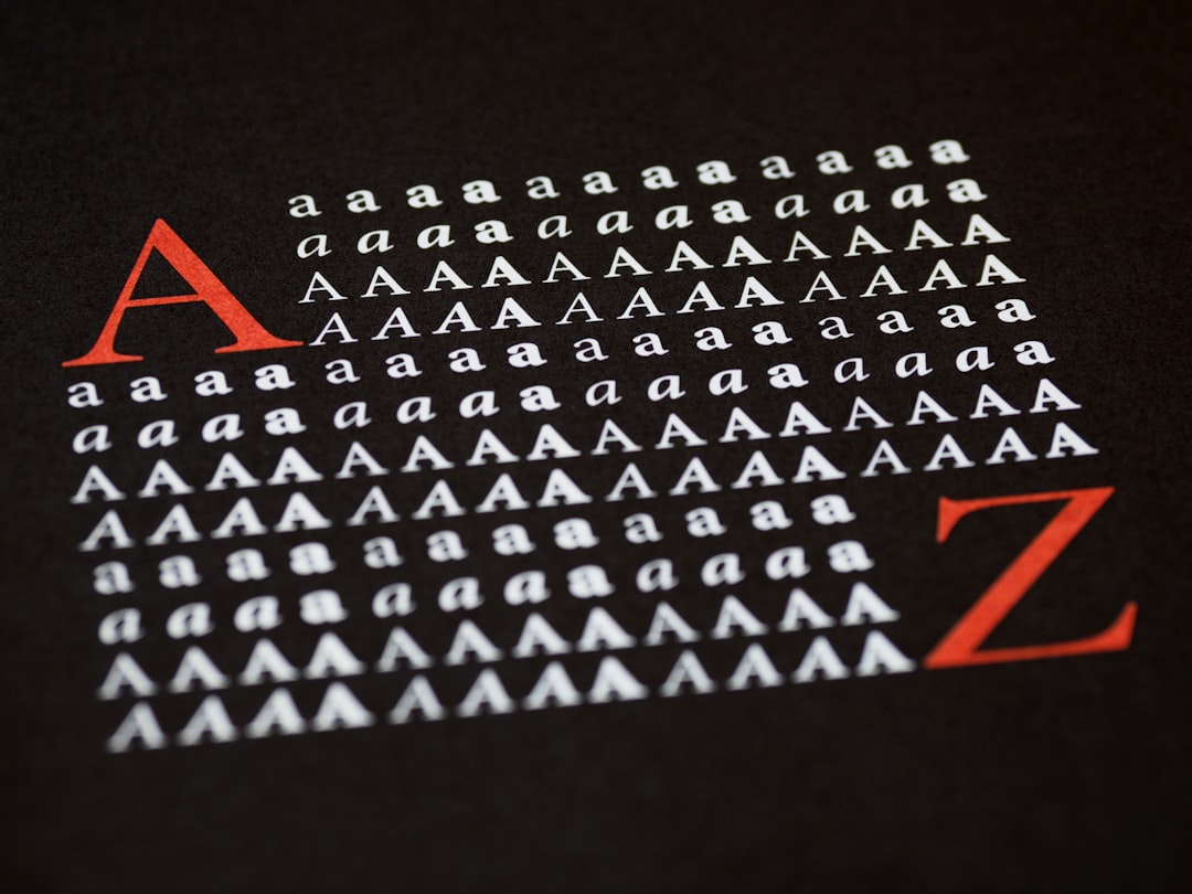
The Memento logo is a custom wordmark, not an off-the-shelf font. Its defining quality is starkness. The lettering is cold and plain, often presented with a fractured, distressed, or unsettled treatment that mirrors the protagonist’s fragmented memory. There is nothing decorative or comforting about it; the type feels clinical and noir, like evidence pinned to a wall.
Any specific font name you see attached to the logo online should be treated as an informed observation, not a confirmed spec. The studio likely drew or heavily modified plain sans-serif capitals and then applied distressing or fracturing effects to achieve the broken, memory-loss feel. Watch for these traits:
- Stark capitals: plain, upright, unadorned letters.
- Fractured treatment: distressed or broken edges suggesting fragmentation.
- Cold tone: clinical and noir rather than warm or friendly.
- High contrast: typically stark white or black against a bleak backdrop.
What typeface is used in the film?
Inside Memento, text carries unusual narrative weight because the protagonist relies on notes, Polaroids, and tattoos to navigate his condition. The on-screen lettering in these props skews plain and functional, the handwriting and stamped text of someone documenting facts they cannot trust themselves to remember. The formal credits use restrained, legible type rather than a decorative display face.
As with most films, there are two typographic layers: the stark custom wordmark on posters and the quieter text used in-film and in credits. When people search for the memento font, they usually mean the poster wordmark, which is the colder and more memorable of the two, even if the in-film notes are thematically central.
What makes Memento unusual is how much the plot itself runs on written text. The protagonist literally cannot trust his own recall, so every Polaroid caption and tattooed sentence becomes a load-bearing piece of the narrative. That gives even the plain, functional lettering an eerie significance: these are not just labels but the scaffolding of a fractured identity. The stark poster wordmark distills that anxiety into a single image.
Free fonts that look like the Memento font
You cannot license the original lettering, but several free fonts capture the stark, cold, noir feeling. The goal is austerity: plain capitals with no warmth, optionally roughened to suggest fragmentation. Here are dependable free starting points.
| Use case | Memento uses | Free alternative |
|---|---|---|
| Main title / poster | Stark custom capitals | Inter (all caps) |
| Cold, clinical headline | Plain grotesque sans | Archivo |
| Fractured / distressed feel | Broken-edge treatment | Oswald + roughen effect |
| Note / evidence text | Plain functional sans | Roboto |
For the poster’s cold, clinical base, Inter or Archivo in capitals get you close. To suggest the fractured, memory-loss quality, take a plain sans and apply a light distress or roughen effect rather than searching for a pre-broken font. If you like this austere, noir register, our breakdown of the stark Insomnia movie font explores a closely related Nolan thriller treatment.
Why does Memento use this kind of type?
The typography reflects the story’s central wound. Memento is about a man whose memory resets constantly, forcing him to externalize everything onto notes and tattoos. A stark, fractured wordmark visualizes that broken continuity, the sense of identity held together by fragments. Cold, clinical lettering also matches the film’s bleak, noir-inflected world.
The plainness serves the realism too. This is a low-budget, ground-level thriller, not a glossy blockbuster, and its austere type signals that grounded, unglamorous tone. The fracturing turns ordinary letterforms into something quietly unsettling, exactly the mood the film sustains. For more on how stark, no-nonsense lettering shapes a brand’s character, see our guide to famous brand fonts.
Can I use the Memento font for my own project?
You can freely recreate the stark style, but you cannot use the actual movie logo. The Memento wordmark and the film name are protected by trademark and copyright held by the rights owners. Using the real logo commercially, or in any way that implies an official connection, is legally risky, and personal fan pieces should never be sold.
The safe approach is to build your own stark, all-caps treatment with a properly licensed free font such as Inter or Archivo, adding a distress effect yourself if you want the fractured look. Always confirm the commercial terms of any font before shipping a paid project, because free to download does not always mean free to sell with. Our font licensing guide walks through exactly what to check.
To capture the fractured quality without relying on a gimmicky pre-broken typeface, start clean and break it yourself. Set your word in stark capitals, then apply a subtle roughen, displacement, or torn-edge effect so the damage looks intentional rather than decorative. Keep the palette cold and high-contrast, leaning on stark whites, deep blacks, and muted greys that echo the film’s bleak, evidence-board aesthetic. A single line of Inter or Archivo caps, lightly distressed and tightly cropped, carries far more of the Memento mood than any ornate or overtly horror-styled font would.
Frequently Asked Questions
Is the Memento logo a real downloadable font?
No. The Memento logo is custom lettering made for the 2000 film, not a retail typeface. You cannot download the exact wordmark. The closest free approach is a stark sans like Inter or Archivo in capitals, with a light distress effect added to mimic the fractured noir feel.
What font is closest to the Memento title?
Inter and Archivo in all caps are strong free matches for the cold, clinical base. To capture the fractured quality, apply a roughen or distress effect rather than hunting for a pre-broken font. None is identical to the original, but each shares its stark, unadorned character.
Why does the Memento logo look fractured?
The film follows a man with short-term memory loss who survives on notes and tattoos. A fractured, distressed wordmark visualizes that broken continuity and fragmented identity. The cold, stark treatment also matches the movie’s bleak, noir tone and grounded, low-budget realism.
Can I use a Memento-style font commercially?
You can use a Memento-style look built from a properly licensed free font, but not the actual movie logo, which is trademarked. Always verify your chosen font’s license for commercial use before selling anything. Our font licensing guide explains the key terms to review first.


