Menu Design Principles That Work
A menu is not just a list of food — it is the most-read sales document a restaurant owns, held by nearly every guest for several minutes. How it is laid out quietly steers what people order and how they feel about the prices. Good menu design principles combine the psychology of how people read a menu with the practical demands of legibility in dim dining rooms and clear organisation. A menu that ignores reading patterns and shouts its prices works against the very business it represents.
The key principles of menu design
These seven principles turn a price list into a tool that guides, reassures, and sells.
| Principle | Why it matters |
|---|---|
| Reading patterns | Guests scan menus in predictable paths you can design around. |
| Clear sections | Logical grouping helps guests find what they want without effort. |
| Price restraint | De-emphasising prices keeps focus on the food, not the cost. |
| Legible typography | Type must stay readable in dim restaurant lighting. |
| Signature highlighting | Featured dishes guide guests toward profitable, memorable choices. |
| Descriptions | Evocative, concise copy makes dishes more appealing. |
| Restrained photography | A few good images add appeal; too many cheapen the menu. |
1. Reading patterns — design for how eyes move
Guests do not read a menu top to bottom; their eyes follow patterns. On a single-page menu, attention often gravitates toward the upper-right “golden triangle,” while multi-column layouts get scanned in a Z-shape. Place the dishes you most want to sell where the eye naturally lands, and use a deliberate visual hierarchy of size and spacing to lead attention rather than leaving it to chance.
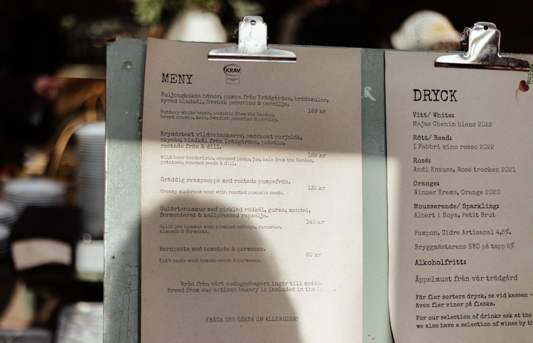
2. Clear sections — make dishes easy to find
A guest deciding what to eat does not want to hunt. Group dishes into intuitive sections — starters, mains, sides, desserts, drinks — with clear headings and consistent spacing between them. Logical grouping reduces decision fatigue and keeps the experience pleasant. Within each section, order items thoughtfully, putting high-margin or signature dishes near the top or bottom where they are most noticed.
3. Price restraint — sell food, not numbers
One of the most counterproductive habits in menu design is emphasising prices: bold figures, currency symbols, and a tidy right-hand column of numbers invite guests to shop by price. Instead, drop the currency sign, set prices in the same size and weight as the description, and place them subtly at the end of the line rather than in a column. This keeps the focus on the dish, not the cost, and reduces “price anchoring” comparisons.
4. Legible typography — read in low light
Restaurants are often dimly lit, so menu type that looks fine on a bright screen can be a struggle at the table. Use comfortable sizes, clear typefaces, and strong contrast between text and background. Limit yourself to one or two typefaces and create hierarchy through weight and size. Avoid pale grey text on cream stock or decorative faces that sacrifice readability; a quick refresher from the typography terms glossary helps you choose wisely.
5. Signature highlighting — feature your best
Not every dish deserves equal billing. Give your most profitable or most memorable items extra visual weight — a box, an icon, a “chef’s favourite” label, or a slightly larger heading — so guests are gently guided toward them. Use this sparingly; if every dish is highlighted, none stands out. One or two featured items per section is usually enough to influence choices without looking cluttered.
6. Descriptions — make dishes mouth-watering
A short, evocative description sells a dish far better than its name alone. Name a key ingredient, a preparation method, or an origin to add appeal and justify the price — “slow-roasted heritage pork” reads better than “pork.” Keep descriptions concise and consistent in length so the layout stays tidy, and avoid over-writing every item, which slows the read and dilutes the effect.
7. Restrained photography — less is more
Photography can boost appeal, but a menu full of glossy photos often reads as cheap and overwhelming. Use a few high-quality images of signature dishes, or none at all, depending on the establishment’s positioning — fine dining typically avoids photos entirely, while casual venues may use a handful. When you do use images, ensure consistent lighting and styling, and pair them with thoughtful color theory so the palette suits the cuisine and brand.
Common menu design mistakes to avoid
- Listing prices in a bold right-hand column, which encourages guests to order by price.
- Setting type too small or too low-contrast to read comfortably in dim dining-room light.
- Cramming every dish onto one crowded page with no sections, spacing, or hierarchy.
- Filling the menu with mediocre photos that cheapen the look and overwhelm the reader.
Frequently Asked Questions
What are the most important menu design principles?
The most important principles are designing around how guests actually read a menu, grouping dishes into clear sections, and exercising restraint with prices. Legible typography for low light, subtle highlighting of signature dishes, and concise appealing descriptions complete the set. A well-designed menu guides choices and reassures guests rather than simply listing items and costs.
What size and format should a menu be?
Common formats include a single A4 or US letter page, a folded bi-fold or tri-fold, and a multi-page booklet for larger offerings. Choose based on how many items you serve and the dining style. A concise menu often outperforms a sprawling one, because fewer, well-presented choices reduce decision fatigue and steer guests toward your strongest dishes.
How should prices be shown on a menu?
Show prices subtly: drop the currency symbol, match the price to the description’s size and weight, and place it at the end of the line rather than in a separate right-hand column. This discourages guests from scanning by price and keeps the focus on the food. Avoid bold or oversized figures that draw attention to cost.
Should a menu include photos of the food?
It depends on the venue. Fine-dining menus usually avoid photos and rely on typography and descriptions, while casual and fast-service venues may use a few high-quality images of signature dishes. If you use photos, keep them consistent in styling and limited in number; too many make a menu feel cheap and cluttered.
How do I make a menu easy to read in dim lighting?
Use clear typefaces at comfortable sizes with strong contrast between text and background, and avoid pale text on cream or dark text on dark stock. Establish hierarchy through weight and spacing rather than tiny size differences, and give sections room to breathe. Test the printed menu under your actual restaurant lighting before finalising it.


