Minimalism vs Maximalism in Design: Key Differences
Few debates in design are as enduring — or as personal — as minimalism vs maximalism. Minimalism champions restraint: “less is more.” Maximalism celebrates abundance: “more is more.” Each philosophy has deep roots in art and design history, passionate advocates, and legitimate applications. Understanding minimalist vs maximalist design is not about choosing a side but about knowing when each approach serves the message, the audience, and the medium best.
The tension between these two poles has driven some of the most important developments in graphic design, architecture, fashion, and product design. And increasingly, the most compelling contemporary work lives somewhere in the space between them — borrowing principles from both to create something fresh. Let us examine what defines each approach, where they came from, and how to deploy them effectively.
What Is Minimalism in Design?
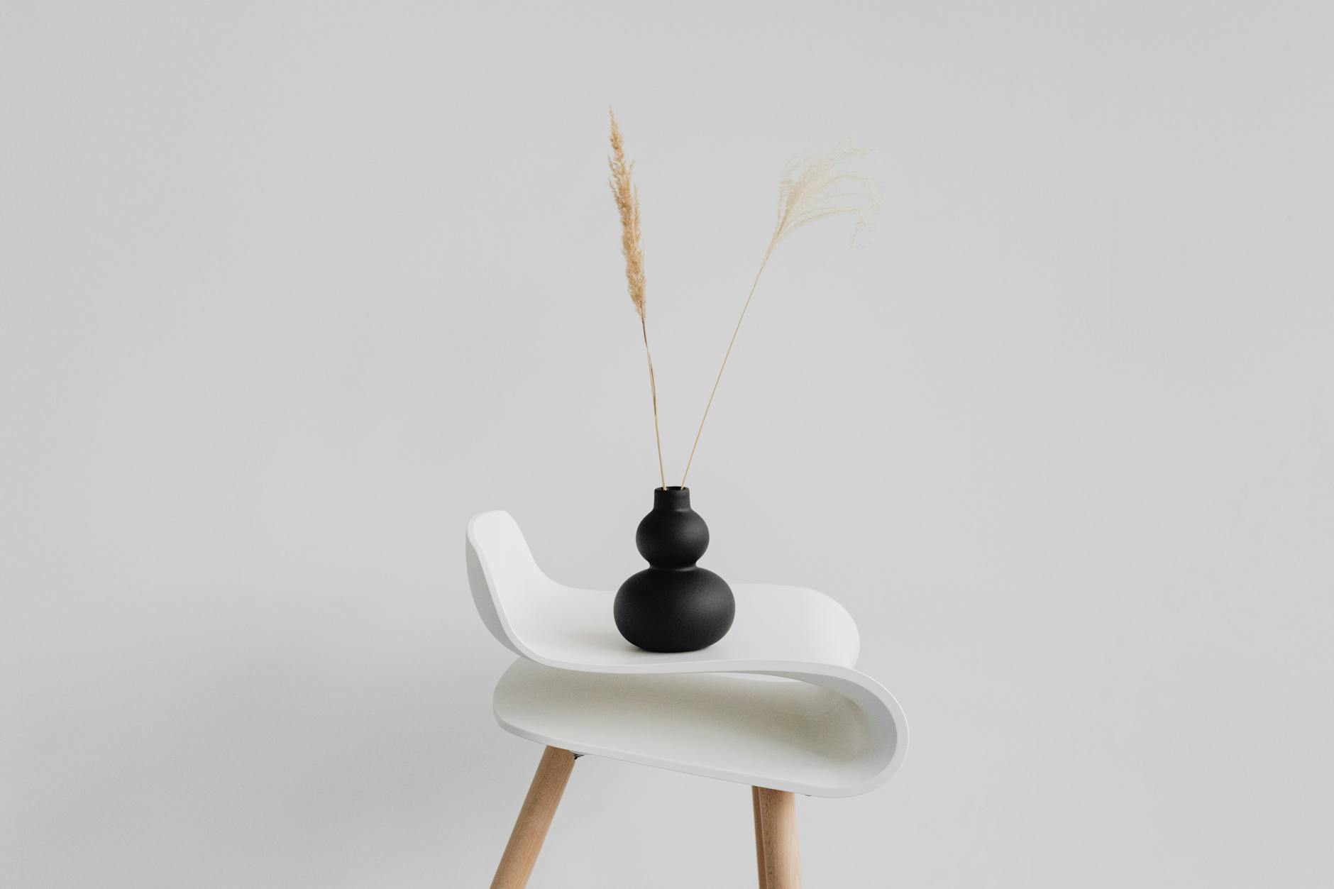
Minimalism in design is the practice of stripping away everything that is not essential. It prioritizes function, clarity, and breathing room. Every element that appears in a minimalist composition earns its place — if it does not serve a clear purpose, it is removed.
The minimalist approach is guided by several core principles:
- Reduction — using the fewest elements necessary to communicate the message
- White space — treating empty space as an active design element that creates focus and elegance
- Limited palette — working with restrained colors, often monochromatic or near-monochromatic schemes
- Clean typography — favoring legible, often sans-serif typefaces with generous spacing
- Grid discipline — organizing elements on strict, logical grids
- Function over decoration — rejecting ornamentation that does not serve communication
Dieter Rams, the legendary industrial designer at Braun, articulated the minimalist ethos through his ten principles of good design, including the famous declaration that “good design is as little design as possible.” His influence extends from product design to the entire Apple aesthetic, which has become synonymous with minimalism for a generation of consumers.
In graphic design, minimalism manifests as clean layouts with ample margins, restrained color usage, and a focus on visual hierarchy achieved through scale and spacing rather than decoration. Brands like Muji, Aesop, and COS have built entire identities around minimalist principles, projecting sophistication through simplicity.
The appeal of minimalism extends beyond aesthetics into user experience. In digital interfaces, minimalist design reduces cognitive load, speeds up decision-making, and makes content the focal point. In print, it creates breathing room that allows the reader’s eye to rest and focus. When executed well, minimalist design does not feel empty — it feels intentional, with every element carrying weight precisely because there is nothing extraneous competing for attention.
What Is Maximalism in Design?
Maximalism is the deliberate embrace of abundance, complexity, and sensory richness. Where minimalism subtracts, maximalism adds. It celebrates pattern, color, texture, ornamentation, layering, and eclecticism. The goal is not chaos but curated excess — a composition that is full, vibrant, and expressive.
Core principles of maximalist design include:
- Abundance — filling the composition with visual information and detail
- Bold color — using rich, saturated, and often contrasting color palettes
- Pattern and texture — layering multiple patterns and tactile elements
- Eclecticism — mixing styles, eras, and influences without concern for “matching”
- Ornamentation — embracing decorative elements as integral rather than superficial
- Emotional impact — prioritizing feeling, energy, and personality over efficiency
Maximalism in graphic design can be seen in the work of designers like David Carson, Stefan Sagmeister, and Paula Scher — artists who fill every inch of their compositions with energy, typographic experimentation, and visual surprises. Brands like Gucci under Alessandro Michele, Desigual, and Dolce & Gabbana have leaned heavily into maximalist aesthetics to signal luxury, creativity, and individuality.
Maximalism should not be confused with clutter. Effective maximalist design is intentional — every added element contributes to the overall composition and message. The difference between maximalism and mess is curation.
In branding, maximalism signals confidence and personality. It says the brand has something to express and is not afraid to take up space. Industries like fashion, hospitality, food, and entertainment often gravitate toward maximalist aesthetics because the richness of the design mirrors the richness of the experience they are selling.
Key Differences
The minimalism vs maximalism design comparison reveals fundamentally different philosophies about what design should do and how it should make people feel.
Visual density. Minimalism uses few elements and generous negative space. Maximalism fills the canvas with detail and layers. The density of information and decoration is the most visible difference between the two.
Color approach. Minimalist palettes tend to be muted, monochromatic, or limited to one or two accent colors. Maximalist palettes are bold, varied, and often include unexpected combinations. Color psychology operates differently in each — in minimalism, a single color carries enormous weight, while in maximalism, colors interact in complex harmonies and contrasts.
Typography. Minimalist typography favors clean, functional typefaces with plenty of leading and tracking. Maximalist typography experiments with scale, layering, mixing typefaces, and treating type as an expressive visual element rather than a neutral carrier of text.
Emotional register. Minimalism evokes calm, sophistication, clarity, and order. Maximalism evokes energy, warmth, personality, and excitement. Neither emotional response is inherently better — the right choice depends on the brand, the message, and the audience.
Underlying philosophy. Minimalism says every element must justify its existence. Maximalism says richness and abundance have inherent value. Minimalism trusts the viewer to appreciate restraint; maximalism trusts the viewer to navigate complexity.
Risk profile. Minimalism risks feeling cold, sterile, or generic — when everything is stripped away, what remains can feel impersonal. Maximalism risks feeling overwhelming, disorganized, or unfocused — when everything is added, the message can get lost. Both design styles require skill to execute well.
Historical Context
The interplay between minimalism and maximalism has shaped design history for over a century, with each movement often emerging as a reaction against the other.
Early roots. Maximalism, in various forms, dominated Western decorative arts for centuries — from the ornate detail of Baroque and Rococo to the elaborate craftsmanship of the Arts and Crafts movement. Design was a demonstration of skill, wealth, and cultural sophistication, expressed through rich decoration.
Modernist shift. The early twentieth century brought a radical pivot toward minimalism. The Bauhaus school (1919-1933) championed “form follows function,” stripping away ornament in favor of clean geometry and industrial materials. The International Typographic Style (Swiss Style) of the 1950s extended this into graphic design, emphasizing grids, sans-serif typography, and objective communication. Mies van der Rohe’s famous “less is more” became a mantra.
Postmodern rebellion. By the 1970s and 1980s, designers began rebelling against what they saw as the sterility of modernist minimalism. Postmodernism reintroduced color, decoration, historical references, and humor. Memphis Group design — founded in Milan in 1981 by Ettore Sottsass — brought bold patterns, clashing colors, and playful forms back into the design conversation. The movement was a deliberate provocation against the sobriety of modernist “good taste.” David Carson’s experimental typography in the 1990s pushed even further, deconstructing layout conventions in ways that made graphic design feel raw and personal again.
Digital minimalism. The rise of digital interfaces in the 2000s and 2010s swung the pendulum back toward minimalism. Apple’s iOS 7 flattened skeuomorphic design into clean, functional interfaces. Web design embraced whitespace, simple navigation, and stripped-back aesthetics. Minimalism became synonymous with modernity.
Current moment. Today’s design trends suggest a new synthesis. While minimalist foundations remain dominant in digital product design, there is a growing appetite for maximalist expression in branding, editorial design, and fashion. Many designers work in a “warm minimalism” or “curated maximalism” space — combining the clarity of minimalism with selected maximalist elements for personality and warmth.
When to Use Each
Choosing between minimalism and maximalism is not a matter of personal preference — it is a strategic decision based on context, audience, and goals.
Use minimalism when:
- Clarity is the priority — data-heavy interfaces, instructional materials, navigation systems
- The brand values sophistication, luxury, or technological modernity
- The audience expects efficiency and speed — digital products, e-commerce, SaaS platforms
- The content itself is the star — photography portfolios, editorial layouts, text-focused sites
- You need to project trust and professionalism — financial services, healthcare, legal
Use maximalism when:
- Emotional impact and personality are the priority — event branding, entertainment, fashion
- The brand values creativity, warmth, individuality, or cultural richness
- The audience expects stimulation and discovery — arts, music, lifestyle
- You want to stand out in a market saturated with minimalist competitors
- The medium supports visual richness — print, large-format, immersive experiences
Consider blending both when:
- You want a clean structure with moments of visual surprise
- Your brand personality is warm but your product requires usability
- You are targeting audiences that value both substance and style
- You want to feel contemporary without looking like every other minimal brand
The most effective designers do not commit dogmatically to either pole. They understand both vocabularies and apply them strategically. A maximalist brand might use a minimalist checkout flow. A minimalist brand might use maximalist imagery in a seasonal campaign. Flexibility is a strength.
It is also worth noting that cultural context plays a role. Design traditions in Japan have long embraced minimalism through the concept of “ma” — the intentional use of negative space. Meanwhile, design traditions in India, Mexico, and Morocco often celebrate maximalist abundance through vibrant color, intricate pattern, and layered ornamentation. Neither approach is more valid — they reflect different cultural values and aesthetic philosophies. Global brands must be especially thoughtful about how minimalist or maximalist choices resonate across different markets and audiences.
FAQ
Is minimalism going out of style?
Minimalism is not going out of style, but its dominance is being challenged. After a decade of minimal digital design, audiences and designers alike are craving more personality, warmth, and visual richness. We are seeing a shift toward designs that use minimalist foundations — clean grids, clear hierarchy, functional layouts — but add maximalist touches like bold typography, rich color, and decorative elements. Minimalism as a toolkit will always be relevant; minimalism as a default is what is being questioned.
Can minimalism and maximalism coexist in one design?
Absolutely, and some of the most interesting contemporary design does exactly this. A poster might use a clean minimalist grid with maximalist color and typographic treatment. A website might have a minimal interface that opens to richly detailed product photography. The key is having a clear structural logic — often minimalist — that gives maximalist elements room to breathe and shine.
Which approach is better for branding?
Neither is universally better. The right approach depends on your brand’s personality, your audience’s expectations, and your competitive landscape. If your competitors are all minimalist, a maximalist identity might help you stand out, and vice versa. What matters most is that the design approach authentically reflects who the brand is. A minimalist identity for a brand that is inherently exuberant will feel dishonest, just as a maximalist identity for a brand built on simplicity will feel forced.
Is maximalism just clutter?
No. Well-executed maximalism is intentionally abundant, not accidentally messy. The difference lies in curation and composition. Maximalist design still follows principles of balance, rhythm, and hierarchy — it just achieves them through complexity rather than reduction. A skilled maximalist designer controls the viewer’s eye as deliberately as a minimalist does, using contrast, scale, and focal points to create order within richness. If a design feels chaotic and unnavigable, it is not maximalism — it is poor design.


