Modern Calligraphy: A Contemporary Guide to Expressive Lettering
Modern calligraphy breaks free from the rigid rules of traditional scripts while preserving the beauty of hand-formed letters. Where classical calligraphy demands strict adherence to historical letterforms, modern calligraphy invites personal expression, irregular baselines, and stylistic choices that would have been considered errors a century ago. The result is lettering that feels alive — organic and individual in a way that no digital script font can fully replicate.
This guide is for anyone who wants to understand what modern calligraphy is, how it differs from traditional calligraphy, what tools you need, and how to move from basic strokes to a personal lettering style. Whether your goal is addressing wedding envelopes, designing brand identities, or developing a meditative creative practice, modern calligraphy offers a flexible framework that accommodates all of these ambitions. It borrows from the discipline of classical penmanship but strips away the rigidity, leaving room for individuality to emerge through ink and paper.
The overlap with hand lettering is significant, and we will clarify the distinction. We will also cover pointed pen work, brush pen techniques, the modern calligraphy alphabet, connecting letters into words, adding flourishes with restraint, applying modern calligraphy to design projects, and bringing hand-written lettering into digital workflows.
What Is Modern Calligraphy?
Modern calligraphy is a contemporary approach to lettering that uses calligraphic tools — pointed pens, brush pens, or brushes — to create expressive, free-form letterforms. It retains the fundamental principle of thick downstrokes and thin upstrokes that defines calligraphy, but it abandons the strict rules governing letter proportions, stroke order, slant angle, and spacing that traditional scripts enforce.
In traditional calligraphy, a Copperplate capital “R” has a specific construction: defined proportions, a prescribed number of strokes executed in a set order, and curves that follow established models refined over centuries. In modern calligraphy, that same “R” might be taller, wider, more looped, less looped, bounced below the baseline, or stripped to a near-abstract flourish — as long as it remains legible and visually harmonious with the surrounding letters. The calligrapher’s personal taste replaces the historical rulebook.
This distinction matters because it positions modern calligraphy as a departure, not a replacement. Traditional scripts like Copperplate, Spencerian, and Italic are complete systems with internal logic developed over centuries. Modern calligraphy borrows their tools and their fundamental thick-thin stroke principle but builds something new on that foundation. Many modern calligraphers study traditional scripts first, learning the rules before choosing which to break. Others enter directly through modern calligraphy and develop their style without that historical grounding. Both paths produce skilled lettering artists.
It is also worth distinguishing modern calligraphy from hand lettering more broadly. Hand lettering is an umbrella term for any hand-drawn letterforms — block letters sketched with a pencil, outlined, and filled in; serif letters constructed stroke by stroke; dimensional letters with shadows and highlights. Modern calligraphy is a subset of hand lettering. Its defining characteristic is that letters are written in flowing strokes with a pressure-sensitive tool, not drawn or constructed. The movement is continuous and rhythmic, closer to writing than to illustration.
Modern vs Traditional Calligraphy
Understanding the differences between modern and traditional calligraphy helps clarify what you are learning and why certain choices matter. Here is a direct comparison across the dimensions that define each approach.
Tools: Traditional calligraphy typically uses a pointed dip pen (for Copperplate and Spencerian) or a broad-edge nib (for Italic, Uncial, and Blackletter). Modern calligraphy most often uses a pointed dip pen or a brush pen. The pointed pen is shared territory, but the brush pen is far more associated with contemporary practice. Traditional broad-edge scripts have no real modern calligraphy equivalent — the thick-thin contrast comes from pressure, not nib angle.
Rules: Traditional scripts are governed by specific rules. Copperplate, for example, prescribes a 55-degree slant, precise oval shapes for letter bodies, specific stroke orders, and consistent x-height to ascender-to-descender ratios. Modern calligraphy has guidelines rather than rules. A modern calligrapher might choose a consistent slant or deliberately vary it. Letter proportions are a stylistic choice, not a requirement.
Baseline: Traditional calligraphy maintains a strict baseline. Letters sit evenly along a straight horizontal line, and deviation is considered an error. Modern calligraphy frequently incorporates “bounce” — intentional variation in where letters sit relative to the baseline. This creates a sense of movement and energy that would be unacceptable in a traditional context.
Consistency: In traditional calligraphy, every “a” should look like every other “a.” Consistency is a mark of mastery. In modern calligraphy, slight variation between repeated letters is often desirable. It reinforces the handmade, organic quality that distinguishes the work from a font.
Learning path: Traditional calligraphy is typically learned by studying a specific script under instruction, practicing exemplar letterforms, and gradually achieving consistency. Modern calligraphy can be learned through drills and practice sheets, but the goal shifts from replication to personal expression more quickly. Many practitioners recommend learning at least the basic strokes and principles of a traditional pointed pen script before branching into modern calligraphy, as the discipline provides a strong technical foundation.
Essential Tools for Modern Calligraphy
Modern calligraphy can be practiced with a surprisingly short list of supplies. The two primary tool categories are the pointed dip pen and the brush pen, each producing a different visual quality. Most calligraphers eventually work with both, but beginners should start with one and develop comfort before adding the other.
Pointed Dip Pens and Nibs
The pointed dip pen is the classic modern calligraphy tool. It consists of a pen holder (oblique or straight) and a removable metal nib that you dip into ink. Pressure on the nib spreads its two tines apart, allowing more ink to flow and creating a thick downstroke. Releasing pressure brings the tines together for a thin upstroke. This mechanism produces the characteristic thick-thin contrast of calligraphic writing.
For beginners, the Nikko G nib is the most widely recommended starting point. It is firm, forgiving, and consistent. The stiffness means you need more deliberate pressure to create thick strokes, which slows you down and encourages control — exactly what a beginner needs. The Hunt 101 is another popular beginner nib with slightly more flexibility, producing more pronounced thick-thin contrast with less pressure. It rewards developing skill but can feel harder to control initially.
As you progress, nibs like the Brause EF66 (very flexible, dramatic contrast) and the Leonardt Principal (fine hairlines, responsive to light pressure) open up more expressive possibilities. Nib choice is deeply personal, and most calligraphers try many before settling on favourites for different applications.
For pen holders, a straight holder works well for modern calligraphy. An oblique holder — with an angled flange that holds the nib at a slant — is traditional for Copperplate and can help achieve a consistent slant in modern pointed pen work, but it is not essential when starting out.
Brush Pens
Brush pens offer a more accessible entry point for modern calligraphy. They are self-contained (no separate ink required), portable, and less fussy than dip pens. The thick-thin variation comes from the same pressure principle: press down for thick strokes, lighten up for thin strokes. The difference is that brush pens use a flexible felt or bristle tip instead of a metal nib.
Small-tip brush pens like the Tombow Fudenosuke (hard tip) and the Pentel Sign Pen Brush Tip are ideal for beginners. The smaller tip is easier to control, and the strokes are naturally more precise. For bolder, more expressive work, large-tip brush pens like the Tombow Dual Brush Pen provide dramatic stroke contrast and blend-friendly water-based ink. A deeper exploration of brush-specific technique can be found in our brush lettering guide.
Ink
For pointed pen work, ink choice affects flow, opacity, and line quality. Sumi ink and iron gall ink are popular for practice and finished work, respectively. Sumi ink flows smoothly and produces opaque black lines. Iron gall ink has a thinner consistency that allows for finer hairlines, and it bites into the paper slightly, which some calligraphers prefer. For coloured work, gouache mixed to an ink-like consistency offers vibrant, opaque results on dark or coloured paper. Avoid India ink with dip nibs, as its shellac content dries on the nib and clogs the tines.
Paper
Smooth paper is essential for both pointed pen and brush pen calligraphy. Textured paper catches on nibs and frays brush tips, producing ragged strokes regardless of your skill level. For dip pen work, Rhodia pads, Clairefontaine Triomphe, and HP Premium LaserJet paper are widely recommended. For brush pens, smooth marker paper preserves tip life and produces clean edges. Keep a pad of inexpensive smooth paper for daily practice and reserve premium paper for finished pieces.
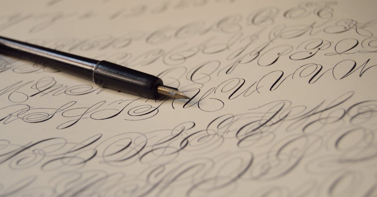
Learning the Modern Calligraphy Alphabet
The modern calligraphy alphabet is not a single, fixed set of letterforms. It is a framework — a set of basic shapes and stroke patterns that each calligrapher interprets through their own developing style. That said, there is a logical learning sequence that builds from simple strokes to complete letters to connected words.
Basic Strokes
Before writing any letters, practice the foundational strokes that compose them. These are the same strokes that underpin traditional pointed pen scripts, and they transfer directly into modern calligraphy:
- Full-pressure downstroke: A straight vertical stroke made with consistent, firm pressure. This trains steady hand pressure.
- Hairline upstroke: A thin line drawn upward with minimal pressure. This trains the light touch needed for thin connecting strokes.
- Overturn: A thin upstroke that curves over the top and transitions into a thick downstroke. This trains the pressure transition that defines calligraphic letters like “n” and “m.”
- Underturn: A thick downstroke that curves at the bottom and transitions into a thin upstroke. This appears in letters like “u” and “a.”
- Oval: A compound curve that combines overturn and underturn movements into a closed or nearly closed shape. This forms the basis of letters like “o,” “a,” “d,” and “g.”
- Ascending loop: A thin upstroke that loops at the top and returns as a thick downstroke. This appears in letters like “l,” “h,” and “b.”
- Descending loop: A thick downstroke that loops below the baseline and returns as a thin upstroke. This appears in letters like “g,” “y,” and “j.”
Practice each stroke in isolation until it feels comfortable, then begin combining them into calligraphy letters. The transition from strokes to letters should feel natural, not forced. If a letter feels difficult, identify which component stroke is weak and drill that stroke specifically.
Lowercase Letters
Start with lowercase letters. They are used far more frequently than uppercase, and their construction relies directly on the basic strokes you have practiced. Group letters by shared structure to make learning more efficient:
- Underturn group: i, u, t, w — built primarily on the underturn stroke
- Overturn group: n, m, v, x — built primarily on the overturn stroke
- Oval group: a, o, c, e, d, g, q — built around the oval shape
- Ascending loop group: l, h, k, b, f — letters that reach above the x-height
- Descending loop group: g, j, y, p, z — letters that extend below the baseline
In modern calligraphy, these letters do not need to match a historical exemplar. Your “a” might have a wider bowl than a Copperplate “a,” or your “g” might have an open descender rather than a closed loop. The goal is internal consistency — your letters should look like they belong to the same alphabet, even if that alphabet is uniquely yours. Refer to our beginner calligraphy alphabet guide for detailed letter-by-letter breakdowns.
Uppercase Letters
Uppercase letters in modern calligraphy offer significantly more creative freedom than lowercase. In traditional scripts, capitals have elaborate constructions with specific stroke orders. In modern calligraphy, uppercase letters are where personal style often shows most clearly. Some calligraphers create minimal, understated capitals that let the lowercase letters dominate. Others develop ornate, flourished capitals that serve as focal points.
A practical approach is to start with simplified versions of traditional Copperplate capitals, then gradually modify them. Reduce unnecessary loops, adjust proportions, add or remove flourishes, and experiment with different entry strokes. Keep legibility as your anchor — a beautiful capital is worthless if the reader cannot identify the letter.
Connecting Letters and Building Words
Individual letters are the vocabulary of calligraphy. Connecting them into words is the grammar. This is where modern calligraphy truly diverges from traditional scripts, because the connections between letters are where much of the style resides.
Entry and Exit Strokes
Every letter has an entry stroke (where your pen first touches the paper) and an exit stroke (where it leaves). In traditional calligraphy, these strokes follow prescribed patterns. In modern calligraphy, you have latitude to modify them. A shorter exit stroke produces tighter letter spacing. A longer, more curved exit stroke creates an airy, open feel. Consistency within a piece matters more than adhering to any particular convention.
Spacing
Letter spacing — the distance between individual letters within a word — is one of the subtlest and most important skills in calligraphy. Uniform mechanical spacing (equal distance between every pair of letters) actually looks uneven to the eye because different letter shapes create different amounts of visual space. The goal is optical evenness: the area of white space between each pair of letters should appear roughly equal, even though the physical distances vary.
This is a skill that develops through practice and observation. Write a word, step back, squint at it, and identify where the spacing looks too tight or too loose. Adjust and rewrite. Over time, your hand learns to make these adjustments automatically.
Bounce Lettering
Bounce lettering is one of the most recognisable features of modern calligraphy. Instead of placing every letter precisely on the baseline, certain letters are shifted slightly above or below it. This creates a rhythmic, playful quality — the letters appear to “bounce” along the line.
Effective bounce lettering is not random. It follows visual logic. Letters with descenders (g, y, p) naturally drop below the baseline, and exaggerating this drop creates bounce. Letters with short bodies (a, e, o) can be shifted slightly upward. The key is restraint. Too much bounce looks chaotic rather than intentional. Start with subtle shifts — a millimetre or two — and increase only when your eye has developed the ability to judge what looks balanced.
Varying Baseline
Related to bounce but distinct from it, a varying baseline means the overall trajectory of the text is not perfectly horizontal. The word might arc slightly upward, dip in the middle, or follow a gentle wave. This technique is common in modern calligraphy compositions, particularly for single words or short phrases displayed as standalone pieces. It adds movement and visual interest but requires careful planning to avoid looking unintentional.
Flourishing and Embellishment
Flourishes are the extended, decorative strokes that embellish calligraphic letters — the sweeping tails, looping ascenders, and ornamental extensions that transform functional lettering into something visually striking. In modern calligraphy, flourishing is one of the most appealing and most misused techniques.
The fundamental principle of good flourishing is restraint. A well-placed flourish draws the eye, adds elegance, and completes a composition. Too many flourishes compete with each other and obscure the letters they are meant to enhance. The best flourishing often occurs at the beginning of a first word, the end of a last word, or on descenders and ascenders that have open space around them.
Technically, flourishes should be executed with the same thick-thin stroke principle as the letters themselves: thick on downward curves, thin on upward curves. A flourish with uniform line weight looks flat and mechanical. A flourish with proper stroke contrast looks like a natural extension of the lettering.
Common flourish locations include the crossbar of a lowercase “t” (extended to the right), the descender of a “y” or “g” (looped widely below the baseline), the entry stroke of a capital letter (swept in from the left), and the exit stroke of a final letter (extended with a graceful curve). Practice each flourish type independently, then introduce them into your lettering selectively. Write the same word with no flourishes, one flourish, and three flourishes, and compare the results. In most cases, less is more.
Modern Calligraphy for Design Projects
Modern calligraphy has become a significant element in contemporary visual design. Its handmade quality provides warmth and personality that balances the clean precision of digital typography. Understanding where and how modern calligraphy is applied in professional contexts helps you develop your work with specific applications in mind.
Wedding Stationery
Wedding invitations, place cards, envelope addressing, menus, and signage remain the largest commercial market for modern calligraphy. Couples seek lettering that feels personal and elevated — qualities that modern calligraphy delivers naturally. The style ranges from refined and minimal (thin strokes, restrained flourishing, generous spacing) to romantic and ornate (dramatic stroke contrast, flowing flourishes, tight letter spacing). Building a portfolio of wedding-related pieces is one of the most direct paths to professional calligraphy work.
Branding and Packaging
Hand-lettered logos, product labels, and packaging designs use modern calligraphy to communicate authenticity, craft, and premium quality. Artisan food brands, beauty products, boutique retailers, and lifestyle brands frequently incorporate calligraphic elements into their visual identity. In branding contexts, calligraphy is typically refined extensively — the initial hand-lettered work is scanned, digitised, and adjusted for consistency and scalability while retaining the organic qualities of the original hand work.
Social Media and Content Design
Calligraphic quotes, hand-lettered headlines, and decorative text overlays are widely used across social media platforms. Modern calligraphy translates well to digital content because its visual texture stands out against the uniformity of typed text. Content creators and graphic designers use calligraphy for Instagram posts, Pinterest graphics, YouTube thumbnails, and digital products like printable art and planner inserts.
Editorial and Event Design
Modern calligraphy appears in magazine layouts, book covers, advertising campaigns, and event signage. In these contexts, it typically functions as a headline or accent element paired with a clean sans-serif or serif typeface for body text. The contrast between the organic calligraphy and the structured typeface creates visual tension that draws attention and establishes hierarchy.
Digital Modern Calligraphy
The intersection of modern calligraphy and digital tools has expanded significantly. Calligraphy is no longer confined to paper — it is created, refined, and distributed through digital workflows that range from simple scanning to fully digital creation on tablets.
iPad Lettering
The iPad with Apple Pencil has become a primary tool for many modern calligraphers. Apps like Procreate offer pressure-sensitive brushes that simulate the thick-thin response of pointed pens and brush pens. The advantages are significant: unlimited undo, instant colour changes, layers for experimentation, and no ink or paper costs. The tactile experience differs from pen on paper, and some calligraphers find the glass surface too slick, but screen protectors with a paper-like texture address this. iPad calligraphy is particularly practical for client work that requires revisions, as corrections that would mean starting over on paper take seconds on screen.
Vectorizing Hand Lettering
For branding, packaging, and any application that requires scalability, hand-lettered calligraphy needs to be converted to vector format. The typical workflow involves creating the calligraphy on paper, scanning or photographing it at high resolution, and tracing it in vector graphic design software like Adobe Illustrator. Auto-trace tools provide a starting point, but professional results usually require manual refinement of anchor points to achieve smooth, accurate curves that honour the original hand work.
An alternative workflow starts digitally in Procreate, exports the lettering as a high-resolution PNG, and traces it in Illustrator. This eliminates the scanning step and allows for more experimentation before committing to the vector conversion.
Modern Calligraphy Fonts
The popularity of modern calligraphy has fueled a vast market for modern calligraphy fonts — digital typefaces that mimic the look of hand-written calligraphy. High-quality calligraphy fonts use OpenType features like alternates, ligatures, and swashes to vary letterforms and simulate the natural variation of handwriting. They are useful for design projects where hiring a calligrapher is impractical or where the text needs to be editable, but they cannot fully replicate the organic quality of genuine hand lettering. Understanding this distinction is important: a font is a tool for design efficiency, while hand calligraphy is a craft that produces one-of-a-kind results.
Developing Your Personal Style
The ultimate goal of practising modern calligraphy is not to replicate someone else’s letterforms but to develop your own recognisable style. This takes time — typically months of consistent practice before a distinctive voice begins to emerge, and years before it matures into something fully realised.
Style develops through three overlapping processes. First, technical practice builds your control and expands the range of strokes, shapes, and connections you can execute reliably. Second, exposure to other calligraphers’ work — through books, social media, workshops, and exhibitions — feeds your visual vocabulary and helps you identify what you find beautiful. Third, deliberate experimentation pushes you beyond your comfort zone. Try different tools, different sizes, different speeds, different levels of flourishing. Write the same word twenty different ways and notice which versions resonate with you.
Avoid the trap of copying a single calligrapher’s style. It is natural to admire specific artists and to learn from their work, but your goal is synthesis, not imitation. Study many calligraphers, absorb what appeals to you from each, and let those influences blend through your own hand into something original. Your style will also be shaped by factors unique to you: the way you hold your pen, the speed at which you write, the letters you find easiest and hardest, and your aesthetic preferences across all visual domains.
FAQ
What is modern calligraphy?
Modern calligraphy is a contemporary approach to hand lettering that uses pointed pens or brush pens to create expressive letterforms with thick-thin stroke contrast. Unlike traditional calligraphy, which follows strict historical scripts with prescribed proportions and stroke orders, modern calligraphy encourages personal interpretation, irregular baselines, and stylistic freedom. It retains the core pressure-based technique of classical calligraphy but replaces rigid rules with personal expression.
Can I learn modern calligraphy without traditional calligraphy training?
Yes. Many successful modern calligraphers started directly with contemporary techniques rather than studying traditional scripts first. The essential skills — pressure control, consistent stroke quality, and understanding thick-thin contrast — can be learned through modern calligraphy drills and practice sheets. That said, studying even the basics of a traditional script like Copperplate provides a strong technical foundation and a deeper understanding of letterform structure. It is not required, but it is beneficial.
What pen is best for modern calligraphy beginners?
For pointed pen calligraphy, start with a Nikko G nib in a straight pen holder. It is firm, forgiving, and widely available. For brush pen calligraphy, the Tombow Fudenosuke (hard tip) is the most recommended first pen — its firm tip is easy to control while still producing clear thick-thin stroke contrast. Either tool is a valid starting point. Brush pens are more convenient and portable, while pointed pens offer a more traditional calligraphic experience with finer hairlines.
How long does it take to develop a personal calligraphy style?
Most calligraphers report that a recognisable personal style begins to emerge after three to six months of regular practice. “Regular” means at least several sessions per week, not daily five-minute efforts. However, a mature, fully developed style can take two or more years of consistent work. Style is not something you choose — it is something that develops organically as your technical skill, aesthetic preferences, and muscle memory converge. Patience with the process is essential.
Is modern calligraphy the same as hand lettering?
No, though the two overlap significantly. Hand lettering is a broad category that includes any hand-drawn letterforms — block letters, serif letters, shadow letters, and more. Modern calligraphy is a specific subset of hand lettering characterised by the use of a pressure-sensitive tool (pointed pen or brush pen) to write letters in flowing strokes with thick-thin contrast. The key difference is that calligraphy is written in continuous motions, while hand lettering is often drawn and constructed through multiple strokes and refinements.


