What Font Does Moriarty the Patriot Use?
If you searched for the Moriarty the Patriot font, you are likely drawn to that polished, aristocratic title, the one that feels as sharply tailored as the show’s gentleman-criminal himself. As with almost every anime logo, the wordmark is custom artwork, not a typeface you can install. The encouraging part is that its look comes from a familiar tradition, classic Victorian serifs and elegant display lettering, so free fonts can get you convincingly close. This guide reads the logo, explains the intent, and gives you a practical kit of look-alikes.
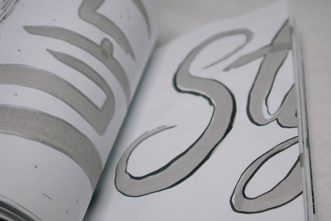
What font is the Moriarty the Patriot logo?
The Moriarty the Patriot logo is a bespoke wordmark made for the series. It reads as refined and dapper: clean classical serifs, elegant proportions and a confident, aristocratic poise. The contrast and detailing evoke the engraved type of a 19th-century English calling card or a finely printed broadsheet, exactly the period the show inhabits. The lettering is stylish and controlled, the visual signature of a brilliant, well-dressed mastermind operating in Victorian London.
As always, separate the protected wordmark from its style. The trademarked Moriarty the Patriot logo (Yuukoku no Moriarty) belongs to the rights holders; you cannot download it and should not clone it for commercial work. The aesthetic, classic serif with Victorian refinement, is fair to reference, and it is reproducible because it rests on a long typographic tradition. The bespoke spacing and tailored proportions are what keep an off-the-shelf font from matching it exactly.
What typeface is used in the anime?
On screen, Moriarty the Patriot leans into its Victorian-English atmosphere. Title cards, chapter framing and promotional materials favour elegant serif and refined display type that reads as period, literary and aristocratic, reinforcing the Sherlock-Holmes-era setting. The main title carries the custom wordmark, while functional text, credits, captions and the like, stays neutral and legible. Across broadcast and home-video releases the precise body faces vary, so treat any single named typeface for that text as unconfirmed rather than canonical.
For recreation, choose your layer. The hero title is the refined, dapper centrepiece. The supporting text is quieter and more practical. To capture the Moriarty feeling you generally want a classic, high-contrast serif for headings, possibly with an engraved or small-caps treatment for that calling-card elegance, plus a clean readable face for body text. That pairing delivers the aristocratic, Victorian-crime mood without imitating the protected logo.
Free fonts that look like the Moriarty the Patriot font
You cannot download the genuine wordmark, but free fonts capture its refinement, classic serif elegance with Victorian poise, very well. Aim for restraint and high craft rather than ornament overload.
| Use case | Moriarty the Patriot uses | Free alternative |
|---|---|---|
| Main title / hero word | Custom refined Victorian wordmark | Playfair Display or Cormorant |
| Elegant display moment | High-contrast aristocratic serif | Cinzel or Marcellus |
| Classic subtitle | Refined book serif | EB Garamond or Cardo |
| Captions and body text | Legible neutral type | Lora or Source Serif 4 |
For the closest hero match, a high-contrast serif like Playfair Display or an engraved, capital-led face such as Cinzel captures the dapper, aristocratic poise. Marcellus offers a slightly softer classical elegance if you want a gentler register. Pair the refined title with a readable serif like Lora for body text, and the system reads as cohesively Victorian and upscale.
- Favour high stroke contrast and generous spacing; both read as refined and engraved.
- Consider small caps or all-caps for the title to evoke a calling-card feel.
- Keep the palette restrained, deep neutrals and metallics suit the dapper mood.
Why does Moriarty the Patriot use this kind of type?
Typography establishes class and era, and this series is defined by both, a stylish reimagining of Professor Moriarty as a charismatic crusader in Victorian London. Modern or mechanical lettering would undercut that. A refined, classical serif signals aristocracy, intellect and period elegance, telling you this is a sophisticated crime drama with impeccable tailoring, not a gritty modern thriller. The dapper type mirrors the dapper villain.
There is also a branding payoff. A distinctive, elegant mark looks superb on manga covers, Blu-ray spines and merchandise, and custom lettering gives the franchise an asset no competitor can reuse. This refined, period approach echoes how heritage brands use classic serifs to project prestige. If that intersection of elegance and identity interests you, our roundup of famous brand fonts shows how classic type signals prestige across industries.
Can I use the Moriarty the Patriot font for my own project?
For personal, non-commercial use, recreating the vibe with free look-alikes is simple and low-risk. The constraint is the actual wordmark: it is protected intellectual property tied to the franchise, so cloning it for merchandise, paid templates, channel art or anything you sell can create trademark and copyright exposure. Referencing the classic-serif style is fine; reproducing the trademarked logo is not.
The professional path is to choose a freely licensed serif or elegant display, then confirm its licence actually covers your use, commercial work, embedding and logo creation often carry different terms, and many free fonts restrict exactly those uses. Our font licensing guide details the checks to run before you publish or sell anything.
If you enjoy refined, Victorian-flavoured mystery titles, compare this with our breakdown of the ornate, gothic Gosick font, which uses the same custom-logo and elegant-serif look-alike strategy in a darker, more antique key.
Frequently Asked Questions
Is the Moriarty the Patriot font free to download?
No. The Moriarty the Patriot title is a custom Victorian wordmark owned by the franchise, so there is no official font file. You can approximate it for free with classic serifs like Playfair Display or engraved faces such as Cinzel, then refine spacing and contrast to match the dapper, aristocratic feel.
What font is closest to the Moriarty the Patriot logo?
A high-contrast serif like Playfair Display or an engraved capital face such as Cinzel gets closest to the refined, Victorian title, with Marcellus as a softer option. Treat these as informed approximations of the bespoke logo rather than confirmed matches to the original artwork.
Why does Moriarty the Patriot look so elegant?
Because it reimagines Professor Moriarty as a charismatic, well-dressed crusader in Victorian London. The refined classical lettering signals aristocracy, intellect and period elegance, preparing you for a sophisticated crime drama with impeccable style rather than a gritty, modern thriller.
Can I use a Moriarty the Patriot-style font commercially?
You can use freely licensed serif or display look-alikes commercially only if their licences allow it, so read the terms first. You should not reproduce the actual trademarked wordmark on products you sell, since that risks trademark and copyright issues tied to the franchise.


