Movement in Graphic Design: Guiding the Eye Through Your Layout
Movement in graphic design is the principle that controls how a viewer’s eye travels through a composition. Unlike physical motion, movement in design is an illusion, a carefully orchestrated path that directs attention from one element to the next in a deliberate sequence. When movement is handled well, viewers absorb information in the order the designer intended, calls to action get noticed, and the overall experience feels effortless. When movement is absent or poorly managed, viewers feel lost, skip critical content, or abandon the design entirely.
This guide covers the mechanics of visual movement, established reading patterns that influence how people scan layouts, specific techniques for creating and controlling movement, and applications across editorial, web, and poster design. Whether you are laying out a magazine spread, designing a landing page, or composing a promotional poster, understanding movement will give you control over your viewer’s experience from the first glance to the last. [LINK: /graphic-design-principles/]
What Is Movement in Graphic Design?
Movement refers to the way a designer directs the viewer’s eye through a composition in a planned sequence. Every layout has a visual path, whether the designer created it intentionally or not. The goal of the movement principle is to make that path intentional, guiding the audience through the most important information first, then through supporting content, and finally to a desired action or conclusion.
Movement operates differently from physical motion, although the two share some vocabulary. A static poster does not literally move, but it can create a strong sense of directional flow through the arrangement of its elements. A website does not physically push the viewer’s eye downward, but its visual structure can make scrolling feel inevitable and natural.
Movement establishes narrative. By controlling the sequence in which information is encountered, movement turns a collection of elements into a story with a beginning, middle, and end. A fundraising poster might move the eye from a striking photograph, to a headline that explains the cause, to supporting statistics, and finally to a donation URL. Each step in that sequence builds on the previous one.
Movement reinforces hierarchy. Visual hierarchy tells the viewer what is most important; movement tells them in what order to process that hierarchy. The two principles are deeply connected. A design can have a clear hierarchy but poor movement if the viewer’s eye bounces randomly between high-priority elements instead of flowing smoothly from one to the next. [LINK: /contrast-in-graphic-design/]
Movement creates engagement. A composition with strong movement holds attention longer because it gives the eye a journey to follow. Designs that lack movement feel static and forgettable. Designs with purposeful movement draw the viewer in and keep them engaged through the entire composition.
Reading Patterns and Natural Eye Movement
Before you can direct movement in graphic design, you need to understand how people naturally scan visual information. Decades of eye-tracking research have identified several consistent patterns that influence how viewers approach a new layout.
The F-Pattern
The F-pattern describes how users typically scan text-heavy content, particularly on websites and in documents. The eye starts at the top left, scans horizontally across the top of the content, drops down, scans a shorter horizontal line, and then moves vertically down the left side. The resulting pattern resembles the letter F.
This pattern has significant implications for design. The top of a page and the left edge receive the most attention, while the lower right area receives the least. Designers working with text-heavy layouts, such as blog posts, news articles, and email newsletters, should place the most important information along the top horizontal line and use strong visual anchors along the left edge to keep readers engaged as they scan downward.
The F-pattern is not inevitable. It emerges when content lacks strong visual cues that redirect the eye. A layout with compelling imagery, clear section breaks, and varied visual elements will override the F-pattern and create a more thorough reading experience.
The Z-Pattern
The Z-pattern applies to layouts with less text and more visual content, such as landing pages, advertisements, and posters. The eye starts at the top left, moves horizontally to the top right, then diagonals down to the bottom left, and finally moves horizontally to the bottom right. The resulting path resembles the letter Z.
This pattern is particularly useful for designers because the diagonal sweep across the middle of the composition is a natural point for placing key content or imagery. Many effective landing pages use the Z-pattern deliberately: the logo sits at the top left, a navigation bar or headline spans the top, a hero image or key message occupies the diagonal, and a call-to-action button sits at the bottom right where the eye naturally comes to rest.
The Z-pattern can be extended into a zigzag for longer pages, where the eye continues the pattern in a series of Z-shapes as the viewer scrolls. This extended zigzag is the foundation of many long-form web designs.
The Gutenberg Diagram
The Gutenberg diagram divides a layout into four quadrants: the primary optical area (top left), the strong fallow area (top right), the weak fallow area (bottom left), and the terminal area (bottom right). According to this model, the eye naturally moves from the primary optical area to the terminal area along a diagonal path called the reading gravity.
The practical takeaway is straightforward. Place the most important information in the primary optical area and the desired action, such as a button, link, or sign-off, in the terminal area. Content placed in the strong and weak fallow areas receives less natural attention and may require additional visual cues, such as bold color or large imagery, to draw the eye.
The Gutenberg diagram is most relevant for layouts with evenly distributed, uniform content, such as forms, simple posters, and traditional print advertisements. Layouts with strong visual hierarchy and varied elements tend to override the Gutenberg pattern with their own movement structure.
Techniques for Creating Movement in Graphic Design
Understanding natural reading patterns gives you a foundation. The following techniques give you active tools for directing visual flow exactly where you want it to go.
Leading Lines
Leading lines are literal or implied lines within a composition that guide the eye along a specific path. They are the most direct technique for creating movement in graphic design. A road vanishing into the distance in a photograph, a row of dots connecting two elements, a long horizontal rule separating sections, even the edge of a building or the line of a horizon, all of these function as leading lines that pull the eye in a particular direction.
Leading lines do not need to be obvious. The alignment of text blocks, the edges of images, and the boundaries of color fields all create implicit lines that direct movement. A column of left-aligned text, for example, creates a strong vertical leading line along its left edge. A series of images arranged in a curve creates an arc that the eye follows naturally. The most sophisticated uses of leading lines are invisible to the viewer but deeply felt in the experience of moving through the design. [LINK: /alignment-in-graphic-design/]
Repetition with Variation
Repeating an element, such as a shape, color, or typographic style, across a composition creates a visual trail that the eye follows from one instance to the next. When each repetition introduces a slight variation, such as a change in size, color intensity, or orientation, the eye is motivated to continue along the trail to see what changes next.
Consider a series of circles that gradually increase in size from left to right across a poster. The repetition of the circle shape connects them as a group, and the size progression creates directional movement from small to large. The viewer’s eye is pulled along this progression naturally, without any explicit arrow or instruction.
This technique is particularly effective in infographics, timelines, and step-by-step layouts, where repeating a consistent shape for each step while varying the content creates a clear path through the information.
Size Progression and Scale
The eye is drawn to larger elements first and smaller elements second. By arranging elements in a deliberate size progression, you create a movement path from the largest element to the smallest. This is one of the most fundamental ways hierarchy and movement intersect.
A classic application is the typographic hierarchy of a magazine cover: the masthead and cover line are the largest elements, drawing the eye first. Secondary cover lines are smaller, drawing the eye next. The barcode, issue number, and fine print are smallest, receiving attention last. The size progression creates a clear, sequential reading experience without any explicit directional cues.
Scale can also create movement through contrast. A single large element surrounded by many small elements draws the eye immediately to the large element, after which the eye explores the smaller elements. This hub-and-spoke pattern is common in poster design and advertising.
Directional Cues and Implied Motion
Humans are highly attuned to directional signals. Arrows, pointing fingers, gaze direction in photographs, and the orientation of triangular or wedge-shaped forms all create strong directional movement. A photograph of a person looking toward the right side of a layout will pull the viewer’s eye in that direction. An arrow, even a subtle one formed by negative space, creates immediate directional flow.
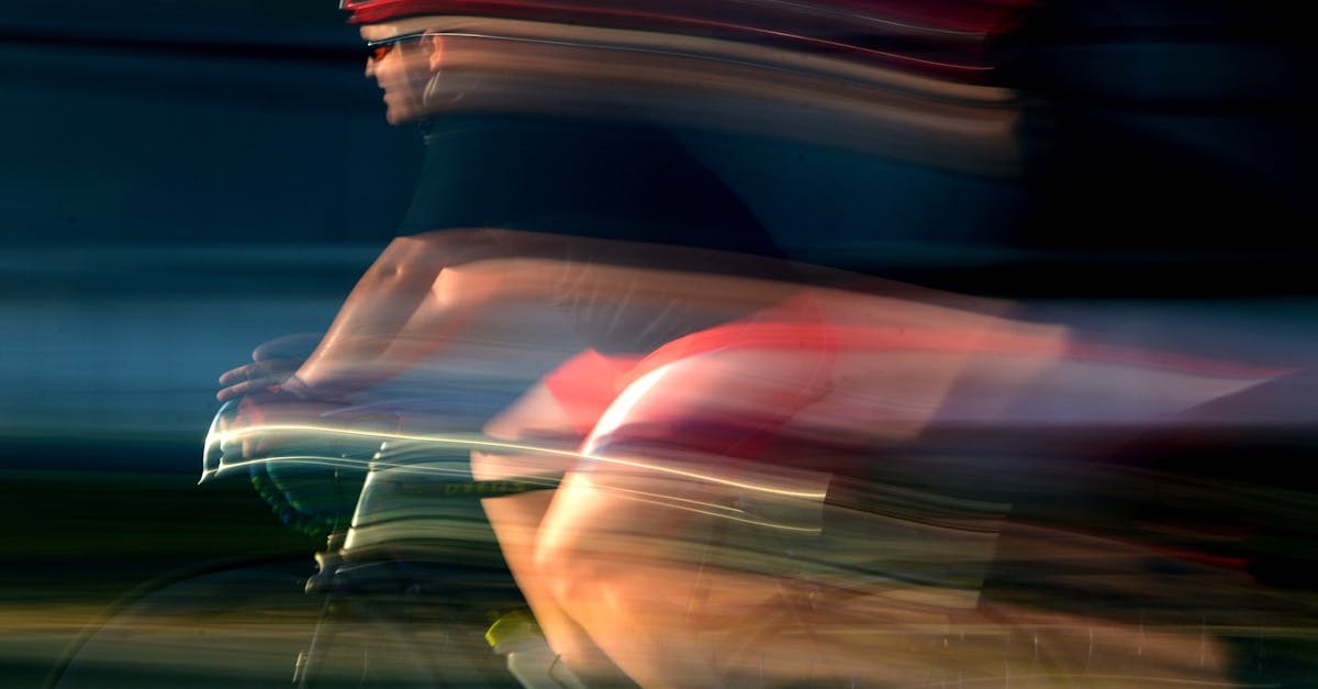
Implied motion, the suggestion that an element is in the process of moving, is another powerful tool. A photograph of a runner mid-stride implies forward motion. A typeface with strong italics suggests speed and direction. Graphic elements with tapered ends, motion blur, or trailing lines all suggest movement even though nothing on the page is actually moving. These cues create energy and dynamism in static compositions.
Diagonal Elements
Horizontal and vertical lines feel stable and static. Diagonal lines feel dynamic and active. Introducing diagonal elements into a composition, whether through tilted images, angled text, slashing graphic lines, or diagonal grid structures, immediately creates a sense of movement and energy.
Diagonals are effective because they imply instability. A horizontal line is at rest; a diagonal line appears to be in the process of falling or rising. This tension draws the eye and creates forward momentum. Diagonal compositions feel energetic, modern, and progressive, which is why they appear frequently in sports branding, technology marketing, and action-oriented editorial design.
The direction of the diagonal matters. In Western reading cultures, a line moving from the lower left to the upper right feels ascending and optimistic. A line moving from the upper left to the lower right follows the natural reading gravity and feels like forward progress. Opposing diagonals create tension and conflict, which can be useful for dramatic compositions but can also feel chaotic if overused.
Color and Value Gradients
A gradient, whether in color, value, or saturation, creates a natural sense of movement as the eye follows the transition from one state to another. A background that shifts from dark at the top to light at the bottom pulls the eye downward. A color transition from warm to cool across a composition creates lateral movement.
Gradients can be literal, as in a color gradient applied to a background or graphic element, or implied, as in a series of elements that gradually shift in color or value across the layout. Both create the sense that the composition is in motion, transitioning from one state to another, and the eye follows that transition naturally.
Movement in Editorial Design
Editorial design, encompassing magazines, newspapers, books, and journals, relies on movement at multiple scales: within a single page, across a two-page spread, and through the publication as a whole.
Page Flow
On a single page, movement guides the reader from the entry point, usually a headline or dominant image, through the body content and any supporting elements. Effective page flow uses a combination of typographic hierarchy, image placement, and white space to create a clear path. The headline draws the eye first, a subhead or introductory paragraph provides the next stop, body text fills in the detail, and pull quotes, sidebars, or images provide visual rest stops that re-engage the reader and prevent fatigue. [LINK: /what-is-typography/]
Drop caps are a classic editorial technique for creating movement. A large initial letter draws the eye to the beginning of a text block and provides a strong entry point. Once the reader begins the first line, the flow of the text itself carries them forward through the content.
Spread Design
A two-page spread presents unique movement challenges because the reader’s eye must navigate across the gutter, the center fold, without losing the visual thread. Successful spread design treats the two pages as a single unified composition rather than two separate layouts.
Common techniques for creating movement across spreads include running an image across both pages, using a headline that spans the gutter, creating a visual bridge with a graphic element that connects left and right pages, and establishing a clear dominant element on one page that leads the eye to a secondary element on the facing page. The strongest spreads have a clear visual entry point, a defined path across both pages, and a satisfying conclusion that prepares the reader to turn the page.
Sequential Flow Through a Publication
At the macro level, editorial designers create movement through an entire publication by varying the rhythm of pages. A sequence of text-heavy pages might be followed by a dramatic full-bleed photograph. A quiet, minimal layout might precede a dense, information-rich spread. This rhythm of tension and release, density and openness, keeps the reader engaged over dozens or hundreds of pages and gives the publication a sense of pacing similar to music or film.
Movement in Web Design
Web design adds a dimension that print design lacks: the scroll. Movement in web design must account for the vertical progression of content as the user scrolls, the placement of interactive elements, and the need to maintain engagement across a potentially very long page.
Scroll Flow
Effective web design creates a compelling reason to keep scrolling. The visual movement of a web page should feel like a guided descent through a narrative, with each section flowing naturally into the next. Techniques for creating smooth scroll flow include consistent directional cues pointing downward, content that is partially visible at the bottom of the viewport to entice further scrolling, and section transitions that use color shifts, angled dividers, or overlapping elements to maintain visual continuity.
The hero section at the top of a page establishes the initial movement. A strong headline paired with a downward-pointing arrow, a scroll indicator, or simply a layout that bleeds past the fold creates the expectation that more content lies below. Each subsequent section should fulfill the promise made by the previous one and hint at what comes next.
Call-to-Action Placement
Movement and conversion are directly linked in web design. A call-to-action button placed at the natural terminus of a visual flow will receive significantly more clicks than one placed against the natural movement of the page. This is why CTA buttons are commonly positioned at the bottom right of content sections, in the terminal area of the Gutenberg diagram, where the eye naturally comes to rest.
The most effective web layouts create multiple movement paths that all converge on the CTA. The headline draws the eye, supporting text and imagery guide it through the value proposition, social proof or testimonials reinforce the message, and the CTA sits at the end of this journey like a natural conclusion. Every element along this path should move the eye closer to the action the designer wants the user to take.
Animation and Micro-Interactions
Web design has the unique ability to incorporate actual motion through animation. Scroll-triggered animations, hover effects, loading transitions, and micro-interactions all create literal movement that guides attention and provides feedback. A card that lifts slightly on hover tells the user it is interactive. A section that fades in as the user scrolls to it draws attention to new content. A progress bar at the top of an article shows the reader how far they have come and how far they have to go.
The principle of movement applies to these animations just as it applies to static layout: the motion should serve a purpose, directing attention, providing feedback, or creating a sense of progression. Animation without purpose is distraction, not movement.
Movement in Poster Design
Poster design is perhaps the purest test of movement in graphic design because a poster must communicate its message in a single glance. The viewer may have only a few seconds of attention, so the movement path must be immediate, clear, and efficient.
Effective poster movement typically follows a three-step structure. The first element in the visual path is the hook, the dominant element that grabs attention. This might be a large image, a bold headline, or a striking graphic. The second element provides context, explaining what the poster is about. The third element delivers the essential information, such as a date, location, or URL, that the viewer needs to act on. [LINK: /typographic-posters/]
The best posters make this three-step movement feel inevitable. The viewer’s eye lands on the hook, flows naturally to the context, and arrives at the action information without any conscious effort. This effortlessness is the hallmark of well-designed movement.
Diagonal compositions are especially popular in poster design because they create immediate dynamism within a static format. A headline placed at the top left with event details at the bottom right, connected by a diagonal image or graphic element, creates a strong Z-pattern that moves the eye efficiently through all three stages of the message.
Real-World Examples of Movement in Design
Studying how accomplished designers handle movement provides practical insight that theory alone cannot offer.
Saul Bass Title Sequences
Saul Bass, one of the most influential graphic designers of the twentieth century, created film title sequences that are masterclasses in movement. His designs for Vertigo, Psycho, and Anatomy of a Murder use spiraling forms, slashing diagonals, and fragmented typography to create powerful directional flow. Although these are motion graphics rather than static compositions, the principles Bass employed, leading lines, directional tension, repetition with variation, apply directly to static design.
Swiss International Typographic Style
The Swiss Style, also known as the International Typographic Style, used grid-based layouts, asymmetric compositions, and strong typographic hierarchy to create clear, purposeful movement. Designers like Josef Muller-Brockmann and Armin Hofmann created posters where the eye moves through the composition in a precise, controlled sequence. The grid provides structure; the asymmetry provides direction. This combination of order and dynamism remains one of the most effective approaches to visual movement. [LINK: /balance-in-graphic-design/]
Apple Product Pages
Apple’s product pages are contemporary examples of movement in web design. Each page guides the viewer through a carefully choreographed scroll experience: a hero image establishes the product, scroll-triggered animations reveal features one by one, and the visual weight and scale of elements decrease as the page progresses from emotional hook to technical specifications. The movement is entirely vertical, following the scroll, but within each section, horizontal and diagonal elements create micro-movements that keep the experience dynamic.
David Carson’s Experimental Layouts
David Carson, known for his work with Ray Gun magazine in the 1990s, pushed movement to its expressive extremes. His layouts used overlapping text, unconventional reading directions, and fragmented imagery to create compositions where the movement path was deliberately challenging and exploratory. While his approach sacrificed conventional readability, it demonstrated that movement can be used not just for clarity but for emotional effect, forcing the viewer to actively engage with the composition rather than passively consume it.
Common Movement Mistakes and How to Fix Them
Understanding what goes wrong with movement is just as valuable as understanding what goes right.
No clear entry point. When every element in a composition competes for attention at the same scale and intensity, the viewer has no idea where to start. The fix is to establish a single dominant element that clearly outweighs everything else. Use size, contrast, or isolation to make one element the undeniable starting point. [LINK: /contrast-in-graphic-design/]
Dead ends. A dead end occurs when the eye reaches an element and has no clear path to the next one. This often happens when elements are isolated in corners or when there is a gap in the visual chain that connects elements. The fix is to ensure that every element in the composition points toward or connects with at least one other element, creating a continuous chain of movement.
Competing movement paths. When multiple strong directional cues pull the eye in different directions simultaneously, the result is confusion rather than flow. The fix is to establish one primary movement path and subordinate all secondary paths to it. If a diagonal image pulls left while a headline pulls right, one of those elements needs to be adjusted to create a unified direction.
Monotonous rhythm. Movement is not just about direction; it is also about pacing. A composition where every element is evenly spaced and identically weighted creates a monotonous rhythm that puts the eye to sleep. Vary the spacing, scale, and visual weight of elements to create a rhythm with moments of acceleration and rest, density and openness.
Frequently Asked Questions
What is the difference between movement and rhythm in graphic design?
Movement and rhythm are closely related but serve different functions. Movement in graphic design refers to the overall directional flow that guides the eye through a composition, the path from entry point to conclusion. Rhythm refers to the pattern of repetition and variation that creates a visual tempo within that path. Think of movement as the route and rhythm as the pace. A composition needs both: movement to establish where the eye goes, and rhythm to control how quickly it gets there and how the journey feels along the way.
How do I create movement in a design that has very little content?
Minimalist designs can still have strong movement. Use white space strategically to isolate your few elements and create a clear visual path between them. Position elements so that the negative space between them forms an implied line or direction. Use a single diagonal element or an asymmetric placement to break the static feeling of centered, symmetrical layouts. Even a subtle size difference between two elements creates movement from the larger to the smaller. The fewer elements you have, the more important their precise placement becomes for establishing flow.
Can movement in design be too fast or too aggressive?
Yes. Just as a film that cuts too quickly between shots can feel disorienting, a design with too many strong directional cues can overwhelm the viewer and create a frantic, uncomfortable experience. Movement should match the content and context. A concert poster for a punk band can use aggressive diagonals and clashing directional cues effectively because the chaos matches the energy of the subject. A financial services brochure needs calmer, more controlled movement that conveys stability and trustworthiness. The intensity of movement should always serve the message and the audience.
How does movement relate to balance in graphic design?
Movement and balance exist in productive tension. Balance creates stability and comfort; movement creates energy and direction. The best designs achieve both simultaneously: a balanced composition that nonetheless has a clear visual flow. Asymmetrical balance is particularly useful for combining these principles because it distributes visual weight unevenly, which inherently creates directional movement from heavier to lighter areas. A perfectly symmetrical composition can feel static because the balanced weight offers no reason for the eye to move in any particular direction. Introducing subtle asymmetry or directional cues within a balanced framework creates compositions that feel both stable and dynamic. [LINK: /balance-in-graphic-design/]


