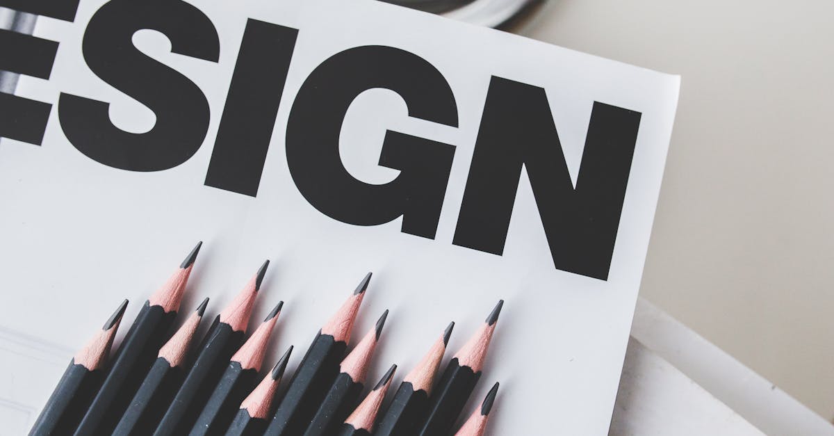
Mrs Eaves Font: The Romantic Baskerville Revival
The Mrs Eaves font is one of the most beautiful and most debated typefaces of the late twentieth century. Designed by Zuzana Licko and released through Emigre in 1996, it is a Baskerville revival that never tried to be a faithful Baskerville revival. Instead, Licko created something entirely her own: a typeface that borrows the skeleton of John Baskerville’s eighteenth-century masterpiece but reimagines it with wider proportions, a noticeably lower x-height, and a looser, more spacious rhythm that gives the letters room to breathe. The result is a serif that looks exquisite at large sizes and in display settings but struggles, by many accounts, in the role it was nominally designed for — body text.
That tension between beauty and functionality is exactly what makes the Mrs Eaves typeface so interesting. It became one of Emigre’s all-time bestsellers, beloved by graphic designers, book designers, and branding professionals who valued its elegance over strict typographic orthodoxy. It was also roundly criticized by type purists who argued that its loose spacing and low x-height made it inefficient and difficult to read at small sizes. Three decades after its release, Mrs Eaves remains a typeface that inspires strong feelings on both sides — and that alone says something about its power.
Mrs Eaves Font: Quick Facts
- Designer: Zuzana Licko
- Foundry: Emigre
- Release Year: 1996
- Classification: Transitional serif / Baskerville revival
- Weights: Roman, Bold, Italic, Bold Italic, plus Small Caps, Petite Caps, and extensive Ligature sets
- Best For: Book design, editorial, luxury branding, invitations, literary projects
- Price: Commercial license through Emigre
- Notable Users: Widely used in publishing, one of Emigre’s bestselling typefaces of all time
The Story Behind Mrs Eaves: Sarah Eaves and John Baskerville
The name of the Mrs Eaves font is itself a piece of typographic storytelling. It refers to Sarah Eaves, the woman who was John Baskerville’s housekeeper, then his live-in partner, and eventually his wife. The naming was a deliberate choice by Licko — a way of honoring the woman who worked alongside one of history’s most important type designers but whose contribution has been largely invisible in the historical record.
Sarah Eaves: The Woman Behind the Name
Sarah Eaves (nee Ruston) came to work as a housekeeper in John Baskerville’s household in Birmingham sometime in the 1740s. She was already married to Richard Eaves, who later abandoned her and their children. Sarah and John Baskerville began a relationship that was, for the time, scandalous — they lived together unmarried for many years while Sarah’s first husband was still alive. After Richard Eaves’s death in 1764, Sarah and John finally married.
What makes Sarah Eaves relevant to typographic history is that she was not merely a domestic figure in Baskerville’s life. She worked in his printing operation, and after John Baskerville’s death in 1775, Sarah managed his printing business and was responsible for overseeing the sale of his punches, matrices, and printing equipment. Without her stewardship of his legacy, Baskerville’s typographic materials might have been lost or scattered far earlier than they were.
By naming her typeface after Sarah rather than John, Licko made a quiet feminist statement. She drew attention to the invisible labor that surrounds so many great creative achievements — the partners, assistants, and collaborators whose names are not recorded in the histories. [LINK: /baskerville-font/]
Zuzana Licko and Emigre
Zuzana Licko is one of the most important type designers of the digital era. Born in Bratislava, Czechoslovakia, in 1961, she moved to the United States as a child and later studied architecture and computer programming at the University of California, Berkeley. In 1984, she co-founded Emigre with her husband, Rudy VanderLans. Emigre began as a cultural magazine and quickly evolved into one of the most influential type foundries of the late twentieth century.
Licko’s early typefaces — Oakland, Emigre, Matrix, Template Gothic — were revolutionary precisely because they embraced the limitations and possibilities of early digital technology rather than trying to replicate the forms of metal type. She designed with the pixel grid and the early Macintosh as her tools, creating typefaces that looked native to the digital world rather than like awkward translations of pre-digital designs.
By the mid-1990s, however, digital type technology had matured to the point where bitmap limitations were no longer a defining constraint. Licko turned her attention to the tradition of serif type design, and Mrs Eaves was the result — her personal interpretation of the typeface that many designers regard as the most refined serif ever created. [LINK: /famous-graphic-designers/]
Design Characteristics of Mrs Eaves
To understand what makes the Mrs Eaves font distinctive, it helps to understand where it departs from the Baskerville model it draws on. Licko did not set out to create a historically accurate revival. She set out to create a typeface that captured the spirit of Baskerville — its elegance, its refinement, its rational clarity — while making design choices that reflected her own aesthetic sensibility.
Wide Letter-Spacing: The Defining Trait
The most immediately noticeable characteristic of Mrs Eaves is its wide letter-spacing. Compared to Baskerville — or virtually any other text serif — Mrs Eaves sets noticeably loose. The letters do not huddle together in the tight, efficient formations that typographers typically expect of a text face. Instead, they stand apart with generous breathing room between them, creating a texture on the page that is airy and open rather than dense and compact.
This spacing is the feature that generated the most controversy. In practical terms, wide spacing means that Mrs Eaves takes up significantly more horizontal space than a standard text face, which means more pages per manuscript and higher printing costs for book-length projects. More importantly, the loose spacing disrupts the tight rhythm of letter-to-letter connections that aids reading fluency at small sizes. The eye has to work harder to group letters into words when the spaces between letters approach the spaces between words.
But the same feature that makes Mrs Eaves problematic as a text face is what makes it breathtaking as a display face. At larger sizes — headlines, titles, invitations, branding — that spaciousness becomes a design asset. Each letter is given enough room to be appreciated as a form, and the overall effect is one of quiet luxury and unhurried elegance.
Low X-Height
The x-height of a typeface — the height of lowercase letters like “a,” “e,” and “o” — is one of the most important factors in readability. Higher x-heights generally improve legibility at small sizes because the critical distinguishing features of lowercase letters are rendered larger. Most modern text faces are designed with relatively tall x-heights for exactly this reason.
Mrs Eaves moves in the opposite direction. Its x-height is noticeably lower than modern Baskerville revivals, which gives the typeface more pronounced ascenders and descenders relative to the body of the lowercase letters. This creates a more elegant vertical rhythm, with ascenders reaching high and descenders dropping low, but it also makes the lowercase letters themselves smaller relative to the overall point size. At body text sizes, this means the actual reading-critical letterforms are rendered smaller than they would be in a typeface like Libre Baskerville or even the standard system Baskerville. [LINK: /libre-baskerville/]
Elegant Proportions
Mrs Eaves has wider proportions than a typical Baskerville. The round letters are more generously shaped, the counters are more open, and the overall feeling is one of expansiveness. Combined with the wide letter-spacing and low x-height, this creates a typeface that occupies space gracefully rather than efficiently. Every design choice Licko made pushes in the same direction: toward beauty and atmosphere at the expense of economy and text-setting performance.
The Famous Ligature System
One of the most celebrated features of the Mrs Eaves typeface is its extensive collection of ligatures. While most serif fonts include the standard fi and fl ligatures (where the dot of the “i” or the ascender of the “l” would collide with the overhang of the “f”), Mrs Eaves goes much further. Licko designed a rich set of discretionary ligatures that includes ct, st, sp, and many other combinations — decorative joined letterforms that recall the calligraphic traditions of early printing.
These ligatures are not necessities of typesetting. They are ornamental, adding a flourish and personality to the text that makes Mrs Eaves feel handcrafted and historically resonant. In display settings and invitations, the ligatures are one of the typeface’s most appealing features, transforming ordinary words into objects of visual delight. The ligature sets became so popular that Emigre later released Mrs Eaves Just Ligatures, a standalone font consisting entirely of these decorative letter combinations.
Small Caps and Petite Caps
Mrs Eaves includes both small caps and petite caps — a distinction that is less common than it should be. Small caps in Mrs Eaves are designed to match the height of the lowercase x-height, as is conventional. Petite caps are slightly smaller, offering a subtler option for acronyms, abbreviations, and other situations where full-size capitals would be too prominent but standard small caps might still feel heavy. This level of typographic refinement is characteristic of Licko’s approach: thoughtful, detailed, and aimed at designers who care about the nuances of type setting.
The Controversy: Beauty vs. Function
No discussion of the Mrs Eaves font is complete without addressing the debate it sparked within the type community. Mrs Eaves became one of the most used typefaces of the late 1990s and early 2000s, particularly in book design, editorial work, and branding. It was everywhere — and not everyone was happy about it.
The Case Against Mrs Eaves
The criticism centered on a straightforward argument: Mrs Eaves performs poorly as a text face. Its loose spacing, low x-height, and wide proportions mean that it sets inefficiently (requiring more space to convey the same text) and that its readability at body sizes is compromised compared to more conventional alternatives. Type designers and typographers who valued functionality and reading performance argued that Mrs Eaves was being misused — applied as a body text face when it was better suited to display work.
Some critics went further, suggesting that Mrs Eaves represented a broader problem in design culture: the prioritization of surface beauty over functional performance, the tendency of designers to choose typefaces based on how they look rather than how they work. The argument was that a well-designed text face should be nearly invisible to the reader, facilitating the transmission of content without calling attention to itself, and that Mrs Eaves, with its distinctive spaciousness and decorative ligatures, was anything but invisible.
The Case for Mrs Eaves
Defenders of Mrs Eaves countered that the criticism missed the point. Licko never claimed she was designing a workhorse text face optimized for maximum efficiency. She was designing a typeface with a specific aesthetic vision — one that valued elegance, atmosphere, and visual pleasure. Judging Mrs Eaves against the criteria of a text face like Times New Roman or Minion is like judging a sports car by the fuel efficiency standards of a commuter sedan. The design goals are different.
Moreover, the designers who championed Mrs Eaves used it in ways that played to its strengths. At display sizes and in contexts where reading speed and economy were secondary to visual impact — wedding invitations, book covers, luxury brand identities, editorial headlines, literary magazines — Mrs Eaves was extraordinarily effective. Its beauty was not a flaw; it was the feature. [LINK: /what-is-typography/]
Licko’s Response: Mrs Eaves XL
Licko herself acknowledged the criticisms and, in 2009, released Mrs Eaves XL — a redesigned version with a larger x-height, tighter spacing, and proportions better suited to body text. Mrs Eaves XL addressed the practical concerns without abandoning the overall character of the original. It is a more functional text face while still being recognizably Mrs Eaves. The release of the XL version was, in a sense, a concession that the original worked better at larger sizes, but it was also a demonstration of Licko’s responsiveness as a designer and her willingness to evolve a design based on real-world use.
Mrs Eaves vs. Baskerville vs. Libre Baskerville
Because Mrs Eaves is rooted in the Baskerville tradition, designers often weigh it against other Baskerville-derived typefaces. Here is how the three most commonly compared options stack up:
| Feature | Mrs Eaves | Baskerville | Libre Baskerville |
|---|---|---|---|
| Designer | Zuzana Licko (1996) | John Baskerville (1757); various revivals | Pablo Impallari (2012) |
| X-Height | Low | Moderate | Tall (optimized for screens) |
| Letter-Spacing | Wide and loose | Standard | Standard to slightly loose |
| Proportions | Wide | Moderate | Moderate to wide |
| Stroke Contrast | Moderate | Moderate-high | Moderate |
| Text Performance | Weak at small sizes; excellent at display | Excellent at all sizes | Excellent on screen |
| Ligatures | Extensive decorative set | Standard fi/fl | Standard fi/fl |
| Price | Commercial (Emigre) | Bundled with macOS; commercial versions vary | Free (Google Fonts) |
| Best Use | Display, branding, editorial headlines, invitations | Body text, books, academic, corporate | Web body text, blogs, digital publications |
The key distinction is one of intent. Baskerville is the benchmark transitional serif — reliable, authoritative, and optimized for reading. Libre Baskerville is a modern interpretation designed specifically for screen readability, available for free through Google Fonts. Mrs Eaves is a romantic reinterpretation that prioritizes aesthetic impact over typographic efficiency. Choosing between them depends entirely on whether your project demands functional performance or visual atmosphere. [LINK: /baskerville-font/] [LINK: /libre-baskerville/]
Best Font Pairings for Mrs Eaves
The Mrs Eaves font pairs best with typefaces that respect its spacious, elegant character without competing with its distinctive personality. Because Mrs Eaves is inherently decorative and attention-grabbing, it works best when paired with quieter, more neutral partners. [LINK: /font-pairing/]
Mrs Eaves + Futura
Futura’s geometric precision and clean lines create a striking contrast with Mrs Eaves’s romantic warmth. This pairing works particularly well for editorial layouts and luxury print pieces, where Futura handles body text or navigational elements while Mrs Eaves commands the headlines.
Mrs Eaves + Gill Sans
Gill Sans is a British humanist sans-serif with enough warmth to complement Mrs Eaves without clashing. The historical resonance is fitting — both typefaces draw on British typographic tradition, and their combination produces a refined, literary aesthetic suitable for publishing and cultural institutions.
Mrs Eaves + Helvetica
The ultimate contrast pairing. Helvetica’s rationalist neutrality serves as a clean, functional counterpoint to the decorative warmth of Mrs Eaves. Use Mrs Eaves for display and Helvetica for body text, captions, and supporting typographic elements. The tension between romance and Swiss precision can be visually compelling.
Mrs Eaves + Avenir
Avenir is a geometric sans-serif with a softer, more humanistic touch than Futura. Its warmth harmonizes with Mrs Eaves’s character while providing the clean readability needed for supporting text. This pairing is well suited to branding projects, particularly in the lifestyle, beauty, and hospitality sectors.
Mrs Eaves + Trade Gothic
Trade Gothic’s slightly rough, no-nonsense character creates an appealing friction with Mrs Eaves’s elegance. This pairing works well for editorial design that wants to feel sophisticated but not precious — literary magazines, independent publishers, and cultural reviews.
Mrs Eaves + Proxima Nova
For digital projects that use Mrs Eaves in display contexts, Proxima Nova is a versatile sans-serif companion. Its large x-height and screen-optimized design ensure readability for body text, while its geometric-humanist hybrid character is neutral enough to defer to Mrs Eaves in the typographic hierarchy.
Mrs Eaves + Mrs Eaves Sans
Emigre released Mrs Eaves Sans as a companion to the serif, designed to share the same proportions and spacing philosophy. Pairing the serif and sans versions together creates a cohesive typographic system with built-in harmony — a ready-made solution for projects that need variety within a consistent visual voice.
Mrs Eaves + Scala Sans
Martin Majoor’s FF Scala Sans shares a similar design philosophy with Mrs Eaves — both are typefaces where aesthetic personality takes precedence over bland neutrality. Together, they create a warm, literary pairing with a distinctly European sensibility, ideal for book design, cultural institutions, and academic publishing.
Best Alternatives to Mrs Eaves
If Mrs Eaves is not the right fit for your project — whether due to licensing costs, readability requirements, or aesthetic preference — these alternatives capture some of its character while offering different trade-offs.
Baskerville
The obvious starting point. If you want the Baskerville skeleton without Mrs Eaves’s romantic reinterpretation, the standard Baskerville (bundled with macOS and available in various commercial digitizations) is a superb text face with excellent readability and timeless elegance. It lacks Mrs Eaves’s distinctive spaciousness and ligature system but excels where Mrs Eaves falters — in continuous body text. [LINK: /baskerville-font/]
Libre Baskerville (Free)
Pablo Impallari’s Libre Baskerville is a free, open-source Baskerville interpretation available through Google Fonts. It was specifically designed for web use, with a taller x-height and robust screen rendering. It is an excellent choice for digital projects that want a Baskerville flavor without any licensing cost. It does not have Mrs Eaves’s personality but offers reliable Baskerville elegance at no charge. [LINK: /libre-baskerville/]
Georgia
Matthew Carter’s Georgia is a transitional serif designed for screen reading. It shares Baskerville’s structural DNA in a form that was built from the ground up for digital use. Georgia is available on virtually every device and operating system, making it a dependable fallback for web projects. It is more workmanlike than Mrs Eaves but supremely functional.
Merriweather (Free)
Eben Sorkin’s Merriweather is a free serif typeface from Google Fonts that was designed for comfortable screen reading. Its generous x-height, sturdy serifs, and thoughtful spacing make it an excellent body text face for the web. It does not share Mrs Eaves’s romantic character, but it is one of the best free serif options available for digital projects that prioritize readability.
Cormorant Garamond (Free)
For designers who are drawn to Mrs Eaves’s decorative elegance but need a free option, Cormorant Garamond is worth considering. It is a display-oriented serif with high stroke contrast and a refined aesthetic that captures some of Mrs Eaves’s visual drama. Like Mrs Eaves, it is at its best in larger sizes. [LINK: /best-serif-fonts/]
When to Use Mrs Eaves
Understanding the strengths and limitations of the Mrs Eaves font is the key to using it well. Here are the contexts where it excels and where you should think twice.
Where Mrs Eaves Shines
- Book covers and title pages: The spacious elegance of Mrs Eaves is perfectly suited to display settings where each letter gets room to breathe.
- Wedding invitations and formal stationery: The decorative ligatures and romantic proportions make Mrs Eaves a natural choice for invitations, menus, and event materials.
- Luxury and lifestyle branding: Mrs Eaves communicates sophistication and refinement without the severity of a Didone serif. It is warm luxury rather than cold luxury.
- Editorial headlines and pull quotes: In magazine and editorial layouts, Mrs Eaves adds personality and visual interest to display text elements.
- Literary and cultural projects: The typeface’s historical resonance and aesthetic personality make it appropriate for projects connected to literature, art, and culture.
Where to Use Caution
- Long-form body text at small sizes: This is where Mrs Eaves’s limitations are most apparent. Its wide spacing and low x-height reduce readability and increase page count. Consider Mrs Eaves XL or a different Baskerville for body text.
- Screen-first digital projects: Mrs Eaves was designed for print. On screen, its fine details and loose spacing can be problematic, particularly at smaller sizes. For web body text, Libre Baskerville or Georgia are better choices.
- Space-constrained layouts: Because Mrs Eaves sets so wide, it is a poor choice for projects where space is at a premium — narrow columns, data-heavy layouts, or compact packaging.
Frequently Asked Questions
Is the Mrs Eaves font free?
No. Mrs Eaves is a commercial typeface available exclusively through Emigre. You must purchase a license from emigre.com to use it in any project. There is no free version of Mrs Eaves, and it is not available on Google Fonts or Adobe Fonts. Free alternatives with a similar Baskerville heritage include Libre Baskerville and Cormorant Garamond, both available through Google Fonts.
What is the difference between Mrs Eaves and Mrs Eaves XL?
Mrs Eaves XL is a 2009 redesign of the original Mrs Eaves with a larger x-height, tighter letter-spacing, and proportions better suited to body text. The original Mrs Eaves excels at display sizes but has readability limitations in small text. Mrs Eaves XL was Zuzana Licko’s response to those concerns — it retains the character of the original while improving its performance as a functional text face. If you plan to use Mrs Eaves for body copy, the XL version is the better choice.
Why is Mrs Eaves called Mrs Eaves?
The typeface is named after Sarah Eaves, who was John Baskerville’s housekeeper, partner, and eventually wife. Sarah worked in Baskerville’s printing operation and managed his business after his death. Zuzana Licko chose the name to honor the woman behind one of typography’s most important figures — acknowledging that creative legacies often depend on people whose contributions go unrecorded. The name is also a way of signaling that this is not a standard Baskerville revival but a personal reinterpretation with its own identity.
What type of projects is Mrs Eaves best suited for?
Mrs Eaves is best suited for display-oriented projects where visual elegance is the priority: book covers, wedding invitations, luxury branding, editorial headlines, literary magazines, and formal stationery. Its wide spacing and decorative ligatures make it exceptionally beautiful at large sizes. It is less well suited to long-form body text at small sizes, where its loose spacing and low x-height can hinder readability. For body text, consider Mrs Eaves XL or a standard Baskerville revival instead. [LINK: /best-serif-fonts/]


