What Font Does Mullard Use?
Searching for the mullard tubes font usually means you want the heritage wordmark from Mullard, the storied British valve maker now reissued for hi-fi and guitar players, not a generic sans you can grab. The honest answer is that the logo is custom lettering, not a single released typeface. The letters carry a bold, classic British character, with a confident, slightly condensed quality that matches a name with deep roots in the golden age of valves. Below we break down what the lettering actually is, why it suits Mullard’s heritage tone, and which free fonts get you closest legally.
What font is the Mullard logo?
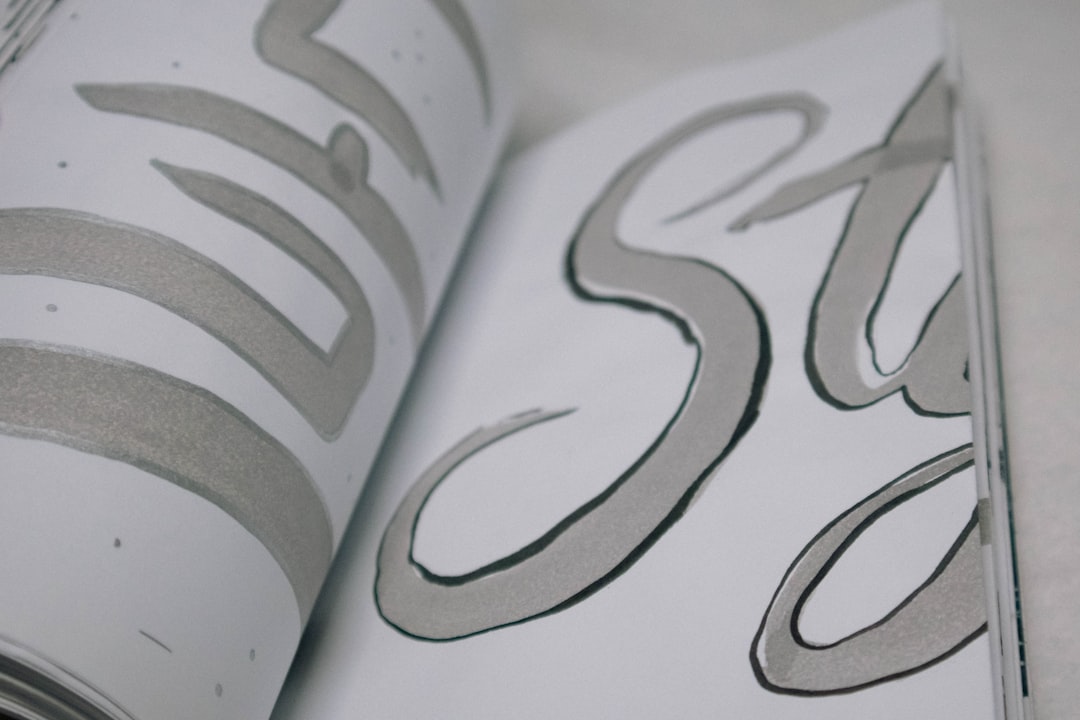
The Mullard logo is best understood as a heritage, custom lettering treatment, rather than a single installed font you can grab. The letters are bold, even, and confident, often with a slightly condensed, mid-century British character drawn for strong presence. That classic character is the whole identity: the wordmark looks established and authoritative rather than modern, with measured strokes that signal decades of valve-making history. The most memorable detail is how cleanly the bold lettering reads on a box or a glass envelope, holding its weight even at small sizes. As with most heritage brands, the characters were drawn, weighted, and spaced so the balance falls exactly where the original designers wanted it.
Because the mark descends from classic British branding, treat any precise font claim as an informed observation, not a confirmed spec. What we can say confidently is that it is not a famous commercial font dropped in unedited. The treatment is reminiscent of bold, slightly condensed mid-century sans lettering rather than any one downloadable file. If it were a stock typeface, collectors would have named it years ago, so treat the construction as bespoke heritage lettering tied to the brand’s identity.
What typeface does Mullard use in its branding?
Across reissue tube boxes, packaging, and dealer material, Mullard keeps its heritage custom wordmark while pairing it with clear, legible sans faces for body copy, tube types, and supporting material. The logo gets the bold treatment; functional text such as ratings, model numbers, and notes is set in a quieter sans so everything stays readable on a box or a screen. This split between a confident wordmark and neutral supporting type is standard for revived heritage brands.
So if your goal is to mirror the whole identity, you need two decisions: one bold, slightly condensed sans face for the logo-style headline, and one calm, well-spaced sans for the paragraphs and specifications. Setting body copy in the same heavy condensed weight as the logo is the most common mistake people make when chasing this heritage aesthetic.
Free fonts that look like the Mullard font
No free font will be an exact match, but several capture the bold, heritage British spirit well enough for a poster, a mockup, or a fan project. Bold names below are alternatives you can search for and license accordingly.
| Use case | Mullard uses | Free alternative |
|---|---|---|
| Main wordmark / headline | Custom bold condensed logotype | Oswald or Anton |
| Subheads / labels | Strong even sans | Archivo or Saira |
| Body / supporting text | Clean legible sans | Source Sans 3 or Roboto |
Oswald is a strong starting point for the wordmark because its bold, condensed character shares the logo’s confident, mid-century feel; scale it and tune the spacing to match. Anton gives an even heavier, more impactful tone if you want extra presence, and Archivo works well for subheads and labels, with solid letterforms that suit a heritage valve look. For clean supporting copy, Source Sans 3 and Roboto stay neutral and readable.
For the most authentic effect, keep the wordmark bold, even, and confident, with measured spacing so the letters feel heritage and substantial. The classic character is what makes the label read as “Mullard,” so the weight and spacing matter as much as the font, and no free font will recreate the exact brand mark for you. Work large, keep the spacing balanced, and let the letters breathe. A single download will always fall short until you build the full look yourself. For a British heritage valve contrast, see our Genalex Gold Lion font guide.
Why does Mullard use this kind of type?
The lettering is doing real branding work. Mullard is positioned around heritage, reliability, and the legacy of classic British valves, so its logo needs to feel bold, confident, and authentic rather than modern or delicate. Strong, even letterforms read as established and authoritative, exactly the mood the brand wants on a reissue box aimed at players and audiophiles chasing classic tone. A thin elegant face would feel wrong here, undercutting the authority that the heritage promise carries. The custom treatment balances impact and legibility, keeping the brand feeling timeless and recognizable.
The choice also primes buyers emotionally. Bold, even letters feel trustworthy and substantial, which suits a brand whose whole appeal is recreating classic valve sound and history. That heritage tone is hard to achieve with a careless stock font, because a generic face can read as ordinary rather than storied. A bespoke heritage wordmark lets the brand pitch the feel precisely, somewhere between bold and classic, which is exactly the register a reissue valve name wants.
Can I use the Mullard font for my own project?
You can recreate the style, but you cannot use the actual logo. The Mullard name and wordmark are trademarked branding owned by its current rights holder, so copying them for merchandise, a business, or anything implying affiliation is off-limits. Using a free bold look-alike for a personal, fan, or unrelated creative project is fine as long as you respect each font’s individual license. Our font licensing guide explains personal-versus-commercial use, and our famous brand fonts hub collects more logo type breakdowns. For a Russian-heritage valve contrast, our Svetlana tubes font guide is a good companion read.
Frequently Asked Questions
Is the Mullard font free to download?
No. The Mullard logo is custom lettering, not a released font, so there is no official file to download. Any “Mullard tubes font” you find is a fan recreation or look-alike. For the style, use free fonts like Oswald or Anton, keep them bold and condensed, and check each license before commercial use.
What font is most similar to the Mullard logo?
Oswald is among the closest free matches for the bold, condensed letterforms, with Anton a heavier alternative and Archivo a solid choice for labels. None is identical, since the logo is custom-styled and relies on its weight and spacing, but with the right tracking they get convincingly close for mockups and fan projects.
Why does the Mullard logo look so classic?
The Mullard mark descends from mid-century British valve branding, when logotypes were drawn with bold, confident, slightly condensed letterforms. The modern reissue keeps that heritage character deliberately to signal authentic vintage tone and history, which is why it feels older than a clean modern sans and why bold condensed fonts make the best free stand-ins.
Can I use a Mullard-style font commercially?
You can use a free look-alike font commercially if its license permits, but you cannot reproduce the trademarked Mullard wordmark or logo on products you sell. Set your own text in a free bold sans instead of copying the official logo, and verify both the font license and trademark rules first. Imitating a heritage mood is fine; reproducing the exact logo is not.