What Font Does Nerf Use?
The nerf font hits you the way the blasters do: fast, loud and impossible to ignore. Owned by Hasbro, Nerf has built an identity around foam-flinging action, and its chunky, capitalised wordmark is engineered to look like sport, speed and adrenaline. This guide breaks down the logo lettering, the brand’s wider type personality and the free fonts that get closest. For more like it, our famous brand fonts hub has dozens of teardowns.
What font is the Nerf logo?
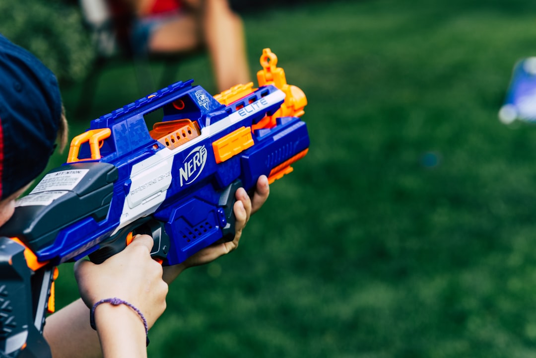
The Nerf logo is custom display lettering, not a font you can buy. “NERF” is set in heavy, all-caps letterforms with bold, blocky strokes and a slightly aggressive, athletic stance, frequently enclosed in a circular bullseye or badge that reinforces the target-and-blaster theme. The weight is the point: thick strokes read as powerful and energetic even at a distance. Because the mark is trademarked and purpose-built, no off-the-shelf font matches it exactly, and any “Nerf font” download is an approximation rather than the real artwork.
What is Nerf’s brand typeface?
Across packaging and campaigns, Nerf tends to favour bold, condensed and italicised sans-serifs that amplify motion and impact, though Hasbro has not published an official Nerf type specimen, so this is informed observation. The supporting type often leans into heavy weights and angled italics to suggest speed, paired with high-contrast colours like the brand’s signature orange. As a single product line under a larger company, Nerf’s typography is tuned more toward action-sport energy than the rounded warmth of its parent, which is exactly the contrast its audience responds to. If you are recreating that vibe, the trick is commitment: half-measures read as generic, but a genuinely heavy, slightly compressed face with hard, confident edges instantly signals the category. Pair it with bold orange accents and plenty of negative space, and even a stock display font starts to feel like it belongs in the action-toy aisle.
Free fonts that look like the Nerf font
You can capture Nerf’s high-impact, sporty energy with free fonts without copying the protected wordmark. Match the use case to the right typeface below.
| Use case | Nerf uses | Free alternative |
|---|---|---|
| Logo / wordmark | Heavy custom all-caps display | Anton or Archivo Black |
| Headlines | Bold condensed / italic sans | Oswald (bold) or Teko |
| Body / packaging | Strong sans-serif | Barlow Semi Condensed |
For more heavy-hitting options, see the best free sans-serif fonts.
Why does Nerf use this kind of type?
Nerf sells action, and its type has to feel like the product in motion. Heavy, blocky caps project strength and confidence, the visual equivalent of a loud “go.” Condensed and italic forms add velocity, tilting the eye forward as if the letters themselves are mid-flight. The bullseye badge ties the wordmark to the core play pattern of aiming and hitting a target, so the brand mark and the gameplay reinforce each other. Bold orange and high contrast finish the job, making the logo pop off a shelf crowded with calmer toy packaging. There is a behavioural logic here too. Nerf’s core promise is permission to be loud and physical indoors, and the type has to give buyers that same jolt of energy on sight. A timid, rounded wordmark would undercut the product before a child ever picked it up. By going maximally bold, the brand sets expectations honestly: this is a toy about momentum, competition and noise, and the letters say so before you read a single word.
Can I use the Nerf font for my own project?
The Nerf name, wordmark and bullseye badge are protected trademarks, so reproducing them commercially or in any way implying endorsement is not allowed. A similar bold font becomes a legal issue once paired with Nerf’s distinctive badge and colours. The safe route is to license a heavy display font and build your own original mark. Our font licensing guide covers what you can and cannot do. For a related teardown, see our Hot Wheels font guide.
Frequently Asked Questions
Is there an official Nerf font download?
No. The Nerf wordmark is custom artwork and has never been published as a retail font. Anything online labelled “Nerf font” is a fan recreation or an unrelated heavy display typeface renamed for search traffic. For legitimate projects, license a bold display font like Anton or Archivo Black and set it in caps rather than chasing the exact mark.
What font is closest to the Nerf logo?
Anton and Archivo Black are the closest free matches for the heavy, all-caps punch of the Nerf wordmark. If you want more of the condensed, sporty italic feel seen on packaging, Oswald or Teko in bold weights work well. None replicate the badge artwork, but they capture the aggressive, athletic energy convincingly.
Why is the Nerf logo in a circle?
The circular badge evokes a bullseye, directly referencing the aiming-and-hitting core of Nerf play. It frames the wordmark, makes the mark instantly recognisable on packaging, and ties the brand visually to its blasters and targets. The badge is part of the trademarked identity, so it should not be reproduced on commercial products.
Is the Nerf font italic?
The primary wordmark is typically upright heavy caps, but Nerf’s wider packaging and sub-brand typography frequently uses bold italics to suggest speed and motion. If you are recreating the energetic look, adding a slight italic to a heavy display font like Anton helps capture that forward-leaning, action-sport feel.
Can I use a Nerf-style font on my own product?
You can use a generic heavy display font you have licensed, but you cannot use Nerf’s protected wordmark, bullseye badge or any design that implies official affiliation. Keep your branding distinct and original, confirm your font permits commercial use, and review the licensing guide before you sell anything.


