Neutral Color Palette: Understated Elegance in Design
A neutral color palette is the foundation upon which the most sophisticated designs are built. Neutrals, encompassing the full spectrum from pure white through grays, beiges, taupes, and tans to deep charcoal and black, provide structure, breathing room, and quiet confidence that allow content to shine. Far from being boring or safe, a well-constructed neutral palette demonstrates design maturity and an understanding that restraint can be more powerful than saturation. Working with neutrals effectively requires the same color harmony knowledge as any chromatic palette, and understanding how neutrals relate to the color wheel reveals the subtle undertones that make each neutral unique.
What Defines the Neutral Color Family
Neutrals are colors with very low saturation that do not compete with chromatic hues for attention. In their purest form, neutrals are achromatic: the black-white-gray scale with zero color content. In practice, most neutrals used in design carry subtle warm or cool undertones. A warm gray has a faint brown or yellow tint. A cool gray has a blue or green tint. Beige, taupe, cream, ivory, and similar colors are warm neutrals with discernible but restrained hue content.
The psychology of neutral colors centers on sophistication, balance, and professionalism. Neutrals communicate that a brand or design does not need color to make its statement. This restraint is itself a message: it suggests confidence, quality, and an understanding that the product, content, or experience speaks for itself. Neutrals also communicate timelessness because they do not tie a design to any color trend.
Culturally, neutrals carry associations with luxury across the globe. Minimalist design traditions from Japan, Scandinavia, and continental Europe all prioritize neutral palettes. In fashion, neutral wardrobes signal sophistication and taste. In architecture, neutral interiors suggest premium quality and considered design. In branding, neutrals position a company as established and refined.
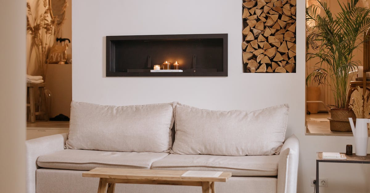
The neutral family is broader than it initially appears. It includes true achromatics like gray and silver; warm neutrals like beige, tan, cream, ivory, sand, and champagne; cool neutrals like slate, pewter, and blue-gray; and borderline neutrals like taupe, greige, and mushroom that sit at the intersection of warm and cool. Each of these carries a distinct mood while remaining functionally neutral in a design context.
Building a Palette with Neutrals
Neutral palettes demand precision because the differences between shades are subtle but impactful. A warm ivory background reads entirely differently from a cool light gray background, even though both function as neutral ground. Start by committing to a temperature direction: warm neutrals or cool neutrals. Mixing warm and cool neutrals without intention creates discord that viewers feel even if they cannot articulate it.
Within your chosen temperature, build a value ladder of at least four to five shades from light to dark. For a warm neutral palette, this might progress from ivory through sand to warm taupe to mocha to espresso. For a cool neutral palette, the progression might move from off-white through silver to mid-gray to slate to charcoal. This value range provides the hierarchy and contrast necessary for functional design.
Accent colors play a special role in neutral palettes. A neutral palette with a single, carefully chosen accent color is one of the most elegant and effective approaches in design. The accent might be a muted blue for complementary contrast against warm beige, a soft sage for an organic feel, a dusty rose for warmth and femininity, or a rich burgundy for drama. The accent should occupy no more than ten to fifteen percent of the visual space, preserving the neutral foundation while adding focal interest.
Texture becomes essential in neutral palettes because it replaces hue variation as a source of visual interest. Paper textures, fabric overlays, subtle patterns, and material photography all add richness to neutral designs. Without textural variation, all-neutral designs risk feeling flat, but with it, they achieve the tactile elegance that makes neutrals so compelling.
Neutrals in Graphic Design
In editorial design, neutral palettes create the conditions for content to command attention. Prestigious publications, literary journals, and art books frequently rely on neutral color systems because the words and images are the stars, not the layout colors. A warm cream background with charcoal text and a single accent color for pull quotes creates a reading experience that feels both luxurious and effortless.
Packaging design uses neutrals to communicate premium quality and minimalist sophistication. Luxury beauty brands, premium spirits, and high-end fashion houses often package products in neutral color schemes, using material quality like heavyweight paper, embossing, and metallic foils to compensate for the absence of chromatic color. This approach communicates that the brand’s confidence lies in its product quality, not its packaging volume. See our graphic design examples for more on neutral luxury packaging approaches.
In poster and print design, neutrals can create striking impact through contrast and scale. A typographic poster using only black, white, and one gray shade can be more arresting than a full-color alternative because it forces the viewer to engage with form and message rather than being seduced by color. Analogous neutral groupings, using a range of warm grays or a progression of taupes, create subtle depth that rewards close viewing.
Photography-driven design particularly benefits from neutral palettes because neutral layouts allow photographs to provide all the color content. Fashion lookbooks, real estate marketing, and portfolio presentations often use neutral frameworks to showcase imagery without chromatic competition.
Neutrals in Branding
Neutral branding occupies the premium end of the market positioning spectrum. Brands that commit to neutral palettes signal confidence, maturity, and a focus on quality over volume. This positioning attracts discerning consumers who value design, craftsmanship, and understated elegance.
A brand strategy built on neutrals works particularly well for luxury fashion and accessories, architectural and interior design firms, premium hospitality and real estate, legal and financial advisory services, high-end beauty and fragrance brands, and artisan food and wine producers. These categories share an audience that reads visual restraint as a positive quality indicator.
When branding with neutrals, differentiation comes from specificity. Simply using gray or beige is not a brand strategy. The specific neutral shade, its undertone, and how it interacts with typography, logo design, and secondary elements creates the distinctive identity. A greige with pink undertones paired with a modern sans-serif font communicates a very different brand from a blue-gray with a traditional serif, even though both are technically neutral palettes.
Neutral brands must also consider how their palette translates to digital environments. Neutrals that look refined in print can appear dull on screen if not adjusted for digital color spaces. Screen neutrals often benefit from very slight saturation increases that are imperceptible individually but create warmth and interest that pure desaturated values lack.
Neutrals in Web and UI Design
Neutral palettes are the backbone of most web and interface design, even when chromatic accent colors are present. The majority of any digital interface is neutral: backgrounds, text, borders, shadows, and structural elements. Mastering neutral design for digital means understanding how subtle value and temperature differences affect usability and mood.
For backgrounds, the choice between warm and cool neutrals shapes the entire user experience. Warm off-white backgrounds (#FAF8F5 or similar) feel inviting and reduce the harshness of extended reading. Cool light gray backgrounds (#F5F5F5 or similar) feel modern and clean. Pure white (#FFFFFF) provides maximum contrast for accessibility but can feel clinical without softening through subtle shadows and generous spacing.
For text, neutral palette choices are critical. Pure black text (#000000) on pure white backgrounds creates maximum contrast but can cause eye strain during long reading sessions. A near-black with warm undertones (#2D2D2D or #333333) is more comfortable while maintaining excellent readability. Gray text should be tested carefully: light grays on white backgrounds frequently fail WCAG accessibility requirements. Body text should never be lighter than about #595959 on white backgrounds to meet the 4.5:1 contrast ratio.
Neutral palettes in UI design create space for content-first experiences. News platforms, reading apps, portfolio sites, and e-commerce stores benefit from neutral frameworks because products, articles, and images provide the color while the interface remains unobtrusive. For call-to-action elements in neutral interfaces, a single accent color with sufficient contrast creates clear focal points against the neutral canvas.
Dark mode has expanded the neutral palette for UI designers. Dark neutral backgrounds in the #1A1A1A to #2D2D2D range paired with off-white text create comfortable evening reading environments. Warm dark neutrals feel more inviting than pure black, and layered gray values can create card-based layouts with subtle depth distinctions even within a narrow value range.
Sample Neutral Color Palettes
Warm Linen Palette
This palette captures the warmth of natural textiles and sunlit interiors. The primary shade is Linen (#FAF0E6), a warm off-white with yellow undertones that feels inviting and organic. It pairs with Warm Sand (#C9B99A) for tonal depth, Camel (#C19A6B) for mid-tone warmth, and Espresso (#3C2415) for rich contrast. This combination suits luxury hospitality brands, artisan bakeries, and interior design firms seeking timeless warmth without chromatic color.
Cool Concrete Palette
Leaning into cooler tones, this palette feels architectural and contemporary. The anchor is Light Gray (#D3D3D3), a true neutral with balanced temperature. It combines with Silver (#C0C0C0) for metallic modernity, Pale Slate (#94A3B8) for cool depth, and Anthracite (#293241) for dramatic darkness. This scheme works for architecture firms, technology companies, and contemporary art galleries where precision and modernity define the brand.
Muted Greige Palette
For the sophisticated middle ground between warm and cool, this palette centers on Greige (#B8A99A), a gray-beige blend that sits perfectly between temperatures. It pairs with Alabaster (#F2EDDC) for warm lightness, Mushroom (#917B73) for organic depth, and Dark Granite (#3A3633) for grounding contrast. Fashion brands, premium cosmetics companies, and editorial publishers will find this palette effortlessly elegant and endlessly versatile.
Bold Monochrome Palette
When neutrals need to make a statement, this high-contrast achromatic palette delivers. It leads with Pure White (#FFFFFF) paired directly against Jet Black (#0A0A0A) for maximum contrast. Mid-tones are provided by Steel Gray (#71797E) and Silver Mist (#B0B7BF). This scheme is engineered for luxury fashion brands, contemporary design studios, and architectural firms where the absence of color is itself the design statement.
Frequently Asked Questions
How do I make a neutral palette feel interesting rather than bland?
Introduce variety through value contrast, ensuring a wide range from very light to very dark within your neutral selection. Add texture through paper stocks, material photography, or subtle digital patterns. Include one carefully chosen accent color for focal points. Invest in strong typography, as neutral palettes shift visual interest to letterforms and layout. Finally, pay attention to undertones: the subtle warmth or coolness within each neutral creates richness that pure grays cannot achieve.
What is the difference between warm neutrals and cool neutrals?
Warm neutrals contain subtle undertones of yellow, orange, or pink. They include colors like cream, beige, tan, camel, and warm gray. They feel inviting, organic, and traditionally elegant. Cool neutrals contain subtle undertones of blue, green, or violet. They include colors like silver, slate, blue-gray, and cool charcoal. They feel modern, architectural, and professionally clean. Mixing temperatures without intention creates visual dissonance, so commit to one direction unless you are deliberately creating tension.
Are neutral palettes appropriate for all industries?
Neutral palettes work best for industries where sophistication, trust, and premium quality are primary brand values: luxury goods, professional services, hospitality, architecture, and high-end fashion. They are less effective for industries that rely on excitement and energy, such as children’s products, entertainment, fast food, and sports brands. However, neutrals can serve any industry as a secondary or background palette when paired with appropriate accent colors.
How do I ensure accessibility in a neutral-only design?
Test all text-background combinations against WCAG 2.1 contrast standards. Use dark neutrals for body text rather than mid-range grays. Avoid placing mid-tone neutrals against each other for text, as the contrast is usually insufficient. For interactive elements, ensure buttons and links are distinguishable through contrast, not just color. Consider using slightly darker or bolder weights for important text elements. Dark mode interfaces should use off-white rather than pure white text to reduce glare and eye strain.


