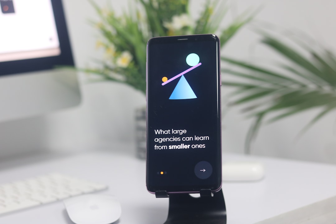
Onboarding Screen Design: Patterns and Tips
Onboarding design is the make-or-break stretch between download and habit. In the first 60 seconds a user decides whether your app is worth their attention, and a bloated, permission-hungry welcome flow is one of the fastest ways to lose them. Done well, onboarding shows value immediately, asks for almost nothing up front, and gets people to their first win fast. This guide covers the patterns that work and the timing decisions that quietly determine retention.
Onboarding sits inside the larger discipline covered in our complete app design guide. Read that for context on layout and platform conventions, then use this piece for the welcome flow itself.
What Onboarding Is Actually For
Onboarding is not a tutorial and it is not a tour of your settings menu. Its job is to bridge the gap between why someone downloaded the app and the moment they get value from it. Everything else is friction. Before designing a single screen, write down the activation moment — the first meaningful thing a user does that proves the app’s worth — and make the entire flow point at it.
If your activation moment is “sent first message” or “created first playlist,” your onboarding should remove every obstacle between launch and that action, not add screens in front of it.
Core Onboarding Patterns
Most successful flows are built from a small set of recognizable patterns. You will usually combine two or three, not all of them.
- Benefit-led screens — two to four screens that sell outcomes, not features (“Find quiet cafes near you,” not “Geolocation enabled”). Keep copy to a headline and a line of support text.
- Progressive disclosure — reveal complexity only as it becomes relevant, instead of front-loading every option on screen one.
- Contextual tooltips — short, in-place hints that fire when a user first encounters a feature, rather than a separate tutorial.
- Setup / personalization — a few targeted questions that tailor the experience, but only when each answer visibly changes what the user sees next.
- Empty-state onboarding — using the first empty list or dashboard itself to guide the next action, which keeps users inside the real product.
Always Let People Skip
Make onboarding skippable. A visible “Skip” affordance is not an admission of weak design; it is respect for returning users, power users, and anyone who already knows what they want. Forcing people through carousels they cannot dismiss reliably increases drop-off. Provide skip, remember that the user skipped, and never trap them in a flow with no exit.
Permission Timing: The Single Biggest Lever
Where and when you ask for permissions matters more than almost any visual choice. The mistake is requesting notifications, location, and contacts on the first screen, before the user understands why. Both Apple’s Human Interface Guidelines and Material Design push toward in-context permission requests: ask at the moment the permission is needed, framed by the benefit.
- Let the user reach the feature that needs the permission.
- Show a short, honest explanation of why you are asking and what they get.
- Only then trigger the system permission dialog.
This “priming” step before the OS prompt dramatically improves opt-in rates, because the system dialog appears only after the user already wants the outcome. Asking cold, on launch, is the surest way to a permanent denial.
Reduce Friction at Sign-Up
If your app requires an account, treat sign-up as part of onboarding and minimize it. Offer a way to explore before registering when possible, support platform sign-in (Sign in with Apple, Google) to avoid typing, and ask only for fields you genuinely need today. Every extra field is a place to abandon. Where you can defer account creation until after the user has seen value, do it.
Copy and Visual Craft
Onboarding copy should be short, concrete, and outcome-focused. Replace feature jargon with the result the user cares about. Visually, keep each screen calm: one clear illustration or product preview, a headline, a line of support text, and a single primary action. Use your UI kit so onboarding components match the rest of the app and inherit the same type and color tokens — onboarding that looks like a different product erodes trust. If you have not built one yet, see our explainer on UI kits and how to use them.
Progress and pacing
For multi-step flows, show progress with dots or a slim progress bar so users know how much remains. Keep the number of steps honest and low — three to four screens is plenty for most apps. If you find yourself adding a fifth and sixth screen, that is usually a sign the product is too complex to explain, and the fix belongs in the product, not the onboarding.
Measure and Iterate
Onboarding is one of the highest-leverage things to test. Instrument each step and watch where people drop off, then attack the worst step first. Useful signals include completion rate per screen, time to the activation moment, and permission opt-in rates. Treat the flow as a living surface you refine, not a one-time deliverable.
Personalization Without the Interrogation
Personalization can lift activation, but only when it pays for itself immediately. If you ask a setup question, the answer should visibly change what the user sees on the very next screen. Asking someone to pick interests, set a goal, or choose a plan is justified when it tailors their first real experience; it is wasteful when the answers disappear into a database and the app looks identical regardless. A good test: for every onboarding question, ask “what does the user get back right now for answering this?” If the honest answer is “nothing yet,” cut the question or move it deep into settings where motivated users can find it later.
Keep personalization choices simple and visual where you can — a grid of tappable options beats a wall of checkboxes. And always provide a sensible default so users who skip still land somewhere reasonable rather than an empty, unconfigured app.
Onboarding for Returning and Updated Users
Onboarding is not only for first-time users. When you ship a significant new feature, a brief, dismissible spotlight or a single contextual tooltip can introduce it without forcing the whole welcome flow again. The rules are the same: keep it short, make it skippable, and trigger it in context rather than dumping a changelog in the user’s face on launch. Respect that returning users already know your app; the lightest touch that surfaces the new value is almost always the right one. Never replay the full first-run experience after an update — it reads as a bug and frustrates loyal users.
Common Onboarding Mistakes
- Requesting all permissions on the first screen, before showing value.
- A long, unskippable carousel of feature screenshots.
- Selling features instead of outcomes.
- Forcing account creation before the user can try anything.
- An onboarding flow that visually clashes with the actual app.
- No analytics, so you have no idea which step is bleeding users.
Once the welcome flow lands users inside the app, navigation takes over. Make sure the destination is just as smooth with our guide to mobile navigation design patterns.
Frequently Asked Questions
How many onboarding screens should an app have?
For most apps, three to four screens is the sweet spot — enough to communicate value without becoming a chore. If you need more, the product is probably too complex to explain up front. Always make the flow skippable and point it at the user’s first meaningful action.
When should I ask for app permissions?
Ask in context, at the moment the permission is actually needed, not on launch. Show a brief explanation of the benefit first, then trigger the system dialog. This priming step substantially raises opt-in rates because users already understand why you are asking and what they receive.
Should onboarding be skippable?
Yes. A visible skip option respects returning and experienced users and reduces drop-off. Forcing everyone through an unskippable carousel frustrates people who already know what they want. Let users skip, remember the choice, and never trap them in a flow with no clear exit.
What is progressive disclosure in onboarding?
Progressive disclosure means revealing features and complexity gradually, as they become relevant, instead of overwhelming users on the first screen. It keeps early screens simple, surfaces advanced options only when needed, and lets people reach their first success quickly before learning the rest of the app.
What is the goal of good onboarding design?
The goal is to get users to their activation moment — the first action that proves the app’s value — as fast as possible. Strong onboarding removes friction, sells outcomes over features, asks for minimal information, and times permission requests well, all of which improve early retention.