What Font Does Outlast Use?
The Outlast font nails its asylum-horror tone before you even hit play: blunt red capitals on a black field, scored as if scratched into metal or skin. So what typeface is it? The honest answer is that the logo is custom lettering, not a font you can buy. Below we separate the trademarked wordmark from the type you see in menus and night-vision HUD, then list free fonts that get you close.
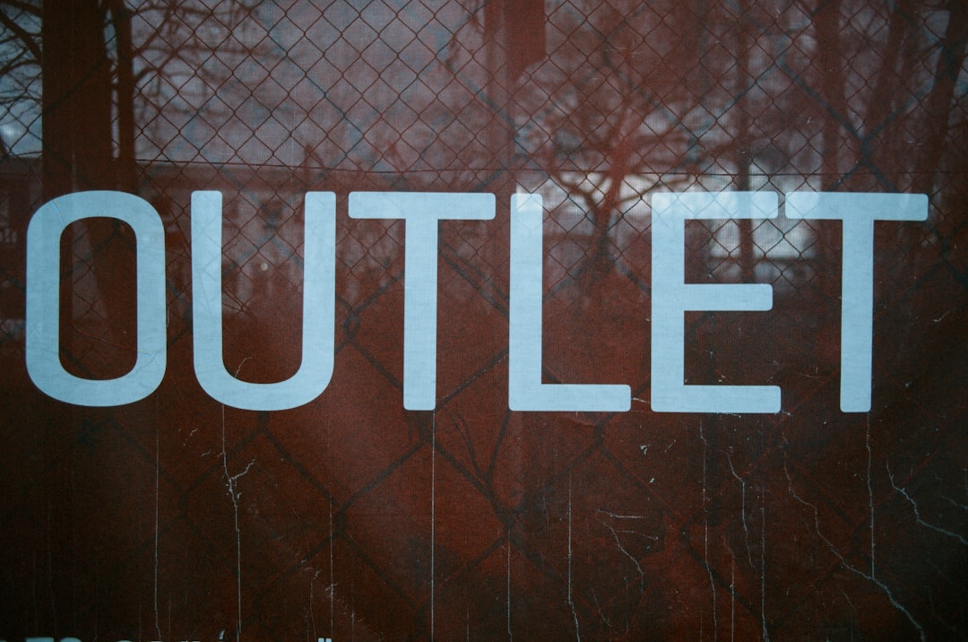
What font is the Outlast logo?
The logo is bespoke artwork built for the franchise by Red Barrels rather than a stock font dropped into a layout. The base is a heavy, condensed, no-nonsense capital letterform, and the horror comes from the scratched, scored treatment laid over it. We have not seen the studio publish a named source typeface, so any single-font claim should be treated as an informed observation, not a confirmed spec.
The defining traits are starkness and aggression: tight letter spacing, blunt terminals, brutal red-on-black contrast, and scratches that read like the marks of something clawing to get out. It is a logo designed to feel violent at a glance.
Strip away the scratches and the underlying letterform is a fairly conventional heavy condensed capital, which again tells you the horror lives in the treatment rather than the typeface. That is good news if you are recreating it, because heavy condensed displays are common and many free ones are excellent. The craft is in the scoring: notice how the scratches are not uniform noise but feel directional, as if dragged, which reads as intentional violence rather than generic grunge. Matching that intent is more important than matching any exact glyph.
What typeface does Outlast use in-game (UI/menus)?
In-game, the interface is sparse by design, because you are unarmed and reliant on a camcorder. Menus and subtitles use clean, legible sans-serif fonts so prompts and the night-vision battery readout stay readable in near-total darkness. The famous green night-vision HUD relies on simple, high-contrast type rather than the scratched logo lettering. As with most horror games, the UI font is functional and restrained, keeping the dread in the environment instead of the menus. Do not expect the scored logo style to appear in the interface.
The night-vision conceit puts real pressure on legibility. When the screen is a wash of green grain and you are sprinting from a pursuer, you still need to glance at a battery indicator and a record icon and parse them instantly. That is why the HUD type is so plain: it has to survive low contrast, motion blur, and panic. The lesson for designers is the same one every game on this list teaches: reserve your expressive lettering for the title and let the working UI be boring and clear.
Free fonts that look like the Outlast font
Recreate the mood with a heavy condensed display plus a scratched overlay. The base font supplies the blunt, oppressive shape; you add the scoring and the red-on-black palette.
| Use case | Outlast uses | Free alternative |
|---|---|---|
| Main logo / title | Custom scratched condensed display | A heavy condensed display (e.g. Oswald Heavy or Anton) with a scratched texture overlay |
| Taglines / chapter cards | Bold condensed caps | A free condensed bold such as Bebas Neue |
| UI / menus | Clean readable sans | A neutral free sans such as Inter or Roboto |
| Night-vision HUD | Simple high-contrast sans | Any legible monospaced or sans free font |
A reliable workflow: set the title in a heavy condensed face like Anton, tighten the tracking until the capitals nearly touch, fill it solid red on a black background, then overlay a scratched or scored texture set to a knockout or mask so the marks cut through the letters rather than sitting on top. Keep the scratches directional for that clawed feel. For more options suited to horror and gaming projects, see our roundup of the best gaming fonts.
Why does Outlast use this kind of type?
The starkness is the point. Outlast strips you of weapons and leaves you to record and run, so its branding is equally stripped down: blunt, loud, and brutal. The red-on-black contrast signals blood and danger instantly, while the scratches imply violence already done. There is no ornament because the game offers no comfort.
- Stark contrast: red on black reads as blood and threat at a glance.
- Condensed weight: tight, heavy caps feel claustrophobic and oppressive.
- Scratches: scored marks imply violence and a struggle to escape.
- Restraint: clean UI type keeps survival prompts readable in the dark.
It is a coherent system. Every choice, from the lack of ornament to the bleeding red, reinforces that this is a game about helplessness and raw fear rather than empowerment. Compare that to a power-fantasy shooter, whose logo might be chrome, beveled, and triumphant, and you can see how precisely Outlast’s stark, scratched lettering is tuned to its genre.
Can I use the Outlast font for my own project?
The logo is a trademarked wordmark owned by Red Barrels, so it is off-limits for commercial use, and copying it closely is legally risky. You can build your own original scratched-condensed treatment using a free display font plus your own textures, which lands in the same territory without lifting the mark. Always confirm the license on any font before publishing; our font licensing guide explains desktop, web, and commercial rights. Building a horror set? Compare approaches in our Dead Space font and The Evil Within font breakdowns.
Frequently Asked Questions
Is the Outlast font available to download?
No. The logo is custom scratched lettering, not a retail typeface, so there is no official file. Any “Outlast font” you find online is a look-alike. To recreate it, start from a heavy condensed display and add a scored, scratched texture in an image editor.
What font is closest to the Outlast logo?
A heavy condensed display such as Anton or Oswald Heavy gives you the blunt, oppressive base shape. Add a scratched overlay and the red-on-black palette to finish the look. The texture matters as much as the letterforms, so do not skip the scoring step.
What font does Outlast use in its menus?
The interface uses clean, legible sans-serif type so prompts and the night-vision battery readout stay readable in darkness. Free alternatives like Inter or Roboto match that functional feel. The scratched logo style does not appear in the UI, which is deliberately restrained.
Why is the Outlast logo red and black?
Red on black instantly signals blood, danger, and dread, matching a game where you are defenseless and constantly fleeing. The high-contrast palette is a deliberate branding choice that telegraphs the tone before play begins, reinforcing the stark, violent identity the scratched lettering establishes.


