Packaging Design: Principles, Process, and Inspiring Examples
Packaging design is where graphic design meets the physical world. Unlike a poster pinned to a wall or a website viewed on a screen, a package must communicate a brand story, attract attention on a crowded shelf, protect its contents during transit, and function as a container that real hands open, pour from, and reseal. It is one of the most demanding disciplines within graphic design because it operates under constraints that purely two-dimensional work never faces: die lines, substrate limitations, regulatory text requirements, and the unforgiving reality of a three-second window to capture a shopper’s gaze.
For brands, packaging is often the single most important piece of design they commission. It is the final touchpoint before purchase and the first tangible experience a customer has with a product. A well-designed package can elevate an ordinary product into a desirable object, justify a premium price point, and build the kind of brand recognition that no amount of digital advertising can replicate. As one of the most commercially impactful types of graphic design, packaging sits at the intersection of art, engineering, and commerce.
This guide covers everything designers and brand owners need to understand about the discipline: core principles, the step-by-step design process, the role of typography and color, real-world examples worth studying, and the production knowledge required to bring a concept from screen to shelf.
What Is Packaging Design?
Packaging design is the discipline of creating the exterior of a product — the container, wrapper, box, bottle, label, or bag that holds and presents a product to the consumer. It encompasses both the structural form of the package (its shape, material, and engineering) and the graphic surface design (typography, color, imagery, and layout) that communicates brand identity and product information.
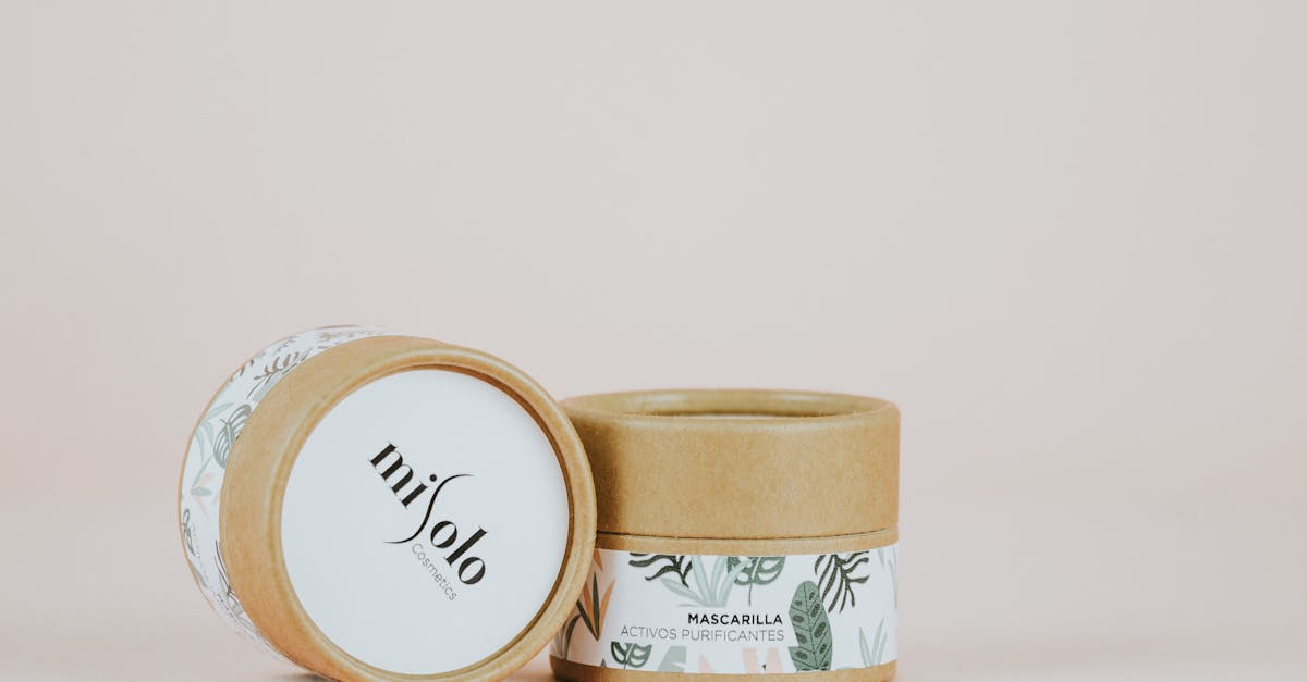
The field distinguishes between three levels of packaging. Primary packaging is the container that directly holds the product: a glass bottle for olive oil, a tube for toothpaste, a pouch for coffee beans. Secondary packaging groups or protects primary packages: the cardboard carton around a perfume bottle, the sleeve around a six-pack of beer. Tertiary packaging is the shipping layer — corrugated boxes, pallets, shrink wrap — designed for logistics rather than consumer interaction.
Most packaging designers focus on primary and secondary packaging, where the graphic and structural design work together to create the consumer experience. The discipline sits at a unique crossroads: it draws on graphic design principles for visual communication, industrial design for structural engineering, materials science for substrate selection, and marketing strategy for shelf positioning. A packaging designer must be fluent in all four domains, or at least collaborate closely with specialists in each.
Product packaging design also carries legal responsibilities that most other graphic design work does not. Nutritional information panels, ingredient lists, allergen warnings, recycling symbols, barcodes, and country-of-origin statements are all mandatory elements that must be accommodated within the design without compromising the brand’s visual identity. Balancing these regulatory requirements with aesthetic goals is one of the defining challenges of the discipline.
Core Principles of Packaging Design
Effective packaging design principles guide every decision from the initial concept sketch to the final press proof. While trends in packaging aesthetics shift with consumer culture, these foundational principles remain constant.
Shelf Impact
A package must be visible and legible from a distance. In a retail environment, products compete for attention on shelves stacked with dozens of alternatives, often viewed from one to three metres away. Shelf impact is the ability of a package to stand out in that context — to register as distinct, recognisable, and relevant to the shopper before they even pick it up.
Designers achieve shelf impact through bold color blocking, distinctive silhouettes, high-contrast typography, and strategic use of white space. A package that looks elegant in a close-up mockup but disappears on a shelf has failed its primary commercial purpose. Testing designs at actual shelf distance, both individually and alongside competitors, is an essential step that separates professional packaging work from amateur efforts.
Brand Consistency
Packaging must align with a brand’s broader visual identity. Consumers develop expectations based on every interaction they have with a brand, from its website to its social media to its advertising. When the packaging departs too dramatically from that established graphic design style, it creates cognitive dissonance that erodes trust.
Brand consistency in packaging means using the established colour palette, typography system, photography style, and tone of voice — while adapting those elements to the specific demands of the format. A luxury skincare brand that uses restrained serif typography and muted tones online should not suddenly adopt playful sans-serifs and neon colors on its boxes. Consistency builds the kind of instant recognition that turns first-time buyers into loyal customers.
Information Hierarchy
Every package carries multiple layers of information, and designing the hierarchy of that information is a critical skill. The typical order of visual priority on a consumer package is: brand name, product name, key product claim or descriptor, hero image or illustration, and then regulatory and supplementary information.
The front panel (the primary display panel) must communicate the essentials at a glance. Secondary panels carry detailed information — ingredients, usage instructions, nutritional data — in a structured, legible format. Designers use scale, weight, color, and spatial grouping to guide the consumer’s eye through this hierarchy in the correct sequence. When every element competes for attention at the same volume, nothing communicates effectively.
Material and Sustainability
The substrate is not a neutral surface — it is an active participant in the design. The texture of uncoated kraft paper communicates something fundamentally different from high-gloss laminated board. A matte-finish glass bottle signals a different market position than a transparent PET plastic container. Material choice affects not only how a design looks and feels but also how it prints, how it performs on the shelf, and how consumers perceive the product’s quality and values.
Sustainability has moved from a niche concern to a primary design consideration. Consumers increasingly favour brands that demonstrate environmental responsibility through their packaging choices. This means designing for recyclability, reducing material usage, choosing mono-materials over multi-material laminates, and communicating sustainability credentials clearly on the pack.
Structural Design
The physical form of a package — its shape, opening mechanism, folds, and closures — is as much a design decision as the graphics applied to its surface. Structural design involves creating dielines (the flat template that will be cut, scored, and folded into the three-dimensional package), specifying materials, and engineering closure systems that balance ease of use with product protection.
A well-designed structure can become a brand asset in itself. Think of the iconic Toblerone triangular prism, the Pringles canister, or the Tiffany pull-out drawer box. These structural forms are as recognisable as the brands’ logos. For designers entering the packaging field, learning to read and create dielines is a foundational skill that distinguishes packaging specialists from general graphic designers.
The Packaging Design Process
The packaging design process moves through distinct stages, each building on the outputs of the previous one. Understanding this sequence helps designers manage timelines, set client expectations, and avoid costly revisions late in production.
Brief and research. Every packaging project begins with a brief that defines the product, the target consumer, the retail environment, the competitive landscape, and the brand’s positioning. Research at this stage involves auditing competitor packaging, studying category conventions, reviewing regulatory requirements for the product category, and understanding the supply chain constraints (shelf life, shipping conditions, display formats). A thorough brief prevents the kind of fundamental misdirection that forces teams to restart midway through the project.
Concept development. With research complete, designers develop multiple visual directions — typically three to five distinct concepts that explore different strategic territories. These concepts are presented as mockups on three-dimensional renders or physical blanks, never as flat artwork alone. Packaging concepts must be evaluated in context: on a shelf, in a consumer’s hand, next to the competition. This stage is where the big strategic and aesthetic decisions are made.
Structural design. Once a visual direction is selected, the structural engineering begins in earnest. This involves finalising the dieline, specifying substrates, and working with packaging engineers or converters to ensure the design is manufacturable at the required scale and cost. Structural and graphic design are iterative at this stage — changes to the structure affect the graphic layout and vice versa.
Graphic design. With the structure locked, the detailed graphic design work begins. This includes finalising typography, creating or commissioning illustration and photography, setting up the information hierarchy across all panels, and incorporating all regulatory text. Designers work on the flat dieline while continuously checking the design on three-dimensional mockups to ensure that panel transitions, fold lines, and seams are handled elegantly.
Prototyping. Before committing to production tooling, physical prototypes are produced. These range from simple hand-cut and folded blanks for structural testing to digitally printed, die-cut samples that closely approximate the finished product. Prototypes are essential for evaluating the design in the real world — under fluorescent retail lighting, on actual shelves, in consumers’ hands. They reveal issues that no screen can: illegible type on a curved surface, colors that shift on the chosen substrate, structural weaknesses that cause panels to bow or closures to fail.
Prepress and production. The final stage involves preparing artwork files for the specific printing process and converting equipment. This includes setting up color separations, creating trap and overprint specifications, preparing spot color call-outs, adding printer marks, and supplying files in the format required by the converter. Prepress for packaging is more complex than prepress for standard print because it involves interaction with the dieline, multiple substrates, and often multiple printing processes (offset, flexo, gravure, digital) on the same job.
Typography in Packaging
Typography on packaging operates under tighter constraints and higher stakes than in almost any other design context. The type must be legible at shelf distance, scannable at arm’s length, and readable at close inspection — three distinct viewing distances that each demand different typographic strategies.
The hierarchy of type on a typical package follows a clear order. The brand name sits at the top of the hierarchy, set in the brand’s proprietary or specified typeface at a size that ensures recognition from the greatest distance. The product name comes next, differentiating the specific SKU within the brand’s range. Below that, descriptors and claims (such as “organic,” “extra virgin,” or “400ml”) provide the secondary information that helps the consumer confirm they have selected the right variant. Finally, regulatory and legal text occupies the lower tiers of the hierarchy, set at the minimum sizes prescribed by law.
Font choices for packaging must account for legibility at small sizes on potentially challenging substrates. Highly decorative display faces that work beautifully at headline sizes often become illegible when reduced for back-panel ingredient lists or nutritional tables. Experienced packaging designers select typefaces with generous x-heights, open counters, and clear differentiation between similar characters — all qualities that maintain readability when type is small, when print quality is variable, or when the substrate texture interferes with fine detail. The best serif fonts for packaging tend to have sturdy strokes and open apertures that hold up under these conditions.
Regulatory requirements vary by country and product category, but most markets mandate minimum type sizes for specific information. In the European Union, for example, mandatory food information must be printed in a font size where the x-height is at least 1.2mm. In the United States, the FDA specifies minimum type sizes for the principal display panel based on the package’s total surface area. Understanding typographic specifications in regulatory contexts is a non-negotiable requirement for packaging designers working in food, beverage, pharmaceutical, or cosmetic categories.
Color in Packaging
Color is the most immediate and visceral element of packaging design. Research consistently shows that consumers make subconscious judgments about products within seconds of seeing them, and color is the dominant factor in those snap assessments. In packaging, color serves three simultaneous functions: it signals category, it communicates brand, and it differentiates SKUs.
Category color codes are powerful, often unwritten conventions that consumers have internalised through years of shopping. Water is blue. Natural and organic products are green or earth-toned. Energy drinks and spicy foods use red and black. Dairy products favour white and light blue. Luxury goods lean on black, gold, and deep jewel tones. Designers can either work within these codes to signal category membership quickly, or deliberately break them to stand out — but breaking category color codes is a strategic risk that requires confidence in the brand’s ability to educate consumers.
Within a brand’s product range, color is the primary tool for differentiating SKUs. A tea brand might use green for its matcha variant, red for its rooibos, and amber for its chamomile. These color systems must be intuitive enough that consumers can navigate the range without reading every label. They must also maintain sufficient contrast to remain distinguishable under variable retail lighting conditions.
One of the practical challenges of color in packaging is the gap between screen and print. Colors that appear vibrant on a calibrated monitor may look dull or shifted when printed on uncoated kraft board or applied to a matte-laminated surface. The difference between coated and uncoated substrates dramatically affects color rendition — the same CMYK values will produce a richer, more saturated result on coated stock than on uncoated. Experienced packaging designers compensate for this by specifying Pantone spot colors for critical brand elements, requesting substrate-specific proofs, and building relationships with printers who understand the nuances of color management on packaging substrates.
Packaging Design Examples by Category
Studying successful packaging design examples across categories reveals how the principles discussed above manifest in real commercial work. The following examples are notable not because they are trendy but because they solve genuine design problems with clarity and craft.
Food and Beverage
Oatly’s cartons transformed a commodity product — oat milk — into a cultural statement. The packaging uses bold, hand-drawn typography, an irreverent tone of voice, and a deliberate rejection of the clean, clinical aesthetic that dominates the dairy alternative category. Every panel carries original copywriting that rewards close reading, turning the entire carton into a brand experience. The design works because it commits fully to a distinctive voice and carries that voice consistently across every touchpoint.
Mast Brothers chocolate bars, despite controversy around the brand, set a benchmark for artisanal food packaging. Each variant features a different pattern — geometric, floral, or abstract — printed on textured paper that wraps the bar like a gift. The approach communicates craft and premium quality through material and pattern rather than through conventional food photography or appetite appeal. The tactile experience of unwrapping the paper is integral to the design.
Heinz Tomato Ketchup demonstrates the power of iconic simplicity maintained over decades. The keystone-shaped label, the specific red, the restrained typography — these elements have remained fundamentally consistent while being subtly refined over time. The design is so deeply embedded in consumer consciousness that Heinz has run advertising campaigns showing just a portion of the label, confident that consumers will complete the image in their minds.
Beauty and Cosmetics
Aesop has built one of the most recognisable brand identities in beauty through a rigorously consistent packaging system. The apothecary-style amber bottles, the clean typographic labels, and the absence of conventional beauty imagery create a visual language that communicates intelligence, simplicity, and substance. The packaging deliberately avoids the aspirational glamour of mainstream beauty brands, instead positioning the products as tools for thoughtful daily rituals.
Glossier’s pink bubble-wrap pouches disrupted beauty packaging conventions by making the secondary packaging as desirable as the product. The pouches became a social media phenomenon — repurposed as pencil cases, cosmetics bags, and travel pouches — extending the brand’s reach far beyond the initial purchase. The design works as both functional packaging and a standalone branded object.
Spirits and Wine
Hendrick’s Gin uses a Victorian apothecary bottle — dark glass, a small diamond-shaped label, a paper pharmacy-style wrapper — to differentiate itself in a category dominated by clean, modern glass bottles. The structural and graphic design work together to tell a story of eccentricity and heritage that aligns with the brand’s marketing positioning. The bottle itself has become the brand’s most powerful advertising tool.
Veuve Clicquot’s consistent use of its signature yellow-orange across all packaging, from the label to the gift box to the limited-edition coolers, demonstrates how a single color, owned and deployed with confidence, can become synonymous with a brand. The colour is so distinctive that it functions as a logo in its own right.
Tech Products
Apple’s product packaging is studied in design schools worldwide for its precision engineering and restraint. The slow-reveal unboxing experience — the slight resistance of the lid, the product nestled in a perfectly fitted tray, the accessories layered beneath — transforms the act of opening a box into a ritual. Every structural detail is intentional, designed to heighten anticipation and communicate the care that the company applies to its products.
Nothing (the tech brand) uses transparent packaging that mirrors its transparent phone design, creating a coherent visual language that extends from product to package. The approach is unusual in tech, where most brands default to white or black boxes, and it demonstrates how packaging can reinforce a product’s core design concept rather than simply containing it.
Print Production Essentials
Designers transitioning into packaging from digital or standard print work encounter a more complex production landscape. Understanding the technical fundamentals of packaging print production is essential for delivering files that translate accurately from screen to finished product.
CMYK and spot colors. Most packaging is printed in CMYK (cyan, magenta, yellow, black), but brand-critical colors are frequently specified as Pantone spot colors to ensure consistency across production runs, substrates, and printing facilities. A brand’s signature red, for example, might be specified as Pantone 485 C rather than a CMYK build, guaranteeing that the color matches regardless of press calibration. Some packaging uses extended gamut printing (six or seven colors) to achieve a wider color range without the cost of dedicated spot color stations.
Die lines. A dieline is the vector template that defines the cut, fold, and perforation lines of a package. It is the structural blueprint upon which all graphic design is placed. Dielines are typically supplied by the packaging converter or structural designer and provided to the graphic designer as a locked layer in Adobe Illustrator. Understanding how to read a dieline — distinguishing cut lines from fold lines, identifying glue tabs, and recognising which panels are visible and which are hidden — is a fundamental skill for any packaging designer.
Bleed and safe zones. Packaging requires bleed (artwork extending beyond the trim line) just as conventional print does, but the tolerances are tighter and the consequences of errors are more visible. A typical packaging bleed is 3mm, but this varies by converter and process. Safe zones — areas where critical text and imagery must remain to avoid being cut or obscured by folds — are equally important and must be specified on the dieline.
Substrates. Packaging substrates range from folding boxboard (FBB) and solid bleached sulphate (SBS) for cartons, to corrugated board for shipping boxes, to flexible films for pouches, to glass, metal, and plastic for rigid containers. Each substrate has its own printability characteristics, structural properties, and cost implications. Designers must understand how their chosen substrate will affect color reproduction, image sharpness, and the feasibility of finishing techniques.
Finishing techniques. Packaging offers a range of finishing options that add tactile and visual distinction. Foil stamping applies metallic or coloured foil to specific areas, creating a premium accent. Embossing and debossing raise or recess areas of the surface, adding a three-dimensional texture. Spot UV applies a high-gloss varnish to selected areas against a matte background, creating contrast through sheen rather than color. These techniques add cost but can significantly elevate perceived value — a consideration that must be weighed against the product’s price point and competitive context.
Sustainable Packaging Design
Sustainability is no longer a differentiator in packaging design — it is a baseline expectation. Consumers, retailers, and regulators are all applying pressure on brands to reduce packaging waste, and designers are central to that effort. Sustainable packaging design is not simply a matter of swapping plastic for cardboard; it requires a systemic rethinking of materials, structures, and design approaches.
Designing for recyclability means understanding the waste stream. A beautifully designed carton that combines paper, plastic film, and metallic foil may be visually striking but is functionally unrecyclable because the mixed materials cannot be separated efficiently at scale. Mono-material designs — packages made from a single material type — are far easier to recycle and are increasingly favoured by both retailers and consumers. Designers who understand material science can make informed choices that reduce environmental impact without sacrificing shelf presence.
The minimalist packaging trend, while partly aesthetic, has a genuine sustainability dimension. Reducing the physical size of packaging, eliminating unnecessary secondary packaging layers, and using lighter-weight substrates all reduce material consumption and shipping emissions. Brands like Lush, which sells many products with no packaging at all, and Who Gives a Crap, which uses the packaging itself as a brand communication surface rather than adding printed inserts, demonstrate how sustainability constraints can drive creative innovation rather than limiting it.
Material innovation is expanding the designer’s palette. Mushroom-based packaging (mycelium), seaweed-derived films, agricultural waste substrates, and compostable plant-based plastics are all entering commercial viability. These materials bring new textures, colours, and structural properties that open creative possibilities while reducing environmental impact. Designers who stay current with material innovation can offer clients solutions that are both environmentally responsible and visually distinctive.
Communicating sustainability on the pack itself is a design challenge in its own right. Greenwashing — making misleading or vague environmental claims — is increasingly policed by regulators and punished by consumers. Effective sustainability communication is specific, verifiable, and integrated into the design rather than applied as an afterthought. Recycling instructions, material identification codes, and certification logos (FSC, Rainforest Alliance, B Corp) should be treated as integral design elements, not relegated to the smallest possible corner of the back panel.
FAQ
What is packaging design?
Packaging design is the discipline of creating the visual and structural exterior of a product’s container, wrapper, box, or label. It encompasses both the graphic elements (typography, colour, imagery, layout) and the physical form (shape, material, opening mechanism) of the package. The goal is to protect the product, communicate brand identity and product information, and attract consumers at the point of sale. It operates at the intersection of graphic design, industrial design, materials science, and marketing.
What software is used for packaging design?
Adobe Illustrator is the industry standard for packaging graphic design because it handles vector artwork, precise measurements, and dieline integration. Adobe Photoshop is used for image editing and retouching. For structural design, specialised software such as ArtiosCAD, Studio (by Esko), and Cape Pack are used to create and test dielines, simulate folding, and optimise pallet configurations. Many designers also use 3D rendering software — Cinema 4D, Blender, or Esko’s Studio Toolkit for Illustrator — to create realistic mockups that show the flat artwork applied to the three-dimensional package.
What is a dieline?
A dieline is the flat, two-dimensional template that maps out all the cut lines, fold lines, perforation lines, and glue tabs of a package. When the flat sheet is die-cut and folded, it becomes the three-dimensional package. Dielines are vector files, typically created in Adobe Illustrator or specialised structural design software, and they serve as the foundation upon which all graphic design is placed. Understanding how to read and work with dielines — knowing which panels are visible, where folds occur, and how surfaces relate to each other in three dimensions — is essential for anyone working in packaging as a type of graphic design.
How is packaging design different from other graphic design?
Packaging design differs from other graphic design disciplines in several fundamental ways. It is three-dimensional, requiring designers to think about how artwork wraps around forms, transitions across folds, and appears from multiple viewing angles. It involves physical materials and manufacturing processes that constrain and inform the design. It must satisfy regulatory requirements for mandatory information that vary by product category and market. And it must perform commercially in a retail environment, competing for attention on a shelf rather than being viewed in isolation. These constraints make packaging one of the most technically demanding areas of graphic design practice.
How much does professional packaging design cost?
The cost of professional packaging design varies widely depending on the scope and complexity of the project. A single SKU label redesign from a freelance designer might cost a few hundred to a few thousand dollars. A comprehensive packaging system for a product range — including structural design, graphic design, prototyping, and production artwork — from a specialist packaging agency typically ranges from tens of thousands to six figures. The investment is justified by the direct commercial impact of packaging: it is the most frequently seen piece of brand communication and often the deciding factor in a purchase decision. Brands that underinvest in packaging design frequently spend more on marketing to compensate for weak shelf presence.


