What Font Does Patagonia Use?
If you have ever owned a fleece or a rain shell, you already know the look: a chunky serif spelling out “patagonia” under a jagged purple-orange-pink mountain ridge. People searching for the patagonia clothing font usually want one of two things — to identify the exact typeface in the logo, or to find a free font that captures the same rugged, outdoorsy confidence for a hiking blog, a trail-race poster, or a small gear brand. This guide covers both, and is careful to separate the trademarked wordmark from look-alike fonts you can legally use.
Quick disambiguation: “Patagonia” is also a vast region spanning southern Argentina and Chile. This article is about Patagonia, Inc., the outdoor-apparel company founded by Yvon Chouinard in 1973 — not the geography. The brand name was, however, inspired by that windswept region, which is why the Fitz Roy skyline (a real mountain on the Argentina–Chile border) anchors the logo.
What font is the Patagonia logo?
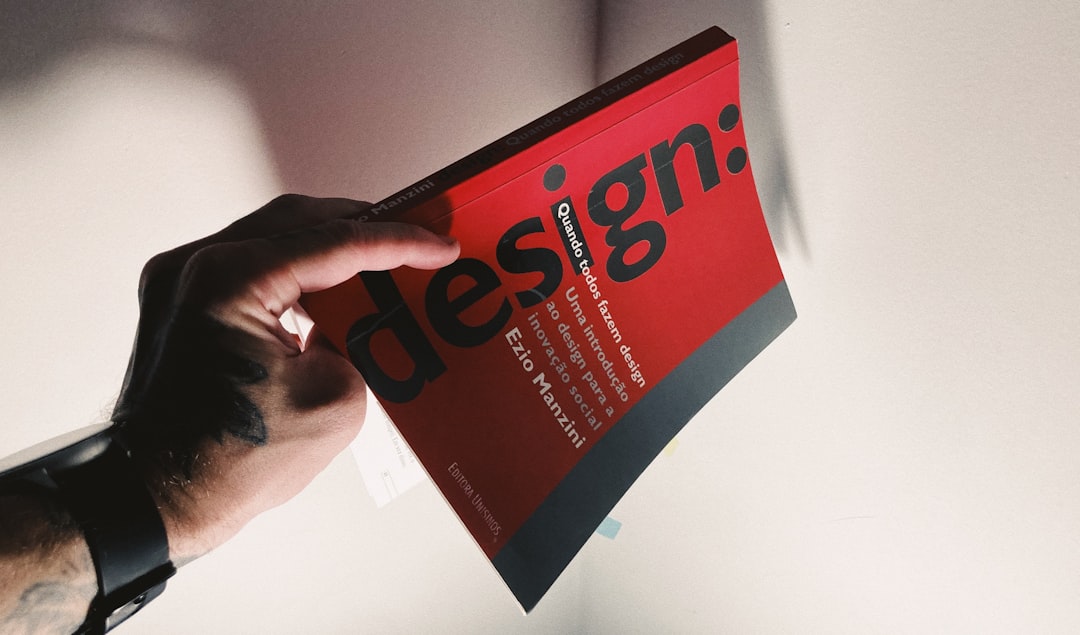
The Patagonia logo has two parts: the Fitz Roy skyline graphic (the gradient mountain silhouette) and the lowercase “patagonia” wordmark set in a bold serif. The wordmark reads as a sturdy, slightly slab-like serif — heavy stroke weight, generous letter spacing, bracketed serifs, and a friendly, grounded feel that matches the brand’s earthy palette.
Patagonia has never publicly published the name of a retail font for its wordmark, and the lettering has the consistent, optically balanced quality of a custom drawing. The most honest answer is that the wordmark is a bespoke serif, likely derived from or inspired by a classic slab/transitional serif and then refined in-house. Treat that as an informed observation, not a confirmed spec — Patagonia has not released the source file.
What typeface does Patagonia use in branding?
Beyond the logo, Patagonia’s catalogs, product tags, and website lean on clean, highly legible type that stays out of the way of photography. In practice you will see two registers:
- Display / headline: the serif spirit of the wordmark carries into editorial headers, giving stories about activism and the environment a warm, book-like authority.
- Body / UI: a neutral humanist sans-serif handles long-form essays, spec sheets, and navigation, prioritizing readability over personality.
This serif-for-soul, sans-for-clarity pairing is common among heritage outdoor brands. The exact web and print fonts have shifted over the years and across regions, so rather than chase a moving target, focus on the relationship: a confident serif voice up top, a quiet sans doing the heavy lifting below. That structure is what makes the brand feel both trustworthy and approachable.
Free fonts that look like the Patagonia font
You cannot legally lift the actual patagonia clothing font — the wordmark is a protected brand asset. But you can reproduce the mood with free, openly licensed serifs. The table below maps each branding use case to a no-cost alternative.
| Use case | Patagonia uses | Free alternative |
|---|---|---|
| Bold logo-style wordmark | Custom bold serif (Fitz Roy lockup) | Zilla Slab (Bold) or Roboto Slab |
| Editorial headlines | Refined serif display | Bitter or Lora |
| Body / long-form text | Humanist sans-serif | Source Sans 3 or Inter |
| Rugged, outdoorsy accent | Heavy slab character | Arvo (Bold) |
For the closest single match to the wordmark, start with a heavy slab like Zilla Slab or Arvo, tighten the stroke contrast, add a touch of letter spacing, and set it lowercase. You’ll land in the same rugged-but-tidy territory without touching the trademark. If you are building an outdoor or denim-adjacent identity, you may also like the heritage feel we cover in our Wrangler font breakdown.
Why does Patagonia use this kind of type?
A serif is an unusual choice for an athletic brand — most performance labels reach for aggressive sans-serifs. Patagonia’s serif does deliberate work:
- Heritage and trust. Serifs read as established and literary, reinforcing Patagonia’s reputation for durability and its long record of environmental writing and advocacy.
- Warmth over aggression. The rounded, grounded letterforms feel human and calm — the opposite of hype-driven sportswear, which suits a company that famously told customers “Don’t Buy This Jacket.”
- Timelessness. A classic serif dates slowly, so the logo has stayed nearly unchanged for decades, building enormous recognition.
Pair that with the Fitz Roy skyline and the whole mark becomes a small story: real mountains, real durability, no gimmicks. It is a masterclass in letting restraint signal premium quality.
There is also a practical dimension. Patagonia products live outdoors, get muddy, and get photographed against busy natural backdrops. A heavy serif holds its shape when embroidered on a fleece, screen-printed on a tag, or shrunk to a tiny size on a zipper pull. The brand rarely leans on color tricks or shifting logos for seasonal campaigns, which means the wordmark itself has to do the heavy lifting year after year. Choosing a robust, classic serif and then leaving it almost untouched for decades is exactly the kind of discipline that builds the deep, automatic recognition Patagonia now enjoys.
Can I use the Patagonia font for my own project?
Not the real one. The Patagonia wordmark and Fitz Roy logo are registered trademarks; reproducing them — or a deceptively similar lockup — for your own brand, merch, or signage risks infringement, even if you rebuild the letters by hand. The typeface design itself may also be proprietary.
What you can do is use a legally licensed look-alike to evoke the same vibe. The free fonts above ship under open licenses (SIL Open Font License or Apache), which generally allow commercial use, but you should always confirm the specific terms. If you are unsure how desktop, web, and embedding rights differ, our font licensing guide walks through it in plain language. For broader context on how apparel labels build recognizable type systems, see our roundup of famous brand fonts.
Frequently Asked Questions
Is the Patagonia font a serif or a sans-serif?
The “patagonia” wordmark is a bold serif — note the small bracketed strokes at the ends of each letter. It leans slab-like in weight. Patagonia’s body and interface text, by contrast, uses a clean humanist sans-serif, giving the brand a serif-headline, sans-body structure.
What is the mountain in the Patagonia logo?
The skyline is Monte Fitz Roy (Cerro Chaltén), a dramatic granite peak on the Argentina–Chile border in the Patagonia region. The gradient silhouette has anchored the logo since the brand’s early years and is as recognizable as the wordmark itself.
Can I download the exact Patagonia font for free?
No. The wordmark appears to be custom-drawn and is a protected trademark, so there is no official free download. Free serifs like Zilla Slab, Arvo, or Bitter reproduce the mood legally without copying the brand’s actual letterforms.
What free font is closest to the Patagonia wordmark?
A heavy slab serif gets you closest. Try Zilla Slab Bold or Arvo Bold set in lowercase with slightly loosened spacing. For a softer editorial take, Bitter and Lora capture the warm, trustworthy serif tone Patagonia uses across its long-form content.


