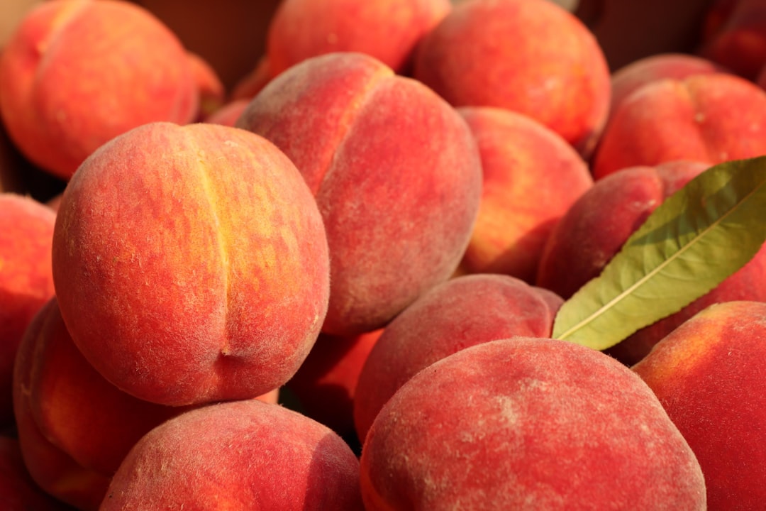
Peach Color Meaning and Symbolism
Peach takes its name from the fruit and its delicate, sun-warmed skin. Peach color meaning revolves around gentleness, sincerity, and an inviting kind of warmth. Peach is essentially a muted, lightened orange with a pink cast, which softens orange’s energy into something tender and welcoming. The color reads as fresh, youthful, and emotionally open. Because it sits so close to natural skin tones, peach has an intimate, human quality that few other colors match, which is a large part of why it feels so welcoming.
What does peach symbolize?
Peach symbolizes warmth, kindness, youthfulness, and approachability. Sitting between pink’s affection and orange’s friendliness, it carries the nurturing, gentle qualities of both. Peach is often linked to sincerity, modesty, and a soft optimism, evoking spring mornings, fresh fruit, and healthy skin. Unlike bolder warm colors, peach feels understated and comforting, which is why it is frequently associated with care, hospitality, and gentle encouragement rather than excitement or urgency.
The psychology of peach
Psychologically, peach has a soothing, reassuring effect. It combines the social warmth of orange with the calming, compassionate qualities of pink, producing a tone that feels friendly without being overwhelming. Peach can lower the sense of intensity in a space, making environments feel welcoming and relaxed. It is often described as flattering and skin-like, which gives it an inherently human, approachable quality. Because it is gentle and low in saturation, peach tends to put people at ease and encourage openness. Unlike vivid orange, which can feel demanding, peach offers warmth without pressure, making it an effective choice for designs meant to feel supportive and unintimidating. Read more in our overview of color psychology.
Peach symbolism across cultures
Peach carries notable meaning in several cultures, particularly in East Asia. In Chinese tradition, the peach fruit and blossom are powerful symbols of longevity, immortality, and good fortune, so peach tones can evoke vitality and renewal. The peach blossom is also associated with romance and youthful beauty. In Western contexts, peach is more often linked to softness, innocence, and warmth, appearing in springtime and wedding palettes. As with most colors, peach’s exact associations vary by region, but themes of gentleness, vitality, and good fortune recur widely.
Positive and negative associations of peach
| Positive | Negative |
|---|---|
| Warmth and friendliness | Can seem timid or weak |
| Youth and freshness | May feel overly sweet or saccharine |
| Gentleness and sincerity | Lacks impact in small or pale doses |
| Approachability and calm | Sometimes read as dated or retro |
Peach in branding and marketing
Peach is widely used by brands that want to feel warm, approachable, and human. It is common in beauty, skincare, and cosmetics, where its skin-like tone signals health and natural softness. Wellness, lifestyle, food, and hospitality brands use peach to convey friendliness and comfort, while baby and childcare products lean on its associations with gentleness and innocence. Peach has also become a popular accent in modern, millennial-leaning design because it feels fresh and optimistic without the boldness of brighter oranges or pinks. As a background or supporting tone, it adds warmth to otherwise minimal layouts and pairs naturally with soft typography and rounded shapes, reinforcing a friendly, contemporary brand voice.
Colors that go well with peach
Peach is highly versatile and pairs well across the spectrum. Teal (#008080) creates a fresh, contemporary contrast that makes peach pop. Soft white (#FAF6F0) keeps a palette light, airy, and clean. Sage green (#9CAF88) brings a natural, calming balance, and navy (#1B2A4A) grounds peach with sophistication for a more elegant look. For help building contrasts, see our guide to complementary colors.
Shades and variations of peach
Peach ranges from pale and creamy to warm and saturated. Peach puff (#FFDAB9) is a classic soft tone. Apricot (#FBCEB1) leans slightly more orange and warm. Coral peach (#FF9E80) is brighter and more vivid, while peachy beige (#F5DEC4) moves toward a neutral. Salmon (#FA8072) adds more pink and intensity. These variations let designers move peach from delicate pastel to lively accent. Explore how such tones relate within color theory.
Frequently Asked Questions
What does the color peach mean?
Peach means warmth, gentleness, youth, and approachability. As a soft blend of pink and orange, it combines affection and friendliness into a tender, welcoming tone. It often symbolizes sincerity and freshness, and in East Asian cultures it is also linked to longevity and good fortune.
What emotions does peach evoke?
Peach evokes feelings of comfort, friendliness, calm, and optimism. Its soft, skin-like quality tends to put people at ease and feels nurturing rather than intense. In some cases it can read as overly sweet or timid, but generally it creates a warm, reassuring emotional tone.
What colors go with peach?
Peach pairs well with teal (#008080) for a fresh contrast, soft white (#FAF6F0) for an airy look, sage green (#9CAF88) for natural balance, and navy (#1B2A4A) for elegant grounding. These combinations highlight peach’s warmth while keeping a palette balanced.
Is peach warm or cool?
Peach is a warm color because it is derived from orange with a pink undertone. Both parent colors sit on the warm side of the spectrum, giving peach a sunny, cozy quality. Its paleness softens that warmth, making it gentle rather than fiery. See our guide to warm vs cool colors.
Is peach a feminine color?
Peach is often perceived as gentle and is frequently used in beauty and lifestyle contexts associated with softness, but it is not strictly feminine. Its warm, approachable, skin-like quality makes it a versatile, gender-neutral tone that works well in modern, friendly, and welcoming designs of all kinds.


