Peach vs Apricot: What’s the Difference?
Both are named after fruit and both live in the warm pastel family, but the peach vs apricot question comes down to where each color sits on the path between pink and orange. Peach carries a pink undertone that keeps it gentle and soft; apricot pushes toward orange and yellow, giving it more warmth and saturation. Once you spot the pink, the two are easy to tell apart.
What is peach?
Peach is a pale, warm color that blends light orange with a clear pink undertone — the color of the fruit’s skin rather than its flesh. A representative value sits around #FFE5B4, though peach spans a range from nearly-cream to a deeper rosy version sometimes called “peach puff.” Its defining trait is softness: peach is low in saturation and high in lightness, which makes it read as delicate and approachable.
Designers use peach for skin-flattering backgrounds, beauty and wellness branding, weddings, and soft editorial layouts. It’s warm without being bold, which is why it functions almost like a tinted neutral. If you like peach, it sits close to coral on the warm spectrum — see how it compares in our coral versus peach breakdown in this same batch.
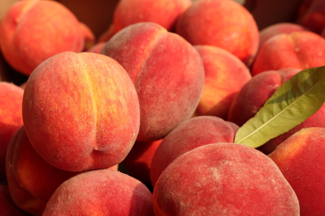
What is apricot?
Apricot is a warm orange-yellow named for the fruit’s ripe flesh. A representative value lands around #FBCEB1 for the soft pastel version, though apricot also describes deeper, more saturated golden-orange tones closer to #ED9121. Compared to peach, apricot has more orange and yellow and far less pink, which gives it a sunnier, more energetic warmth.
Because it leans golden, apricot pairs naturally with terracotta, cream, and deep greens, and it shows up in autumn palettes, food packaging, and lifestyle branding that wants warmth with a bit more confidence than a pastel peach. Where peach whispers, apricot glows.
What’s the difference between peach and apricot?
The difference is the pink-versus-orange lean and the level of saturation. Peach contains a visible pink undertone and stays soft; apricot pushes toward orange-yellow and reads warmer and richer. Here’s a side-by-side using representative values — these are descriptive color names rather than standardized inks, so exact hexes vary by brand and product.
| Property | Peach | Apricot |
|---|---|---|
| Hex code | #FFE5B4 | #FBCEB1 |
| RGB | 255, 229, 180 | 251, 206, 177 |
| CMYK | 0, 10, 29, 0 | 0, 18, 29, 2 |
| Undertone | Warm with pink lean | Warm with orange-yellow lean |
| Hue family | Pinkish-orange pastel | Orange-yellow / golden |
| Best used for | Beauty, weddings, soft backgrounds, skin tones | Autumn palettes, food packaging, warm lifestyle branding |
| Mood/feel | Soft, gentle, delicate, romantic | Sunny, warm, inviting, energetic |
When should you use each?
Choose peach when you want softness and a flattering, romantic warmth — cosmetics, bridal and event design, baby and wellness products, or web backgrounds that should feel gentle against text. Its pink undertone makes skin look healthy, which is why it dominates beauty photography and packaging.
Choose apricot when you want warmth with more presence. It’s stronger than peach without tipping into a full orange, making it ideal for autumn campaigns, artisanal food and drink, and palettes that pair with browns, creams, and deep greens. Apricot reads as cozy and abundant rather than delicate.
A quick test: hold the swatch next to a neutral pink. If it almost disappears into the pink, it’s peach; if it clearly pulls toward orange and gold, it’s apricot. For the bigger picture on temperature, our guide to warm versus cool colors explains why these subtle undertones change a whole palette.
Do peach and apricot go together?
Yes — they’re natural companions because they sit a short step apart on the warm spectrum. Layering peach and apricot creates a soft, monochromatic warm scheme with gentle depth, like a sunset gradient. The key is keeping a clear difference in value or saturation so the softer peach and the richer apricot read as two intentional tones rather than a muddy near-match.
For an analogous palette, add cream and terracotta; for contrast, a soft sage or dusty blue cools the warmth without fighting it. If you’re refining the warmer, pinker end of this family, our coral versus peach comparison covers the more saturated neighbor that often anchors these palettes.
How do you tell peach and apricot apart in practice?
The fastest method is the white-paper test: place each swatch against a sheet of pure white in daylight. Peach will reveal a faint pink or rosy cast, while apricot leans visibly warmer toward orange and gold. Because both colors are light, this contrast against true white is far more reliable than judging them in isolation, where memory and surrounding colors easily mislead the eye.
A second cue is saturation. Apricot, especially in its deeper “ripe” versions, carries more chroma — it looks more colorful — while peach stays pale and quiet. If a tone reads as “a colored neutral” you can put behind text without distraction, it’s almost certainly peach. If it reads as a confident, sun-warmed hue you’d use as a feature color, it’s apricot. Lighting matters too: warm artificial light pushes peach toward apricot, so always confirm undertones in neutral daylight before locking a palette.
One practical naming caveat worth remembering: both terms are loosely used in fashion, paint, and digital palettes, so a swatch labeled “apricot” by one brand may match another brand’s “peach.” When precision matters — matching a print to a screen, or a fabric to a logo — work from hex or Pantone values rather than the color name alone.
Frequently Asked Questions
Is apricot more orange than peach?
Yes. Apricot leans toward orange and yellow, giving it a warmer, more golden appearance, while peach carries a visible pink undertone that keeps it softer. Side by side, apricot reads as the sunnier, more saturated color and peach as the gentler, pinker one.
What is the hex code for peach?
A common representative hex for peach is #FFE5B4, with RGB values of 255, 229, 180. Peach spans a range, so you’ll also see lighter cream-leaning versions and deeper rosy ones; treat #FFE5B4 as a reliable midpoint rather than a fixed standard.
Does peach have pink in it?
Yes. The defining feature of peach is its pink undertone mixed into a light orange base, which is exactly what separates it from apricot. That touch of pink is why peach is so flattering against skin tones and so popular in beauty and bridal design.
Can peach and apricot be used together?
Absolutely. Because they sit close on the warm spectrum, peach and apricot create a soft, sunset-like tonal palette. Keep them distinct in lightness or saturation so the pinker peach and the more golden apricot read as deliberate, layered tones rather than an accidental clash.
Is apricot a warm or cool color?
Apricot is firmly a warm color. It blends orange and yellow with very little pink, placing it in the golden, sun-warmed part of the spectrum. This warmth is why it pairs so well with terracotta, cream, and earthy autumn tones in interior and brand palettes.


