Pink Color Palette: Blush to Hot Pink for Design
A pink color palette has evolved from a niche, gendered color choice into one of the most versatile and contemporary families in modern design. Pink occupies a unique space between the warmth of red and the purity of white, giving it a range that spans from barely-there blush tones to electric fuchsia. Whether you are designing a luxury brand, a digital product, or an editorial spread, pink offers softness, energy, and sophistication in equal measure. Working with pink effectively requires familiarity with color harmony and a clear understanding of how pink relates to its neighbors on the color wheel.
What Defines the Pink Color Family
Pink is technically a tint of red, created by adding white to pure red. However, pink functions as its own color family in design because its associations, uses, and emotional impact are fundamentally different from red. Where red demands and commands, pink invites and charms. Where red is aggressive, pink is persuasive.
The psychological profile of pink is complex and shifting. Traditionally associated with femininity, romance, and tenderness, pink has undergone a cultural reappraisal. Millennial pink, a muted salmon-blush tone, broke gendered conventions and became a unisex design staple in the mid-2010s. Hot pink and magenta have been reclaimed as colors of empowerment and rebellion. Dusty rose communicates vintage elegance. Each shade of pink carries its own personality.
Culturally, pink varies in meaning. In Japan, pink is associated with cherry blossoms and spring, carrying connotations of renewal and transient beauty. In India, pink is worn by men and women alike and is associated with hospitality and warmth. In Western fashion and design, pink has oscillated between hyper-feminine and gender-neutral positioning, depending on shade and context.
Visually, pink ranges from warm, yellow-leaning shades like peach-pink and salmon to cool, blue-leaning shades like fuchsia and magenta. This warm-cool spectrum gives designers significant flexibility. Warm pinks feel approachable and organic. Cool pinks feel modern, energetic, and slightly edgy.
Building a Palette with Pink
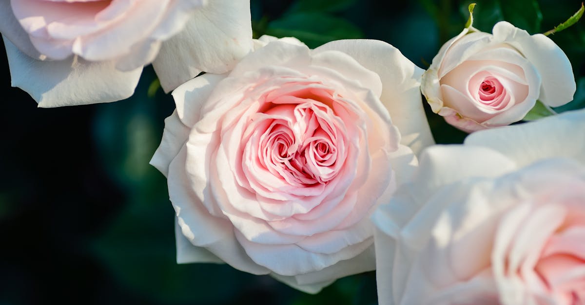
Selecting a primary pink is the first and most consequential decision. A blush pink (#F4C2C2) creates a soft, premium foundation suited to beauty, lifestyle, and hospitality projects. A hot pink (#FF69B4) demands attention and works for bold, youth-oriented, or fashion-forward brands. A dusty rose (#C4767A) bridges vintage and modern aesthetics with muted sophistication.
Pink’s complementary relationship with green creates some of the most striking palettes in design. Blush with sage green feels organic and peaceful. Hot pink with emerald is dramatic and luxurious. Coral pink with mint is fresh and playful. These green-pink pairings draw from nature, where flowers against foliage demonstrate the combination’s inherent harmony.
For analogous warmth, combine pink with peach, coral, and light red tones. This creates a monochromatic warmth that feels inviting and cohesive, perfect for beauty brands and lifestyle content. Moving in the cooler direction, pink paired with lavender and soft violet creates a dreamy, ethereal palette popular in wellness and creative industries.
Neutrals ground pink palettes and prevent them from feeling overly sweet. Warm grays, taupes, and warm whites pair beautifully with blush and rose tones. For bolder pinks, charcoal and black provide the necessary weight and contrast. Gold accents add luxury to any pink palette, while silver or cool gray accents modernize it.
Pink in Graphic Design
Pink has become a defining color of contemporary graphic design. The widespread adoption of millennial pink opened the door for pink to appear in contexts previously dominated by blue, gray, and green: technology marketing, financial services advertisements, and architectural signage. This shift demonstrated that pink could communicate modernity and confidence alongside its traditional softness.
In packaging design, pink signals premium quality and sensory pleasure. Cosmetics and skincare brands use pink extensively because it flatters skin tones in product photography and suggests care and gentleness. Food packaging uses pink for desserts, beverages, and products marketed as indulgent treats. For a broader look at effective color usage in packaging, visit our graphic design examples.
In poster and promotional design, hot pink and magenta create unmissable impact. These saturated pinks work particularly well against dark backgrounds, where they seem to glow. Duotone treatments using pink as the highlight color and dark blue or black as the shadow create a contemporary, music-industry-inspired aesthetic.
Editorial design has embraced pink as a layout color for backgrounds, section dividers, and accent typography. A pale pink background with dark text creates a reading experience that feels warmer and more inviting than stark white, reducing harshness while maintaining excellent readability.
Pink in Branding
Pink branding is no longer limited to beauty and fashion. While those industries still use pink extensively, the color has expanded into technology, food and beverage, wellness, and even B2B services. The common thread across successful pink brands is a willingness to stand out and an audience that values emotional connection alongside functional benefits.
Developing a brand strategy around pink requires clarity about which shade matches your brand’s personality. Pale blush positions a brand as refined, gentle, and premium. It works for luxury skincare, boutique hospitality, and high-end stationery. Bright pink positions a brand as confident, fun, and unapologetic. It works for entertainment, fashion retail, and direct-to-consumer products. Dusty rose positions a brand as thoughtful, artistic, and approachable, working for creative agencies, craft brands, and wellness services.
Industries increasingly using pink include fintech and digital banking platforms targeting younger demographics, plant-based and alternative food brands seeking shelf differentiation, wellness and mental health services communicating warmth, and co-working and lifestyle brands building community-focused identities.
The key to effective pink branding is confidence. Brands that use pink tentatively, as a minor accent or in overly desaturated form, can appear uncertain. Brands that commit fully to pink as a primary color create memorable, distinctive identities that stand apart from the blue-and-gray competition.
Pink in Web and UI Design
Pink has gained significant ground in web and interface design, driven by trends toward warmer, more human-centered digital experiences. Pale pink backgrounds have replaced pure white in many modern websites, creating a softer visual environment that reduces the clinical feel of traditional web design.
For contrast and readability, pink requires thoughtful management. Very light pinks on white backgrounds lack sufficient contrast for text, so reserve pale pinks for large background areas rather than typography. Dark text on light pink backgrounds provides comfortable reading contrast. Hot pink and magenta can serve as accent colors for links, buttons, and interactive elements, where their vibrancy draws attention without the warning connotations of red.
Pink call-to-action buttons work particularly well for brands in beauty, lifestyle, and subscription-based services. They feel inviting rather than urgent, which suits products where the purchase decision is aspirational rather than time-sensitive. For maximum visibility, place pink buttons against neutral or cool-toned backgrounds.
Accessibility with pink demands attention. Pale pinks consistently fail contrast tests against white backgrounds, so never use blush-on-white for text. Saturated pinks like fuchsia and magenta generally meet contrast requirements against white for large text but may fall short for body copy. Dark pinks and roses perform well for text but should still be verified with contrast checking tools. Always provide non-color indicators alongside pink status elements.
Sample Pink Color Palettes
Warm Blush Palette
This palette exudes quiet luxury through soft, warm tones. The primary shade is Blush Pink (#F4C2C2), a barely-there pink with peach undertones that feels premium and gentle. It pairs with Champagne Gold (#F7E7CE) for warmth, Soft White (#F9F6F2) for breathing room, and Warm Taupe (#8B7D6B) for understated contrast. This combination is designed for luxury beauty brands, wedding stationery, and boutique hospitality identities.
Cool Fuchsia Palette
Bold and unapologetic, this palette pushes pink into energetic territory. The anchor is Fuchsia (#FF00FF), a cool, vivid pink that demands attention. It combines with Deep Navy (#1B1B3A) for grounding drama, Ice White (#F0F0F0) for sharp contrast, and Slate Gray (#708090) for modern neutrality. This scheme serves fashion brands, entertainment companies, and tech startups that want to shatter expectations.
Muted Rose Palette
For designs that need warmth without intensity, this desaturated palette centers on Dusty Rose (#C4767A), a pink with gray and mauve undertones that feels vintage yet current. It pairs with Sage Green (#9CAF88) for natural harmony, Warm Cream (#F5E6CC) for softness, and Espresso (#3C2415) for depth. Creative studios, artisan chocolatiers, and lifestyle publications will find this palette endlessly adaptable.
Bold Coral Palette
This vibrant palette straddles pink and orange for maximum warmth. It leads with Coral Pink (#F88379), a joyful, warm-leaning pink that radiates approachability. Paired with Teal (#008080) for striking complementary contrast, Ivory (#FFFFF0) for softness, and Charcoal (#36454F) for structure, this scheme is built for travel brands, food and beverage companies, and social media campaigns that celebrate life and vitality.
Frequently Asked Questions
Is pink appropriate for professional and corporate design?
Absolutely. Pink has moved well beyond gendered or casual associations. Muted pinks like blush and rose communicate sophistication and emotional intelligence, qualities increasingly valued in corporate culture. Major financial technology companies and professional services firms have adopted pink in their branding to differentiate themselves and signal a human-centered approach. The key is selecting the right shade and pairing it with grounding neutrals.
What colors work best alongside pink?
Green is pink’s natural complement, and combinations like blush with sage or hot pink with emerald are consistently effective. Navy blue provides authoritative grounding. Gold adds luxury. Gray and charcoal modernize pink palettes. For analogous warmth, pair pink with peach and coral. For cooler combinations, pair pink with lavender and soft violet. Avoid pairing highly saturated pink with equally saturated orange, as the combination can appear garish.
How do I use pink without reinforcing gender stereotypes?
Choose muted or unexpected shades rather than bubblegum pink, which carries the strongest gendered associations. Dusty rose, salmon, magenta, and millennial pink all read as gender-neutral. Pair pink with non-traditional companions like charcoal, navy, or olive green. Use pink in bold, geometric layouts rather than soft, flowing ones. Context and typography choices influence perception as much as the color itself.
What are the most trending pink shades in current design?
Dusty pink and mauve tones continue to perform strongly across branding and interior design. Hot pink and magenta have resurged in fashion and digital design, driven by maximalist trends. Peach-pink tones are popular in food and lifestyle branding. Deep raspberry and wine-pink shades are gaining traction in luxury and editorial contexts, offering pink’s warmth with added depth and seriousness.


