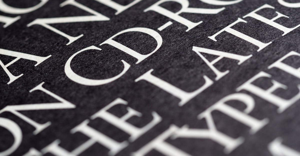
Playfair Display Font Pairing: 12 Best Combinations
[IMAGE: Playfair Display font pairing specimen hero image]
Playfair Display is one of the most widely used display serifs on the web, and for good reason. Designed by Claus Eggers Sorensen and available free on Google Fonts, it draws on the tradition of eighteenth-century European type design with its high stroke contrast, delicate hairlines, and broad, elegant letterforms. It was built specifically for headlines and titling work, not for long passages of body copy.
That distinction matters when you are choosing a font pairing. The high contrast between thick and thin strokes gives Playfair Display a dramatic, editorial personality. Pair it with another high-contrast typeface and the result competes for attention. Pair it with a bland, poorly proportioned sans-serif and the layout feels disjointed. The best Playfair Display font pairings create a deliberate relationship: the companion typeface absorbs the workload of readability while Playfair commands the visual hierarchy from the headline.
This guide presents 12 curated Playfair Display combinations, organized by category, with recommended weights, CSS snippets, and specific use cases so you can implement them immediately.
Key Principles for Pairing with Playfair Display
Before jumping to the list, it helps to understand why certain fonts work alongside Playfair Display and others do not. Three principles govern nearly every successful pairing.
1. Contrast With Its Contrast
Playfair Display already has extreme stroke contrast. A companion typeface should offer low to moderate contrast so the two fonts occupy different visual registers. This is why geometric and humanist sans-serifs work so well: their relatively uniform stroke widths provide the counterpoint Playfair needs.
2. X-Height Matching
Playfair Display has a generous x-height for a display serif. When set alongside a body font, the two should appear optically balanced at their respective sizes. Fonts with a similarly generous x-height (Source Sans Pro, Lato, Inter) align naturally, reducing the need for awkward size adjustments.
3. Weight Balance
Playfair Display Bold is heavy. If your body font is too light, the headline will overpower the page. If the body font is too heavy, the layout loses its hierarchy. As a general rule, pair Playfair Display Bold (700) or Black (900) headlines with a Regular (400) or Medium (500) body weight, and test the combination at actual production sizes before committing.
[IMAGE: Stroke contrast comparison diagram — Playfair Display vs. low-contrast sans-serif]
Sans-Serif Companions
Sans-serif typefaces are the most natural partners for Playfair Display. Their clean, low-contrast strokes create immediate visual separation from the ornate serif headline, and most offer excellent screen readability at body sizes.
1. Playfair Display + Source Sans Pro
[IMAGE: Playfair Display + Source Sans Pro pairing specimen]
Source Sans Pro, designed by Paul D. Hunt for Adobe, is a humanist sans-serif with open letterforms and a tall x-height that closely matches Playfair Display. Its moderate character width keeps body text compact without sacrificing legibility, and its range of weights (from Extra Light to Black) gives you complete control over hierarchy. This is arguably the single most versatile Playfair Display pairing available at no cost.
Best for: Editorial websites, long-form articles, corporate branding, annual reports.
Recommended weights: Playfair Display Bold (700) for headlines, Source Sans Pro Regular (400) for body, Source Sans Pro SemiBold (600) for subheadings.
/* Playfair Display + Source Sans Pro */
@import url('https://fonts.googleapis.com/css2?family=Playfair+Display:wght@700&family=Source+Sans+Pro:wght@400;600&display=swap');

h1, h2, h3 {
  font-family: 'Playfair Display', Georgia, serif;
  font-weight: 700;
}

body, p, li {
  font-family: 'Source Sans Pro', 'Segoe UI', sans-serif;
  font-weight: 400;
  line-height: 1.7;
}
2. Playfair Display + Lato
[IMAGE: Playfair Display + Lato pairing specimen]
Lato, designed by Lukasz Dziedzic, balances warmth and professionalism. Its semi-rounded details soften the formality of Playfair Display without undermining it, making the combination approachable rather than stiff. Lato’s extensive weight range (Hairline through Black) and wide language support make it a dependable workhorse for international projects.
Best for: Business websites, SaaS landing pages, portfolios, event invitations.
Recommended weights: Playfair Display Bold (700) for headlines, Lato Regular (400) for body, Lato Bold (700) for emphasis and UI elements.
/* Playfair Display + Lato */
@import url('https://fonts.googleapis.com/css2?family=Playfair+Display:wght@700&family=Lato:wght@400;700&display=swap');

h1, h2 {
  font-family: 'Playfair Display', Georgia, serif;
  font-weight: 700;
  letter-spacing: -0.02em;
}

body, p {
  font-family: 'Lato', Helvetica, Arial, sans-serif;
  font-weight: 400;
  line-height: 1.65;
}
3. Playfair Display + Open Sans
[IMAGE: Playfair Display + Open Sans pairing specimen]
Open Sans, designed by Steve Matteson, was optimized for screen legibility from the start. Its wide apertures and neutral personality make it nearly invisible as body text, which is precisely what you want when Playfair Display is doing the visual heavy lifting in the headline. The pairing is ubiquitous for a reason: it works reliably across devices and contexts with minimal fuss.
Best for: News sites, blogs, e-commerce product pages, email newsletters.
Recommended weights: Playfair Display Bold (700) for headlines, Open Sans Regular (400) for body, Open Sans SemiBold (600) for navigation and labels.
/* Playfair Display + Open Sans */
@import url('https://fonts.googleapis.com/css2?family=Playfair+Display:wght@700&family=Open+Sans:wght@400;600&display=swap');

h1, h2 {
  font-family: 'Playfair Display', Georgia, serif;
  font-weight: 700;
}

body, p {
  font-family: 'Open Sans', sans-serif;
  font-weight: 400;
  line-height: 1.75;
  font-size: 1.05rem;
}
4. Playfair Display + Raleway
[IMAGE: Playfair Display + Raleway pairing specimen]
Raleway is an elegant sans-serif with geometric leanings and characteristically thin strokes in its lighter weights. When paired with Playfair Display, it creates a refined, fashion-forward aesthetic. The key is weight selection: use Raleway at Medium (500) or SemiBold (600) for body text, as the thinner weights can strain readability at small sizes.
Best for: Fashion and lifestyle brands, luxury product pages, wedding invitations, photography portfolios.
Recommended weights: Playfair Display Bold (700) for headlines, Raleway Medium (500) for body, Raleway SemiBold (600) for subheadings.
5. Playfair Display + Nunito Sans
[IMAGE: Playfair Display + Nunito Sans pairing specimen]
Nunito Sans brings rounded terminals and a friendly demeanor that tempers the formality of Playfair Display. This makes the combination well suited for brands that want to appear sophisticated but not intimidating. The rounded forms in Nunito Sans also complement the ball terminals found in Playfair Display’s italic cuts, creating a subtle visual echo between the two typefaces.
Best for: Wellness and hospitality brands, children’s education, nonprofit organizations, app interfaces.
Recommended weights: Playfair Display Bold (700) for headlines, Nunito Sans Regular (400) for body, Nunito Sans Bold (700) for buttons and CTAs.
6. Playfair Display + Inter
[IMAGE: Playfair Display + Inter pairing specimen]
Inter, designed by Rasmus Andersson, was purpose-built for computer screens. Its tall x-height, open apertures, and variable font technology make it one of the most technically capable body fonts available today. Paired with Playfair Display, it delivers a modern editorial look that performs exceptionally well at small sizes and on high-density screens. The contrast in personality between the two — classical ornamented serif against utilitarian screen sans — is what makes the pairing compelling.
Best for: Tech editorial, documentation sites, data-driven dashboards with editorial headers, modern magazines.
Recommended weights: Playfair Display Bold (700) for headlines, Inter Regular (400) for body, Inter Medium (500) for UI components.
Serif Companions for Body Text
Pairing two serifs requires more care than pairing a serif with a sans-serif. The risk of visual conflict is higher. The solution: choose a body serif with significantly lower stroke contrast than Playfair Display.
7. Playfair Display + Crimson Text
[IMAGE: Playfair Display + Crimson Text pairing specimen]
Crimson Text, designed by Sebastian Kosch, is an old-style serif with moderate contrast and slightly condensed proportions. It reads comfortably at body sizes where Playfair Display would not, and its classical roots create a cohesive all-serif layout without the two typefaces fighting each other. The difference in contrast levels does the work of separation.
Best for: Literary journals, book landing pages, academic publications, long-form essays.
Recommended weights: Playfair Display Bold (700) for headlines, Crimson Text Regular (400) for body, Crimson Text Italic (400i) for block quotes.
8. Playfair Display + Libre Baskerville
[IMAGE: Playfair Display + Libre Baskerville pairing specimen]
Libre Baskerville was specifically optimized for body text on screen, which immediately distinguishes it from Playfair Display’s headline orientation. Its moderate contrast and slightly wider proportions make it legible down to 14px, and its Baskerville heritage complements Playfair’s transitional roots without duplicating its visual characteristics. This is the go-to serif-on-serif pairing for anyone building an editorial layout that needs to feel traditional and authoritative.
Best for: Law firm websites, museum and gallery sites, literary magazines, traditional brand identities.
Recommended weights: Playfair Display Black (900) for headlines, Libre Baskerville Regular (400) for body, Libre Baskerville Italic (400i) for captions.
Display Pairings: Playfair as the Accent
Playfair Display does not always have to be the headline. In some layouts, it works best as a secondary display element — a pull quote, a drop cap, or an article subtitle — while a bolder, more geometric typeface takes the lead.
9. Montserrat Headings + Playfair Display Pull Quotes
[IMAGE: Montserrat + Playfair Display accent pairing specimen]
Flipping the typical hierarchy, Montserrat handles the headlines with its geometric confidence while Playfair Display Italic appears in pull quotes and accent text. This reversal creates a modern layout with classical punctuation marks. The geometric sans-serif headline feels contemporary; the Playfair accent adds editorial gravitas at the moments that matter most.
Best for: Modern magazine layouts, brand storytelling pages, feature articles, case studies.
Recommended weights: Montserrat Bold (700) or ExtraBold (800) for headlines, any neutral sans-serif at Regular (400) for body, Playfair Display Italic (400i) for pull quotes and special callouts.
10. Bebas Neue Headings + Playfair Display Subtitles
[IMAGE: Bebas Neue + Playfair Display subtitle pairing specimen]
Bebas Neue is a condensed, all-caps sans-serif that brings an industrial, poster-like energy. Using Playfair Display as a subtitle or deck head beneath it introduces a sharp contrast in personality: the blunt, uniform strokes of Bebas Neue against the refined, high-contrast curves of Playfair. The effect is striking and works particularly well in hero sections and above-the-fold layouts.
Best for: Portfolio hero sections, event posters, editorial mastheads, restaurant and bar branding.
Recommended weights: Bebas Neue Regular (400) for headlines (set large), Playfair Display Regular (400) for subtitles, a neutral sans-serif for body text.
Monospace Companions for Tech-Editorial
When Playfair Display appears on a site that also contains code snippets, data tables, or technical content, you need a monospace font that can coexist without clashing.
11. Playfair Display + Fira Code
[IMAGE: Playfair Display + Fira Code pairing specimen]
Fira Code, an extension of Fira Mono with programming ligatures, pairs surprisingly well with Playfair Display in tech-editorial contexts. The monospace font stays in its lane — code blocks, inline code, data tables — while Playfair Display presides over the editorial layer. The contrast between ornamental serif and utilitarian monospace reinforces the distinction between prose and code.
Best for: Developer blogs with editorial ambition, tech newsletters, documentation with a design-forward voice.
Recommended weights: Playfair Display Bold (700) for headlines, a sans-serif (Inter or Source Sans Pro) at 400 for body, Fira Code Regular (400) for code blocks.
12. Playfair Display + IBM Plex Mono
[IMAGE: Playfair Display + IBM Plex Mono pairing specimen]
IBM Plex Mono carries a corporate-meets-technical aesthetic that pairs cleanly with Playfair Display when the editorial tone needs to feel authoritative and data-literate. Its slightly wider proportions and distinctive ink traps give it more character than many monospace options, which helps it hold its own alongside the high-contrast serif. Use it for inline code, tabular data, and metadata labels.
Best for: Fintech editorial, data journalism, technical whitepapers with an editorial wrapper, research publications.
Recommended weights: Playfair Display Bold (700) for headlines, IBM Plex Sans Regular (400) for body, IBM Plex Mono Regular (400) for code and data.
Web Performance Tips for Playfair Display Pairings
Loading two or more web fonts comes with a performance cost. Here is how to keep your Playfair Display pairing fast.
Limit the Number of Weights
Every weight you load adds to the total download size. For most projects, you need no more than two weights of Playfair Display (Regular and Bold) and two or three weights of your body font. Audit your CSS and remove any weights you are not actually using.
Use font-display: swap
This CSS descriptor tells the browser to show fallback text immediately, then swap in the web font once it loads. It eliminates the flash of invisible text (FOIT) and keeps your site usable during font loading.
@font-face {
  font-family: 'Playfair Display';
  font-display: swap;
  /* src declarations */
}
Consider Variable Fonts
Playfair Display is available as a variable font on Google Fonts. A single variable font file replaces multiple static weight files, often at a smaller total file size. If you need three or more weights, the variable version will almost certainly be more efficient.
/* Variable font -- one file covers all weights */
@import url('https://fonts.googleapis.com/css2?family=Playfair+Display:wght@400..900&display=swap');
Self-Host for Maximum Control
Downloading font files and serving them from your own domain eliminates the DNS lookup to Google’s servers and gives you full control over caching headers. Tools like google-webfonts-helper make the conversion straightforward.
Subset When Possible
If your site only uses Latin characters, load only the Latin subset. Google Fonts does this automatically through unicode-range splitting, but if you self-host, use a tool like pyftsubset or glyphhanger to strip unused character sets.
Frequently Asked Questions
What is the best font to pair with Playfair Display?
Source Sans Pro is the most versatile all-around pairing. It matches Playfair Display’s x-height, offers a full range of weights, and reads comfortably at body sizes across devices. If you want a more modern feel, Inter is an excellent alternative. For an all-serif approach, Libre Baskerville is the strongest option. The right choice depends on your project’s tone and audience, but any of those three will perform reliably.
Can I use Playfair Display for body text?
It is not recommended. Playfair Display was designed as a display typeface, meaning it is optimized for large sizes — headlines, titles, pull quotes. At body text sizes (14-18px), its high stroke contrast and thin hairlines become difficult to read, especially on low-resolution screens. Use it for headings and accent text, and choose a purpose-built body font for paragraphs.
How many font weights should I load for a Playfair Display pairing?
Keep it to four or five total weights across both fonts. A typical setup would be Playfair Display Bold (700) for headlines, plus Regular (400), Medium or SemiBold, and Bold of your body font. Each additional weight adds to your page load time. If you need more flexibility, switch to variable font files, which bundle all weights into a single download.
Does Playfair Display work for print design?
Yes, and it often looks even better in print than on screen. The high stroke contrast that can cause legibility issues at small screen sizes is a feature, not a bug, when you have the resolution of print. Use Playfair Display freely for headlines, chapter titles, and display text in print projects. Pair it with a workhorse print serif like Crimson Text or a clean sans-serif like Source Sans Pro for body copy. You can access Playfair Display for print use through Google Fonts’ download option, which provides the full family in OTF or TTF format.
Choosing Your Playfair Display Pairing
The 12 combinations above cover the most common design scenarios, from corporate editorial to tech documentation to luxury branding. The underlying logic is consistent: let Playfair Display do what it does best — command attention at headline sizes — and give it a companion that handles readability without competing for the spotlight.
Start with Source Sans Pro or Inter if you need a safe, high-performing default. Move to Raleway or Montserrat if the project calls for more personality. Reach for Crimson Text or Libre Baskerville when the brief demands a classical, all-serif aesthetic. And remember that every pairing on this list is available free through Google Fonts, so you can test each one in your actual layout before making a final decision.
For more pairing strategies and typography fundamentals, see our guides to font pairing and the best serif fonts for web and print design.


