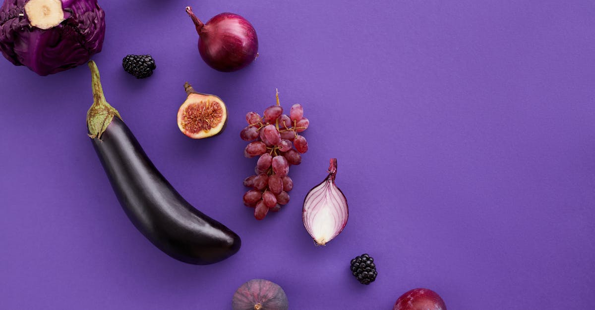
Plum vs Eggplant: What’s the Difference?
Plum and eggplant are both rich, dark purples named after fruits, and they are often used interchangeably in casual conversation. In design, however, the difference between plum and eggplant is significant. Plum is a lighter, warmer reddish-purple with a vibrant, berry-like quality (hex ~#8E4585), while eggplant is a darker, cooler brown-purple that feels moody and subdued (hex ~#614051). The plum vs eggplant color choice affects everything from brand perception to seasonal palette direction.
This guide explores both shades in depth — covering hex codes, undertones, design applications, and practical guidance for choosing the right dark purple. For a broader survey of purple shades, see our purple color palette resource.
Plum: The Warm Reddish-Purple
Plum takes its name from the fruit, and the association is immediate — a juicy, saturated purple with a red warmth that makes it feel lively even at darker values. Among the dark purples, plum is the approachable one, carrying enough vibrancy to attract the eye while still projecting sophistication.
Characteristics of Plum
A widely used hex for plum is #8E4585, yielding RGB 142, 69, 133. Its hue sits around 307 degrees — in the magenta-purple range — with moderate saturation and medium lightness. This reddish lean is what separates plum from cooler purples like violet or grape. It feels warm, almost berry-like, and carries a noticeable energy that pure eggplant lacks.
Plum’s warmth gives it strong pairing potential with golds, creams, dusty pinks, and warm grays. It reads as romantic, creative, and confident — three qualities that make it a popular choice in beauty, fashion, and lifestyle branding.
Design Applications for Plum
In graphic design, plum serves as a strong accent or secondary color that adds richness without the heaviness of black or navy. It works beautifully in call-to-action buttons, headline text, and illustration accents. In packaging, plum tones signal premium quality with a feminine or artisanal lean — think wine labels, chocolate boxes, and cosmetic tubes.
Plum is also a natural fit for autumn palettes, pairing with burnt orange, mustard, and deep olive. In color psychology, it bridges the creativity of purple with the passion of red, making it effective for brands that want to project both imagination and warmth.
Eggplant: The Dark Brown-Purple
Eggplant — called aubergine in British English — takes its name from the dark-skinned fruit. The color is deeper, browner, and moodier than plum, sitting in the shadows of the purple spectrum where sophistication borders on mystery.
Characteristics of Eggplant
Eggplant is commonly coded as #614051, translating to RGB 97, 64, 81. Its hue sits around 329 degrees with low saturation and low lightness — noticeably darker and more muted than plum. The brown undertone is the defining feature: it pulls eggplant away from the vibrancy of the purple family and toward the gravity of dark neutrals.
In practice, eggplant reads almost like a colored black. At small sizes or in dim lighting, it can appear very close to charcoal or espresso brown. This near-neutral quality makes it extremely versatile for dark backgrounds, text, and borders where a hint of color is desired without full chromatic intensity.
Design Applications for Eggplant
Eggplant excels in luxury and high-end design contexts. Its darkness and subtlety project exclusivity and refinement — qualities that resonate with fine dining, boutique hotels, premium spirits, and luxury fashion. As a background color, eggplant creates a moody, enveloping atmosphere that feels more nuanced and warmer than black.
In web design, eggplant backgrounds paired with light text (cream, gold, or soft white) create elegant dark-mode experiences. It also works as a sophisticated alternative to navy or charcoal in corporate branding for companies that want to stand apart from the standard dark-neutral playbook.
Key Differences
Here is how plum and eggplant compare across critical design dimensions:
- Lightness: Plum is a mid-dark purple; eggplant is a deep, near-black purple.
- Undertone: Plum leans red-magenta; eggplant leans brown.
- Saturation: Plum is more saturated and visibly colorful; eggplant is desaturated and muted.
- Temperature: Plum reads warmer due to its red content; eggplant reads cooler and more neutral.
- Mood: Plum feels vibrant, romantic, and creative; eggplant feels moody, mysterious, and ultra-sophisticated.
- Function: Plum works as an accent or secondary color; eggplant works as a dark base or background alternative to black.
Hex Codes and Design Use
Reference values for both colors:
- Plum (#8E4585): RGB 142, 69, 133 | CMYK 0, 51, 6, 44
- Eggplant (#614051): RGB 97, 64, 81 | CMYK 0, 34, 16, 62
In digital design, plum’s moderate lightness means it can serve as either a dark or light element depending on context. Against a white background, plum reads as a strong, colorful dark. Against a black background, it glows as a rich mid-tone. This versatility makes it invaluable for graphic design projects that span light and dark themes.
Eggplant, being much darker, functions primarily as a dark-mode background, text color, or container fill. Its CMYK values produce reliably on press because the ink coverage is heavy and even, avoiding the banding issues that lighter purples sometimes encounter. It reproduces especially well on uncoated paper stocks, where its brown undertone gains a rich, velvety quality.
The two colors combine powerfully. Using eggplant as a background with plum accents — buttons, links, highlighted text — creates a tonal purple scheme that feels both cohesive and dimensional. Add a metallic gold or warm cream as a third element and the palette radiates luxury.
When to Use Each
Choose Plum When
- You want a dark purple that still reads as unmistakably purple and carries visible warmth.
- The project has a romantic, creative, or feminine identity — beauty, fashion, lifestyle.
- Autumn or berry-themed seasonal campaigns need a rich accent color.
- You need a mid-value color that bridges light and dark elements in a layout.
Choose Eggplant When
- You want a near-black with a subtle color personality — an alternative to pure black or charcoal.
- The brand targets ultra-premium, moody, or mysterious positioning — fine dining, luxury spirits, boutique hospitality.
- Dark backgrounds need warmth and depth beyond what neutral darks offer.
- You are designing for autumn or winter palettes where deep, subdued tones dominate.
FAQ
Is eggplant just a darker plum?
Eggplant is darker than plum, but the difference extends beyond value. Eggplant has a distinct brown undertone that makes it read as a near-neutral, while plum’s red-magenta lean keeps it firmly in the colorful purple camp. Darkening plum would produce a deep magenta-purple, not the brown-tinged darkness of eggplant.
Can plum and eggplant work together in a design?
Yes, and the combination is highly effective. Eggplant provides a deep, moody base, while plum adds a warmer, more vibrant accent. The tonal relationship between the two creates visual depth without requiring a contrasting hue. Add a light neutral like cream or gold for balance.
Which purple is better for luxury branding?
Both work in luxury contexts, but they project different facets of it. Plum conveys accessible luxury — beauty brands, boutique retail, artisanal products. Eggplant conveys exclusive luxury — private clubs, premium spirits, high-end hospitality. The choice depends on whether the brand wants to feel inviting or rarefied. For more on how purple shades influence brand perception, visit our color psychology guide.
What colors pair well with eggplant?
Eggplant pairs beautifully with gold, brass, cream, dusty rose, sage green, and warm gray. For contrast, try eggplant with mustard or burnt orange. Cooler pairings include silver, icy blue, and lavender. Browse our purple color palette for curated combinations featuring eggplant and other deep purples.


