Postcard Design Principles That Work
A postcard gets a fraction of a second to earn attention as it is pulled from a mailbox alongside bills and flyers. There is no envelope to open, so the message is exposed and the design must land instantly. Effective postcard design principles prioritize a single bold idea, ruthless legibility, and a layout that satisfies postal requirements. Postcards fail when they cram in too many messages, ignore safe zones so artwork gets trimmed, or bury the call to action. They succeed when one focal point, a scannable hierarchy, and a clean mail-ready back work together.
The key principles of postcard design
Postcards reward simplicity and punish clutter. The principles below balance visual impact on the front with the practical demands of the back and the postal system. Here is the quick reference.
| Principle | Why it matters |
|---|---|
| One bold focal point | A single image or message captures attention in a glance. |
| Scannable hierarchy | Readers absorb the message without stopping to study it. |
| Standard sizes | 4×6, 5×7, and 6×9 fit printing and postal rate brackets. |
| Bleed and safe zones | Proper margins keep artwork and text from being trimmed off. |
| Clear call to action | One obvious next step turns attention into response. |
| Mail-ready back layout | Address and postage areas must follow postal regulations. |
| Legibility at a glance | Bold type and contrast carry the message from arm’s length. |
1. One bold focal point — a single idea on the front
The front of a postcard should deliver one dominant image or headline, not a collage of competing elements. Whether it is a striking photograph, a single offer, or a short punchy message, that focal point must be the first and clearest thing the reader sees. Resist the temptation to communicate everything at once; a single strong idea cuts through the noise of a crowded mailbox far better than a busy layout ever could.
2. Scannable hierarchy — read it without trying
Most people skim a postcard, so the design must reward skimming. Establish an obvious order: headline first, supporting detail second, call to action third. Use size, weight, and color to rank these so the eye flows naturally through them. A reader should grasp the core message in under three seconds. A confident visual hierarchy is what separates a postcard that gets read from one that gets tossed.
3. Standard sizes — design for print and postage
Postcards print and mail most economically at standard dimensions: 4 x 6, 5 x 7, and 6 x 9 inches are the common choices. These sizes align with printer presets and postal rate categories, so choosing one keeps both production and mailing costs predictable. Larger formats command more attention but may push into higher postage brackets. Confirm the exact dimensions and rate category before you finalize the layout.
4. Bleed and safe zones — protect your edges
Commercial printing trims each card slightly, so any background color or image that reaches the edge must extend past it as bleed, typically an eighth of an inch. Keep all critical text and logos inside a safe zone, set in from the trim line, so nothing important gets cut. Ignoring bleed leaves thin white slivers at the edges; ignoring the safe zone risks chopping off your headline. Set up your file with these margins from the start.
5. Clear call to action — make the next step obvious
A postcard exists to prompt an action: visit a site, call a number, redeem an offer, attend an event. That call to action must be unmistakable and singular. Give it visual prominence, phrase it in plain imperative language, and make any code, URL, or deadline easy to read and remember. Burying the CTA or offering too many competing actions dilutes response. One clear ask outperforms several scattered ones.
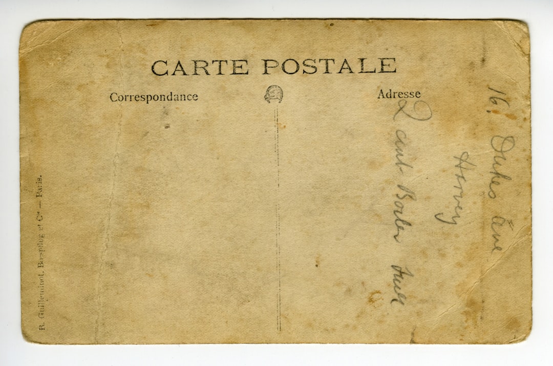
6. Mail-ready back layout — respect postal regulations
The back of a postcard is divided by convention and regulation: the right portion is reserved for the recipient’s address and the postage or indicia area, while the left holds your message and details. Keep the address zone clear of graphics so automated sorting equipment can read it, and leave the required clear space around the postage area. A clean, compliant back ensures your card actually gets delivered.
7. Legibility at a glance — bold type and high contrast
Because a postcard is read quickly and often at arm’s length, type must be bold and high-contrast. Keep headlines large, avoid thin fonts on busy photographic backgrounds, and ensure text sits over areas of sufficient contrast. Generous white space around the key message keeps it from drowning in imagery and helps it read instantly. If a passerby cannot read the headline in a second, the design needs more contrast or less clutter.
Common postcard design mistakes to avoid
- Cramming multiple messages or offers onto the front instead of one focal point.
- Placing important text or logos outside the safe zone so they get trimmed.
- Crowding the address area with graphics that confuse postal sorting machines.
- Hiding or omitting a clear call to action, leaving readers with no next step.
Frequently Asked Questions
What are the most important postcard design principles?
The most important principles are leading with one bold focal point, keeping the layout scannable, including a single clear call to action, and respecting bleed, safe zones, and postal regulations on the back. Together they make a postcard that grabs attention instantly and actually gets delivered and acted upon.
What are standard postcard sizes?
The most common postcard sizes are 4 x 6, 5 x 7, and 6 x 9 inches. These align with printer presets and US postal rate brackets, keeping production and mailing affordable. The 4 x 6 size qualifies for the lowest postcard postage rate, while larger sizes draw more attention at higher cost.
What is bleed and why does it matter on a postcard?
Bleed is the extra image area, usually an eighth of an inch, that extends beyond the trim line so background color reaches the edge after cutting. Without it, slight trimming variance leaves thin white borders. Keep critical text inside a matching safe zone so nothing important is cut off.
How should I lay out the back of a postcard?
Reserve the right portion of the back for the recipient’s address and postage area, keeping it free of graphics so sorting machines can read it. Use the left portion for your message, details, and contact information. Follow your postal service’s spacing requirements to ensure smooth delivery.
How do I make a postcard stand out in the mail?
Lead with one bold image or message, use high-contrast type, and apply proven design principles of hierarchy and restraint. A larger format, a striking color, and a single compelling call to action all help your card cut through a crowded mailbox.


