Raleway Font Pairing: 12 Best Combinations for Elegant Design
The right Raleway font pairing transforms a design from presentable to refined. Raleway is one of the most elegant geometric sans-serif typefaces available on Google Fonts, distinguished by its striking thin weights, clean letterforms, and a personality that leans toward sophistication rather than brute impact. Originally designed by Matt McInerney as a single thin weight and later expanded into a full family by Pablo Impallari and Rodrigo Fuenzalida, Raleway has earned its place in portfolios, fashion sites, and luxury branding projects worldwide.
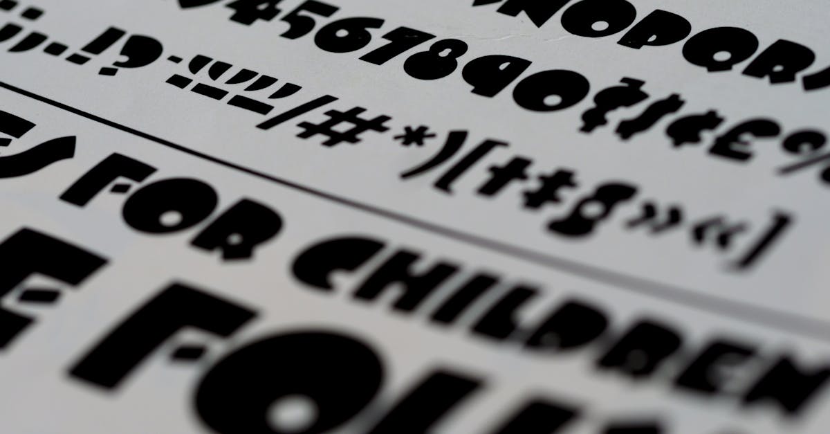
But Raleway has a specific temperament. It shines brightest at thin and light weights for headings and display text, where its delicate geometry and distinctive letterforms (look at that capital W) can breathe. Pair it carelessly with the wrong body font and the elegance collapses. Pair it thoughtfully and you get that rare combination of visual refinement and effortless readability that separates professional typography from guesswork.
In this guide, I have curated 12 of the best Raleway font pairing combinations, organized by style. Each entry includes the reasoning behind the pairing, recommended font weights, ideal use cases, and CSS snippets you can use immediately. Whether you are building a personal portfolio, designing a luxury brand identity, or laying out an editorial website, there is a Raleway combination here that fits.
The Key Principle Behind Raleway Font Pairing
Before jumping into specific combinations, there is one guiding rule that shapes every pairing in this list: Raleway is at its best when used at thin, light, or regular weights for headings, not for body text.
This is the single most important thing to understand about pairing with Raleway. Unlike Montserrat or Open Sans, which work across the full spectrum of sizes and weights, Raleway’s character is defined by its delicate thin strokes and elegant geometry. At heavier weights it becomes competent but unremarkable. At body text sizes, its wide letterforms and even stroke widths can tire readers over long passages.
The strategy, then, is to let Raleway handle the display work and choose a body font that delivers strong readability at smaller sizes. The best companions are fonts with generous x-heights, clear letter differentiation, and enough warmth or texture to contrast with Raleway’s cool precision. For a deeper look at these principles, see our complete guide to font pairing.
Raleway + Serif Font Pairings
Serif fonts are the most natural companions for Raleway. The organic details and stroke variation in serif letterforms contrast beautifully with Raleway’s geometric precision, creating a dynamic that feels both modern and grounded. These are the strongest fonts that go with Raleway for editorial and long-form content.
1. Raleway + Lora
Why it works: Lora is a contemporary serif with roots in calligraphy, offering brushed curves and moderate contrast that soften Raleway’s geometric coolness. The two fonts share a similar sense of elegance without competing for attention. Lora’s generous x-height ensures strong readability at body sizes, while its subtle calligraphic details introduce the organic warmth that Raleway lacks on its own. This is arguably the single best Raleway Google font pairing for most projects.
Best for: Lifestyle blogs, boutique e-commerce, wedding sites, and creative portfolios.
Recommended weights:
- Headings: Raleway Light (300) or Regular (400) at 36px+
- Body: Lora Regular (400)
- Emphasis: Lora Italic (400i) for pull quotes and highlighted passages
CSS snippet:
@import url('https://fonts.googleapis.com/css2?family=Lora:ital,wght@0,400;1,400&family=Raleway:wght@300;400&display=swap');

h1, h2, h3 {
  font-family: 'Raleway', sans-serif;
  font-weight: 300;
  letter-spacing: 0.02em;
}
body, p {
  font-family: 'Lora', serif;
  font-weight: 400;
  line-height: 1.75;
}
2. Raleway + Merriweather
Why it works: Merriweather was built from the ground up for screen readability, with sturdy serifs, large counters, and a tall x-height that keeps text sharp at small sizes. Against Raleway’s thin, airy headings, Merriweather’s solidity creates a satisfying visual anchor. The contrast in texture is pronounced: where Raleway floats with geometric delicacy, Merriweather plants itself firmly on the page and invites the reader in. This pairing works across the widest range of projects.
Best for: Content-heavy blogs, news sites, SaaS landing pages, and corporate communications.
Recommended weights:
- Headings: Raleway Light (300) or Thin (100) at 40px+
- Body: Merriweather Regular (400)
- Pull quotes: Merriweather Light (300) at 22px+
CSS snippet:
@import url('https://fonts.googleapis.com/css2?family=Merriweather:wght@300;400&family=Raleway:wght@100;300&display=swap');

h1 {
  font-family: 'Raleway', sans-serif;
  font-weight: 100;
  font-size: 3rem;
  letter-spacing: 0.03em;
}
h2, h3 {
  font-family: 'Raleway', sans-serif;
  font-weight: 300;
}
body, p {
  font-family: 'Merriweather', serif;
  font-weight: 400;
  line-height: 1.8;
}
3. Raleway + Cormorant Garamond
Why it works: Cormorant Garamond is a display serif designed by Christian Thalmann, inspired by the work of Claude Garamond but reimagined for screen with higher contrast and more dramatic proportions. When paired with Raleway, the result is pure elegance. Both fonts share a refined, almost aristocratic sensibility, yet they differ enough in structure to avoid redundancy. Raleway’s geometric lines set the modern tone, and Cormorant Garamond’s classical serif forms add depth and historical resonance.
Best for: Luxury fashion brands, high-end real estate, fine dining, jewelry sites, and art gallery portfolios.
Recommended weights:
- Headings: Raleway Thin (100) or ExtraLight (200) at 42px+
- Body: Cormorant Garamond Regular (400) at 18px+
- Subheadings: Cormorant Garamond SemiBold (600)
CSS snippet:
@import url('https://fonts.googleapis.com/css2?family=Cormorant+Garamond:wght@400;600&family=Raleway:wght@100;200&display=swap');

h1, h2 {
  font-family: 'Raleway', sans-serif;
  font-weight: 100;
  text-transform: uppercase;
  letter-spacing: 0.08em;
}
body, p {
  font-family: 'Cormorant Garamond', serif;
  font-weight: 400;
  font-size: 1.125rem;
  line-height: 1.75;
}
4. Raleway + Libre Baskerville
Why it works: Libre Baskerville is a web-optimized revival of the classic Baskerville design, with wider counters and slightly heavier strokes than its historical predecessor. These adjustments make it remarkably legible on screen while preserving the scholarly authority of the original. Paired with Raleway’s modern geometry, the combination bridges contemporary minimalism and literary tradition. It feels smart without being stuffy.
Best for: Publishing houses, book review platforms, academic journals, law firm websites, and editorial design.
Recommended weights:
- Headings: Raleway Regular (400) or Light (300)
- Body: Libre Baskerville Regular (400)
- Emphasis: Libre Baskerville Italic (400i)
5. Raleway + Crimson Text
Why it works: Crimson Text is an old-style serif with gentle bracketed serifs and a warm, literary character. Its proportions are modeled on classical text typefaces, making it exceptionally comfortable for sustained reading. Raleway’s cool geometry and Crimson Text’s old-world warmth create a pairing with genuine personality. The contrast is not just visual but emotional: modern precision meeting timeless craftsmanship.
Best for: Independent bookstores, literary magazines, non-profit organizations, and cultural institutions.
Recommended weights:
- Headings: Raleway Light (300) at 32px+
- Body: Crimson Text Regular (400) at 18px+ (its smaller x-height benefits from slightly larger sizing)
- Emphasis: Crimson Text Italic (400i)
Raleway + Sans-Serif Font Pairings
Pairing Raleway with another sans-serif requires careful selection. Because Raleway is geometric, the companion should come from a different classification. Humanist sans-serifs work best, bringing the organic stroke variation and open forms that prevent the pairing from feeling flat. Here are the best Raleway combinations within the sans-serif family.
6. Raleway + Open Sans
Why it works: Open Sans is a humanist sans-serif designed by Steve Matteson with neutral, friendly letterforms and outstanding screen legibility. While both fonts are sans-serifs, their structural DNA is entirely different. Raleway is geometric and angular, with distinctive character shapes. Open Sans is humanist and organic, with calligraphic underpinnings and softer curves. This structural contrast gives the pairing visual interest while maintaining a unified, modern feel.
Best for: SaaS platforms, corporate websites, tech documentation, and product landing pages.
Recommended weights:
- Headings: Raleway Regular (400) or Medium (500)
- Body: Open Sans Regular (400)
- UI elements: Open Sans SemiBold (600)
7. Raleway + Roboto
Why it works: Roboto occupies a unique space between geometric and humanist sans-serif classifications. Its letterforms start with a geometric skeleton but feature open curves and natural letter widths that make it highly readable at body sizes. This hybrid nature makes it a strong Raleway companion. Raleway handles the elegant display role, and Roboto provides a utilitarian, no-fuss reading experience for everything else. Google uses Roboto as the default Android typeface, so it is one of the most battle-tested body fonts available.
Best for: Android app design, material design projects, startup websites, and dashboard interfaces.
Recommended weights:
- Headings: Raleway Light (300) or Regular (400)
- Body: Roboto Regular (400)
- Captions and metadata: Roboto Light (300)
8. Raleway + Montserrat
Why it works: This is a pairing between two geometric sans-serifs that works because of how each font handles its geometry differently. Raleway is thinner, more refined, and has more distinctive letterforms, especially in its capital W and lowercase e. Montserrat is broader, bolder, and more assertive. Using Raleway at thin weights for hero headings and Montserrat at regular weight for body and subheadings creates a hierarchy based on weight and personality rather than serif-versus-sans-serif contrast.
Best for: Architecture firms, design studios, photography portfolios, and minimalist branding.
Recommended weights:
- Headings: Raleway Thin (100) or ExtraLight (200) at 48px+
- Subheadings: Montserrat Medium (500)
- Body: Montserrat Regular (400) with 1.65 line height
Raleway + Display Font Pairings
Display pairings let you use Raleway in a supporting role while a more expressive typeface commands the hero space. Alternatively, some display fonts pair beautifully with Raleway when Raleway takes the lead in its thinnest weights. These combinations are for projects where visual impact and brand personality take priority.
9. Raleway + Playfair Display
Why it works: Playfair Display is a high-contrast transitional serif with sharp, unbracketed serifs and dramatic thick-thin strokes. It commands attention at large sizes with an editorial, almost journalistic authority. Pairing it with Raleway creates a two-level display system: Playfair Display for primary headlines that demand notice, and Raleway Light for subheadings and navigational text that require elegance without competing. The combination is rich with contrast yet cohesive in its refined mood.
Best for: Fashion magazines, editorial sites, upscale restaurant branding, and luxury e-commerce.
Recommended weights:
- Primary headings: Playfair Display Bold (700) at 48px+
- Subheadings: Raleway Light (300) or Regular (400)
- Body: Raleway Regular (400) at 16px with 1.7 line height
10. Raleway + DM Serif Display
Why it works: DM Serif Display is a modern interpretation of the transitional serif style with slightly rounded details and a warm, approachable personality. Where Playfair Display is sharp and authoritative, DM Serif Display is inviting and contemporary. Paired with Raleway, the combination strikes a balance between formality and friendliness. DM Serif Display brings the organic curves and weight that Raleway’s thin headings lack, and Raleway provides the geometric structure that keeps the overall design feeling modern.
Best for: Boutique hotel websites, lifestyle brands, food and beverage marketing, and creative studio portfolios.
Recommended weights:
- Primary headings: DM Serif Display Regular (400) at 40px+
- Subheadings: Raleway Medium (500)
- Body: Raleway Regular (400)
11. Raleway + Abril Fatface
Why it works: Abril Fatface is a didone display typeface with extreme thick-thin contrast and voluptuous curves. It is unapologetically dramatic. Pairing it with Raleway Thin creates one of the most visually striking combinations in this list. The near-hairline strokes of Raleway at its lightest weight echo the thin strokes in Abril Fatface’s letterforms, creating a subtle visual thread between the two fonts despite their vastly different personalities. The dramatic and the minimal exist side by side.
Best for: Event invitations, magazine covers, theatrical promotion, and bold brand statements.
Recommended weights:
- Display headings: Abril Fatface Regular (400) at 56px+
- Supporting text: Raleway Thin (100) or ExtraLight (200)
- Body: Raleway Light (300) at 16px with 1.7 line height
Raleway + Monospace Font Pairing
12. Raleway + Fira Code
Why it works: Fira Code is a monospace typeface designed for programming, with coding ligatures and a technical aesthetic that pairs unexpectedly well with Raleway’s refined geometry. The combination works because both fonts share a sense of precision and intentionality. Raleway brings the elegance, Fira Code brings the technical credibility. This is not a pairing for every project, but for the right context it is distinctive and memorable.
Best for: Developer portfolios, tech documentation with a design-forward aesthetic, creative coding sites, and digital agency case studies.
Recommended weights:
- Headings: Raleway Light (300) or Regular (400)
- Body: Fira Code Regular (400) at 15-16px
- Code blocks: Fira Code Light (300)
Tips for Getting the Most from Raleway Font Pairings
Raleway rewards designers who understand its strengths and work with them rather than against them. Here are practical guidelines to keep in mind:
- Lean into thin weights for headings. Raleway Thin (100) and Light (300) are where the font’s character lives. At Bold or ExtraBold, it loses the distinctiveness that sets it apart from other geometric sans-serifs. Use heavier weights only for UI elements or buttons where emphasis is needed.
- Increase letter-spacing at thin weights. At Thin and ExtraLight weights, adding 0.02em to 0.05em of letter-spacing improves legibility and amplifies the airy, elegant quality. For uppercase text, increase to 0.06em to 0.1em.
- Set headings large. Raleway Thin at 14px is illegible. At 40px or above, it is stunning. The thin weights demand generous sizing. Plan your typographic scale accordingly.
- Use uppercase sparingly but effectively. Raleway in all caps with generous letter-spacing creates a refined, fashion-editorial look. This works for short lines like navigation items, section labels, and category tags. Avoid setting long sentences in uppercase.
- Limit loaded weights. Load only the weights you need. For most projects, Thin (100) and Light (300) for headings, plus Regular (400) for supporting text, is sufficient. Each additional weight adds to your page load time. Raleway is available as a variable font, which lets you access every weight in a single file.
Frequently Asked Questions
What is the best font to pair with Raleway?
For most projects, Lora is the best font to pair with Raleway. Its calligraphic warmth and generous x-height complement Raleway’s geometric coolness, creating a pairing that balances elegance with readability. For a more luxurious feel, Cormorant Garamond is an outstanding choice. For sans-serif body text, Open Sans offers the most versatile and readable option. The right choice depends on your project’s tone and content volume. Browse our best Google Fonts guide for more options across categories.
Is Raleway a good font for body text?
Raleway is not ideal for body text in most situations. Its geometric structure, wide letterforms, and even stroke widths create fatigue over long passages. Raleway performs best as a heading and display font, particularly at its thinner weights (100-300), where its distinctive character can shine at large sizes. For body text, pair it with a font specifically designed for extended reading, such as Merriweather, Lora, or Open Sans. If you must use Raleway for body text, set it at Regular (400) weight, increase line height to at least 1.7, and keep text blocks short.
What is the difference between Raleway and Montserrat?
Both are geometric sans-serifs on Google Fonts, but they serve different roles. Montserrat is broader, bolder, and more assertive, working well across all weights from Thin to Black. Raleway is thinner, more refined, and most distinctive at light weights. Montserrat excels as an all-purpose font that handles headings, body text, and UI equally well. Raleway excels as a display and heading font where elegance and delicacy are the priority. Look at the capital W in each font and the difference in personality is immediately clear. For more on Raleway’s design history and characteristics, see our dedicated review.
Can I use Raleway and Playfair Display together?
Yes, Raleway and Playfair Display make an excellent pairing. Use Playfair Display for primary headlines at large sizes to leverage its high-contrast, editorial character, and use Raleway at Light or Regular weight for subheadings, navigation, and body text. The two fonts share a refined sensibility but differ enough in structure to create strong typographic contrast. This combination is particularly effective for fashion, editorial, and luxury brand projects.


