Rebranding: When and How to Refresh Your Brand
Rebranding is one of the highest-stakes decisions a business can make. It involves changing how a company presents itself to the world — sometimes subtly, sometimes dramatically — and the consequences of getting it right or wrong can define a brand’s trajectory for years. Done well, a rebrand breathes new life into a stagnant business, repositions it for a changed market, or signals a genuine transformation in what the company stands for. Done poorly, it alienates loyal customers, wastes enormous resources, and erases the equity that took years to build. Understanding what branding actually involves is the necessary starting point for any conversation about changing it.
The decision to rebrand should never be casual. It requires honest assessment of where a brand stands, clear thinking about where it needs to go, and a deliberate brand strategy that connects the two. This guide covers the full picture: when rebranding makes sense, when it does not, the step-by-step process for doing it well, and the mistakes that derail even well-intentioned efforts.
What Is Rebranding?
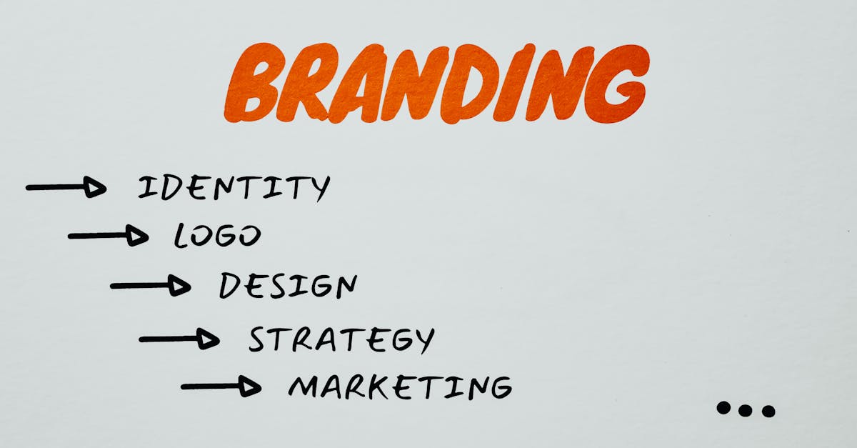
Rebranding is a fundamental change to a brand’s identity, positioning, or strategy — or some combination of all three. It is the process of reshaping how a company is perceived by its audience, and it can range from a focused visual update to a complete strategic overhaul that touches every aspect of the business. The scope depends entirely on what needs to change and why.
There is an important distinction between a brand refresh and a full rebrand. A brand refresh is a visual update that works within the existing strategic framework. The brand’s positioning, values, and fundamental identity remain the same, but the visual execution is modernized. Think of it as updating the wardrobe without changing the personality. A refresh typically involves refining the logo, updating the color palette, introducing new typography, or modernizing the overall design language — all while preserving the core identity that customers already recognize.
A full rebrand, by contrast, involves strategic repositioning. The brand’s target audience, market position, value proposition, or even its name may change. The visual identity changes too, but as a consequence of the strategic shift rather than as the primary objective. A full rebrand says something has fundamentally changed about what this company is, who it serves, or how it competes. The brand identity that emerges from a full rebrand should feel like a different entity, because strategically it is one.
Most rebranding projects fall somewhere on the spectrum between these two poles. The critical question is always whether the existing strategy is still sound. If the strategy works but the visual execution has aged, a refresh is appropriate. If the strategy itself no longer serves the business, a full rebrand is necessary.
When to Rebrand
A rebrand should be a response to a genuine strategic need, not a reaction to boredom or trend anxiety. The following situations represent legitimate reasons to consider rebranding.
Merger or Acquisition
When two companies come together, the resulting entity needs a unified brand. This might mean adopting one company’s brand, blending elements of both, or creating something entirely new. The right approach depends on relative brand equity, market positioning, and the strategic intent behind the merger. Mergers are among the most common triggers for rebranding because the alternative — operating under two conflicting brand identities — creates confusion and dilutes both brands.
Outdated Visual Identity
Design ages. A visual identity that felt current in 2005 may look dated now, and visual perception directly affects credibility. If a brand’s design language signals a previous era, potential customers may assume the products, services, or thinking behind them are equally outdated. This is especially relevant in industries where innovation and modernity are core to the value proposition. Outdated design is one of the clearest signals that at least a brand refresh is overdue.
Market Repositioning
When a company shifts its target market — moving upmarket, downmarket, or into an entirely different category — the existing brand identity often no longer fits. A budget brand entering the premium space needs to look and feel premium. A B2B company pivoting to B2C needs to communicate differently. The brand must reflect the reality of who the company now serves and how it competes.
Negative Reputation
Sometimes a brand becomes associated with something damaging — a scandal, systemic failures, or persistent negative perceptions that no amount of good work can overcome under the current identity. In these cases, rebranding can signal a genuine break from the past. But the rebrand only works if the underlying problems have actually been addressed. Changing the logo on a broken company is not rebranding. It is camouflage.
Audience Shift
If a brand’s core audience has changed significantly — through demographic shifts, evolving customer needs, or expansion into new markets — the brand may need to evolve with them. A brand that once spoke primarily to Gen X professionals may now need to resonate with millennial and Gen Z audiences without alienating its existing base. This is one of the more nuanced rebranding scenarios because it requires evolution rather than revolution.
New Leadership or Direction
A significant change in company direction — new leadership with a different vision, a pivot in business model, or a fundamental shift in company values — can warrant a rebrand. The brand should reflect who the company actually is, and when that changes substantially, the brand needs to follow.
Name Change
Whether driven by legal requirements, international expansion, or strategic repositioning, a name change necessitates a rebrand. The name is the most fundamental element of brand identity, and changing it creates both the need and the opportunity to reconsider everything else.
In all of these cases, the key test is whether the current brand is actively holding the business back. If the answer is yes, and the reasons are structural rather than superficial, a rebrand deserves serious consideration. But there is an equally important question: if the brand is working, does it need to change? The “if it ain’t broke” principle applies here. Rebranding carries real risk, and the burden of proof should be on the case for change, not the case for the status quo.
When NOT to Rebrand
Not every itch to change deserves to be scratched. Some of the most common reasons companies pursue rebranding are, frankly, bad reasons — and the result is wasted money, lost brand equity, and confused customers.
Leadership Boredom
The most common bad reason for rebranding is that the founder, CEO, or marketing team is simply tired of looking at the current brand. This is a natural human reaction — the people who see a brand every single day will tire of it long before the audience does. But the audience is the one that matters. A brand that feels stale internally may still be working effectively in the market. Rebrand because the market demands it, not because the boardroom is restless.
A Competitor Changed Their Look
When a competitor rebrands, it can trigger anxiety. Suddenly the industry looks different, and the impulse is to keep up. But reactive rebranding driven by competitor moves is rarely strategic. The competitor’s reasons for changing are their own. Unless their rebrand has genuinely shifted the competitive landscape in ways that affect your positioning, their design decisions should not dictate yours.
Following Design Trends
Trends are temporary by definition. Rebranding to chase a trend — flat design, gradient everything, geometric minimalism — guarantees that the brand will need to change again when the trend passes. Strong brands are designed to outlast trends, not embody them. Drawing inspiration from contemporary design is different from rebuilding a brand identity around a passing aesthetic moment.
New CEO Ego
New leadership sometimes wants to put a visible stamp on the organization, and rebranding is the most visible stamp available. But a rebrand should serve the business, not the ego of its new leader. If the existing brand is strong and the new CEO’s objections are matters of personal taste rather than strategic substance, the right move is to leave it alone.
Masking Operational Problems
A rebrand cannot fix a broken product, poor customer service, or a toxic internal culture. If customers are leaving because of bad experiences, a new logo will not bring them back. Rebranding as a substitute for fixing operational problems is not just ineffective — it can accelerate decline by drawing attention to a company that is not ready for scrutiny. Fix the fundamentals first. Rebrand once there is something genuinely better to represent.
The Rebranding Process
A well-executed rebrand follows a structured process that moves from assessment through strategy, design, and implementation. Skipping steps or rushing through them is where most rebranding efforts go wrong. The following eight stages represent a proven rebranding process that balances strategic rigor with creative exploration.
1. Audit the Current Brand
Before changing anything, understand what you have. A brand audit examines every aspect of the current brand — visual identity, messaging, customer perception, competitive positioning, and market performance. The audit should answer two fundamental questions: what is working, and what is not? This is not a subjective exercise. It requires data: customer surveys, brand awareness metrics, competitor analysis, and an honest assessment of where the brand stands relative to where it needs to be.
The audit also inventories all existing brand assets — logos, templates, signage, packaging, digital properties, marketing materials — to understand the scope of what a rebrand would need to replace. This inventory directly affects timeline and budget planning.
2. Research and Strategy
With the audit complete, the next step is research that informs the rebrand strategy. This includes market research to understand current customer needs and expectations, competitive analysis to identify positioning opportunities, and internal stakeholder interviews to align leadership on the brand’s future direction. The research phase should surface insights that challenge assumptions. If the research simply confirms what everyone already believed, it probably was not thorough enough.
The strategic output of this phase is a clear articulation of the brand’s new positioning: who it serves, how it differentiates, what it promises, and why that promise is credible. Every design decision that follows should trace back to this strategic foundation.
3. Redefine Positioning and Messaging
With the strategy set, the brand’s positioning statement, key messages, value propositions, and brand voice need to be defined or redefined. This is the verbal layer of the brand — the words it uses, the tone it strikes, and the narrative it tells about itself. Messaging should be developed before visual design begins because the design needs to express something specific. Designing first and writing later almost always produces an identity that looks appealing but communicates nothing distinctive.
4. Visual Identity Exploration
Now the design work begins. Visual identity exploration is the creative phase where designers translate the strategic and verbal foundations into visual language. This includes logo development, color palette exploration, typographic systems, photography and illustration direction, and supporting graphic elements. The principles that guide effective logo design remain constant whether the project is a first identity or a rebrand, though rebranding adds the additional consideration of how much to preserve from the existing identity.
Exploration should be broad before it narrows. Multiple directions should be developed and evaluated against the strategy — not against personal preferences. The strongest creative direction is the one that most effectively communicates the strategic position, even if it is not the one the design team or leadership initially favored. Understanding the different types of logos available helps ensure the exploration considers all viable approaches rather than defaulting to familiar formats.
5. Brand Guidelines Creation
Once the visual identity is finalized, it must be documented comprehensively. Brand guidelines specify how every element of the identity should be used — and how it should not be used. This includes logo clear space, minimum sizes, approved color combinations, typography hierarchy, image treatment standards, and application examples across key touchpoints. Guidelines are what ensure consistency as the brand is implemented across teams, agencies, and media channels. Without them, the brand begins to fragment the moment it leaves the design team’s hands.
6. Internal Launch
The rebrand should reach employees before it reaches customers. Internal launch is the process of introducing the new brand to the organization, explaining the strategic rationale behind it, and equipping people to represent it correctly. Employees who do not understand or believe in the rebrand become a liability — they will revert to old language, resist new materials, and undermine the consistency that the brand depends on.
Internal launch is also an opportunity to generate genuine enthusiasm. When employees understand why the change is happening and feel included in the process, they become ambassadors rather than skeptics. This requires more than an all-hands email. It requires training, conversation, and the time for people to ask questions and process the change.
7. External Rollout
The external launch is the public-facing debut of the new brand. The approach — whether a dramatic reveal or a phased transition — depends on the scale of the change and the brand’s relationship with its audience. A full rebrand with a name change typically requires a coordinated launch moment. A brand refresh might be rolled out gradually, updating touchpoints over weeks or months.
Rollout planning must account for every place the brand appears: website, social media profiles, email templates, packaging, signage, advertising, documentation, app stores, third-party listings, and physical spaces. Missing touchpoints during rollout creates a confusing period where the old and new brands coexist, which undermines the credibility of the change.
8. Monitor and Adjust
A rebrand does not end at launch. The weeks and months following an external rollout require active monitoring of audience response, media coverage, customer feedback, and business metrics. Some elements of a new brand may need refinement based on real-world performance. Typography that tested well in mockups might not work at certain sizes in production. Color combinations might present accessibility challenges that were not caught in design. The rollout is the beginning of the new brand’s life, not the end of the project.
Brand Refresh vs Full Rebrand
Choosing between a refresh and a full rebrand is one of the most consequential early decisions in the process. The distinction is not just about scope — it is about what needs to change and why.
A brand refresh is the right choice when the brand’s strategic foundation is still sound but its visual execution has fallen behind. The positioning works. The audience is right. The values still resonate. The brand just looks like it belongs to a different decade. In this case, the goal is to modernize the visual language without disrupting the recognition and equity that the brand has built. Burger King’s 2021 refresh is a textbook example: the company returned to a heritage-inspired design that felt both familiar and modern, stripping away the glossy effects of its previous logo in favor of a flatter, warmer, more confident visual identity. The strategy did not change. The execution improved.
Instagram’s logo evolution followed a similar logic. The shift from the realistic camera icon to the gradient glyph in 2016 was controversial but strategically sound — the app had outgrown the skeuomorphic era, and the new mark better represented the platform’s expanding role in visual culture. It was a significant visual change, but the brand’s positioning and audience remained constant.
A full rebrand is necessary when the strategy itself has shifted. Dunkin’ Donuts dropping “Donuts” from its name was not a visual exercise — it reflected a strategic repositioning away from being a donut shop and toward being a beverage-led quick-service brand. The visual changes followed the strategic change. Facebook’s transformation into Meta was even more dramatic: a fundamental repositioning of the entire company around a different technological vision, requiring a new name, new mark, and new brand architecture to distinguish the corporate entity from the social media platform.
Understanding broader design styles and how they evolve over time helps contextualize why some refreshes succeed while others feel forced. The risk of choosing a refresh when a full rebrand is needed is that the result feels cosmetic — a fresh coat of paint on a structure that needed renovation. The risk of choosing a full rebrand when a refresh would suffice is that it destroys hard-earned recognition and forces customers to rebuild their mental model of the brand from scratch. Neither mistake is cheap to fix.
Famous Rebrand Examples
Studying successful rebrands reveals patterns in what works and why. The following examples represent different types of rebranding challenges and strategies.
Burberry: From Negative Association to Luxury Authority
Burberry’s rebrand is one of the most studied turnarounds in fashion history. By the early 2000s, the brand’s signature check pattern had become so widely counterfeited and associated with a specific British subculture that it was actively damaging the brand’s luxury positioning. The brand had lost control of its own identity — a dangerous position for any company, but potentially fatal for a luxury house.
The turnaround was strategic before it was visual. Under CEO Angela Ahrendts and then Christopher Bailey, Burberry restricted distribution, invested heavily in digital innovation, and repositioned itself as a modern British luxury brand with genuine heritage. The visual identity evolved to support this positioning — cleaner, more refined, unmistakably premium. The success was not in the new design itself but in the alignment between what the brand promised visually and what it delivered experientially.
Old Spice: Demographic Repositioning
Old Spice faced an existential problem: its audience was aging, and younger men associated the brand with their grandfathers. The product was fine. The brand was the problem. The rebrand strategy was bold — rather than gradually modernizing, Old Spice leaned into humor and absurdity with the “The Man Your Man Could Smell Like” campaign, completely redefining the brand’s personality while keeping the existing product line largely intact.
What makes Old Spice’s rebrand instructive is that it was primarily a repositioning of brand voice and personality rather than a visual overhaul. The logo, packaging, and product remained recognizable. The brand’s entire attitude changed. This demonstrates that rebranding is not always about design — sometimes the most powerful rebrand is changing how the brand talks, not how it looks.
Mailchimp: Startup to Enterprise
Mailchimp’s 2018 rebrand addressed a common scaling challenge: the brand’s quirky, whimsical identity — epitomized by Freddie the chimp mascot — had helped it stand out as a startup but risked undermining its credibility as it moved into the enterprise market. The rebrand did not abandon Freddie or the brand’s irreverent personality. Instead, it codified and refined them into a more sophisticated design system with custom typography (the bespoke typeface Cooper Light), an expanded illustration style, and a more structured visual language.
The lesson from Mailchimp is that rebranding does not require starting from zero. The most successful rebrands often preserve what made the brand distinctive in the first place while elevating the execution to match the company’s current scale and ambition.
Airbnb: The Belo and the Concept of Belonging
Airbnb’s 2014 rebrand replaced its straightforward wordmark with the Belo — a symbol designed to represent belonging. The rebrand was accompanied by a strategic narrative about Airbnb being more than a booking platform; it was a community built on trust and human connection. This was branding as storytelling, tying a visual identity directly to an emotional proposition.
The Belo initially attracted criticism and mockery online, which is common for high-profile rebrands. But its simplicity and versatility proved effective over time. The symbol works at any size, in any medium, and has become one of the most recognizable marks in the sharing economy. The lesson is that initial public reaction to a rebrand is not always predictive of long-term success. Bold rebrands need time to establish themselves.
The Design Elements of a Rebrand
The visual and verbal elements that change during a rebrand must be considered both individually and as a system. Each element carries meaning, and the relationships between them are as important as the elements themselves.
Logo
The logo decision in a rebrand is typically the most debated: evolve or replace? Evolution preserves recognition while signaling change — think of how Apple, Google, and Pepsi have refined their marks over decades. Replacement is appropriate when the existing mark is fundamentally tied to an identity the brand is leaving behind. The principles of effective logo design apply regardless of which approach is chosen, but evolution requires the additional skill of distilling what makes the existing mark recognizable and carrying those qualities forward in a new form.
Color Palette
Color is one of the strongest carriers of brand recognition, which makes palette changes during a rebrand particularly consequential. A brand that owns a color in its category — Tiffany blue, Coca-Cola red, UPS brown — should think carefully before changing it. The principles of color psychology inform palette decisions during a rebrand, but so does the practical question of how much recognition the brand can afford to lose. Some rebrands introduce new colors gradually, maintaining the primary brand color while expanding the supporting palette. Understanding color harmony principles ensures the new palette works as a cohesive system rather than a collection of individually selected hues.
Typography
Typeface changes during a rebrand can be subtle or dramatic, but they always affect how the brand feels. Typography carries personality — a shift from a traditional serif to a geometric sans-serif signals modernity and simplification, while a move from a generic system font to a bespoke typeface signals investment and distinctiveness. Effective font pairing within the new system ensures typographic hierarchy remains clear and cohesive. Many contemporary rebrands include the commissioning of a custom typeface, which serves both functional purposes (ensuring the brand does not share its primary face with competitors) and symbolic ones (signaling that the brand is serious enough to invest in unique typographic expression).
Imagery, Voice, and Packaging
Beyond the primary identity elements, a rebrand must address photography and illustration style, brand voice and copywriting standards, and — for physical product brands — packaging design. These are the touchpoints where the rebrand meets the real world, and inconsistency at this level undermines even the strongest identity system. A rebrand that changes the logo and colors but leaves the photography style, tone of voice, and packaging unchanged will feel incomplete.
Managing the Transition Period
There is an unavoidable period during any rebrand when old and new brand materials coexist. Signage cannot be replaced overnight. Printed materials have shelf lives. Partner websites display cached logos. Managing this transition requires a clear plan that prioritizes the highest-visibility touchpoints first (website, social media, main signage) and systematically works through lower-priority materials on a defined timeline. Some brands embrace the transition openly, acknowledging the change and giving customers context. Others aim for a clean cutover by staging materials in advance and launching everything simultaneously.
Common Rebranding Mistakes
Rebrands fail more often than they succeed, and the reasons tend to be predictable. Awareness of these common mistakes does not guarantee avoiding them, but it makes the pitfalls harder to ignore.
Abandoning Brand Equity
Brand equity — the value embedded in a brand’s existing recognition, associations, and loyalty — is built over years and can be destroyed in a single rebrand. Following core graphic design principles does not protect against strategic errors. The most damaging mistake is treating a rebrand as a chance to start fresh when the existing brand has significant equity worth preserving. Tropicana’s 2009 packaging redesign is the canonical cautionary tale: the new design was so different from what customers expected that sales dropped 20% in two months, and the company reverted to the original packaging.
Not Involving Customers
Rebrands that happen entirely behind closed doors often blindside the very people they are meant to serve. While customers should not design the brand, understanding their perceptions, attachments, and expectations through research is essential. A rebrand that contradicts deeply held customer associations without explanation risks being rejected.
Executing Design Without Strategy
Designing a new visual identity without first defining the strategic rationale is one of the most expensive mistakes in branding. It produces design work that may be beautiful in isolation but has no foundation — no clear reason for existing, no criteria for evaluation, and no strategic alignment with business objectives. If the first step of the rebrand is opening a design application rather than writing a strategy document, the process is already off track.
Inconsistent Rollout
A rebrand that launches on the website but not on social media, or updates the logo but not the email templates, creates confusion and undermines credibility. Inconsistency signals that the rebrand is not being taken seriously by the organization itself — so why should customers take it seriously? A comprehensive rollout plan that accounts for every brand touchpoint is not optional. It is a fundamental requirement.
Underestimating Cost and Timeline
Rebrands consistently take longer and cost more than projected. The design phase may go smoothly, but the implementation — updating every physical sign, reprinting materials, re-skinning digital properties, training staff, communicating with partners — is where budgets and timelines expand. Organizations that underestimate this commitment either cut corners during implementation (producing a half-finished rebrand) or exhaust themselves trying to maintain quality across an unrealistic timeline.
Ignoring Internal Culture
A rebrand that the organization’s own people do not believe in is a rebrand that will fail. Employees are the most credible representatives of a brand, and if they see the rebrand as superficial, ego-driven, or disconnected from reality, that skepticism will reach customers. Internal alignment is not a nice-to-have. It is a prerequisite for the rebrand to function as intended.
Measuring Rebrand Success
A rebrand is an investment, and like any investment, it should be measured against clear objectives. The metrics that matter depend on why the rebrand was undertaken, but several categories of measurement apply broadly.
Brand awareness should be measured before and after the rebrand using consistent methodology. If the rebrand was intended to increase visibility or reach new audiences, awareness metrics — both aided and unaided recall — will indicate whether that goal is being achieved.
Customer sentiment tracks how people feel about the brand. Sentiment analysis of social media, customer reviews, and direct feedback reveals whether the rebrand is landing as intended or generating confusion and resistance. A short-term dip in sentiment is normal for any significant change, but sustained negative sentiment indicates a problem.
Employee engagement is an often-overlooked metric. Internal surveys that measure understanding of, belief in, and enthusiasm for the new brand provide early indicators of implementation success. If employees are not engaged, external consistency will eventually suffer.
Media coverage and industry response, while not the primary purpose of a rebrand, provide useful signal about how the change is being received by influential audiences. Positive coverage amplifies the rebrand’s reach. Negative coverage creates headwinds that the brand must address.
Business metrics — revenue, customer acquisition, retention, website traffic, conversion rates — are the ultimate measure of rebrand success, though they are also the most difficult to attribute directly. Many factors affect business performance, and isolating the rebrand’s contribution requires careful analysis. The best approach is to establish baseline metrics before the rebrand and track trajectory over the following 12 to 24 months, controlling for other variables where possible.
The most important measurement principle is patience. Rebrands take time to settle. Initial reactions — whether enthusiastic or hostile — are often unreliable predictors of long-term success. Measuring too early, or overreacting to short-term data, leads to premature judgment. A well-executed rebrand should be evaluated on a timeline of months and years, not days and weeks.
Frequently Asked Questions
How long does a rebranding process typically take?
A comprehensive rebrand typically takes 6 to 18 months from initial audit to full external rollout. The strategy and design phases usually take 3 to 6 months, while implementation — updating all touchpoints, producing new materials, and training staff — often takes longer than the creative work itself. Smaller organizations with fewer touchpoints can move faster. Large enterprises with global operations, physical locations, and complex partner ecosystems should plan for the longer end of the range.
How much does a rebrand cost?
Costs vary enormously depending on the scope of the rebrand and the size of the organization. A brand refresh for a small business might cost $5,000 to $25,000. A full rebrand for a mid-size company typically ranges from $50,000 to $250,000. Enterprise-level rebrands — including strategy, design, implementation across all touchpoints, and launch campaigns — can cost millions. The design fees are often the smaller portion of the total budget; implementation and rollout are where costs accumulate.
Should I rebrand or just refresh my logo?
The answer depends on whether the issue is visual or strategic. If your brand positioning is still accurate, your target audience has not changed, and your value proposition remains relevant — but your visual identity looks dated — a logo refresh or broader visual update is likely sufficient. If your business has changed fundamentally — different audience, different market position, different value proposition — a superficial visual update will not address the real problem, and a strategic rebrand is necessary.
How do I maintain customer loyalty during a rebrand?
Communicate transparently about why the change is happening. Give loyal customers advance notice when possible. Explain what is changing and, equally important, what is staying the same. Avoid framing the rebrand as a rejection of the past — instead, position it as an evolution that honors the brand’s history while preparing for its future. The product or service experience should remain consistent or improve during the transition. A rebrand that coincides with a decline in service quality will be blamed for it, regardless of whether the two are related.
What happens if the rebrand is not well received?
First, distinguish between initial shock and genuine rejection. Most significant rebrands generate some negative reaction simply because people resist change. Give the new brand time to establish itself before drawing conclusions. If negative reaction persists and is reflected in business metrics — declining sales, increased customer churn, widespread confusion — the options are to adjust specific elements that are not working while maintaining the overall direction, or in rare cases, to reverse course entirely. The key is to have monitoring systems in place so that you are making decisions based on data rather than the loudest voices on social media.


