What Font Does Red Dead Redemption Use?
If you came looking for the Red Dead Redemption font, you almost certainly want that dusty, frontier-saloon wordmark stamped across the box art and title screen. The honest answer: Rockstar built it as bespoke artwork, so no off-the-shelf file will give you a pixel-perfect copy. But the style is a well-established type genre, and free fonts can get you most of the way there. Below we break down what the lettering actually is, what RDR2 uses in its menus, and the free Western faces a designer would reach for.
What font is the Red Dead Redemption logo?
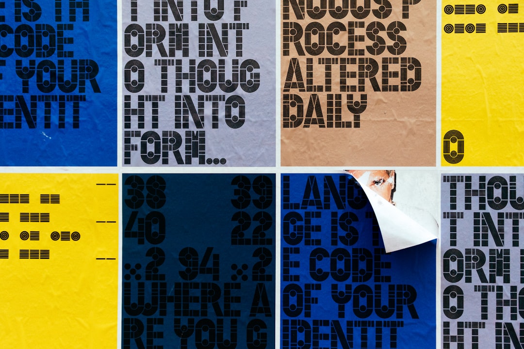
The Red Dead Redemption logo is custom lettering rooted in 19th-century American Western display type. Specifically, it draws on the Tuscan slab-serif tradition: heavy, ornamental serifs that often split or flare at the tips, paired with thick, confident strokes. This is the exact family of letterforms you’d see printed on a genuine Old West “WANTED” poster, theater bill, or whiskey label. The designers leaned into that history deliberately, then weathered and customized the shapes so the mark reads instantly as frontier Americana.
Because it’s bespoke, treat any “this is THE Red Dead font” claim online as an informed guess. Fan recreations do exist, and you can find community-made versions by searching “Red Dead” on DaFont. These are display fonts built to imitate the look, not Rockstar’s production files, and quality varies. They’re fine for mockups and personal art, but verify the license before any commercial use.
What typeface does Red Dead Redemption use in-game (UI/menus)?
In-game, RDR2 separates its decorative title type from its functional reading type. The menus, mission text, journal entries, and HUD lean on clean, legible serif and sans-serif faces chosen for readability at gameplay distances, with subtle period styling so they still feel old-fashioned. Newspapers, signage, and store fronts inside the world use a wide mix of antique slab-serifs, Tuscans, and condensed gothics to mimic real Victorian-era American printing. Arthur’s journal in particular pairs a handwritten-style script for his diary entries with cleaner type for system text, a small touch that does a lot of period-authentic work. So the ornate “Red Dead Redemption font” you remember is the hero wordmark, while the actual interface text is far more restrained and readable – a split you’ll see in almost every prestige title.
Free fonts that look like the Red Dead Redemption font
To rebuild the vibe you want a Tuscan or Clarendon-style slab, then add light distress. Here are practical free starting points:
- Carnevalee Freakshow (free for personal use) – a flared, vintage circus/Western display that nails the ornamental serif feel.
- Clarendon-style slabs (various free versions) – the bracketed, sturdy slab serif that underpins much classic Western printing.
- Rye (Google Fonts, open license) – a freely usable Tuscan/Western display, safe for commercial work.
| Use case | Red Dead Redemption uses | Free alternative |
|---|---|---|
| Hero title / wordmark | Custom Tuscan slab-serif lettering | Rye or Carnevalee Freakshow + distress |
| Period signage / posters | Antique slab serifs and condensed gothics | Clarendon-style slab (free version) |
| Body / menu copy | Clean period-styled serif/sans | PT Serif or Roboto |
For commercial projects, lean on the open-licensed options (Rye, PT Serif, Roboto) and read our font licensing guide before you publish. You can also compare it against other title treatments in our roundup of the best gaming fonts.
Why does Red Dead Redemption use this kind of type?
The type choice is world-building. A Tuscan slab-serif instantly signals the American frontier of the late 1800s, the exact era the game depicts. Those flared, ornamental serifs evoke letterpress printing, hand-painted saloon signs, and bounty posters – props that surround the player constantly. The heavy weight reads loud and authoritative on a poster or a thumbnail, while the weathering adds grit and authenticity. A clean modern sans would shatter the illusion immediately. Typography here is shorthand for time and place: dusty, lawless, romantic. For a very different but equally mood-driven mark, see how a Norse heavy display does similar work in our breakdown of the God of War font.
Can I use the Red Dead Redemption font for my own project?
You can use a look-alike font to make Red Dead-inspired art, but mind two separate issues. First, the typeface license: free fan fonts are often personal-use only, while Google Fonts options (Rye, PT Serif) are open for commercial use. Second, and more important, the trademark: “Red Dead Redemption,” the logo, and related artwork are owned by Rockstar Games and Take-Two Interactive. Recreating the official wordmark and selling merchandise can infringe trademark and copyright even when your font is free. Personal fan art is low-risk; anything sold should avoid the protected mark. If you want a Western feel that’s safe to commercialize, build your own title from an open Tuscan slab rather than copying the official logo. For a related distressed-display approach, see our Borderlands font guide.
Frequently Asked Questions
Is there an official Red Dead Redemption font to download?
No. The Red Dead Redemption logo is custom Western artwork, so there’s no official retail font file. What you’ll find online are fan-made recreations and Tuscan look-alikes. They imitate the slab-serif style but aren’t Rockstar’s production files, and most carry personal-use-only licenses, so check terms before any commercial project.
What font is closest to the Red Dead Redemption logo for free?
A Tuscan or Clarendon-style slab gets you closest. Rye on Google Fonts is open-licensed and freely usable for commercial work, while Carnevalee Freakshow captures the ornamental flair for personal art. Pair either with a light grunge texture to recreate the weathered, sun-bleached edges of the original wordmark.
What font does RDR2 use in its menus?
RDR2’s menus and journal use clean, legible serif and sans-serif faces with subtle period styling, chosen for readability rather than decoration. The ornate Western type you remember is the title wordmark and in-world signage, not the interface text, which stays restrained so mission details and the journal remain easy to read.
Is the Red Dead Redemption font a slab serif?
Effectively yes – it’s a Tuscan slab serif, a heavy display style with thick strokes and flared, sometimes split serifs drawn from 1800s American printing. Some letters carry extra ornamentation. That hybrid is why no single download matches perfectly; you recreate it by combining a free Tuscan slab base with custom weathering.