Rose vs Blush: What’s the Difference?
Both are pinks, but the rose vs blush distinction is about how deep and how warm each one is. Rose is a fuller, medium pink that leans slightly cool because it’s rooted in red; blush is a whisper-pale pink with a warm, peachy softness. Rose makes a statement; blush sets a mood.
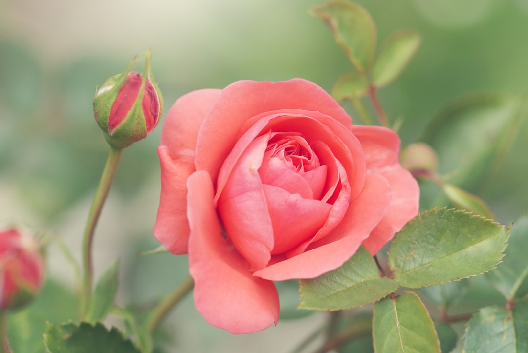
What is rose?
Rose is a medium pink named after the flower, sitting between red and pink on the wheel. A representative value lands around #FF66A3, though “rose” describes a wide range from this brighter version down to the muted, grayed-out dusty rose near #C08081. What unites them is a red root that gives rose a slightly cool, sophisticated edge compared to a pure baby pink.
Designers use rose for romantic-but-grounded branding, beauty and fashion, florals, and palettes that want pink with some backbone. It’s pink that means business. For the muted, grayed version specifically, our mauve versus dusty rose comparison covers where rose blurs into purple-leaning neutrals, and if your pink is leaning vivid and electric instead, see how it compares in our magenta versus pink breakdown in this batch.
What is blush?
Blush is a very pale, warm pink — the color of a light flush on skin, which is exactly where the name comes from. A representative value sits around #FFE3E0. Blush is so light and low in saturation that it often behaves like a warm neutral, filling large areas without ever feeling like a strong color. Its warmth comes from a subtle peach-pink lean rather than a cool red base.
Blush dominates weddings, beauty, wellness, and “quiet luxury” branding, where it provides softness and warmth without commitment. Where rose is a defined pink, blush is the gentlest possible tint of one — barely there, endlessly flattering.
What’s the difference between rose and blush?
The difference is depth and temperature. Rose is a medium, saturated pink with a slightly cool red undertone; blush is a pale, warm, desaturated pink that reads almost neutral. Here’s a side-by-side using representative values — these are descriptive color names, not standardized inks, so exact hexes vary by brand and product.
| Property | Rose | Blush |
|---|---|---|
| Hex code | #FF66A3 | #FFE3E0 |
| RGB | 255, 102, 163 | 255, 227, 224 |
| CMYK | 0, 60, 36, 0 | 0, 11, 12, 0 |
| Undertone | Slightly cool (red-leaning) | Warm (peach-pink lean) |
| Hue family | Medium pink | Very pale pink |
| Best used for | Beauty/fashion accents, florals, bold romantic branding | Backgrounds, weddings, quiet-luxury and wellness branding |
| Mood/feel | Romantic, confident, refined | Soft, calm, delicate, understated |
When should you use each?
Choose rose when you want pink with presence. Its medium depth and slight coolness make it ideal for accents, logos, fashion and beauty branding, and floral palettes that need a defined pink rather than a faint tint. Rose holds its own next to neutrals and can carry a brand color on its own.
Choose blush when you want softness and warmth in the background. Blush excels as a large surface color, a paper-soft web background, or a wash behind type and photography. It signals calm, premium, and understated — the visual equivalent of a quiet exhale. Where rose leads, blush supports.
A quick test: place the color next to pure white. If it clearly reads as “pink,” it’s rose; if it almost disappears into a warm off-white, it’s blush. For more on how warm and cool pinks behave together, our guide to warm versus cool colors is a useful companion.
Do rose and blush go together?
Yes — they’re a classic pairing because they’re the same family at two depths. Using blush as the base and rose as the accent creates a layered, monochromatic pink scheme with built-in hierarchy and no risk of clashing. The contrast in value does the work, so the palette feels intentional rather than flat.
To extend it, add a cream or ivory to brighten and a deep burgundy or charcoal to ground the softness. If you’re deciding whether your pink should lean cool and muted instead, the mauve versus dusty rose comparison will help you pin down the exact rose before you build the rest of the palette.
How do you choose between rose and blush for branding?
The decision usually comes down to how much “color confidence” the brand needs to project. Rose, with its medium depth and slightly cool red root, can serve as a true brand color — it has enough presence to anchor a logo, a packaging panel, or a headline. Blush, by contrast, almost never works as a primary brand color on its own; it’s too pale to register as a deliberate choice and reads as a sophisticated background instead. Many beauty and wellness brands use both: blush for the overall canvas and rose for the logo and accents.
Temperature is the second consideration. Rose’s cool, red-based undertone reads as refined and slightly serious, which suits fashion, florals, and premium beauty. Blush’s warm, peach-leaning softness reads as calm and tender, which suits weddings, skincare, and “quiet luxury” identities. If your brand wants to feel grown-up and assured, lean rose; if it wants to feel gentle and reassuring, lean blush. Pairing them gives you both registers at once.
Watch the lighting and material context, too. On uncoated paper or matte packaging, both colors deepen slightly and the warmth in blush becomes more obvious; on a glossy screen, blush can disappear into white. As always, define each color by hex or Pantone reference so the rose stays distinctly pink and the blush stays distinctly soft across every surface.
Frequently Asked Questions
Is blush lighter than rose?
Yes. Blush is a very pale, warm pink that often behaves like a tinted neutral, while rose is a medium-depth pink with more saturation and a slightly cool undertone. Side by side, blush reads as the soft background and rose as the defined, statement pink.
Is rose a warm or cool pink?
Rose leans slightly cool because it’s rooted in red rather than orange, which gives it a more refined, less sugary feel than a warm baby pink. Blush, by contrast, is warm. That temperature gap is one of the clearest ways to tell the two apart.
What is the hex code for blush?
A common representative hex for blush is #FFE3E0, with RGB values of 255, 227, 224. Blush spans a narrow range of very pale warm pinks, so you’ll see slightly peachier or pinker variants; treat #FFE3E0 as a dependable midpoint rather than a fixed standard.
Can rose and blush be used together?
Absolutely. They share a hue family at different depths, so pairing blush as a base with rose as an accent creates an instantly harmonious, layered pink palette. The natural difference in lightness provides hierarchy, so the combination looks deliberate rather than washed out.
Is dusty rose the same as blush?
No. Dusty rose is a muted, grayed-down medium pink with a cool, slightly purple lean, while blush is a much paler, warmer pink. Dusty rose is a subdued version of rose; blush is a light tint. They can pair, but they read as distinctly different tones.


