Rust vs Orange: How They Differ
The rust vs orange question comes down to brightness and brown. Orange is the pure, vivid secondary color sitting between red and yellow. Rust takes that orange, pushes it toward red, darkens it, and folds in brown, producing the deep, earthy tone of oxidized iron. That muted, brownish-red depth is the whole difference.
What color is orange?
Orange is a secondary color made by mixing red and yellow. A representative hex is #FFA500, where red is maxed, green is moderate, and blue is zero, producing a bright, warm, high-energy color. Orange is the color of citrus, sunsets, and traffic cones, and it carries associations of enthusiasm, playfulness, and visibility. Because it borrows yellow’s brightness and red’s warmth, pure orange is one of the most attention-grabbing colors in the palette.
The defining trait of pure orange is that it stays bright and saturated, sitting squarely between red and yellow with nothing dulling it. It is vivid and energetic rather than earthy. For the deeper meaning and history of the hue, see our guide to orange color meaning.
What color is rust?
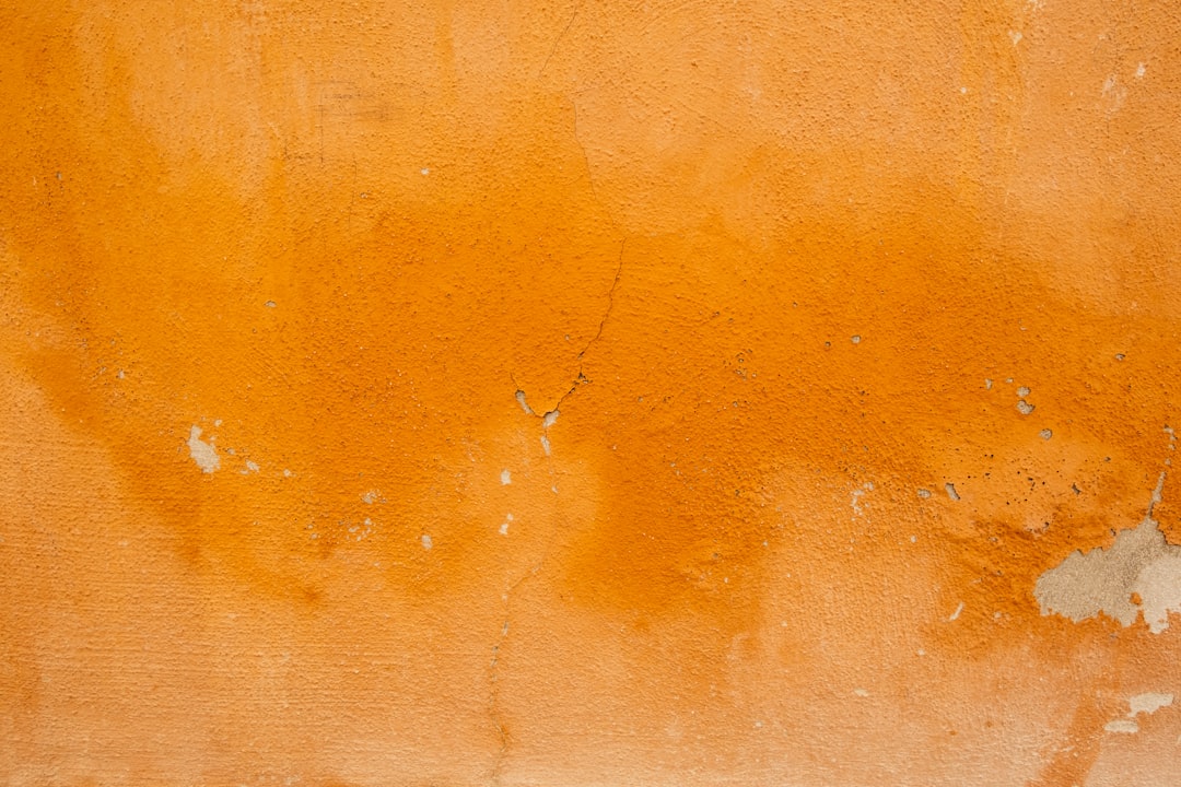
Rust is a deep, muted orange named after oxidized iron, the reddish-brown that forms when metal corrodes. A representative hex is #B7410E, where red is high, green is low, and blue is minimal, producing a dark, earthy red-orange. Compared with pure orange, rust is shifted toward red, lowered in brightness, and grayed with brown, which gives it a warm, vintage, grounded quality. Rust reads as cozy, autumnal, and sophisticated rather than loud.
Because rust blends orange, red, and brown, swatches drift between burnt orange, terracotta, and brick depending on the mix. It is essentially orange darkened and dulled into an earth tone. Rust sits alongside burnt orange and terracotta in the family of warm, muted oranges that dominate autumn palettes.
Rust vs orange: side-by-side comparison
Exact values vary across brands and screens, but these representative specs show the muted, brownish split clearly.
| Attribute | Rust | Orange |
|---|---|---|
| Hex code | #B7410E | #FFA500 |
| RGB | 183, 65, 14 | 255, 165, 0 |
| CMYK (approx) | 0, 64, 92, 28 | 0, 35, 100, 0 |
| Undertone | Warm, red-brown lean | Pure warm, yellow-red balance |
| Hue family | Burnt red-orange (muted) | Orange (secondary) |
| Best used for | Autumn palettes, earthy brands, decor | Energy, food, sport, bold CTAs |
| Mood / feel | Earthy, cozy, vintage, grounded | Vivid, energetic, playful, bold |
How can you tell rust and orange apart?
The reliable test is to look for brown and depth. Hold the swatches together: pure orange stays bright and citrusy, almost glowing, while rust looks darker, redder, and dulled, as if brown has been stirred in. If the color reminds you of fallen leaves, terracotta pots, or weathered metal, it is rust. If it reminds you of an orange fruit or a traffic cone, it is pure orange. A second cue is energy: orange feels loud and active, while rust feels warm and settled.
The numbers confirm it. Orange at 255, 165, 0 keeps red maxed and green high, so the color stays bright. Rust at 183, 65, 14 drops red below maximum, cuts green sharply, and keeps blue near zero, which darkens and reddens the color into an earth tone. Whenever an orange’s brightness falls and it leans toward red-brown, you are looking at rust rather than pure orange.
Where do rust and orange sit on the color wheel?
On the color wheel, orange is a secondary hue sitting exactly between red and yellow. Rust sits just past orange toward red, in the red-orange region, and then drops sharply in brightness and saturation. So rust is not a separate hue; it is a dark, muted shade of red-orange, orange nudged toward red and dulled into brown. That position explains why rust feels like the deep, earthy relative of orange rather than a different color family.
The second axis is value and saturation. Pure orange at #FFA500 is fully saturated and bright. Rust at #B7410E is much darker and partly grayed, which is what produces its cozy, vintage quality. This combination, a small hue shift toward red plus a big drop in brightness and saturation, is why rust reads as grounded and autumnal where orange reads as energetic and loud. For the wider conversation about temperature in palettes, see warm vs cool colors.
How do rust and orange perform in branding and interiors?
In branding, orange is an extrovert: bold, energetic, and impossible to ignore, which is why it dominates food, sport, entertainment, and budget retail that wants to feel fun and accessible. Rust takes that warmth and matures it, reading as earthy, artisanal, and sophisticated. That grounded character is why rust has surged in craft, wellness, fashion, and hospitality branding, especially for brands that want warmth with a heritage, handmade feel. Rust signals cozy authenticity where orange signals high-energy fun.
In interiors, orange behaves like a statement accent: a single orange piece energizes a room and demands attention, so it is used sparingly. Rust behaves like a livable warm tone; it works across walls, sofas, rugs, and textiles because its muted depth feels rich rather than overwhelming. A room with orange accents feels playful and bold, while a room built on rust feels warm, earthy, and effortlessly cozy, which is why rust is a perennial favorite in autumn and mid-century palettes.
When should you use rust vs orange?
Choose orange when you want energy, playfulness, and visibility. Its boldness suits food and beverage, sport, entertainment, and high-impact calls to action where you want to grab attention. Orange is a confident, extroverted color. Choose rust when you want warmth with depth and maturity: autumn palettes, earthy and artisanal brands, fashion, and cozy interiors lean on rust because it feels grounded, vintage, and sophisticated.
Rust also works as a softer, richer substitute when pure orange feels too loud for a brand or a room. For a related comparison of a softer warm tone, see coral vs orange, and to understand why orange energizes and rust soothes, read our guide to color psychology.
Frequently Asked Questions
Is rust a shade of orange or brown?
Rust sits between the two. It is a dark, muted red-orange with enough brown folded in to read as an earth tone. At #B7410E it keeps orange’s warmth but drops the brightness and leans red-brown. The most accurate label is burnt or oxidized orange, which is exactly why it reads earthier and deeper than a pure orange.
What are the hex codes for rust and orange?
Pure orange is commonly #FFA500 (RGB 255, 165, 0), bright and fully saturated. Rust is often around #B7410E (RGB 183, 65, 14), much darker and red-leaning. Exact values vary widely, but rust always sits lower in brightness and saturation than pure orange, with a clear red-brown cast.
Is rust the same as burnt orange or terracotta?
They are close cousins and often overlap. Rust leans the most red and brown of the three and reads as the deepest. Burnt orange sits slightly brighter and more clearly orange, while terracotta leans a touch more pink-clay. All three are muted, warm, autumnal oranges, so the labels are used loosely depending on the exact swatch.
What colors go well with rust and orange?
Rust pairs beautifully with deep teal, navy, olive, cream, and warm wood tones for a rich, earthy palette. Pure orange pops against blue, charcoal, and crisp white for high-energy contrast. Because rust is muted, it sits comfortably in larger amounts, while bright orange usually works best as an accent against cooler neutrals.
Which is better for a cozy, autumnal look?
Rust is the stronger choice for a cozy, autumnal look because its muted, brown-leaning warmth evokes fallen leaves, spices, and weathered materials. Pure orange can feel too bright and energetic for a settled autumn scheme. If you want fun and high visibility, choose orange; if you want warmth, depth, and seasonal coziness, choose rust.


