Scandinavian Color Palette: Hex Codes
A Scandinavian color palette is defined by light, simplicity, and warmth-in-restraint — the Nordic design tradition of bright rooms, natural wood, and a single soft accent. The signature set is white (#FAFAFA), light gray (#E0E0E0), soft black (#2B2B2B), dusty blue (#A3B5C0), blush (#E8D5D0), and pale wood (#D8C3A5). The named palettes and hex table below are ready to copy; the guidance underneath explains how the palette stays warm and inviting despite being mostly neutral.
Scandinavian design is the practical face of the minimalist color palette, built almost entirely from a refined neutral color palette. For why airy neutrals read as calm and trustworthy, see color psychology; for the soft cousin in this batch that adds more bloom, our cottagecore color palette shares the same gentle naturals with more color.
What colors are in a Scandinavian palette?
Scandinavian colors are light, low-saturation neutrals warmed by natural wood and softened by one muted accent. The defining trait is an airy, high-key base — lots of white and light gray — kept from feeling cold by pale wood tones and a soft blush or dusty blue. Core members are white (#FAFAFA), a soft off-white base; light gray (#E0E0E0), a gentle secondary neutral; soft black (#2B2B2B), a warm near-black for contrast and text; dusty blue (#A3B5C0), a calm muted accent; blush (#E8D5D0), a soft warm pink; and pale wood (#D8C3A5), the natural tone that gives the palette its warmth.
| Color name | Hex | RGB | Role |
|---|---|---|---|
| White | #FAFAFA | 250, 250, 250 | Primary / background |
| Light Gray | #E0E0E0 | 224, 224, 224 | Secondary neutral |
| Soft Black | #2B2B2B | 43, 43, 43 | Contrast / text |
| Dusty Blue | #A3B5C0 | 163, 181, 192 | Accent |
| Blush | #E8D5D0 | 232, 213, 208 | Soft accent |
| Pale Wood | #D8C3A5 | 216, 195, 165 | Warm neutral |
5 Scandinavian palettes with hex codes
Each scheme keeps a light neutral base, a warm wood note, and at most one soft accent. Copy the hex codes directly.
1. Classic Scandi
The signature airy mix — white, gray, and soft black with pale wood warmth.
White #FAFAFA Light Gray #E0E0E0 Pale Wood #D8C3A5 Mid Gray #9A9A9A Soft Black #2B2B2B
2. Hygge Warmth
Wood and blush for a cozy, candle-lit Nordic comfort.
White #FAFAFA Blush #E8D5D0 Pale Wood #D8C3A5 Warm Taupe #B89B82 Soft Black #2B2B2B
3. Nordic Blue
Cool and crisp — dusty blue with bright neutrals for a fresh, coastal Scandi feel.
Dusty Blue #A3B5C0 Slate Blue #7E96A3 White #FAFAFA Light Gray #E0E0E0 Soft Black #2B2B2B
4. Greige Minimal
The quietest scheme — warm grays and wood with no bright accent at all.
White #FAFAFA Greige #D6CFC4 Pale Wood #D8C3A5 Stone #9A9489 Soft Black #2B2B2B
5. Scandi Sage
A gentle green note added to the neutral base for a botanical, calm finish.
White #FAFAFA Soft Sage #B7C2AE Pale Wood #D8C3A5 Light Gray #E0E0E0 Soft Black #2B2B2B
Which Scandinavian colors go together?
A Scandinavian palette is mostly neutral, so the pairings that matter are how warmth is introduced and where a single accent lands. White (#FAFAFA) and Pale Wood (#D8C3A5) is the foundational combination — a soft off-white base warmed by natural wood is what separates Nordic design from a cold, clinical minimalism. Light Gray (#E0E0E0) and Soft Black (#2B2B2B) supply the structural contrast for type, dividers, and detail without ever reaching a harsh pure black.
The accent is where personality enters, and the rule is one, not several. Dusty Blue (#A3B5C0) gives a crisp, coastal feel; Blush (#E8D5D0) gives a warm, hygge softness; a soft sage gives a botanical calm. Any one of these against the neutral base reads as confident and intentional, whereas two or three competing accents undo the restraint the style depends on. The reliable formula is a light neutral dominating, wood or a warm neutral for warmth, soft black for contrast, and a single muted accent in a small proportion. The most important single choice is using a soft off-white rather than a stark white — that warmth is what makes a Scandi scheme feel inviting rather than sterile.
How to use a Scandinavian palette in design
The Scandinavian look depends on light and space, so a bright base does most of the work. Build on White (#FAFAFA) and Light Gray (#E0E0E0), use Soft Black (#2B2B2B) — never a harsh pure black — for type and structure, and let Pale Wood (#D8C3A5) supply the warmth that keeps the palette from feeling clinical. A reliable structure is 70% light neutral, 20% wood or warm neutral, and 10% a single soft accent (dusty blue or blush).
Restraint is the whole point: one accent, never several, and plenty of empty space. The warmth comes from natural materials and a soft off-white rather than a stark white, which is the single most important choice in making a Scandi scheme feel inviting rather than cold. Clean sans-serif typography, generous margins, and natural textures (wood, linen, ceramic) complete the look. For the broader system of warm and cool neutrals to extend any scheme, the neutral color palette is the companion page.
Scandinavian palette for branding, web, and interiors
In branding, Scandinavian palettes signal calm, quality, and modern simplicity — they suit lifestyle, wellness, home goods, and design-forward tech and DTC brands. The light, neutral base with one soft accent reads as confident and uncluttered. See how to choose brand colors to pick the single accent that gives an otherwise neutral brand its personality.
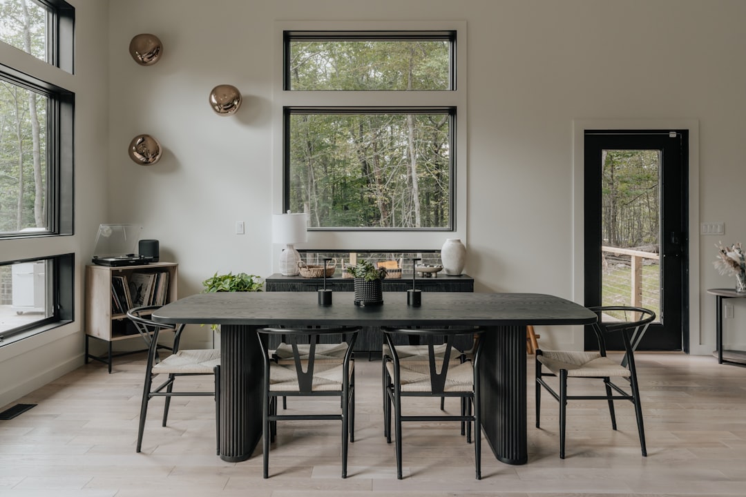
On the web, Scandinavian palettes are ideal for clean, content-first interfaces: white backgrounds, light-gray dividers, soft-black text (which comfortably meets contrast standards), and a dusty-blue or blush accent used sparingly for links and buttons. For interiors, the palette is the foundation of Nordic design: white walls, pale wood floors and furniture, light-gray textiles, and a single blush or blue accent — bright, airy, and warm even through long, dark winters. The discipline that makes it work is the same one behind the broader minimalist color palette.
Frequently Asked Questions
What colors are Scandinavian?
Scandinavian colors are light, low-saturation neutrals warmed by wood: white (#FAFAFA), light gray (#E0E0E0), soft black (#2B2B2B), pale wood (#D8C3A5), and one soft accent such as dusty blue (#A3B5C0) or blush (#E8D5D0). The palette is airy, calm, and quietly warm.
What is the main color of Scandinavian design?
White — specifically a soft off-white like #FAFAFA — is the foundation of Scandinavian design, chosen to maximize light in dark northern climates. Light gray and pale wood support it, while a single muted accent in dusty blue or blush adds gentle personality without breaking the calm.
Why does Scandinavian design use so much white?
The Nordic countries have long, dark winters, so bright white walls and light neutrals maximize available daylight and make interiors feel larger and more open. Pale wood and soft accents add warmth so the result feels cozy and inviting rather than cold or sterile.
What is the difference between Scandinavian and minimalist colors?
They overlap heavily, but Scandinavian palettes are warmer — built on soft off-white with pale wood and a gentle accent — while minimalist palettes can run cooler and more austere. Scandinavian design always keeps a note of warmth through wood and a single soft color.


