What Font Does Seraph of the End Use?
If the title card of Seraph of the End — known in Japan as Owari no Seraph — caught your eye and you want to know what the seraph of the end font is, the answer is more nuanced than a single name. The lettering looks typeset, but it is almost certainly bespoke. Below we separate the custom gothic logo from the functional type used in the anime, and we point you to free fonts that echo its apocalyptic, vampire-noir atmosphere without claiming to be the genuine article.
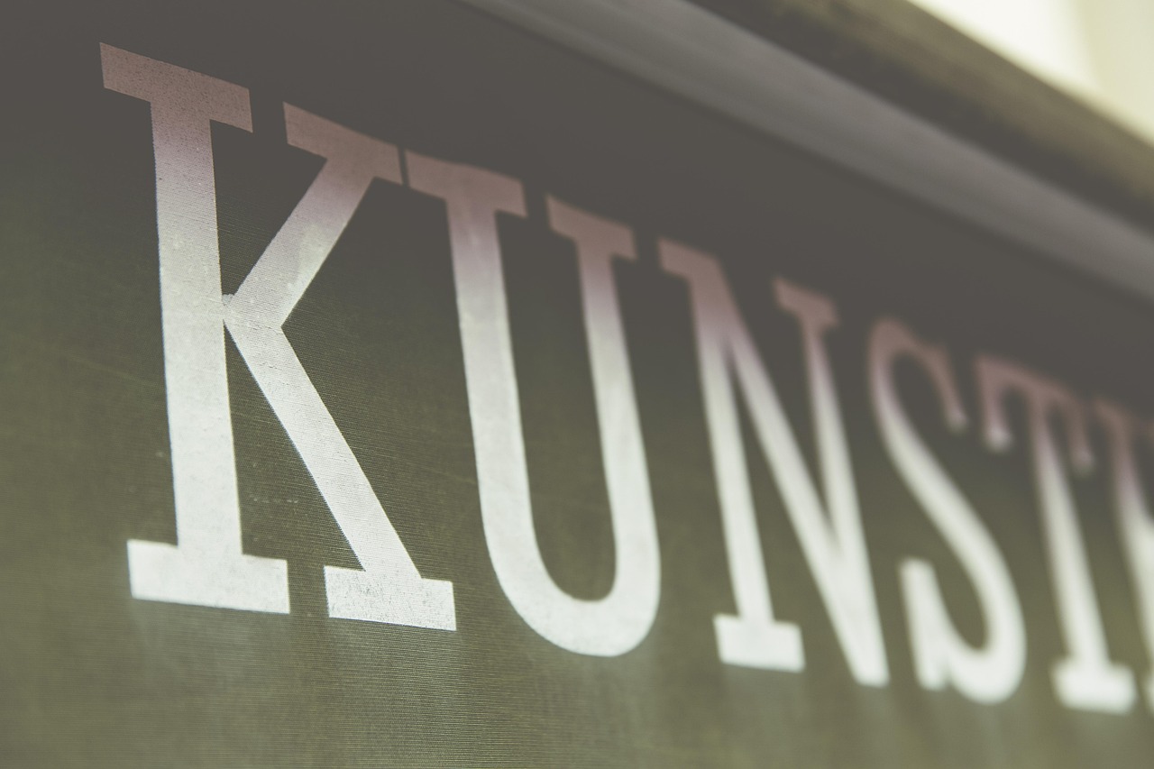
What font is the Seraph of the End logo?
The Seraph of the End title treatment is best read as custom lettering rather than a stock font. The wordmark carries gothic weight, sharp angular detailing, and an ominous, end-of-the-world tone that fits the series’ post-apocalyptic vampire setting. As with most major anime, the logo was almost certainly drawn or heavily modified for the property so it could be trademarked and remain consistent across the manga, anime, and merchandise.
Because the mark is bespoke, its precise stroke weights, spacing, and ornamentation do not map cleanly onto any single retail typeface. Some fan sources name a specific gothic font as the basis, but those are best treated as informed guesses, not confirmed facts. The honest position: the logo is a one-off design, and the most you can achieve is a close visual cousin.
What typeface is used in the anime?
Across the series, typography divides into two roles. The gothic, dramatic styling is reserved for the title card and key art, where the custom wordmark and apocalyptic graphics set the tone. Subtitle text, episode titles in localized releases, and credits use neutral, legible serif or sans-serif faces chosen for readability rather than for brand identity.
That separation is typical. The marketing logo can be ornate and dense because it only appears large, while the functional text stays clean so viewers can follow along. So when fans ask which typeface “is used” in Seraph of the End, the useful answer is that the memorable, gothic part is custom, and the readable part is generic — there is no single downloadable Seraph of the End font that covers both.
It also helps to remember that the English title and the Japanese title are designed as two distinct lockups. The Japanese Owari no Seraph wordmark uses its own custom kanji and kana styling, while the Latin-script “Seraph of the End” treatment is built separately to feel like a matched sibling. Fans hunting for “the font” sometimes conflate the two, but they are independent pieces of lettering. Neither is a retail typeface, and the visual harmony between them is the product of a designer deliberately tuning weight, contrast, and ornament so both scripts feel like one brand.
Free fonts that look like the Seraph of the End font
You cannot legitimately download the original wordmark, but free gothic and ornate display faces can recreate its dark, apocalyptic mood. Aim to match the gothic weight, sharp detailing, and sense of dread rather than chasing a perfect copy. Useful free starting points include blackletter faces like UnifrakturMaguntia and Pirata One, plus broader gothic-display options such as MedievalSharp.
| Use case | Seraph of the End uses | Free alternative |
|---|---|---|
| Main title / hero | Custom gothic apocalyptic wordmark | UnifrakturMaguntia |
| Subtitle / tagline | Drawn gothic lettering | Pirata One |
| Body & captions | Neutral serif/sans | EB Garamond or Spectral |
| Poster accents | Decorative gothic flourish | MedievalSharp |
For a wider gothic palette, our roundup of the best gothic fonts collects blackletter, dark-display, and horror-leaning faces that suit vampire and apocalyptic themes. If you want to study another dark-fantasy gothic logo, the Vampire Hunter D font breakdown explores a closely related ornate gothic direction.
Why does Seraph of the End use this kind of type?
The gothic, apocalyptic lettering is a deliberate narrative cue. Seraph of the End is set in a world devastated by a virus, ruled by vampires, and steeped in biblical, end-times imagery. The logo has to communicate dread, decay, and a touch of the sacred all at once — a modern, neutral font would erase that atmosphere immediately.
- Tone signaling: gothic strokes telegraph dark fantasy and apocalypse before a word is read.
- Thematic fit: ornate, ecclesiastical forms echo the series’ angelic and biblical motifs.
- Ownership: a custom mark can be trademarked, which a stock font cannot.
- Recognition: bespoke lettering keeps the brand consistent across manga, anime, and merch.
This is the same approach behind many horror and dark-fantasy logos: the type sets the mood instantly. Gothic forms carry deep associations with death, the supernatural, and the religious — all central to this story.
Can I use the Seraph of the End font for my own project?
Not the original wordmark, and not commercially. The Seraph of the End logo is a protected brand asset. Strictly personal, non-commercial fan art is the usual gray area, but once your project involves sales, merchandise, or client work, recreating the mark exposes you to trademark and copyright risk.
A practical workflow for fan posters: set the title in a blackletter face, reduce the spacing slightly, then layer in subtle cracks, a faint blood-red gradient, or a weathered texture to push the apocalyptic mood. Keep your version clearly different from the official lockup so it reads as homage rather than a counterfeit mark. This gets you the dread and the gothic gravity without leaning on the protected original.
The safe path is a free or licensed look-alike with verified terms. Some free fonts allow commercial use while others are personal-only, so always read the license. Our font licensing guide covers desktop, web, and embedding rights in plain terms. If your project also wants a horror-grunge counterpart to the gothic look, the Deadman Wonderland font article covers a distressed display direction that pairs well.
Frequently Asked Questions
Is there an official Seraph of the End font to download?
No. The title is a custom-drawn gothic wordmark created for the franchise, not a released typeface. Any “official” download is a fan recreation or a similar gothic face renamed. Treat such files carefully and confirm their license before using them for anything beyond personal experimentation.
What free font looks most like the Owari no Seraph logo?
Blackletter faces like UnifrakturMaguntia and Pirata One get closest to the gothic weight, while MedievalSharp adds ornamental flourish. None match the original exactly, but layered with subtle distressing and tight spacing they capture the apocalyptic, dark-fantasy mood for posters and fan projects.
Can I use a gothic look-alike font commercially?
Sometimes — it depends on each font’s individual license. Some free gothic fonts permit commercial use; others restrict it to personal projects. Recreating the actual Seraph of the End wordmark commercially is not safe because it is protected. Always read the license and pick a font explicitly cleared for commercial work.
Why does the logo look medieval and religious?
Gothic and blackletter forms come from medieval manuscripts and carry strong associations with religion, antiquity, and the supernatural. Seraph of the End leans on that history deliberately to sell its post-apocalyptic world of vampires, angels, and biblical end-times imagery, setting tone before any plot is revealed.


