What Font Does Seventeen Use?
Searching the seventeen font brings up the same K-pop reality: SEVENTEEN, the thirteen-member self-producing group under PLEDIS, don’t rely on one fixed typeface. Their strongest constant is the diamond “SVT” emblem, while album titles get custom lettering tuned to each concept, usually polished and refined rather than chaotic. This guide explains what the logo and branding look like, why groups design this way, and which free fonts match. For more identity teardowns, see our famous brand fonts hub, and compare how peers like TWICE and NewJeans handle theirs.
What font is the Seventeen logo?
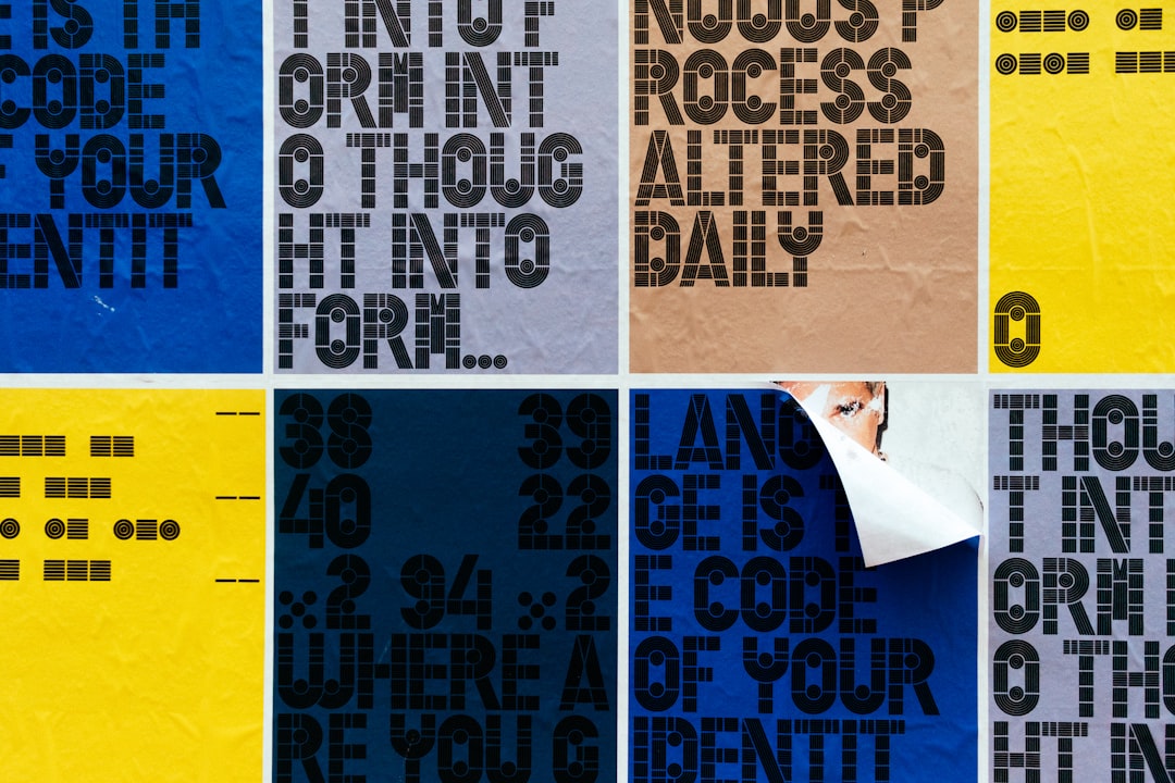
SEVENTEEN’s most enduring mark is the diamond-shaped “SVT” monogram, custom graphic artwork rather than a typeface, used as the group’s compact signature across merch, lightsticks, and branding. The full “SEVENTEEN” wordmark, when it appears, is typically set in a clean, bold sans-serif with even strokes and a confident, geometric feel, polished and grown-up to match the group’s reputation for tight performance and self-production. Like all K-pop logos, the exact glyphs are bespoke and adjusted per era, so the “SEVENTEEN logo font” is best understood as a refined, modern sans-serif style anchored by the recurring diamond emblem, not a single downloadable file.
What font does Seventeen use for albums/branding?
Album titles are where SEVENTEEN’s typography shifts with the concept. Brighter, youthful eras use clean bold sans-serifs; more mature or cinematic comebacks reach for elegant serifs or stylized display lettering. The diamond “SVT” mark and current album logo carry through to lightstick (the “CARAT Bong”), merch, and tour graphics for a cohesive look within each release. As with every K-pop act, consistency lives in the polished sensibility rather than one repeated font. The names below are close visual matches you can customize, not the precise files PLEDIS designers used.
Free fonts that look like the Seventeen font
To recreate SEVENTEEN’s look, start with a clean bold sans for the wordmark, then add the diamond motif or an elegant serif for more cinematic eras.
| Use case | SEVENTEEN use | Free alternative |
|---|---|---|
| Logo / wordmark | Diamond “SVT” mark + clean bold sans wordmark | Archivo Bold or Montserrat Bold |
| Albums / branding | Polished sans for bright eras, elegant serif for cinematic ones | Montserrat Bold or a free serif like Playfair Display |
| Body | Clean neutral sans for tracklists and credits | Inter or Roboto |
For more crisp, professional choices in this lane, browse the best sans-serif fonts.
Why does Seventeen use this kind of type?
SEVENTEEN’s polished typography reflects their identity as a large, highly disciplined, self-producing group. Clean bold sans-serifs read as professional, modern, and cohesive, fitting for thirteen members who write, choreograph, and produce much of their own work and are known for precision. The diamond “SVT” mark gives the brand a compact, premium signature that scales perfectly onto small merch and lightsticks, while remaining instantly recognizable to fans (CARATs). Shifting album lettering per era lets each comeback feel distinct, bright, mature, or theatrical, without diluting the refined, put-together core. The system balances flexibility with a strong, ownable emblem. The diamond itself carries quiet meaning, evoking value, polish, and the idea of many facets working as one, a fitting metaphor for a thirteen-member group split into vocal, hip-hop, and performance units that still move as a single act. That layering of symbolism into a simple mark is exactly the kind of restraint that lets the brand feel premium without ever shouting.
Can I use the Seventeen font for my own project?
No, the diamond “SVT” mark, the SEVENTEEN wordmark, and album lettering are protected assets owned by PLEDIS Entertainment, so copying them risks copyright and trademark issues. Keep any fan edits non-commercial. If you want the aesthetic, design original work in the same genre using licensed fonts, free options like Archivo, Montserrat, and Playfair Display cover both their clean and cinematic eras. Confirm each font’s terms before commercial use; our font licensing guide explains what desktop, web, and merch licenses allow.
Frequently Asked Questions
What font does the SEVENTEEN logo use?
SEVENTEEN’s logo pairs the custom diamond “SVT” emblem with a clean, bold sans-serif wordmark. Neither is a downloadable font, the emblem is graphic artwork and the lettering is bespoke per era. For a close free match, use Archivo Bold or Montserrat Bold and add the diamond motif.
Is there a free SEVENTEEN font download?
No official SEVENTEEN font exists, because the wordmark and “SVT” mark are custom artwork. To recreate the polished look for free, download Archivo or Montserrat from Google Fonts for the bold sans eras, or pair with a free serif like Playfair Display for their more cinematic comebacks.
What is the diamond logo in SEVENTEEN’s branding?
The diamond is SEVENTEEN’s “SVT” monogram, a compact, premium-looking emblem that serves as the group’s recurring signature on merch, lightsticks, and branding. It works as a standalone mark where the full wordmark would be too small, and it stays consistent even as album lettering changes each era.
Why does SEVENTEEN change their album font?
SEVENTEEN, like other K-pop groups, give each comeback its own custom lettering so the typography matches the concept, bright, mature, or theatrical. This makes every release feel fresh and collectible for fans, while the diamond “SVT” emblem keeps the overall brand recognizable across all those changing album logos.
Can I use a SEVENTEEN-style font commercially?
You can use a licensed lookalike font commercially, but not the actual diamond mark or SEVENTEEN wordmark, those are PLEDIS trademarks. Free fonts like Archivo, Montserrat, and Playfair Display permit commercial use under open licenses, though you should confirm each font’s terms before selling merch or products.