Shades of Brown: Names and Hex Codes
This is a practical reference for the most useful shades of brown, with accurate hex codes, RGB values, and notes on character and use. Brown is a tertiary color built from warm hues plus black, so it reads as natural, grounded, and dependable — but small shifts toward red, yellow, or gray change it from rustic to refined. Use the table below as a citable palette, then read on for how the shades group together.
For the meaning behind the color, see brown color meaning; for two of its trickiest neutrals, compare taupe vs beige. The closely related warm and neutral families are covered in our shades of yellow and shades of white references.
Shades of brown: full table
| Shade name | Hex | RGB | Notes |
|---|---|---|---|
| Chocolate | #7B3F00 | 123, 63, 0 | Deep cocoa brown; rich and warm. |
| Chestnut | #954535 | 149, 69, 53 | Reddish brown; earthy and warm. |
| Tan | #D2B48C | 210, 180, 140 | Light sandy brown; classic neutral. |
| Taupe | #483C32 | 72, 60, 50 | Dark gray-brown; sophisticated neutral. |
| Sienna | #A0522D | 160, 82, 45 | Earthy orange-brown pigment. |
| Mahogany | #C04000 | 192, 64, 0 | Rich red-brown; furniture wood tone. |
| Coffee | #6F4E37 | 111, 78, 55 | Medium roasted brown; cozy and neutral. |
| Khaki | #C3B091 | 195, 176, 145 | Dusty tan-beige; military neutral. |
| Beige | #F5F5DC | 245, 245, 220 | Pale warm neutral; soft background. |
| Walnut | #5C5248 | 92, 82, 72 | Dark muted brown; rich wood tone. |
| Brown | #964B00 | 150, 75, 0 | Standard mid brown; warm and balanced. |
| Saddle Brown | #8B4513 | 139, 69, 19 | CSS saddle brown; leathery and deep. |
| Brick Brown | #A52A2A | 165, 42, 42 | CSS “brown”; reddish and earthy. |
| Peru | #CD853F | 205, 133, 63 | Warm tan-brown; CSS named color. |
| Burlywood | #DEB887 | 222, 184, 135 | Light woody tan; soft and natural. |
| Caramel | #A17249 | 161, 114, 73 | Golden-brown; sweet and warm. |
| Bistre | #6B4423 | 107, 68, 35 | Dark sooty brown; old ink pigment. |
| Bistre Brown (Dark) | #3D2B1F | 61, 43, 31 | Very dark espresso brown. |
| Terracotta | #E2725B | 226, 114, 91 | Clay red-brown; warm and rustic. |
| Burnt Sienna | #E97451 | 233, 116, 81 | Warm orange-brown artist pigment. |
| Raw Umber | #826644 | 130, 102, 68 | Muted earth brown; natural pigment. |
| Bronze | #7F5217 | 127, 82, 23 | Metallic golden brown. |
| Camel | #C19A6B | 193, 154, 107 | Soft tan; warm fashion neutral. |
| Cocoa | #4A2C2A | 74, 44, 42 | Deep red-brown; near-black depth. |
| Mushroom | #988558 | 152, 133, 88 | Muted greenish tan-brown. |
| Russet | #80461B | 128, 70, 27 | Reddish autumn brown. |
| Light Brown | #B5651D | 181, 101, 29 | Warm mid-light brown; honeyed. |
| Dark Brown | #3B2F2F | 59, 47, 47 | Deep, near-neutral dark brown. |
Deep, dark browns
The darkest end is anchored by Chocolate (#7B3F00), Walnut (#5C5248), Cocoa (#4A2C2A), Bistre Brown (#3D2B1F), and Dark Brown (#3B2F2F). These behave almost like neutrals and make excellent grounding colors — strong enough to replace black in warm, organic palettes without the harshness. Using a deep walnut or cocoa instead of pure black keeps a layout feeling soft and natural rather than stark, which is why earthy and craft brands lean on them for text and footers. Coffee (#6F4E37) sits just above them as a versatile mid-dark workhorse, dark enough to anchor a section yet warm enough to feel inviting rather than severe.
Warm reddish browns
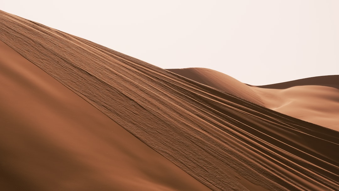
Chestnut (#954535), Mahogany (#C04000), Sienna (#A0522D), Russet (#80461B), Burnt Sienna (#E97451), and Terracotta (#E2725B) carry red and orange undertones. They feel rich and seasonal — autumnal, leathery, and rustic — and are the browns most associated with wood, terracotta, and natural materials. Sienna and Burnt Sienna are genuine artist pigments with centuries of history, which is why they read as warm and authentic rather than synthetic. Mahogany and Chestnut evoke polished wood and leather, making them strong choices for heritage branding, while Terracotta has become a defining color of contemporary interiors and earthy palettes. These reddish browns sit between brown and orange, so they bring energy and warmth that the cooler, grayer browns cannot.
Tans, beiges, and light neutrals
The pale family includes Tan (#D2B48C), Beige (#F5F5DC), Camel (#C19A6B), Khaki (#C3B091), Burlywood (#DEB887), and Caramel (#A17249). These are the quiet backbone of most warm neutral palettes, the colors you reach for when you want warmth without weight. Beige and Burlywood function almost as warm off-whites, perfect for backgrounds, while Camel and Caramel add enough depth to act as soft accent tones. Taupe (#483C32) is the gray-leaning member that bridges brown and gray — it reads cooler and more sophisticated than the other light browns, which is exactly why it is so often confused with beige. See the taupe vs beige comparison if you are deciding between the two for a project.
Metallic and earth-pigment browns
A few browns trace back to specific materials and pigments, which gives them a distinctive, authentic character. Bronze (#7F5217) and Old Gold-adjacent tones read as metallic and work well as accents in heritage or premium branding. The earth pigments — Raw Umber (#826644), Bistre (#6B4423), and Burnt Sienna (#E97451) — come from natural clays and have been used by painters for centuries, so they feel grounded and timeless in a way synthetic-looking browns do not. Russet (#80461B) and Mushroom (#988558) round out this group with muted, slightly desaturated tones that suit autumnal and organic palettes. When you want a brown to feel crafted rather than corporate, reaching for a named pigment color rather than a generic mid-brown makes a noticeable difference.
Most popular shades of brown
The browns most people name and use are Chocolate (#7B3F00) for depth, Tan (#D2B48C) for a light neutral, Taupe (#483C32) for sophistication, Sienna (#A0522D) for earthy warmth, and Beige (#F5F5DC) for soft backgrounds. Together they cover dark to light and cool to warm, which is why they anchor most natural, organic palettes.
How to use shades of brown in design
Brown is the most natural-feeling neutral, so it grounds palettes that would feel cold in pure gray. Use light tans and beiges as backgrounds, mid browns like coffee and caramel for supporting elements, and deep chocolates or walnuts in place of black for warmth. Browns pair effortlessly with cream, sage green, terracotta, and muted blues, evoking craft, heritage, and the outdoors. Watch contrast on mid browns — they can muddy against similar warm tones, so separate them with a clean cream or off-white to keep the palette legible. A reliable approach is to build a warm value scale, much like you would with gray: a beige background, a tan or camel mid-tone, and a chocolate or walnut for text and emphasis, all sharing the same warm undertone. Because brown signals earthiness and dependability, it suits food, outdoor, and artisanal brands far better than a clinical gray would. For the psychology that makes brown read as reliable and grounded, see color psychology.
Frequently Asked Questions
What is the hex code for brown?
A common hex code for a standard brown is #964B00 (RGB 150, 75, 0), a warm mid brown. The CSS named color “brown” is actually #A52A2A, which is noticeably redder. For chocolate brown, use #7B3F00, and for a light tan, use #D2B48C.
What is the difference between taupe and beige?
Taupe (#483C32) is a darker, gray-leaning brown that feels cool and sophisticated, while beige (#F5F5DC) is a pale, warm neutral that feels soft and light. Taupe works as a grounding tone; beige works as a background. They are often confused because both sit in the muted neutral zone.
How many shades of brown are there?
Brown variations are effectively limitless because brown spans a wide swath of low-saturation warm hues, but designers typically reference 25 to 35 named shades. This list includes 28 of the most recognized, from deep chocolate through tans and earthy reds.
What colors go well with brown?
Brown pairs naturally with cream, beige, sage and olive green, terracotta, and muted blues for an earthy, organic palette. For more contrast, combine deep browns with white or gold. Cooler browns like taupe also work alongside gray-based schemes.


