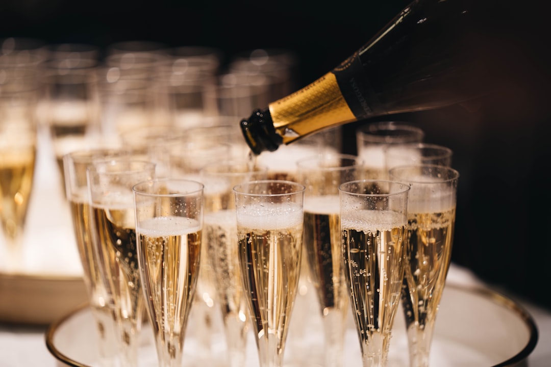
Shades of Champagne: Names and Hex Codes
There are many recognized shades of champagne, from the soft warm-cream classic to pinker blush tones and deeper golden hues. Below is a practitioner reference: each shade with its name, hex code, RGB value, and a note on where it works best. Use it as a swatch library when building a palette, and pair it with our guide to color psychology when you need the symbolism behind the swatch.
A quick note on terminology, because champagne sits in a soft warm-neutral zone. Champagne — commonly cited as #F7E7CE — is a pale, warm beige with a faint yellow-pink glow, named after the sparkling wine. It is frequently confused with cream (cooler, whiter), beige (flatter), and gold (deeper, more metallic). If you need that distinction, see our comparison of champagne vs gold and our reference on shades of gold. Throughout this guide, “shades of champagne” covers every named variation in that soft, warm, luminous neutral family.
Each entry below gives three values so you can use it anywhere: the hex code (for CSS, HTML, and most design tools), the RGB triplet (for screen-based tools that ask for red, green, and blue channels separately), and a short note on the mood and best use of that shade. If you need CMYK or a Pantone match for print, convert from the hex value in your design software, and always proof — pale warm neutrals shift noticeably between screen and press.
Classic champagnes
These are the core champagnes most people picture — soft, luminous warm neutrals used in wedding, beauty, and luxury branding.
| Shade name | Hex | RGB | Notes / use |
|---|---|---|---|
| Champagne | #F7E7CE | 247, 231, 206 | Classic warm cream; elegant, soft. |
| Soft Champagne | #F3E5C0 | 243, 229, 192 | Mellow warm beige; gentle, refined. |
| Antique Champagne | #FAEBD7 | 250, 235, 215 | Soft antique-white; classic, warm. |
| Warm Champagne | #F1E0C5 | 241, 224, 197 | Golden-warm cream; inviting, soft. |
| Ivory Champagne | #F5E6D3 | 245, 230, 211 | Soft ivory-cream; clean, elegant. |
| Silk Champagne | #EFE2C8 | 239, 226, 200 | Muted satin neutral; luxe, calm. |
Pink and blush champagnes
The softer, pinker champagnes that tip toward blush and rose — romantic, modern, and elegant.
| Shade name | Hex | RGB | Notes / use |
|---|---|---|---|
| Pink Champagne | #F1DDCF | 241, 221, 207 | Soft blush-cream; romantic, warm. |
| Rose Champagne | #F3DAD2 | 243, 218, 210 | Pinkish warm neutral; delicate, elegant. |
| Blush Champagne | #EFD9C9 | 239, 217, 201 | Soft peach-pink; gentle, romantic. |
| Petal Champagne | #F6E0D6 | 246, 224, 214 | Pale rosy cream; airy, feminine. |
| Dusty Champagne | #E9CFC0 | 233, 207, 192 | Muted warm taupe-pink; subtle, refined. |
| Peach Champagne | #EAD4C8 | 234, 212, 200 | Warm peachy cream; soft, inviting. |
Gold and deep champagnes
The richer, more golden champagnes — pushed toward metallic gold for a warmer, more opulent feel.
| Shade name | Hex | RGB | Notes / use |
|---|---|---|---|
| Gold Champagne | #D1B894 | 209, 184, 148 | Warm golden beige; rich, luxe. |
| Champagne Gold | #D9C19A | 217, 193, 154 | Soft metallic gold; elegant, warm. |
| Deep Champagne | #C9A86A | 201, 168, 106 | Richer gold-tan; opulent, grounded. |
| Honey Champagne | #E0C99B | 224, 201, 155 | Warm honey-beige; soft, inviting. |
| Antique Gold Champagne | #C2A878 | 194, 168, 120 | Muted aged gold; heritage, refined. |
Beige and pale champagnes
Toward soft neutral and pale, these champagnes are the most versatile bases for backgrounds and packaging.
| Shade name | Hex | RGB | Notes / use |
|---|---|---|---|
| Pale Champagne | #EDD7B5 | 237, 215, 181 | Light warm beige; soft, versatile. |
| Champagne Beige | #E3D0B0 | 227, 208, 176 | Neutral warm beige; calm, flexible. |
| Light Champagne | #F4ECDC | 244, 236, 220 | Near-white warm cream; airy, clean. |
| Sand Champagne | #DECBAA | 222, 203, 170 | Soft sandy beige; natural, warm. |
| Linen Champagne | #EAE0CC | 234, 224, 204 | Muted linen neutral; understated, soft. |
What are the most popular shades of champagne?
The most-used named champagnes in design are champagne (#F7E7CE), pink champagne (#F1DDCF), gold champagne (#D1B894), pale champagne (#EDD7B5), and champagne beige (#E3D0B0). Classic champagne dominates wedding, beauty, and luxury branding; pink champagne adds romance; gold champagne brings opulence; and champagne beige provides a flexible neutral base. Lighter champagnes feel airy and elegant, while deeper champagnes project warmth and richness.
Champagne’s appeal is that it reads as the most refined of the warm neutrals — it carries the softness of cream but adds a faint luminous glow that feels celebratory and expensive. That makes it a favorite for weddings, beauty and fragrance packaging, jewelry, and premium hospitality, where the wine association does instant elegance work. Because it sits between cream, beige, blush, and gold, champagne flexes from soft and romantic to rich and opulent. Choosing a champagne is really choosing how pink, how golden, or how pale you want that luminous neutral to lean.
Champagne is often realized as a metallic or pearlescent finish, not just a flat color, which is the most useful thing to know when specifying it. On screen, a hex like #F7E7CE captures the base tone, but the celebratory champagne look usually comes from foil, pearl coatings, or subtle gradients in print and packaging. The values in the tables above — champagne at #F7E7CE, gold champagne at #D1B894, champagne beige at #E3D0B0 — are the widely cited references, but always pin the exact hex and note whether you want a flat or metallic finish. This matters doubly in packaging and invitations, where champagne is frequently printed in foil and small hue shifts read as completely different colors under different lighting.
How to use shades of champagne in design
Champagne is a soft, luxurious neutral that signals celebration and refinement. Pair classic champagne with deep navy, emerald, or black for an elegant, high-contrast palette, or with blush and ivory for a soft, romantic wedding look. Deeper gold champagne works beautifully as a metallic accent, while champagne beige makes a versatile, calming base.
Practical guidance: champagne’s natural partners are deep jewel tones and rich neutrals, which let its softness read as luxury rather than washed-out. For type, champagne is too pale for body text on white; use it as a background, large fill, or paired with a dark neutral for contrast. To keep champagne from feeling flat, add a metallic or pearl finish in print, or pair it with a deep accent on screen. Champagne sits close to gold and cream; see our comparison of champagne vs gold, and explore neighboring warm neutrals in our reference on shades of apricot.
Frequently Asked Questions
What is the hex code for champagne?
Champagne is most commonly cited as #F7E7CE, which is RGB 247, 231, 206 — a pale, warm beige with a faint golden glow named after the sparkling wine. It is the widely accepted reference value, though champagne is often realized as a metallic or pearl finish in print.
What is the difference between champagne and gold?
Champagne (#F7E7CE) is a pale, soft warm neutral, while gold (#FFD700) is deeper, more saturated, and more metallic. Champagne reads as understated and elegant; gold reads as bold and opulent. See our full champagne vs gold comparison for examples and palette ideas.
What is the difference between champagne and beige?
Champagne (#F7E7CE) is a beige with a faint pink-gold luminous glow, while plain beige is flatter and more neutral. Champagne feels celebratory and refined; beige feels practical and understated. Champagne beige (#E3D0B0) bridges the two with a warm, versatile neutral.
Which shade of champagne is best for a brand?
For weddings and beauty, classic champagne (#F7E7CE) feels elegant and celebratory. For luxury and jewelry, gold champagne (#D1B894) adds opulence. For versatile packaging backgrounds, champagne beige (#E3D0B0) is flexible. Choose by how pink, golden, or pale you want the identity to feel.
What colors go well with champagne?
Champagne pairs beautifully with deep navy, emerald, and black for an elegant high-contrast palette, and with blush, ivory, and soft gray for a romantic, soft look. Burgundy creates a rich, festive combination, while sage green gives champagne a fresh, modern feel.


