What Font Does Shiki Use?
If you searched for the shiki anime font — and to be clear, we mean the 2010 horror series Shiki, not the common Japanese word or personal name — you are almost certainly trying to recreate its gothic, eerie title. Shiki is a rural vampire horror set in the isolated mountain village of Sotoba, where a wave of mysterious deaths reveals that the dead are rising as the shiki, and the village doctor wages a grim war against an enemy that wears his neighbors’ faces. The honest answer is that the logo is bespoke artwork, not a single released typeface. Below we break down what the lettering actually is, why it matches the show’s gothic, funereal tone, and which free fonts get you closest without copying the trademark.
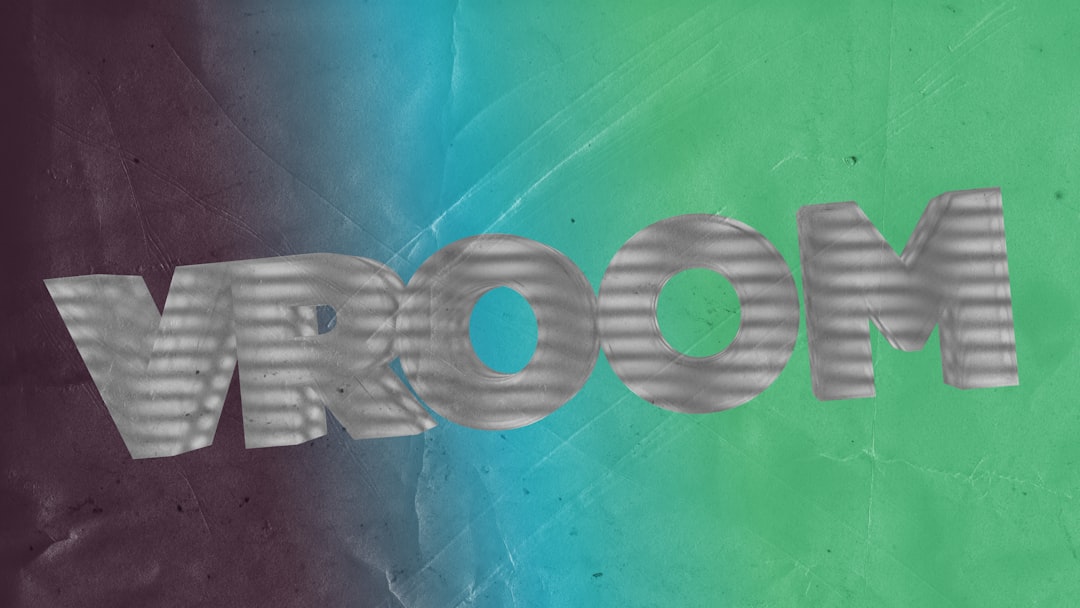
What font is the Shiki logo?
The Shiki title is a custom-designed wordmark, not a downloadable font. The lettering is gothic and eerie — dark, ornate forms with a funereal character that suits a series built on rural plague, rising corpses, and slow creeping dread. Like most anime logos, it was drawn and spaced by hand to work as a single graphic, often with blackletter flourishes, sharp serifs, or shadowed accents that no standard typeface includes. So while you will find “Shiki font” files online, they are fan recreations, not the real logo type. Treat any specific font claim as an informed observation, not a confirmed spec — to our eyes it is reminiscent of a dark, ornate gothic display face, but that is an estimate, not a confirmed source.
What typeface does Shiki use in its branding?
Shiki wraps its rural vampire horror in a deliberately gothic, eerie identity, and it helps to separate the layers. The custom Latin wordmark carries the dark, ornate signature, while the show uses clean supporting type for episode titles and on-screen labels. The Japanese title and the on-screen text and credits are set in standard broadcast and print typefaces, usually a mix of gothic (sans) and mincho (serif) faces chosen by the production and localization teams. These supporting choices vary by the Japanese master, streaming captions, and any home-video release. The recognizable, eerie identity lives in the hand-built logo, not the supporting type.
So if your goal is to match “the anime font,” be precise about which element you mean. The gothic, eerie signature is the main logo, not the subtitle text on a streaming platform. For fan art and tribute pieces, focus on echoing that dark, ornate display lettering. If you enjoy this kind of breakdown, our look at the Hell Girl font covers another atmospheric supernatural title for an interesting contrast in tone.
Free fonts that look like the Shiki font
You cannot legally reuse the trademarked Shiki logo, but you can capture its gothic, eerie feel with free, openly licensed fonts. This table maps each layer of the look to a free alternative you can install today.
| Use case | Shiki uses | Free alternative |
|---|---|---|
| Logo / title | Custom gothic eerie wordmark | UnifrakturMaguntia or Pirata One |
| Subtitles / taglines | Dark ornate lettering | Metamorphous or Pirata One |
| Body / captions | Antique funereal serif | IM Fell or Cormorant |
UnifrakturMaguntia is the best starting point for the title: its dense blackletter capitals echo the logo’s dark, ornate character, and its heavy, medieval weight reads as funereal and eerie — perfect for a rural vampire plague. Set it large with deliberate spacing, and you are most of the way to that gothic, eerie feel. Pirata One is a lighter, more legible blackletter alternative when you want the title to feel ornate but still readable, fitting the show’s gothic village dread nicely.
To push the resemblance further, lean on darkness and decay rather than gloss. Keep the forms dense, surround the title with thin crosses and faint mist, and choose a funereal palette — grave black, dried blood, and candle amber that match Sotoba’s nighttime burials and shuttered houses. Metamorphous is a good option when you want a carved, stony gothic edge for a more weathered title, while IM Fell offers an antique, ink-bled serif look for taglines and labels. These are presentation choices layered on top of a free font, but they do most of the work in selling the gothic, eerie personality. Keep supporting copy in a complementary antique serif like IM Fell so the layout stays dark and unified.
Why does Shiki use this kind of type?
Shiki is a gothic rural vampire horror, so its logo needs to feel dark, ornate, and funereal. Blackletter, high-detail lettering reads as old-world and eerie — matching the village burials and rising dead without feeling modern or plain. A clean sans would undercut the dread; a playful font would kill the horror entirely. The custom wordmark threads that needle, and its dark, ornate detailing makes the brand instantly recognizable as a gothic vampire title.
Can I use the Shiki font for my own project?
The Shiki logo is a trademark tied to its publisher and studio, so you should not reproduce it on anything you sell or distribute. For personal fan art it is fine to imitate the style, but for commercial work, use a free look-alike like UnifrakturMaguntia or Pirata One and confirm its license first. Our font licensing guide explains the difference between personal and commercial use, and our gothic fonts hub collects more display-type breakdowns. If you are styling a whole horror project, our Junji Ito Collection font guide covers another dark title worth comparing.
Frequently Asked Questions
Is the Shiki anime font free to download?
No. The Shiki logo is custom brand lettering, not a released font, so there is no official file to download. Any “Shiki font” you find is a fan recreation or look-alike. For the style, use free fonts like UnifrakturMaguntia or Pirata One and check their licenses before commercial use.
What font is most similar to the Shiki logo?
UnifrakturMaguntia is the closest free match for the gothic, eerie, blackletter feel, with Pirata One a more legible alternative. Neither is identical, since the wordmark is hand-drawn, but in large sizes with deliberate spacing either gets convincingly close for fan projects.
Can I use a Shiki-style font commercially?
You can use a free look-alike font commercially if its license permits, but you cannot reproduce the trademarked Shiki logo on products you sell. Set your own text in a free gothic display font instead of copying the official wordmark, and verify both the font license and trademark rules first.
What kind of font is the Shiki logo?
It is a custom display wordmark — gothic, eerie, and dark with ornate, blackletter-flavored strokes. It sits in the gothic display title category but was drawn specifically for the Shiki anime rather than typed in any existing typeface.


