Stencil Fonts: Military, Industrial & Utilitarian Typefaces
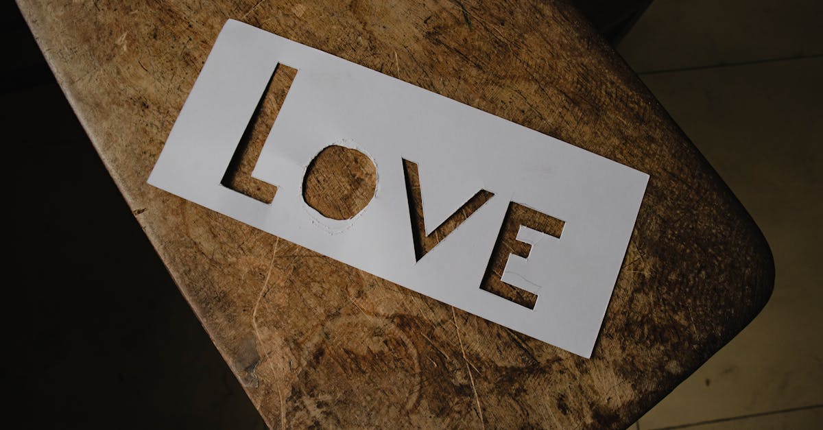
Stencil fonts are among the most instantly recognizable typeface categories in design. Their defining feature — deliberate breaks or gaps in the letterforms known as bridges — traces back not to an aesthetic decision but to a physical constraint. When you cut a letter from a sheet of metal or cardboard, certain shapes collapse without connecting bridges: the counter of an O falls out, the interior of a B disappears, the enclosed space in a D drops away. Stencil typefaces preserve these structural gaps as a visual signature, even in digital form where the constraint no longer exists.
The result is a style that carries decades of military, industrial and utilitarian association. A stencil typeface on a label, poster or brand mark immediately communicates ruggedness, authority and no-nonsense functionality. This guide covers the history of stencil lettering, the main stylistic subcategories, the best stencil fonts available today, and practical advice on using them effectively in design and branding. For a broader foundation on letterform anatomy and classification, see our overview of what is typography.
What Are Stencil Fonts?
A stencil font is a typeface designed with breaks in the letterforms that mimic the appearance of physically cut stencils. These breaks, called bridges, are structurally necessary in actual stencil making. When a letter like O, A or P is cut from a rigid material, the enclosed interior section (the counter) would fall out entirely without connecting bridges holding it in place. Physical stencils solve this by leaving narrow uncut strips that connect the interior island to the surrounding material.
Digital stencil fonts replicate these bridge gaps as a deliberate design choice. The gaps appear as small breaks in the strokes of each letter, typically at consistent positions and widths throughout the character set. Some stencil typefaces place bridges only where structurally necessary (letters with enclosed counters), while others introduce breaks in every letterform for visual consistency.
The stencil aesthetic was born from practical necessity. Before digital printing, marking text on crates, barrels, walls and equipment required physical templates that could be used repeatedly with paint, ink or dye. Military organizations, shipping companies, warehouses and factories all relied on stencil systems for labeling and identification. The lettering style that emerged from this functional requirement — blocky, high-contrast, unmistakable at a distance — eventually became a design aesthetic in its own right.
What separates a well-designed stencil font from a poorly executed one is the treatment of the bridges. In the best stencil typefaces, the gaps feel intentional and rhythmic. The bridge widths are consistent, their placement follows a logical system, and the overall letterforms remain legible and balanced despite the interruptions. Poor stencil fonts simply chop random gaps into existing typefaces, creating letterforms that feel broken rather than designed. The style sits within a broader landscape of design approaches covered in our guide to graphic design styles.
History of Stencil Fonts
The history of stencil lettering predates typography itself. Stenciling as a marking technique dates back centuries, used for decorating walls, fabric and pottery long before movable type existed. But the stencil letterforms that influence today’s fonts emerged primarily from military and industrial applications of the 19th and 20th centuries.
Military Origins
The strongest association with stencil lettering belongs to the military. From the early 1800s onward, armed forces worldwide adopted stencil systems for marking shipping crates, ammunition boxes, vehicle identification numbers, equipment serial codes and supply chain labels. The requirements were specific: letters had to be large enough to read at a distance, simple enough to cut from sheet metal, and durable enough to survive repeated use with heavy-duty paint.
The U.S. military standardized its stencil letterforms through specification documents that defined exact proportions, stroke widths and bridge placements. These specifications prioritized legibility and manufacturing simplicity over aesthetics, which is precisely why the resulting lettering style feels so honest and functional. The blocky, uppercase-only characters seen on olive drab ammunition cans and wooden supply crates became one of the most culturally embedded lettering styles of the 20th century.
Industrial and Commercial Adoption
Beyond the military, stencil lettering became standard practice across shipping, warehousing, manufacturing and construction. Dock workers used brass stencil sets to mark cargo destinations on crates. Factories stenciled batch numbers and handling instructions on packaging. Road crews used large stencil templates for street markings. Each industry developed its own conventions, but the core aesthetic remained consistent: bold, simple, bridged letterforms designed for fast application and easy reading.
The first commercially available stencil typeface in the modern sense was released by the Ludlow Typograph Company in the 1930s. Other foundries followed, recognizing that designers wanted access to the stencil aesthetic without the constraints of physical stencil making. The ITC Stencil font, released in 1937 and later revised, became the benchmark and remains one of the most widely used stencil typefaces today.
From Function to Design Aesthetic
By the mid-20th century, stencil lettering had crossed from purely functional marking into deliberate design territory. Graphic designers began using stencil typefaces for posters, album covers, packaging and editorial layouts where the military and industrial associations served the creative concept. The stencil style communicated toughness, authenticity and utilitarian honesty — qualities that no other typographic category could deliver as efficiently.
The punk and street art movements of the 1970s and 1980s further expanded stencil’s cultural reach. Artists like Banksy used physical stencils for graffiti, reinforcing the association between stencil lettering and counter-cultural expression. Fashion brands adopted stencil typefaces for streetwear labels. Film studios used them for war movie posters and action franchise logos. Each new context layered additional meaning onto the stencil aesthetic while keeping its core identity intact.
Types of Stencil Fonts
Not all stencil typefaces share the same personality. The category spans a wide range of styles, from raw military replications to refined serif stencils suitable for luxury packaging. Understanding these subcategories helps designers choose the right stencil font for their specific project.
Classic Military Stencil
The most recognizable stencil subcategory. These fonts directly reference the blocky, utilitarian lettering found on military equipment and supply crates. Characteristics include uniform stroke widths, squared-off letterforms, uppercase dominance, wide spacing and prominent bridge gaps. The mood is authoritative, rugged and no-frills. Classic military stencil fonts work best for projects that need to communicate strength, durability or institutional authority — think outdoor brands, hardware companies, defense contractors and survival gear.
Elegant Stencil Serifs
A more refined branch of the stencil family that applies bridge gaps to serif letterforms. Fonts in this subcategory, such as Tea Chest and Orator Stencil, retain the structural breaks of stencil design but wrap them in more sophisticated letterform anatomy. The serifs add formality, and the proportions tend to be more traditional than the blocky military style. Elegant stencil serifs suit fashion branding, wine labels, upscale packaging and editorial design where the stencil reference needs to feel curated rather than rough.
Modern Stencil Sans
Contemporary interpretations that apply stencil bridges to clean sans-serif frameworks. These fonts strip away the historical grit of military stencils and present the bridge-gap concept in a polished, geometric context. The letterforms are often more refined, with thinner bridges and more precise geometry than their military counterparts. Modern stencil sans fonts work well in tech-adjacent design, contemporary branding and situations where you want the stencil idea without its full historical weight.
Decorative and Artistic Stencils
The most stylistically diverse subcategory. Decorative stencil fonts treat the bridge gaps as a creative element rather than a structural reference, experimenting with unusual gap placements, varying bridge widths, textured fills and non-traditional proportions. Some push so far from the functional origin that the stencil quality becomes purely ornamental. These fonts suit poster design, album artwork, event branding and any context where the stencil aesthetic is being used for visual impact rather than utilitarian association.
Best Stencil Fonts
The following selection covers the strongest stencil typefaces available today, from industry-standard classics to free options suitable for web and print projects. Each recommendation notes the designer, the stylistic subcategory, the best use cases, and the cost. For more free options across all font categories, see our guide to the best Google Fonts.
Stencil (ITC)
The benchmark. Originally designed by Gerry Powell in 1937 and later digitized by ITC, this is the stencil font that most designers picture when they hear the term. Its bold, blocky uppercase characters with clean, symmetrical bridge gaps define the category. Stencil (ITC) has appeared on everything from military-themed film posters to hardware store signage to fashion brand lookbooks. It remains the safest choice when a project calls for unmistakable stencil character.
Style: Classic military stencil.
Best for: Packaging, poster design, display headlines, military-themed projects.
Price: Commercial license required (available from ITC/Monotype).
Allerta Stencil
Designed by Matt McInerney, Allerta Stencil is a free Google Font that applies clean stencil bridges to a legible, slightly condensed sans-serif framework. It offers excellent screen readability, which sets it apart from most stencil typefaces that struggle at smaller sizes. The bridge gaps are restrained and well-proportioned, giving it a modern rather than historical feel.
Style: Modern stencil sans.
Best for: Web typography, UI elements, digital design where stencil character is needed at text sizes.
Price: Free (Google Fonts).
Stardos Stencil
Stardos Stencil, designed by Vernon Adams, brings a distinctive personality to the stencil category through its slightly irregular, hand-cut quality. Available through Google Fonts in Regular and Bold weights, it evokes the imperfect charm of hand-made stencil work rather than the precision of military specification lettering. The serifs add warmth, and the slightly uneven proportions give it a vintage, artisanal character.
Style: Elegant stencil serif with vintage character.
Best for: Craft branding, vintage-inspired packaging, editorial headlines, artisanal product labels.
Price: Free (Google Fonts).
Major Mono Display
Major Mono Display is a monospaced stencil font that occupies a unique position in the category. Designed by Emre Parlak and available free through Google Fonts, its uppercase characters feature prominent stencil bridges while the lowercase letters use a more experimental, geometric construction. The monospaced structure adds a technical, coded quality that standard stencil fonts lack. It pairs the stencil aesthetic with the monospace font tradition.
Style: Decorative/artistic stencil with monospace structure.
Best for: Tech-themed display work, poster design, experimental editorial layouts, creative coding projects.
Price: Free (Google Fonts).
Diploma
Diploma is a stencil serif that balances military heritage with typographic refinement. Its letterforms are based on traditional serif proportions but interrupted by precisely placed stencil bridges that feel structural rather than decorative. The result is a font that reads as authoritative and established — institutional rather than aggressive. Diploma works particularly well in contexts where stencil lettering needs to convey credibility and formality alongside its utilitarian roots.
Style: Elegant stencil serif.
Best for: Certificates, formal branding, institutional signage, premium packaging.
Price: Commercial license required.
Octin Stencil
Designed by Ray Larabie of Typodermic Fonts, Octin Stencil is a comprehensive military-style stencil family that includes multiple widths and weights. Its design draws directly from military specification lettering, with clean bridge gaps, uniform stroke widths and squared proportions. The family’s range makes it unusually versatile for a stencil font — designers can use different widths and weights across a project while maintaining consistent stencil character.
Style: Classic military stencil.
Best for: Military-themed design, game UI, film and television graphics, tactical product branding.
Price: Free for personal use; commercial license available.
Cargo
Cargo captures the aesthetic of shipping crate lettering with a level of refinement that makes it suitable for professional design work. Its letterforms reference the hand-cut quality of industrial stencil templates — slightly imperfect edges, pragmatic proportions, no-nonsense spacing. Cargo sits in the middle ground between raw authenticity and design polish, making it a strong choice for projects that want industrial character without looking unfinished.
Style: Classic military/industrial stencil.
Best for: Packaging design, industrial branding, shipping and logistics graphics, workwear labels.
Price: Commercial license required.
TF2 Build
Inspired by the visual language of Team Fortress 2, TF2 Build is a stencil font that bridges gaming culture and industrial design. Its bold, slightly rounded letterforms with clean stencil breaks create a personality that feels both utilitarian and playful. While it originated in gaming context, the font works effectively for any project that needs stencil character with a touch of personality and approachability.
Style: Decorative stencil with gaming influence.
Best for: Game-related design, event posters, casual branding, creative projects that need approachable stencil lettering.
Price: Free for personal use.
Saira Stencil One
Part of the Saira superfamily designed by Omnibus-Type, Saira Stencil One applies precise stencil bridges to a contemporary sans-serif structure. The letterforms are geometric and well-proportioned, with bridges that feel integrated into the design rather than imposed upon it. As a Google Font, it offers excellent web performance and broad language support. It represents the cleanest, most contemporary end of the stencil spectrum.
Style: Modern stencil sans.
Best for: Contemporary branding, web design, app interfaces, sports-related design.
Price: Free (Google Fonts).
Using Stencil Fonts in Design
Stencil typefaces carry strong associations that shape how viewers interpret any design they appear in. Using them effectively means understanding and leveraging those associations rather than fighting against them. Here are the primary contexts where stencil fonts perform best.
Military and utility aesthetic. The most obvious application. When a design needs to reference military culture, tactical equipment, survival gear, or rugged outdoor functionality, a stencil font is the single fastest way to establish that visual language. The typeface does the contextual heavy lifting, allowing the rest of the design to remain relatively simple.
Packaging design. Stencil fonts excel on packaging, particularly for products that want to communicate authenticity, durability or handmade quality. Craft spirits, artisanal food products, hardware, outdoor gear and workwear all benefit from stencil typography on their packaging. The style suggests that the product is real, substantial and made for use rather than display. For broader packaging principles, see our packaging design guide.
Outdoor advertising. The high legibility of stencil letterforms at large sizes makes them effective for outdoor signage, billboards and environmental graphics. The bold strokes and open counters (thanks to the bridge gaps) maintain clarity even at a distance or in poor lighting conditions. This functional advantage — a direct inheritance from the stencil’s original purpose — makes it genuinely useful rather than merely aesthetic.
Fashion and streetwear. The stencil aesthetic has deep roots in street culture, from graffiti stencils to punk zine lettering to military surplus fashion. Streetwear brands, in particular, have used stencil fonts extensively for everything from garment labels to lookbook typography to social media assets. The style signals authenticity, urban edge and a connection to subculture.
Masculine branding. While no font category is inherently gendered, stencil typefaces carry associations — industrial labor, military service, heavy equipment, raw materials — that skew toward traditionally masculine brand positioning. Brands targeting male audiences in categories like grooming, fitness, automotive and tools frequently reach for stencil fonts to establish the right tone.
Stencil Fonts in Branding
A stencil typeface in a brand’s visual identity is a strong signal. It tells the audience something specific about the brand’s personality, values and market position. That specificity is both its strength and its limitation.
When Stencil Works
Stencil fonts perform well as primary brand typefaces for companies and products positioned around ruggedness, authenticity, craftsmanship, outdoor culture, industrial heritage or military association. Specific categories where stencil branding tends to succeed include outdoor and adventure brands, workwear and tactical clothing, craft breweries and distilleries, construction and heavy equipment companies, automotive aftermarket brands, and fitness and training programs. The key is alignment — the stencil aesthetic needs to match what the brand actually is and does. For more on choosing the right logo style for a brand, see our guide to types of logos.
When Stencil Does Not Work
Stencil fonts create friction when applied to brands that operate outside the stencil’s associative range. Technology startups, healthcare providers, financial services firms, children’s products, luxury fashion houses and fine dining restaurants generally find that stencil typefaces send the wrong message. The military and industrial connotations clash with the softness, sophistication or approachability these brands need to project. There are exceptions — a luxury brand might use an elegant stencil serif ironically, or a tech company might use one for a deliberately retro product line — but the default should be to avoid stencil fonts in these contexts.
The middle ground exists for brands that want to reference stencil aesthetics without fully committing. Using a stencil font only for a tagline, a product sub-brand or a seasonal campaign allows the stencil character to add texture without defining the entire brand personality.
Pairing Stencil Fonts
Stencil fonts are almost always display faces — they dominate headlines and labels but are not comfortable in body text. Every stencil typeface needs a companion font that handles the running text, captions, navigation and other supporting roles. The right pairing reinforces the stencil font’s character without competing with it.
Stencil plus clean sans-serif. The most reliable pairing. A neutral sans-serif like Inter, Work Sans, or Source Sans Pro provides a calm, readable counterpoint to the stencil font’s visual intensity. The sans-serif handles body text and secondary information while the stencil font commands the headlines. This combination works across nearly every application — print, web, packaging, signage. For a comprehensive approach to combining typefaces, see our font pairing guide.
Stencil plus monospace. Pairing a stencil font with a monospace font creates a cohesive utilitarian system. Both font categories share roots in functional, industrial contexts — stencils from manufacturing and shipping, monospace from typewriters and early computing. Together, they build a visual language that feels technical, systematic and purposeful. This pairing works particularly well for tactical brands, engineering firms and products with a military or industrial identity.
Stencil plus humanist serif. A less obvious but effective pairing that creates productive contrast. The warmth and organic curves of a humanist serif — Garamond, Minion, or Freight Text — play against the stencil font’s mechanical rigidity. This combination suits editorial design, book covers and branding projects where the stencil reference needs to be tempered with sophistication.
What to avoid. Pairing two stencil fonts is rarely successful — the competing bridge patterns create visual noise. Similarly, pairing a stencil font with an equally heavy or decorative display face produces a cluttered, directionless design. The companion font should always be quieter than the stencil.
Frequently Asked Questions
Why do stencil fonts have gaps in the letters?
The gaps, called bridges, exist because physical stencils require them. When a letter is cut from a rigid sheet, enclosed areas (like the inside of an O or B) would fall out without connecting strips holding them to the surrounding material. Digital stencil fonts preserve these gaps as a visual style even though the structural necessity no longer applies.
Are stencil fonts good for body text?
Generally, no. The bridge gaps interrupt the reading flow that body text depends on. Stencil fonts work best as display typefaces — headlines, labels, signage and short text blocks. For longer passages, pair a stencil headline font with a clean sans-serif or serif for the body text.
What is the best free stencil font?
Allerta Stencil (Google Fonts) is the strongest free option for general use due to its clean design and screen readability. Stardos Stencil (Google Fonts) is the best free choice for projects that want a vintage or artisanal stencil character. Saira Stencil One offers the most contemporary free stencil option.
Can stencil fonts work for luxury or high-end branding?
Yes, but only with the right subcategory. Elegant stencil serifs like Diploma or refined options like Tea Chest can carry luxury associations when paired with appropriate design elements. Classic blocky military stencils, however, tend to undermine luxury positioning. The choice depends on whether the brand’s version of luxury aligns with concepts like heritage, craftsmanship and authenticity — qualities that stencil lettering can reinforce.


