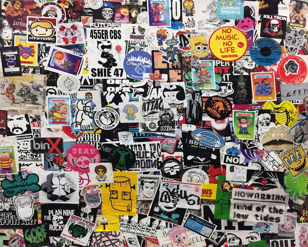
Sticker Design Principles That Work
A sticker is a tiny, physical object that has to survive printing, cutting, and the real world. Designs that work on screen often fall apart in print because fine lines vanish, edges get trimmed unevenly, and complex artwork turns muddy at two inches wide. Sound sticker design principles account for the manufacturing process from the start: bold shapes, thick outlines, vector files, and the right bleed and safe-margin setup. Get these right and your sticker prints crisp, cuts clean, and reads instantly.
The key principles of sticker design
These seven principles bridge the gap between a screen mockup and a durable, professional printed sticker.
| Principle | Why it matters |
|---|---|
| Bold, simple artwork | Reads clearly at small physical sizes |
| Thick outlines and borders | Define the shape and frame the design |
| Vector art | Scales and prints crisply at any size |
| Die-cut shape | Gives the sticker a distinctive, intentional silhouette |
| Bleed and safe margin | Prevents trimming from cutting into artwork |
| High contrast | Makes the design pop on any surface |
| Right material and finish | Ensures durability and the intended look |
1. Keep the artwork bold and simple
Stickers are small, so designs need to communicate fast with strong shapes and limited detail. Strip the artwork down to its essential elements, favor flat color areas over gradients, and avoid intricate textures that turn to mush when printed at a couple of inches. A simple, confident graphic almost always outperforms a busy one at sticker scale, and a little white space inside the design keeps the shapes from crowding each other.
2. Use thick outlines and borders
A bold outline around the artwork, and often a white border around the whole sticker, defines the shape and helps it stand out on any surface. Thick contour lines also hide the small inaccuracies of the cutting process, so a heavy outline is more forgiving than a thin one that a slight cut offset would expose. The classic white keyline border is popular precisely because it frames the design and tolerates trim variation.
3. Build it as vector art
Design stickers in vector software so the artwork stays razor-sharp at any size and the cut line can be defined precisely. Vector files scale without pixelation, produce clean edges, and let the printer generate an accurate die-cut path. If you must include raster elements like a photo, place them at high resolution, ideally 300 dpi at final print size, to avoid blurry results.
4. Design a deliberate die-cut shape
Part of a sticker’s appeal is its silhouette. Decide whether you want a standard shape, a contour cut that hugs the artwork, or a custom die-cut, and design the cut line intentionally. Avoid long thin protrusions and tiny tabs that peel or tear easily. A clean, slightly simplified outline cuts reliably and holds up better through handling.
5. Set up bleed and a safe margin
Printing and cutting are never perfectly aligned, so extend background color beyond the cut line as bleed, and keep important elements like text and faces inside a safe margin away from the edge. A common setup is roughly an eighth of an inch of bleed and a similar safe zone. This buffer guarantees no white slivers appear at the edge and nothing critical gets trimmed off.
6. Maximize contrast and color impact
Stickers land on laptops, bottles, and walls of every color, so high contrast within the design keeps it legible on any background. A white border helps separate the sticker from its surface. Thoughtful color theory choices, like complementary pairings and saturated fills, make the design vivid in print where muted tones can look flat.
7. Choose the right material and finish
The substrate and finish shape both durability and look. Vinyl is the standard for outdoor and waterproof stickers, while paper suits short-lived indoor uses. Matte finishes read as premium and reduce glare, gloss boosts color vibrancy, and holographic or transparent stock create special effects. Match the material to where the sticker will live so it lasts as intended.
Common sticker design mistakes to avoid
- Packing in fine details, thin lines, and small text that disappear at print size.
- Forgetting bleed, so white edges appear when the cut is slightly off.
- Placing important text or artwork too close to the cut line and getting it trimmed.
- Submitting low-resolution raster files that print blurry instead of crisp vector art.
Frequently Asked Questions
What are the most important sticker design principles?
The most important principles are using bold, simple artwork, thick outlines, and high contrast, then building the file as vector art with a clear die-cut shape. Setting up proper bleed and a safe margin ensures the artwork prints and cuts cleanly without losing detail or showing white edges.
What size and bleed should a sticker have?
Common sticker sizes range from about 2 to 4 inches, sized so the key elements stay readable. Add roughly an eighth of an inch (around 3mm) of bleed beyond the cut line and keep important content inside a similar safe margin so trimming variation never cuts into the artwork.
What file format is best for sticker design?
Vector formats like AI, EPS, PDF, or SVG are best because they scale without pixelation and let the printer create an accurate cut line. If you include raster images, supply them at 300 dpi at final size. Always confirm the printer’s preferred format and color mode, usually CMYK, before submitting.
What material should I choose for my sticker?
Choose vinyl for durable, waterproof, outdoor, or frequently handled stickers, and paper for inexpensive indoor or short-term uses. Then pick a finish: matte for a premium low-glare look, gloss for vibrant color, or specialty stocks like holographic and transparent for effects. Match the material to where the sticker will be used.
Why does my sticker look blurry or get cut wrong?
Blurriness usually comes from low-resolution raster artwork instead of vector files, while bad cuts come from missing bleed or a poorly defined die-cut line. Design in vector, add an eighth-inch bleed, keep a safe margin, and use thick outlines that absorb minor trim offsets to fix both problems.


