Symmetry vs Asymmetry in Design: When to Use Each
Balance is one of the most fundamental principles of graphic design, and it can be achieved in two very different ways. Symmetry vs asymmetry in design represents a choice between mirror-image balance and dynamic visual equilibrium. Symmetrical designs feel formal, stable, and traditional. Asymmetrical designs feel energetic, modern, and visually engaging. Both approaches create balance — they simply arrive at it through different means. Understanding symmetrical vs asymmetrical design gives you the tools to match your layout approach to your message and audience.
Whether you are designing a logo, a web page, a poster, or a brand identity system, the choice between symmetry and asymmetry shapes how viewers experience and interpret your work. Let us explore what each approach offers and when to reach for one over the other.
What Is Symmetry in Design?
Symmetry in design occurs when elements are arranged evenly around a central axis, creating a mirror-image effect. When you fold a symmetrical composition along its axis, both halves match — or nearly match. This balance produces a sense of order, harmony, and visual predictability that humans find naturally pleasing.
Symmetry appears everywhere in nature — butterfly wings, human faces, flowers, snowflakes — which is one reason it feels inherently harmonious and trustworthy to us. In design, this natural association translates into compositions that communicate stability, elegance, and formality.
Symmetrical layouts are common in traditional and institutional design. Wedding invitations, government buildings, luxury brand identities, religious architecture, and classical typography all lean heavily on symmetry. The message is implicit: this is established, this is reliable, this is worthy of respect.
In practice, symmetrical design centers content along a vertical axis. Headlines are centered, images are flanked by equal margins, and elements on the left mirror elements on the right. The result is orderly, dignified, and easy to parse — the viewer knows exactly where to look because the composition guides them to the center.
What Is Asymmetry in Design?
Asymmetry in design is the arrangement of elements without mirror-image balance, yet still achieving visual equilibrium through the careful distribution of visual weight. An asymmetrical vs symmetrical layout may look unbalanced at first glance, but skilled asymmetric compositions use contrasts in size, color, texture, and position to create a sense of balance that is dynamic rather than static.
Asymmetry creates movement. When elements are not evenly distributed, the eye travels through the composition along a path the designer creates. This makes asymmetric layouts feel more energetic, contemporary, and interesting — there is an element of surprise that symmetry rarely provides.
The International Typographic Style (Swiss Style) of the mid-twentieth century championed asymmetric layouts built on grid systems. By placing elements off-center and varying their scale and weight, Swiss designers created compositions that were orderly yet dynamic — proving that asymmetry and structure are not mutually exclusive.
Asymmetric balance is achieved through several techniques:
- Scale contrast — a large element on one side balanced by several smaller elements on the other
- Color weight — a small, bold-colored element balancing a larger, muted one
- Whitespace — using empty space as a counterweight to filled areas
- Texture and detail — a detailed area balancing a larger simple one
- Position — elements closer to the edge carry more visual weight than centered ones
Types of Symmetry
Symmetry in design is not a single concept but a family of related arrangements. Understanding the different types helps you apply symmetry with more nuance and variety.
Bilateral symmetry is the most common type — elements are mirrored along a single axis, usually vertical. This is what most people picture when they think of symmetry. A centered logo, a balanced poster layout, or a classical building facade all demonstrate bilateral symmetry. It is the most formal and static of the symmetry types.
Radial symmetry arranges elements around a central point, radiating outward like spokes on a wheel. Think of a mandala, a starburst pattern, or a compass rose. Radial symmetry draws the eye to the center and creates a sense of energy emanating outward. It is common in logo design, decorative patterns, and medallion-style layouts.
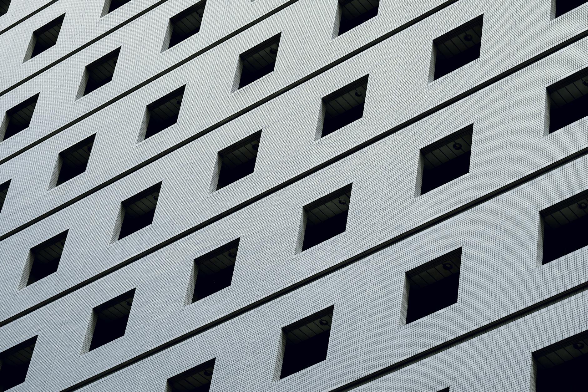
Translational symmetry (also called crystallographic symmetry) repeats elements at regular intervals across a surface without reflection or rotation. A row of identical icons, a repeating tile pattern, or a grid of product images all demonstrate translational symmetry. It creates rhythm and consistency, making it especially useful in pattern design and systematic layouts.
Approximate symmetry uses elements that are similar but not identical on each side of an axis. A layout where one side has an image and the other has a text block of equivalent visual weight is approximately symmetrical. This type blends the stability of symmetry with the interest of asymmetry and is extremely common in modern web design.
Key Differences
The choice between symmetry vs asymmetry shapes both the aesthetic feel and the functional behavior of a design.
Visual impression. Symmetry reads as formal, stable, classical, and predictable. Asymmetry reads as informal, dynamic, modern, and unexpected. Neither impression is inherently better — each serves different communication goals.
Eye movement. In symmetrical compositions, the eye is drawn to the center and rests there. In asymmetrical compositions, the eye travels through the design following a path created by visual weight, contrast, and spatial relationships. Asymmetry gives designers more control over the order in which viewers encounter information.
Emotional tone. Symmetry conveys authority, tradition, elegance, and calm. Asymmetry conveys creativity, energy, informality, and progressiveness. A law firm might choose symmetry to project gravitas; a creative agency might choose asymmetry to signal innovation.
Complexity of execution. Symmetry is relatively straightforward to achieve — center things, mirror them, and balance is automatic. Asymmetry is more challenging because balance must be felt rather than measured. It requires a trained eye to distribute visual weight effectively without a mirror axis to rely on.
Flexibility. Asymmetric layouts offer more flexibility in accommodating varied content. When you have a mix of images, text, and interactive elements of different sizes and proportions, asymmetry adapts more naturally than symmetry, which requires elements to conform to a mirror structure.
When to Use Each
Use symmetry when:
- The brand or message calls for tradition, formality, or authority — legal, financial, government, luxury
- You want to create a sense of calm, order, and harmony
- The content is relatively uniform — similar-sized images, consistent text blocks, matching sections
- The design must project reliability and trustworthiness
- You are designing for contexts where classical aesthetics are valued — invitations, certificates, memorial materials
Use asymmetry when:
- The brand values creativity, innovation, or modernity
- You want to create visual energy, movement, and interest
- Content varies significantly in type and size — mixed media, varied text lengths, different image proportions
- You need to guide the viewer through information in a specific order
- The design should feel approachable, contemporary, and human rather than institutional
Many effective designs use both. A website might have a symmetrical hero section for impact and authority, followed by asymmetrical content sections for interest and engagement. A poster might use a symmetrical typographic layout over an asymmetrically composed photograph. The best designers in any design style understand both tools and mix them intentionally.
FAQ
Is asymmetrical design harder to get right?
Generally, yes. Symmetry provides an automatic balancing mechanism — if both halves match, balance is guaranteed. Asymmetry requires the designer to feel visual weight intuitively and test whether a composition feels balanced without a structural rule to verify it. This is why asymmetric design often looks effortless but demands significant skill. Working with a grid system helps — grids provide structure that makes asymmetric placement more systematic and less arbitrary.
Which is better for logo design?
Both work well, and the choice depends on the brand’s personality. Many of the world’s most recognized logos are symmetrical — Target, Volkswagen, Starbucks, and BMW all use symmetry or radial symmetry. But plenty of iconic logos are asymmetrical — Nike’s swoosh, Apple’s bitten apple, and the FedEx arrow all break symmetry. Symmetrical logos tend to feel more traditional and authoritative; asymmetrical logos tend to feel more dynamic and distinctive.
Can a design be both symmetrical and asymmetrical?
Yes, and this combination is extremely common. A design might be symmetrical along one axis but asymmetrical along another. A webpage might center its header symmetrically while arranging its content blocks asymmetrically. A poster might feature a symmetrical typographic block offset asymmetrically on the page. Using symmetry in some areas and asymmetry in others creates a rhythm of stability and energy that keeps the viewer engaged.
Does symmetry always feel boring?
Not at all. Symmetry feels boring only when it is applied without thought — when centering everything is the default rather than a deliberate choice. Intentional symmetry, especially when combined with strong typography, compelling imagery, or unexpected content, can be powerful and striking. Consider the visual impact of a perfectly centered bold headline on a poster, or the quiet elegance of a symmetrically designed book cover. The key is using symmetry as a conscious compositional strategy, not a lazy shortcut.


