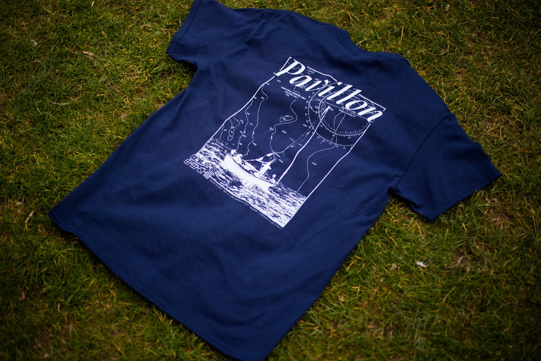
T-Shirt Design Principles That Work
A t-shirt is a piece of wearable design that has to look good on fabric, survive washing, and read from across a room. Smart t-shirt design principles account for the garment color, the print method, and the way artwork behaves at scale, not just how it looks on screen. Designs fail when fine detail clogs up in printing, when the artwork clashes with the shirt color, or when files are raster and pixelate at print size. They succeed when bold, clean art sits perfectly placed on the garment.
The key principles of t-shirt design
The seven principles below cover artwork preparation, placement, and the production realities of putting ink on fabric.
| Principle | Why it matters |
|---|---|
| Design in vector | Vector art scales to any print size without pixelating. |
| Choose placement and size | Chest, full front, or pocket each suit different designs. |
| Contrast with the garment | Artwork must stand out from the shirt color, not blend in. |
| Keep detail simple | Fine lines and tiny text can clog or break up in print. |
| Match the print method | Screen printing and DTG favor different artwork choices. |
| Limit color separations | Fewer colors lower cost and simplify screen printing. |
| Stay legible from a distance | A wearable design should read across a room. |
1. Design in vector — scale without pixelating
T-shirt artwork gets printed large, so build it as vector wherever possible. Vector files scale from a pocket logo to a full-front print with no loss of quality, while raster images pixelate and blur when enlarged. Vector also makes it easy to separate colors for screen printing and to recolor the design for different garment colors. If you must use raster art, create it at high resolution at the final print size.
2. Choose placement and size — design for the body
Where the art sits changes the whole design. A left-chest print is small and logo-like, a full-front print is a statement, and a pocket or sleeve print is an accent. Each has a typical print area, so design within those bounds rather than assuming the art fills the whole shirt. Consider how the placement interacts with seams, collars, and the way fabric drapes once the garment is actually worn.
3. Contrast with the garment — make the art pop
The shirt color is effectively part of your palette. A design that looks great on white can vanish on black, and vice versa. Choose ink colors that stand out clearly from the garment, and plan separate color versions if the design will run on both light and dark shirts. Applying solid color theory helps you pick combinations that stay vivid against whatever fabric you print on.
4. Keep detail simple — survive the print
Fabric is not paper. Very thin lines, tiny text, and subtle gradients can clog, crack, or disappear depending on the print method. Favor bold shapes, clean edges, and confident line weights that reproduce reliably. Simplify intricate illustrations so the key forms read clearly at arm’s length. A design that’s a little bolder than feels necessary on screen usually prints far better on a shirt.
5. Match the print method — screen vs DTG
The two common methods reward different art. Screen printing produces vibrant, durable prints and is cost-effective at volume, but it works best with a limited number of solid colors. Direct-to-garment (DTG) prints full-color, photographic detail without color separations, which suits complex art and small runs, though it shines most on cotton. Know your method before finalizing artwork so the design plays to its strengths.
6. Limit color separations — fewer inks, lower cost
For screen printing, each color is a separate screen, so every extra color adds setup and cost. Designing with a tight, intentional palette keeps printing affordable and often looks stronger anyway. Use the garment color as one of your tones by leaving areas unprinted. Clear visual hierarchy lets a few well-chosen colors carry the design without needing a long ink list.
7. Stay legible from a distance — read it across a room
People see a t-shirt design from several feet away, not at desk distance. Any text should be large and bold enough to read across a room, and the overall composition should resolve into a clear image at a glance. Step back from your monitor or print a mock-up and view it from a few paces. If the message or main shape isn’t clear at that range, simplify and enlarge.
Common t-shirt design mistakes to avoid
- Supplying low-resolution raster art that pixelates at print size.
- Using fine detail or tiny text that clogs or breaks up on fabric.
- Ignoring the garment color so the artwork blends into the shirt.
- Adding too many ink colors, driving up screen-printing cost.
Frequently Asked Questions
What are the most important t-shirt design principles?
The essentials are building artwork in vector so it scales cleanly, choosing the right placement and print size, ensuring bold contrast against the garment color, keeping detail simple enough to print well, and matching the design to your print method. Together these produce a sharp, durable design that reads from a distance.
What is the standard print size and placement for a t-shirt?
Common placements include a left-chest print around 3 to 4 inches wide, a full-front print roughly 10 to 12 inches wide, and smaller pocket or sleeve accents. Exact maximums depend on the garment size and printer, so design within the print area for your chosen placement rather than assuming the art fills the shirt.
Should t-shirt artwork be vector or raster?
Vector is preferred because it scales to any size without losing quality and makes color separation for screen printing straightforward. If you need photographic or highly detailed art, raster can work, but create it at high resolution at the final print size and lean toward direct-to-garment printing, which handles full-color detail well.
What is the difference between screen printing and DTG?
Screen printing pushes ink through screens, one per color, giving vibrant, durable results that are cost-effective in bulk but best with a limited palette. Direct-to-garment prints full-color detail like an inkjet, with no color separations, which suits complex art and small runs. Choose the method before finalizing your artwork.
How do I make a t-shirt design stand out?
Combine bold, simple artwork, strong contrast against the garment color, and a placement that suits the design. Keep text large enough to read across a room and limit your palette for impact and printability. For more on contrast and hierarchy, see our overview of core design principles.


