What Font Does TAG Heuer Use?
Searching for the tag heuer font usually ends in frustration, because no standard typeface quite nails the bold, confident look of the logo. That is intentional. TAG Heuer’s identity is built on custom lettering and a distinctive shield, not on a font you can install. This guide explains what the wordmark actually is, why the brand chose a strong modern sans, and which free fonts come closest if you need the look for a non-commercial project.
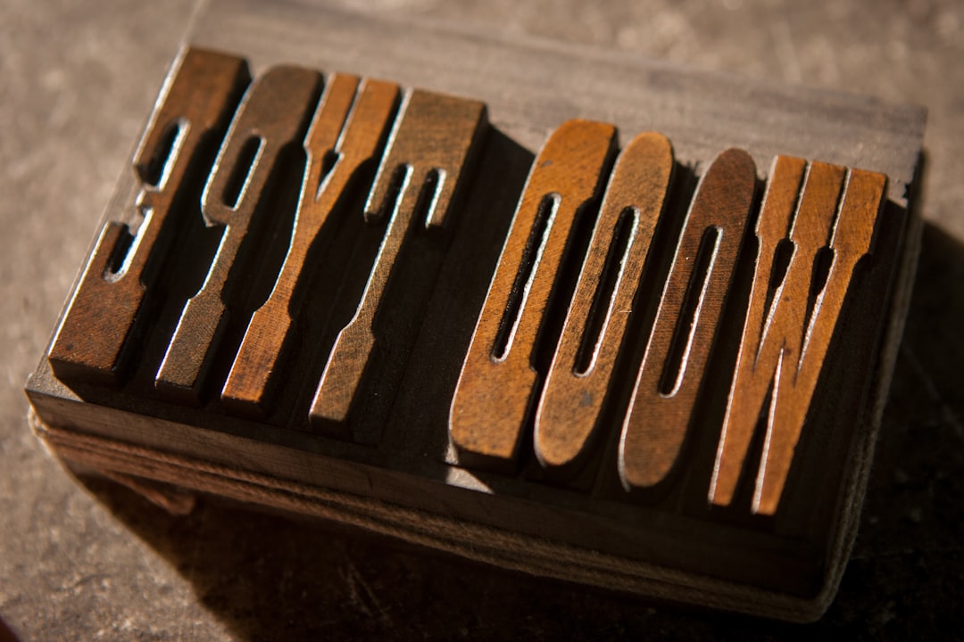
What font is the TAG Heuer logo?
The TAG Heuer logo is a custom, bold sans-serif wordmark. The “TAG” portion is typically set in heavy uppercase, while “Heuer” carries the heritage family name. The letterforms are sturdy, upright, and geometric, with even stroke weights and clean terminals that signal sport, precision, and motorsport energy. Alongside the lettering sits the shield emblem in the brand’s green and red, a mark that ties back to TAG Heuer’s racing and chronograph heritage.
Because the wordmark is bespoke, no off-the-shelf font reproduces it exactly. The weight, spacing, and proportions are tuned for impact. So if you ask which typeface TAG Heuer uses, the accurate answer is a custom bold sans-serif in the modern geometric tradition, not a specific commercial font you can buy. Treat that as an informed observation, not a confirmed spec.
What typeface does TAG Heuer use in branding?
Across advertising, sponsorship branding, and product communications, TAG Heuer stays consistent with the bold, modern sans-serif language of its logo. Headlines tend to use strong uppercase sans type, while supporting copy uses a clean, legible sans that keeps everything fast and readable, fitting for a brand wrapped up in racing, sport, and performance.
Recurring traits in TAG Heuer’s typography include:
- Bold, confident sans-serif capitals with strong presence.
- Geometric, upright letterforms that feel engineered and sporty.
- The shield emblem as a recognizable standalone mark.
- Clean, high-legibility supporting type for technical clarity.
The mix of weights within the wordmark is part of what makes it work. Setting “TAG” heavier than “Heuer” creates a clear visual hierarchy and gives the lockup a sense of motion, almost like a logo built for the side of a race car. That contrast also helps the mark stay legible at small sizes and from a distance, which matters for a brand whose name appears on trackside signage, dashboards, and event branding. Few luxury watchmakers chase this kind of high-energy clarity, and it is a big reason TAG Heuer reads as younger and more sporting than its rivals. The bold weight also gives the name real presence in busy environments, from a crowded grandstand to a cluttered retail wall, where a lighter or more decorative logo would simply recede.
This bold-sans direction sets TAG Heuer apart from the serif-led luxury crowd. Compare it with the refined high-contrast serif of the Rolex wordmark, or with the elegant classic serif used by Patek Philippe, to see how a sportier watchmaker uses type to signal energy rather than old-world heritage.
Free fonts that look like the TAG Heuer font
You cannot download the actual TAG Heuer wordmark, but several free sans-serifs share its bold, geometric character. The table maps common use cases to a TAG Heuer-style choice and a free alternative.
| Use case | TAG Heuer uses | Free alternative |
|---|---|---|
| Logo-style wordmark | Custom bold geometric sans | Montserrat Bold (Google Fonts) |
| Strong uppercase headline | Heavy upright capitals | Archivo Black |
| Sporty display | Condensed bold sans | Oswald |
| Body and supporting text | Clean legible sans | Work Sans |
For a quick match, Montserrat Bold in all caps captures the geometric, confident feel of the wordmark. If you want extra weight and punch, Archivo Black is a strong choice. All of these are free for personal and most commercial use, but confirm the license before shipping anything public.
Why does TAG Heuer use this kind of type?
TAG Heuer’s brand is rooted in motorsport, chronographs, and an “avant-garde since 1860” attitude. A bold, modern sans-serif communicates speed, precision, and confidence far better than a delicate serif would. The geometric forms feel engineered and contemporary, aligning the brand with performance and innovation rather than nostalgia.
Commissioning custom letterforms also protects the identity. A bespoke wordmark cannot be replicated by anyone with the same font file, which strengthens trademark distinctiveness and makes imitations easier to challenge. The shield emblem reinforces this with a mark that carries the brand’s racing heritage. Together, the bold lettering and shield create an identity that feels fast, strong, and unmistakable. For more on how recognizable brands build these systems, browse our collection of famous brand fonts.
Can I use the TAG Heuer font for my own project?
No. The “TAG Heuer” wordmark and shield emblem are registered trademarks and proprietary artwork. You cannot use them, or a close imitation, to brand your own products, store, or merchandise. In the watch industry this is enforced firmly, and imitation marks can lead to trademark and counterfeiting claims.
You can use a free bold geometric sans for your own original branding, or for fan and editorial content that does not imply any affiliation with TAG Heuer. The general look of strong sans-serif capitals is not owned by anyone; only TAG Heuer’s specific name, wordmark, and shield are protected. Before publishing commercial work, check each font’s terms and read our font licensing guide so you respect both font licenses and trademark law.
Frequently Asked Questions
Is the TAG Heuer logo font available for download?
No. The TAG Heuer wordmark is custom artwork and is not sold as a font. Files marketed as the “TAG Heuer font” online are look-alikes or fan recreations, not the genuine trademarked lettering. Using them to imitate the brand can create legal risk, so build original designs instead.
What font is closest to the TAG Heuer logo?
Montserrat Bold is the closest easy match. It is a bold geometric sans that, set in uppercase, captures the strong, modern character of the wordmark. Archivo Black offers a heavier option, while Oswald works if you want a more condensed, sporty look for mockups.
Is the TAG Heuer font a serif or sans-serif?
It is a sans-serif, specifically a bold, geometric, modern sans. The clean strokes and upright capitals give it a sporty, engineered feel that matches TAG Heuer’s motorsport heritage, distinguishing it from the high-contrast serifs used by more traditional luxury watch brands.
What is the shield in the TAG Heuer logo?
The green-and-red shield is TAG Heuer’s emblem, rooted in the brand’s racing and chronograph heritage. It is a registered trademark used alongside the wordmark and works as a recognizable standalone mark. Like the lettering, it is proprietary and cannot be reused for your own branding.


